flutx_ui
Getting Started
Custom Widgets
Here we would see the difference between normal widgets and the widgets that we provide in FlutX.
FlutXUI provides ready to use widgets which makes your work more simple and fast. It makes code more compact and easy to understand.
full doc: Widgets | FlutKit - Flutter UI Kit (coderthemes.com)
Libraries
- core/logs/log
- FxLog - provides a way to print anything in the console-
- core/network/header
- core/network/network
- core/network/response
- core/network/util
- core/routes/middlewares/middleware
- core/routes/route
- core/routes/route_builders/enter_exit_route
- core/routes/route_builders/fade_route
- core/routes/route_builders/rotation_route
- core/routes/route_builders/scale_rotate_route
- core/routes/route_builders/scale_route
- core/routes/route_builders/size_route
- core/routes/route_builders/slide_left_route
- core/routes/route_builders/slide_right_route
- core/routes/routes
- FxRoutes - able to create add and map routes.
- core/state_management/builder
- core/state_management/controller
- core/state_management/controller_store
- core/state_management/disposable_interface
- core/state_management/lifecycle
- core/state_management/listenable_mixin
- core/state_management/state_management
- core/tuple
- extensions/color_extension
- extensions/extensions
- extensions/string_extension
- flutx
- icons/box_icon/box_icon_data
- icons/two_tone/two_tone_icon
- FxTwoToneIcon - provides two tone Icons.
- icons/two_tone/two_tone_icon_data
- icons/two_tone/two_tone_mdi_icons
- FxTwoToneMdiIcons - List of the Icons
- mixins/form_data_mixin
- mixins/mixins
- styles/shadow
- FxShadow - provides custom shadow to the widget
- styles/styles
- themes/app_theme
- FxAppThemeType.dark - Applies all the properties for dark theme FxAppThemeType.light - Applies all the properties for light theme
- themes/app_theme_notifier
- FxAppThemeNotifier - notifies the app by giving the theme to the app
- themes/constant
- themes/text_style
- FxTextStyle - gives 13 different type of styles to the text on the basis of size
- themes/themes
- utils/color_utils
- FxColorUtils - returns a list of colors.
- utils/distance_utils
- FxDistanceUtils - gives different functions that can be used for calculating or formatting distance
- utils/formatters/card_month_input_formatter
- utils/formatters/card_number_input_formatter
- utils/measure_size
- FxMeasureSize - measures the size of any particular widget
- utils/spacing
- FxSpacing - provides spacing of various types.
- utils/text_utils
- FxTextUtils - provides different functions for paring, generating and formatting a string.
- utils/time_utils
- utils/utils
- utils/validators/string_validator
- widgets/app_bar/app_bar
- There are mainly 2 types of bottomNavigationbar implemented using material Widgets.
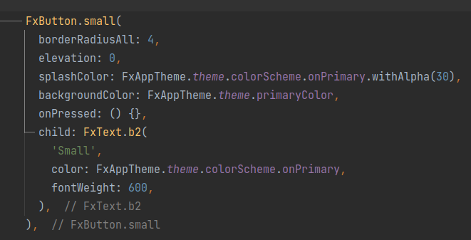
- Three types of button implemented from Material Button. FxButtonType.elevated - gives elevation to the button along with some height and shadow. FxButtonType.outlined - gives outline to the button FxButtonType.text - able to build text button
- widgets/card/card
- There are mainly 2 types of card .
- widgets/color_picker/color_picker
- widgets/container/container
- widgets/credit_card/credit_card
- FxCreditCard - customisable credit card with all the necessary details in it.
- widgets/custom_rating/custom_rating
- FxCustomRating - able to give customisable rating widget with custom features.
- widgets/dashed_divider/dashed_divider
- FxDashedDivider - Provides a dashed line to the screen for the given width and height.
- widgets/dotted_border/dash_painter
- widgets/dotted_border/dotted_border
- widgets/dotted_line/dotted_line
- FxDottedLine - gives a dotted line.
- widgets/on_boarding/animation_gesture/page_dragger
- widgets/on_boarding/animation_gesture/page_reveal
- widgets/on_boarding/on_boarding
- FxOnBoarding - Gives a custom page onBoarding widget with 2 buttons for SKIP and DONE.
- widgets/on_boarding/ui/pager_indicator
- widgets/on_boarding/ui/pages
- widgets/page_view/page_view
- widgets/path_drawing/dash_path
- widgets/path_drawing/path_drawing
- widgets/path_drawing/trim_path
- widgets/progress_bar/progress_bar
- widgets/star_rating/star_rating
- widgets/svg/svg
- widgets/tab_indicator/tab_indicator
- widgets/tab_indicator/tab_indicator_painter
- widgets/text/text
- There are mainly 13 types of Text widgets. h1,h2,h3,h4,h5,h6,sh1,sh2,b1,b2,button,caption,overline - This is the order of its size.
- widgets/text_field/text_field
- There are mainly 2 styles of TextField. FxTextFieldStyle.underlined - It gives underline to the textField. FxTextFieldStyle.outlined - It gives outline to the textField.
- widgets/text_liquid_fill/text_liquid_fill
- FxTextLiquidFill - builds a widget for text which gets build having a watery effect.
- widgets/widgets