
flutter_swiper_plus
The best swiper for flutter , with multiple layouts, infinite loop. Compatible with Android & iOS.
If you need run on flutter that version before 2.0, see:flutter_swiper
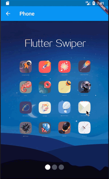
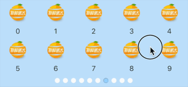
Show Case
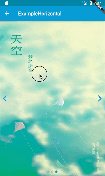
Horizontal
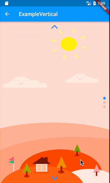
Vertical
Horizontal & Vertical in part
Imitating BiliBili's (with text)
- flutter_swiper_plus👇:
- BiliBili's👇:

Imitate mobile page
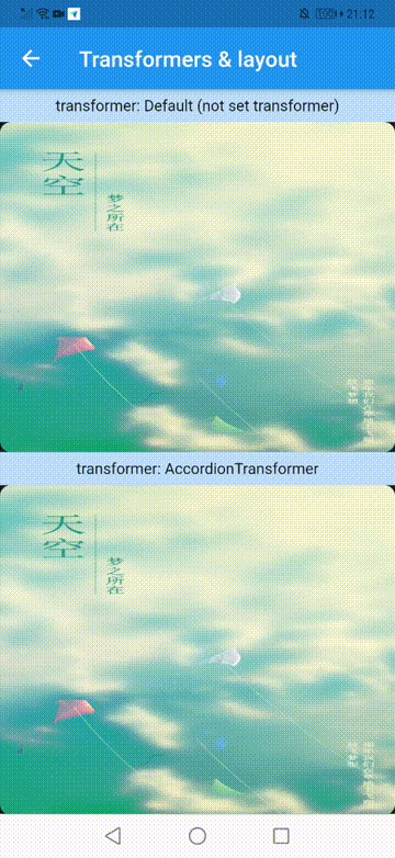
Different Transformers
- You can override 'PageTransformer' to customize the animation ,see
buildin_transformers.dart - The existing animation is shown below 👇:
you can run
main.dartin example to see the actual effect.
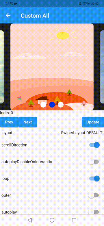
Different layouts
- This part is currently controlled by enum, It can be previewed in the
Custom Allof the example project - The following is a demonstration 👇:
you can run
main.dartin example to see the actual effect.
- Very easy to create you own custom animation, like this👇:
 new Swiper(
  layout: SwiperLayout.CUSTOM,
  customLayoutOption: new CustomLayoutOption(
      startIndex: -1,
      stateCount: 3
  ).addRotate([
    -45.0/180,
    0.0,
    45.0/180
  ]).addTranslate([
    new Offset(-370.0, -40.0),
    new Offset(0.0, 0.0),
    new Offset(370.0, -40.0)
  ]),
  itemWidth: 300.0,
  itemHeight: 200.0,
  itemBuilder: (context, index) {
    return new Container(
      color: Colors.grey,
      child: new Center(
        child: new Text("$index"),
      ),
    );
  },
  itemCount: 10)
- The
CustomLayoutOptionis designed to describe animations. It is very easy to specify every state of items in Swiper, like this👇:
new CustomLayoutOption(
      startIndex: -1,  /// 开始下标
      stateCount: 3    /// 下面的数组长度
  ).addRotate([        //  每个元素的角度
    -45.0/180,
    0.0,
    45.0/180
  ]).addTranslate([           /// 每个元素的偏移
    new Offset(-370.0, -40.0),
    new Offset(0.0, 0.0),
    new Offset(370.0, -40.0)
  ])
change log
- See:CHANGELOG.md
quick start
installation
in pubspec.yaml, write this👇:
dependencies:
  flutter_swiper_plus : 2.0.4
then run this👇 in your project root:
flutter packages get
Simple_Demo
import 'package:flutter/material.dart';
import 'package:flutter_swiper_plus/flutter_swiper_plus.dart';

void main() => runApp(new MyApp());

class MyApp extends StatelessWidget {
  @override
  Widget build(BuildContext context) {
    return new MaterialApp(
      title: 'Flutter Demo',
      theme: new ThemeData(
        primarySwatch: Colors.blue,
      ),
      home: new MyHomePage(title: 'Flutter Demo Home Page'),
    );
  }
}

class MyHomePage extends StatefulWidget {
  MyHomePage({Key? key, required this.title}) : super(key: key);

  final String title;

  @override
  _MyHomePageState createState() => new _MyHomePageState();
}

class _MyHomePageState extends State<MyHomePage> {

  @override
  Widget build(BuildContext context) {
    return new Scaffold(
      appBar: new AppBar(
        title: new Text(widget.title),
      ),
      body:  new Swiper(
        itemBuilder: (BuildContext context,int index){
          return new Image.network("http://via.placeholder.com/350x150",fit: BoxFit.fill,);
        },
        itemCount: 3,
        pagination: new SwiperPagination(),
        control: new SwiperControl(),
      ),
    );
  }
}
Constructor
Basic
| Parameter | Default | Description |
|---|---|---|
| scrollDirection | Axis.horizontal | If Axis.horizontal, the scroll view's children are arranged horizontally in a row instead of vertically in a column. |
| loop | true | Set to false to disable continuous loop mode. |
| index | 0 | Index number of initial slide. |
| autoplay | false | Set to true enable auto play mode. |
| onIndexChanged | void onIndexChanged(int index) | Called with the new index when the user swiped or autoplay |
| onTap | void onTap(int index) | Called when user tap ui. |
| duration | 300.0 | The milliscends of every transaction animation costs |
| pagination | null | set new SwiperPagination() to show default pagination |
| control | null | set new SwiperControl() to show default control buttons |
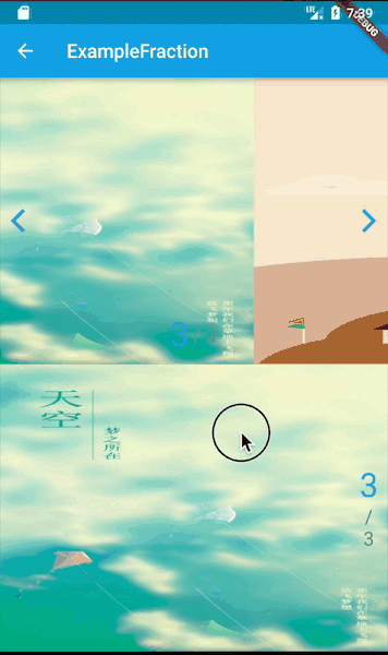
Pagination
The pagination extends from SwiperPlugin,the SwiperPlugin provides extra ui for Swiper.Set new SwiperPagination() to show default pagination.
| Parameter | Default | Description |
|---|---|---|
| alignment | Alignment.bottomCenter | Change this value if you what to put pagination in other place |
| margin | const EdgeInsets.all(10.0) | The distance between inner side of the parent container. |
| builder | SwiperPagination.dots | There are two default styles SwiperPagination.dots and SwiperPagination.fraction,both can be customized. |
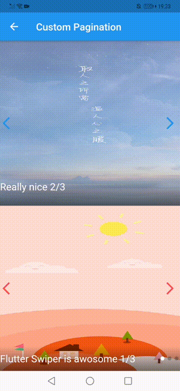
If you'd like to customize your own pagination, you can do like this:
new Swiper(
    ...,
    pagination:new SwiperCustomPagination(
        builder:(BuildContext context, SwiperPluginConfig config){
            return new YourOwnPaginatipon();
        }
    )
);
Control buttons
The control also extends from SwiperPlugin,set new SwiperControl() to show default control buttons.
| Parameter | Default | Description |
|---|---|---|
| iconPrevious | Icons.arrow_back_ios | The icon data to display previous control button |
| iconNext | Icons.arrow_forward_ios | The icon data to display next. |
| color | Theme.of(context).primaryColor | Control button color |
| size | 30.0 | Control button size |
| padding | const EdgeInsets.all(5.0) | Control button padding |
Controller
The Controller is used to control the index of the Swiper, start or stop autoplay.You can create a controller by new SwiperController() and save the instance by futher usage.
| Method | Description |
|---|---|
| void move(int index, {bool animation: true}) | Move to the spicified index,with animation or not |
| void next({bool animation: true}) | Move to next |
| void previous({bool animation: true}) | Move to previous |
| void startAutoplay() | Start autoplay |
| void stopAutoplay() | Stop autoplay |
Autoplay
| Parameter | Default | Description |
|---|---|---|
| autoplayDelay | 3000 | Autoplay delay milliseconds. |
| autoplayDisableOnInteraction | true | If set true, autoplay is disabled when use swipes. |