Language: English | 中文
Introduction
An elegant Flutter Dialog solution.
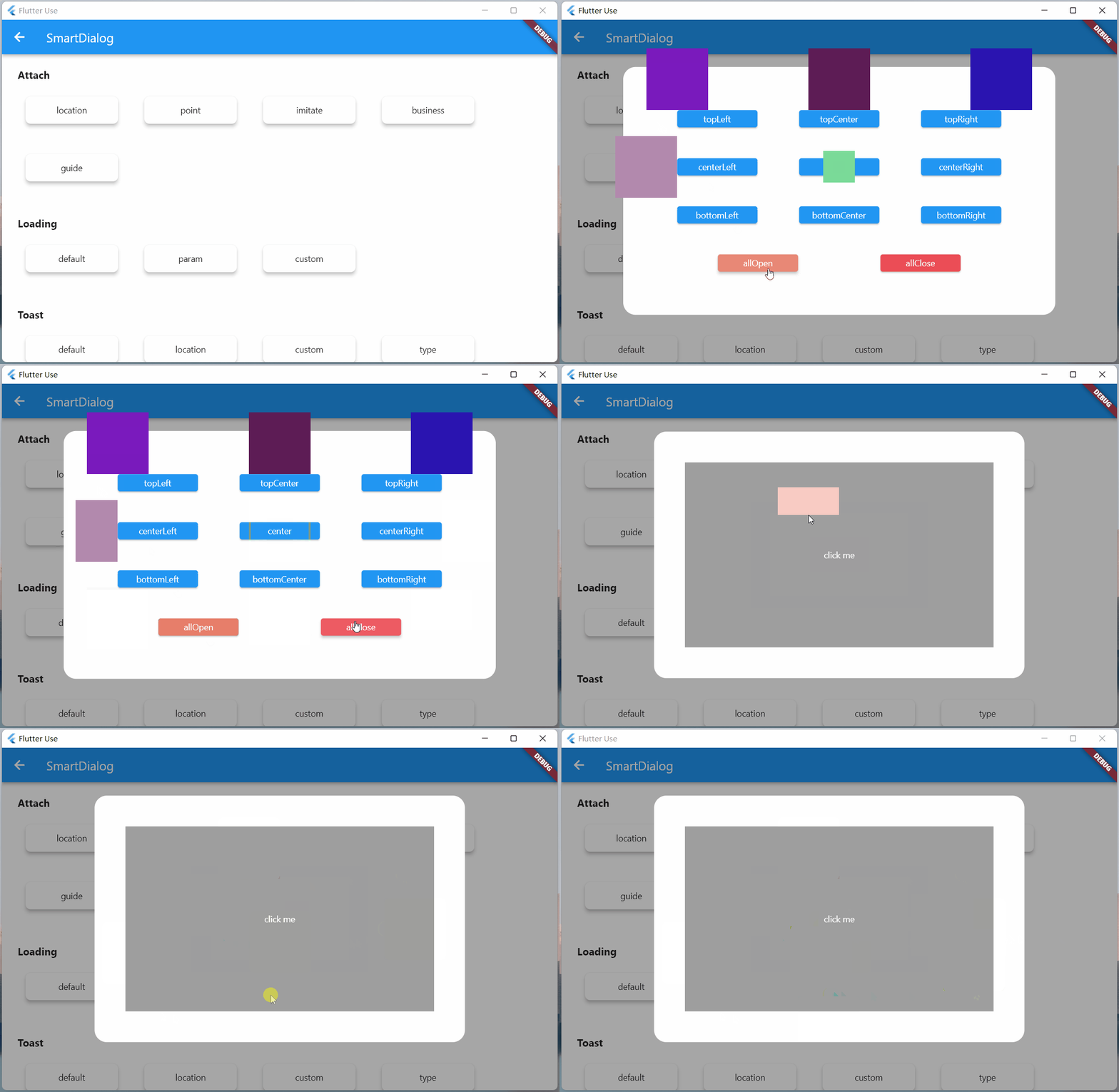
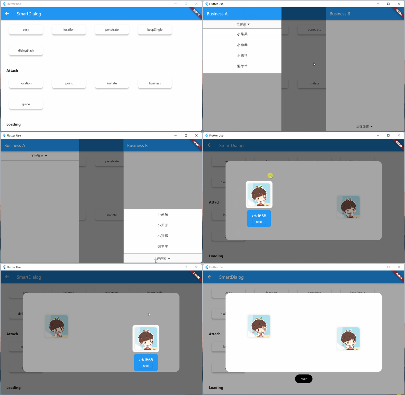
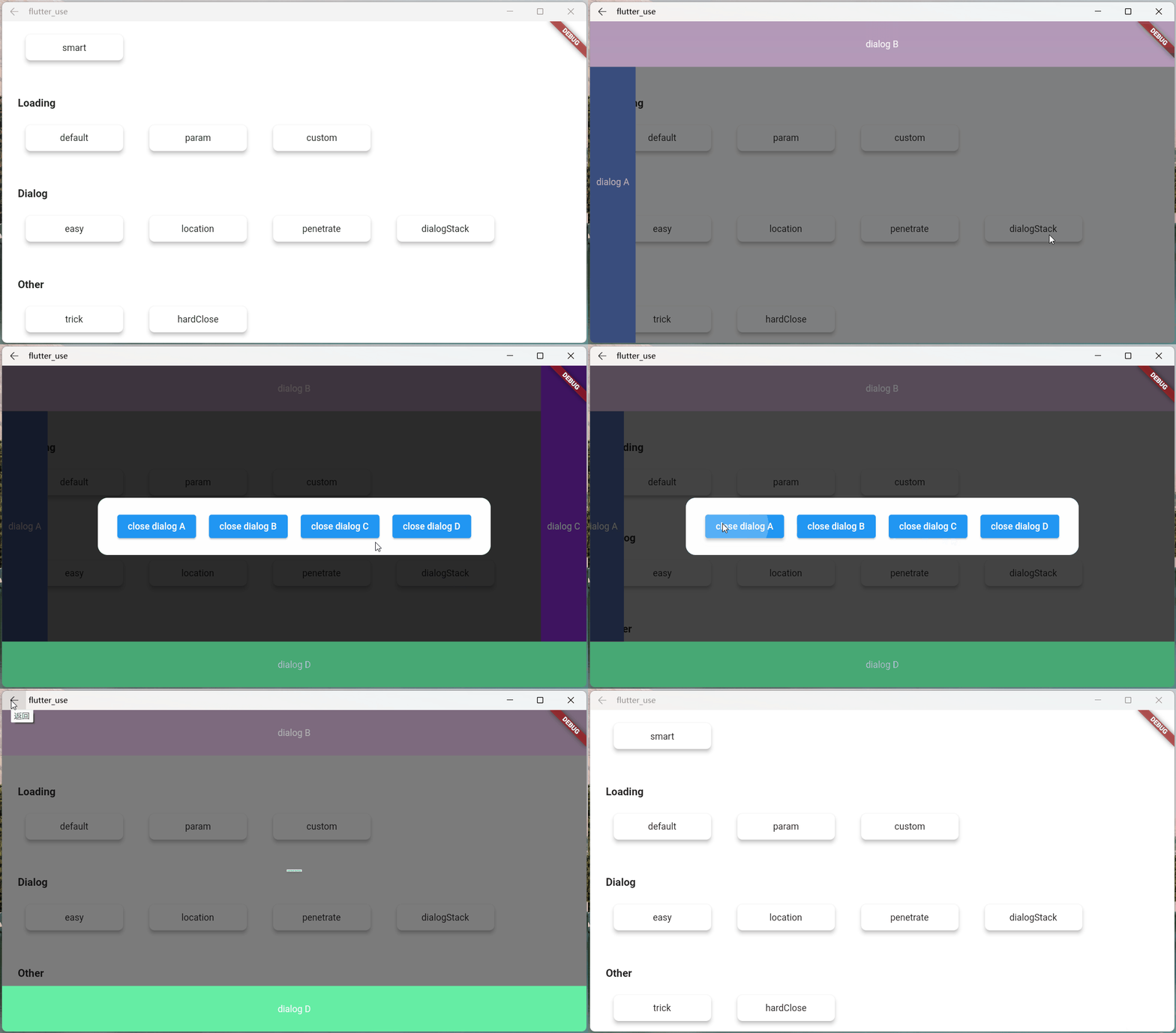
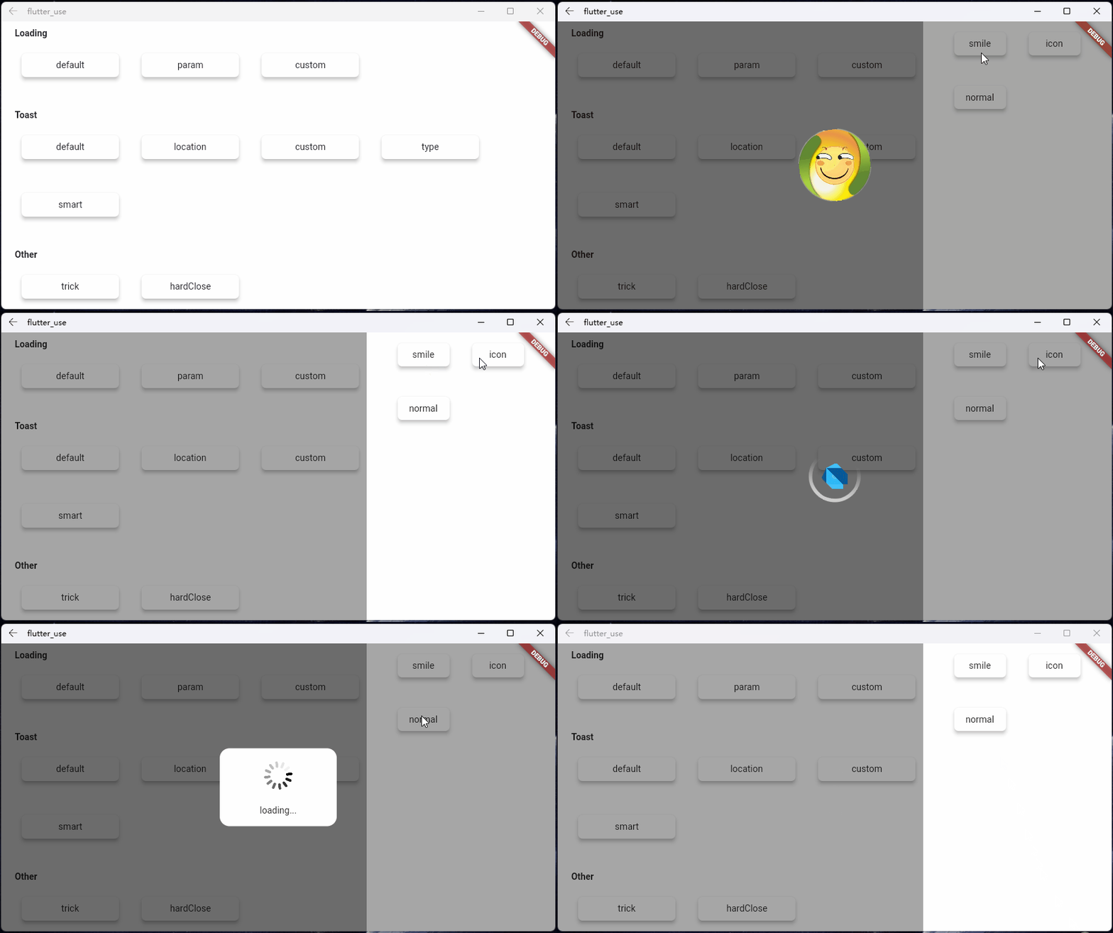
Some Effect

Advantage
-
Do not need BuildContext
-
Can penetrate dark background, click on the page behind dialog
-
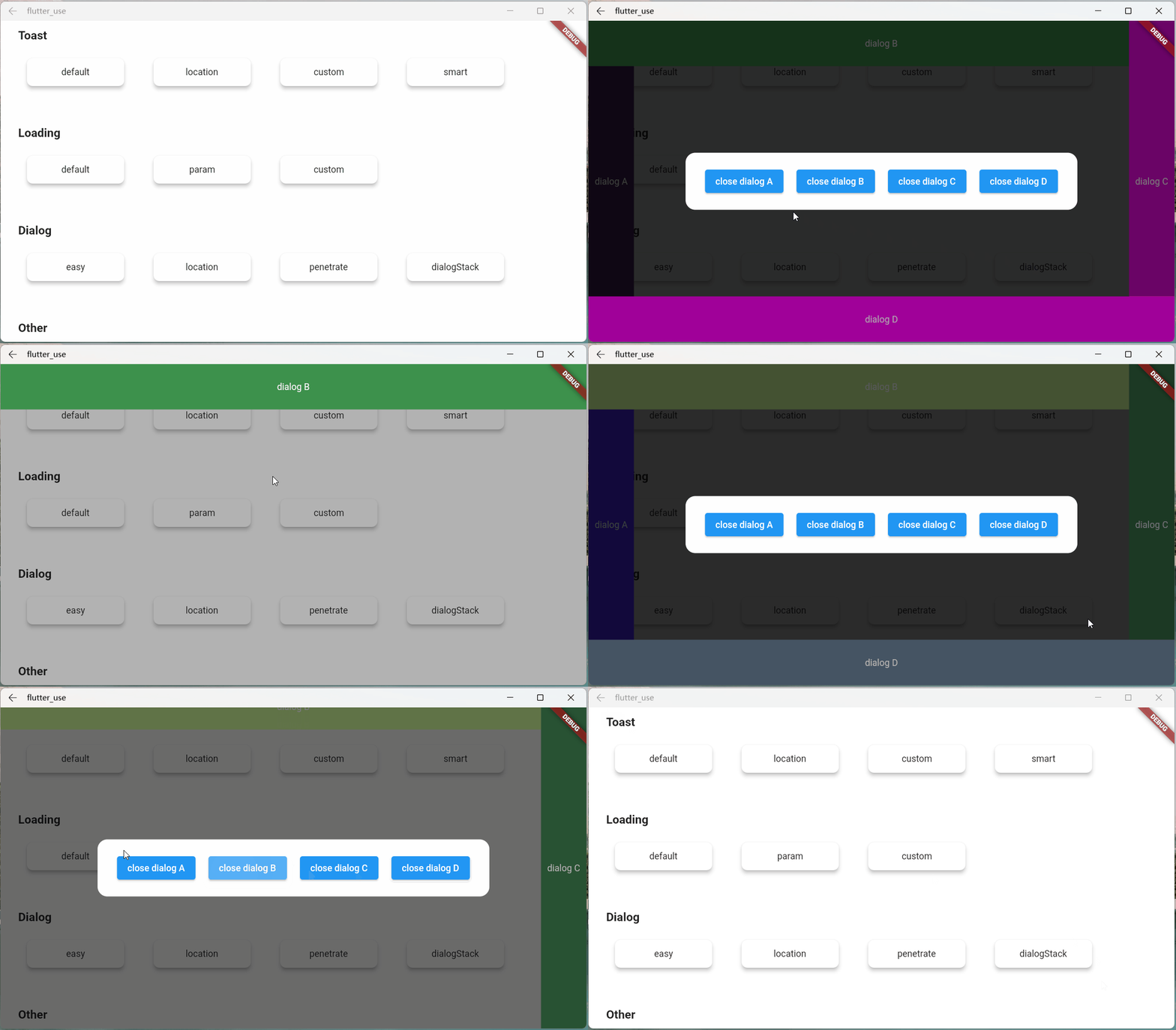
Support dialog stack,close the specified dialog
-
Support positioning widget, display the specified location dialog
-
Support highlight feature,dissolve the specified location mask
-
Easily implement toast,loading,attach dialog,custome dialog
Quick start
Install
- latest version:install pub
Initialization
initialization
void main() => runApp(MyApp());

class MyApp extends StatelessWidget {
  @override
  Widget build(BuildContext context) {
    return MaterialApp(
      home: HomePage,
      // here
      navigatorObservers: [FlutterSmartDialog.observer],
      // here
      builder: FlutterSmartDialog.init(),
    );
  }
}
Advanced initialization: configure global custom Loading and Toast
SmartDialog's showLoading and showToast provide a default style. Of course, custom param are definitely supported.
- SmartDialog custom Loading or Toast is very simple: However, when using it, it may make you feel a little troublesome
- for example
- Use custom Loading:
SmartDialog.showLoading(widget: CustomLoadingWidget); - The effect we want must be like this:
SmartDialog.showLoading();
- Use custom Loading:
- In view of the above considerations, I added the function of setting custom default Loading and Toast styles at the entrance
Let me show you the following
- The entry needs to be configured: implement toastBuilder and loadingBuilder, and pass in custom Toast and Loading
void main() => runApp(MyApp());

class MyApp extends StatelessWidget {
  @override
  Widget build(BuildContext context) {
    return MaterialApp(
      home: HomePage,
      // here
      navigatorObservers: [FlutterSmartDialog.observer],
      // here
      builder: FlutterSmartDialog.init(
        //default toast widget
        toastBuilder: (String msg, AlignmentGeometry alignment) {
          return CustomToastWidget(msg: msg, alignment: alignment);
        },
        //default loading widget
        loadingBuilder: (String msg, Color background) {
          return CustomLoadingWidget(msg: msg, background: background);
        },
      ),
    );
  }
}
Easy usage
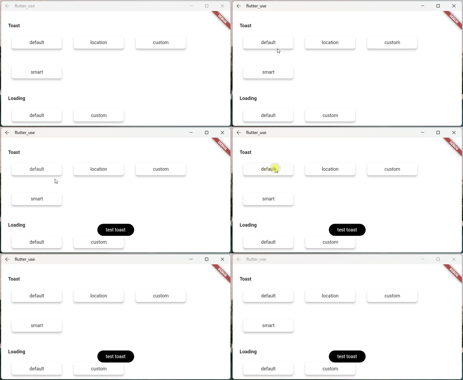
- toast usage💬
SmartDialog.showToast('test toast');
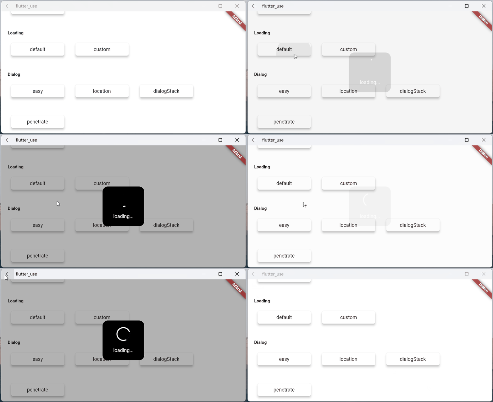
- loading usage⏳
SmartDialog.showLoading();
await Future.delayed(Duration(seconds: 2));
SmartDialog.dismiss();
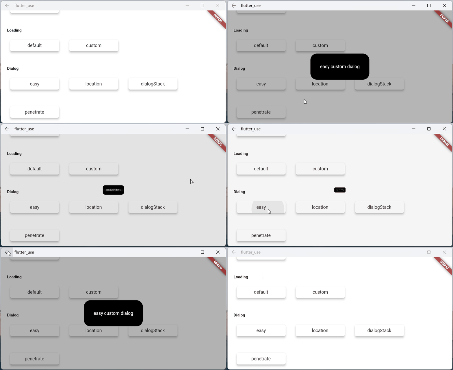
- dialog usage🎨
var custom = Container(
    height: 80,
    width: 180,
    decoration: BoxDecoration(
        color: Colors.black,
        borderRadius: BorderRadius.circular(20),
    ),
    alignment: Alignment.center,
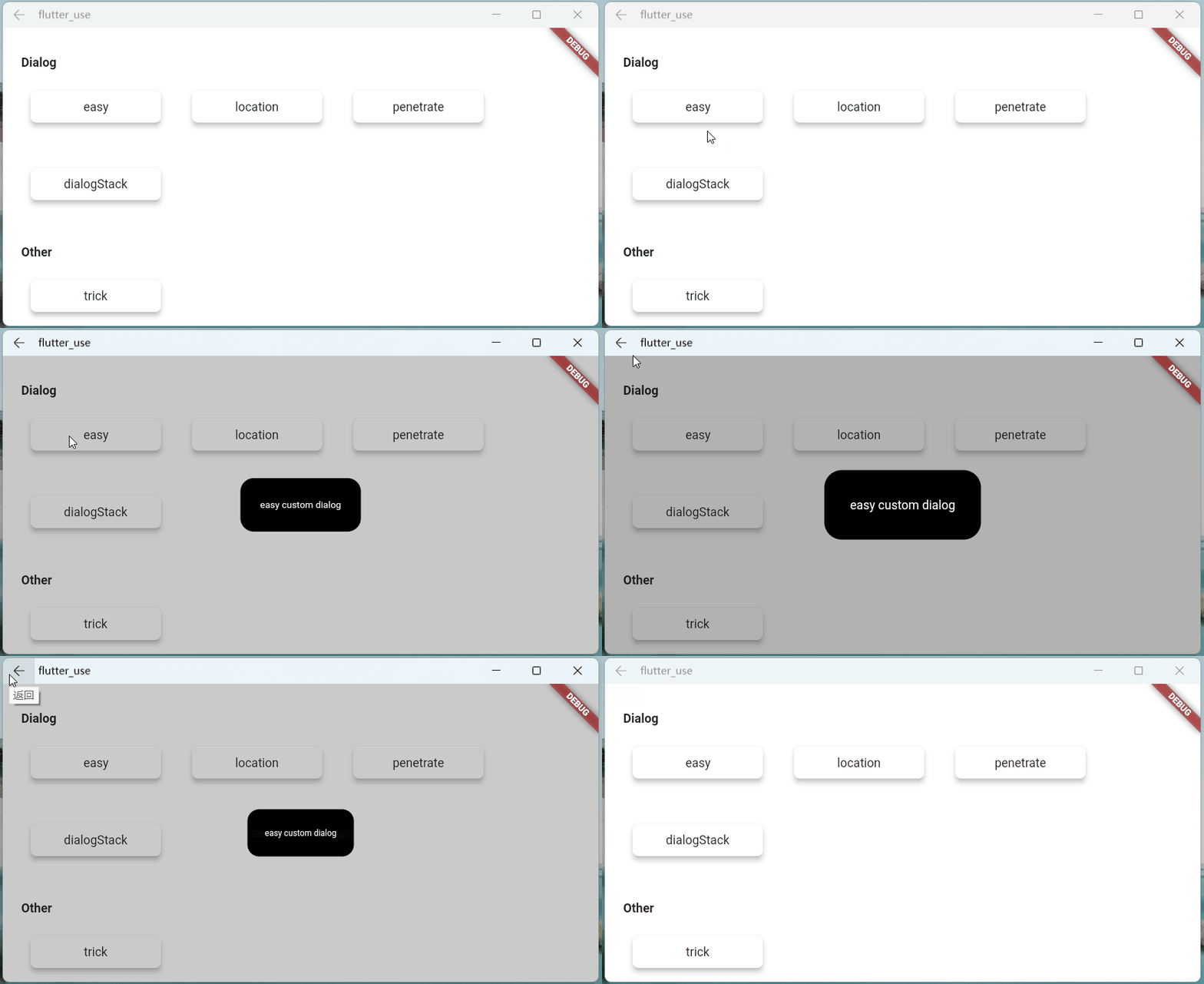
    child: Text('easy custom dialog', style: TextStyle(color: Colors.white)),
);
// here
SmartDialog.show(widget: custom, isLoadingTemp: false);
You may have questions
For details, please check: Some Consideration Details
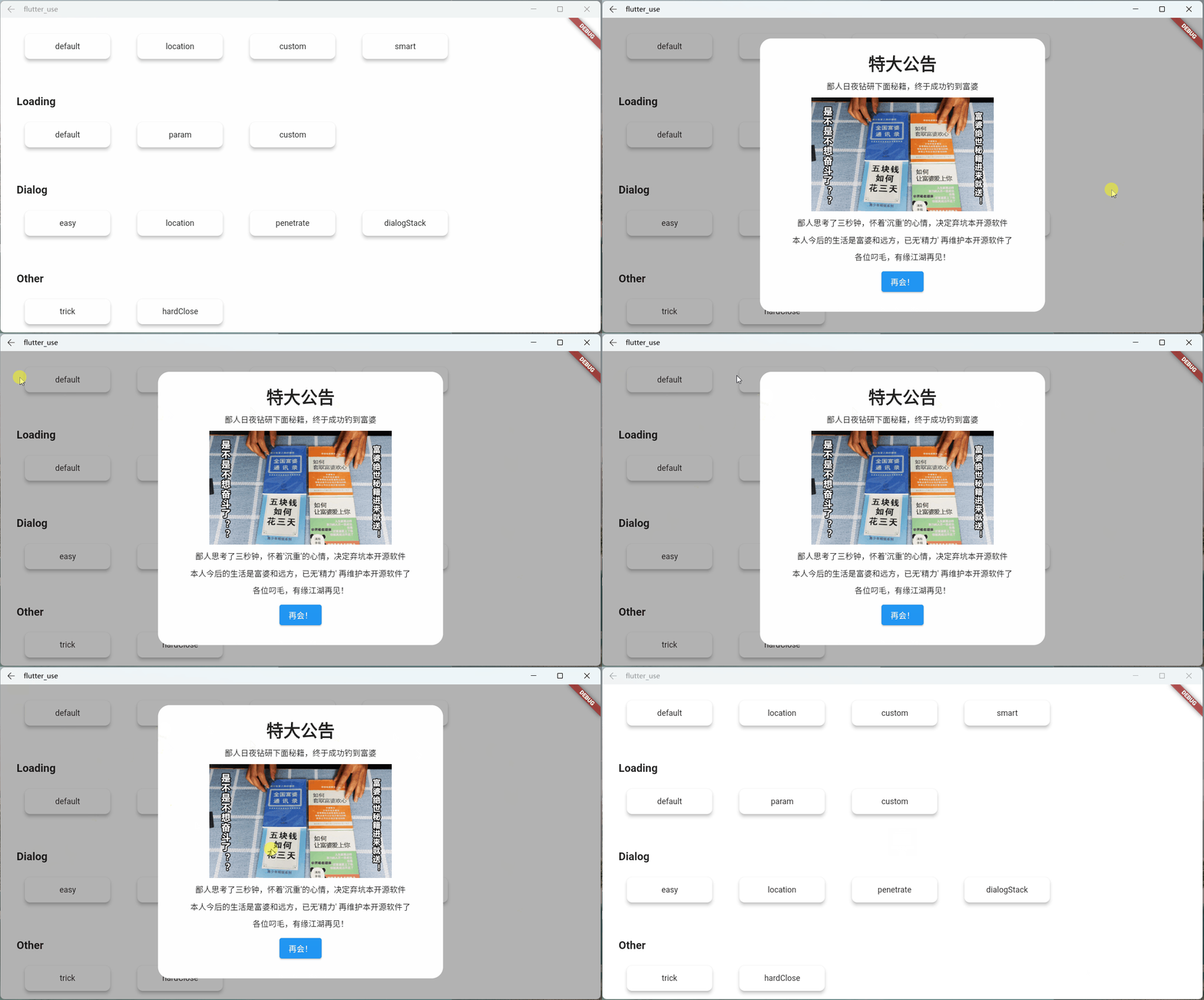
Attach Chapter
For details, please check: Attach Chapter Details
This is a very important function. I wanted to add it a long time ago, but it was busy and has been shelved; New Year's Day (2022.1.1) started, and it took some time to complete this function and related demos.
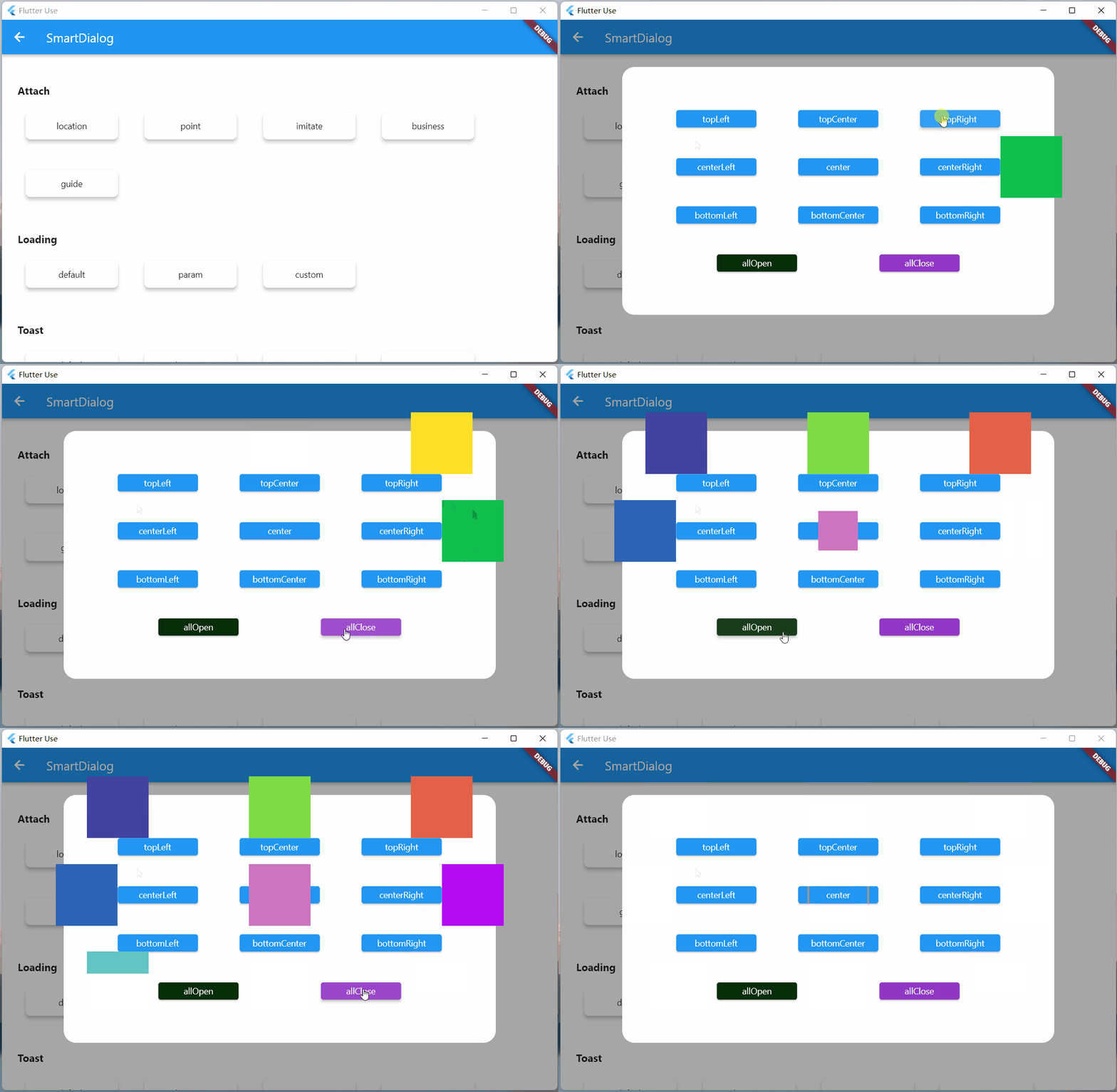
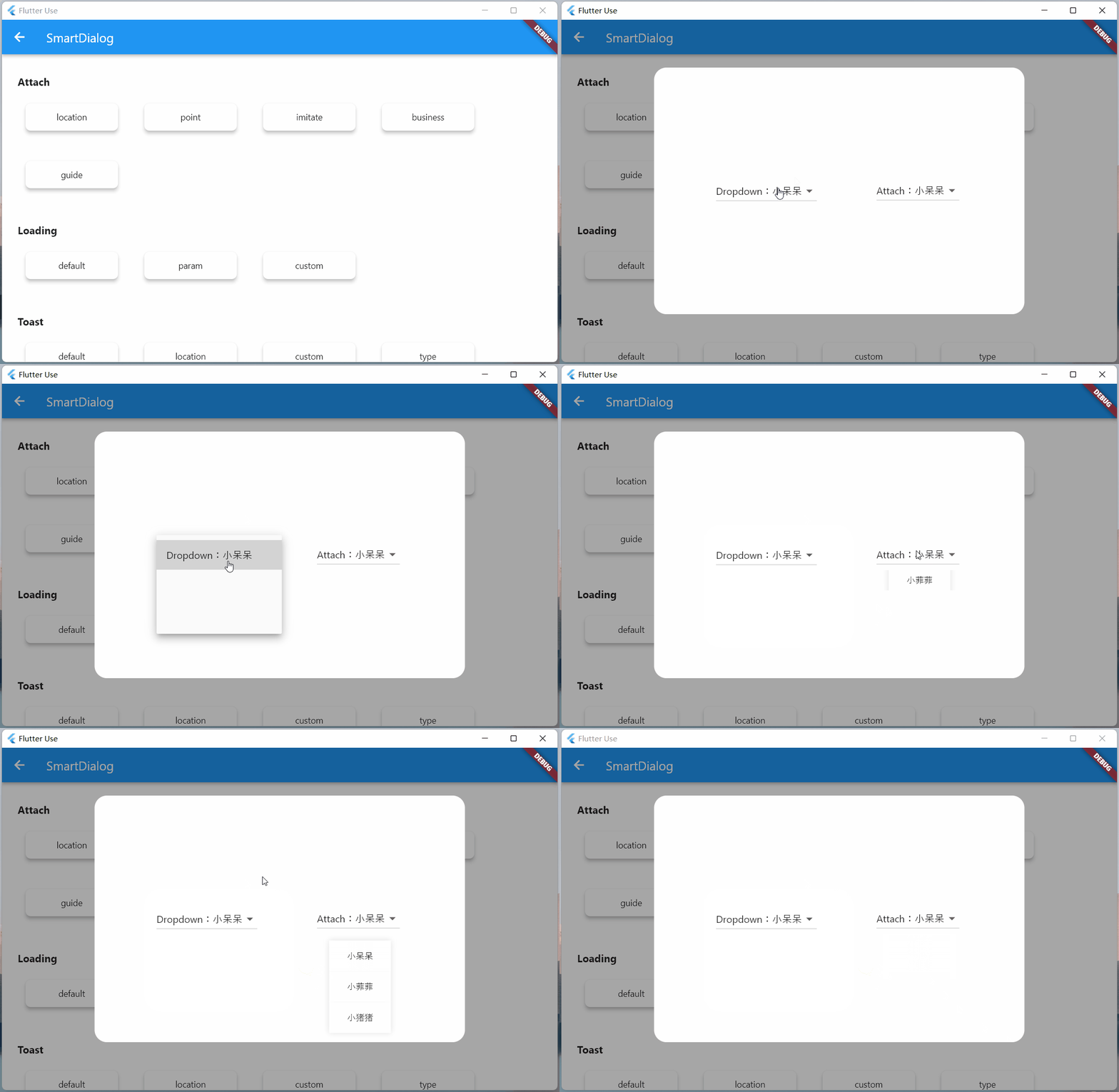

Dialog Chapter
For details, please check: Dialog Chapter Details
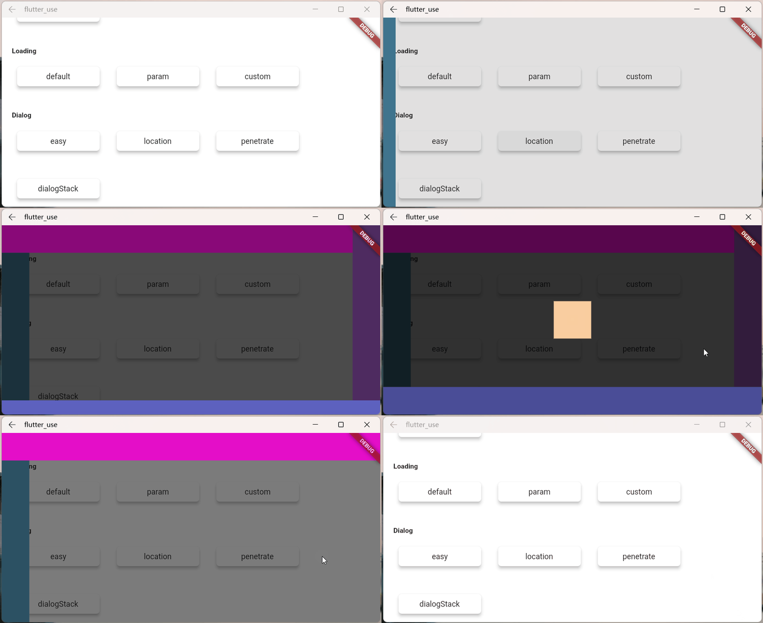

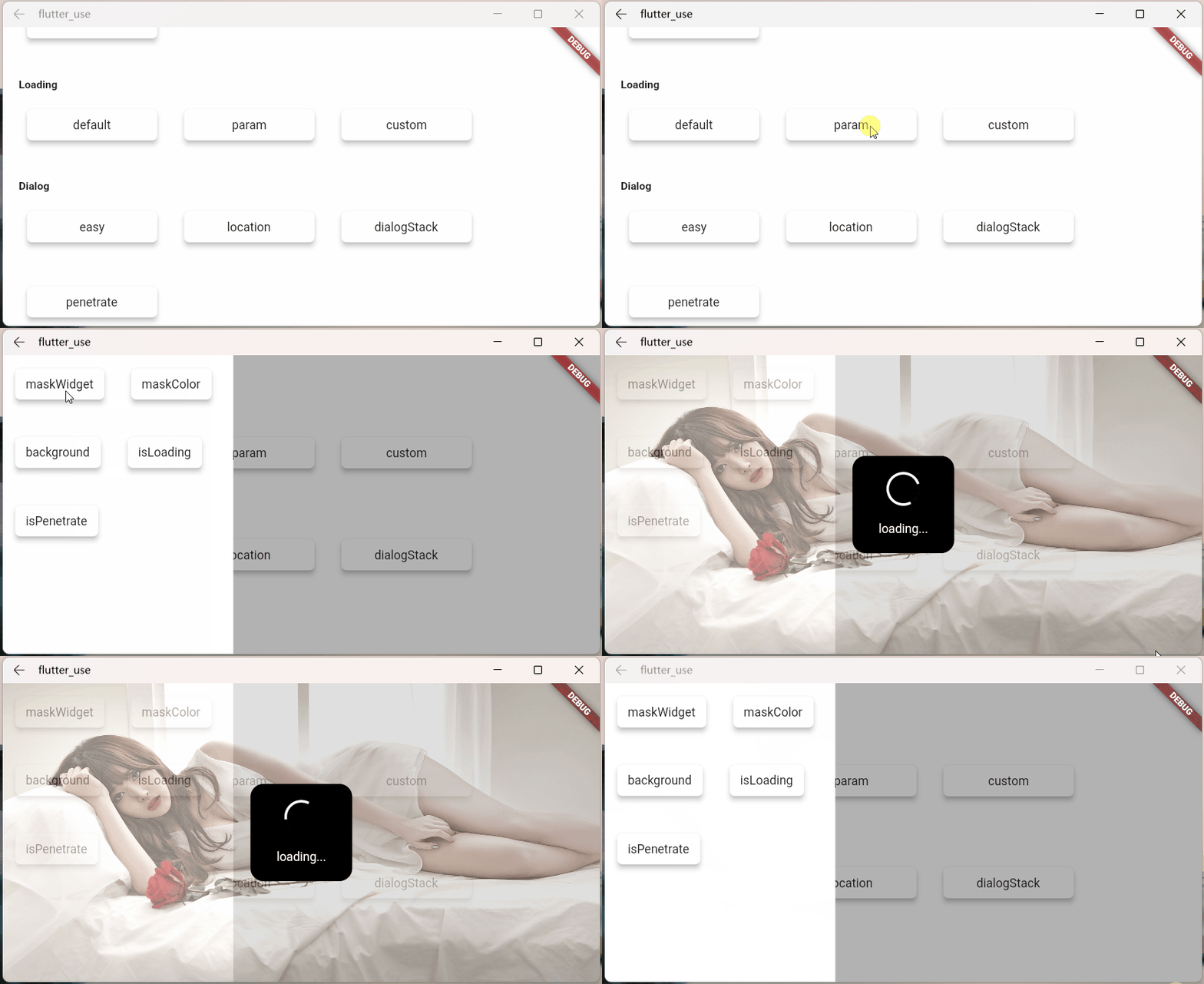
Loading Chapter
For details, please check: Loading Chapter Details
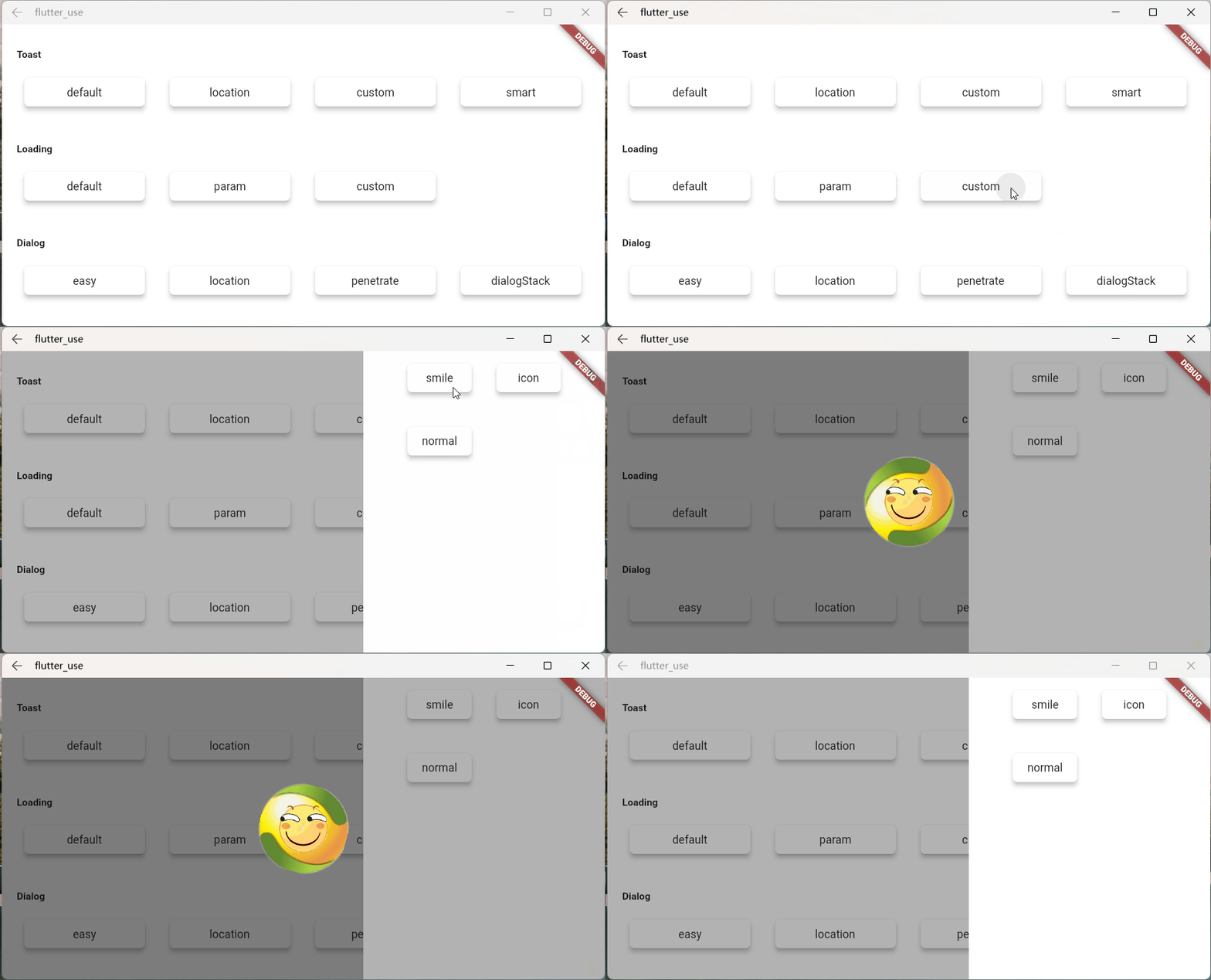
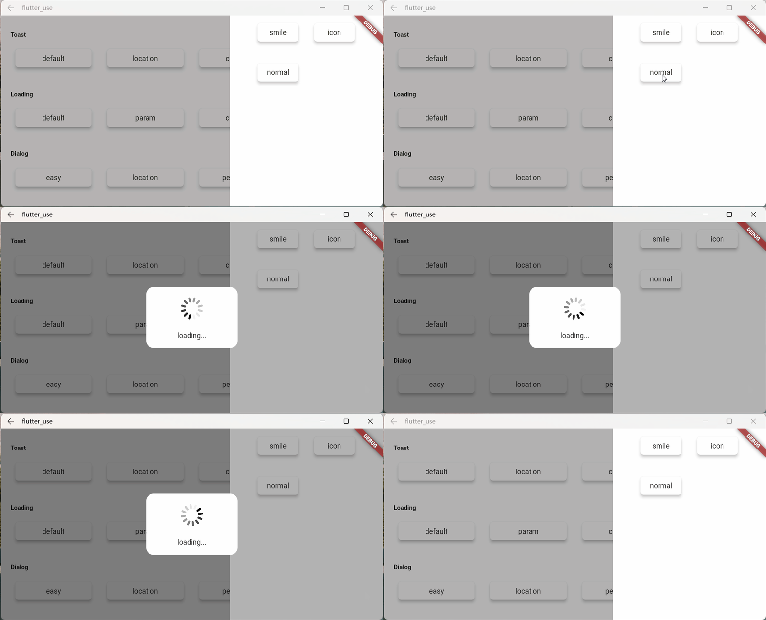
Toast Chapter
For details, please check: Toast Chapter Details
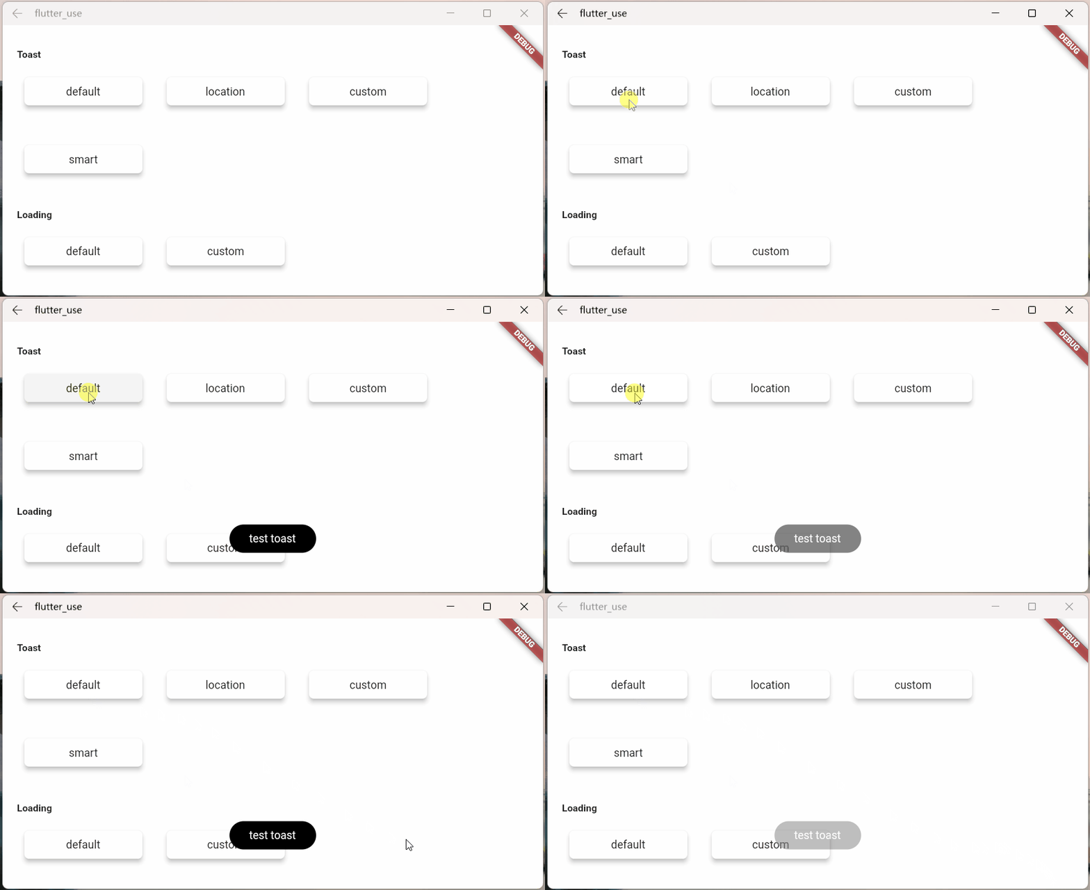
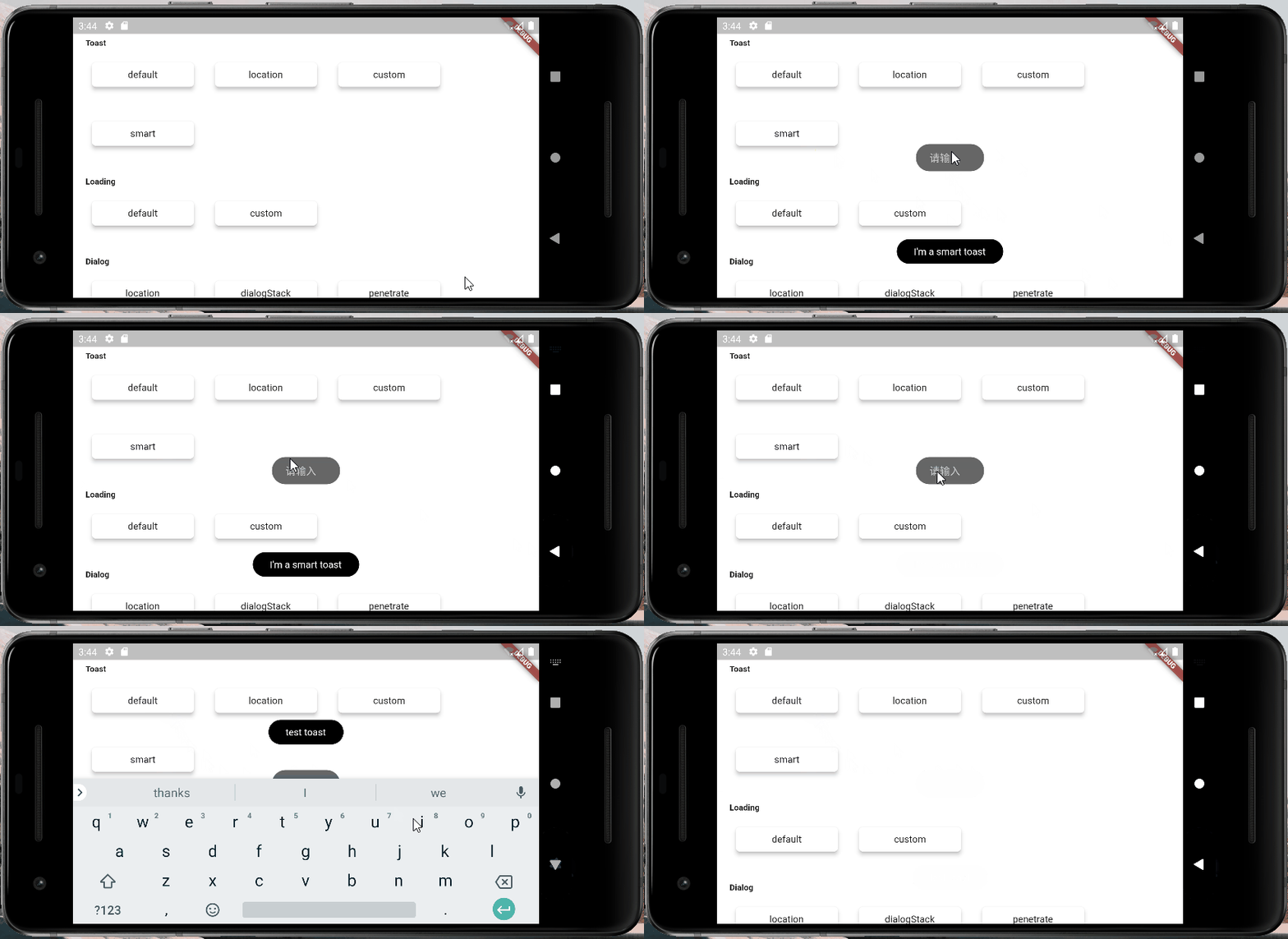

Little tricks of anger
There is a scene that compares the egg cone
- We encapsulated a small component using StatefulWidget
- In a special situation, we need to trigger a method inside this component outside the component
- There are many implementation methods for this kind of scene, but it may be a little troublesome to make it
Here is a simple idea, which can be triggered very easily, a method inside the component
- Create a widget
class OtherTrick extends StatefulWidget {
  const OtherTrick({Key? key, this.onUpdate}): super(key: key);

  final Function(VoidCallback onInvoke)? onUpdate;

  @override
  _OtherTrickState createState() => _OtherTrickState();
}

class _OtherTrickState extends State<OtherTrick> {
  int _count = 0;

  @override
  void initState() {
    // here
    widget.onUpdate?.call(() {
      _count++;
      setState(() {});
    });

    super.initState();
  }

  @override
  Widget build(BuildContext context) {
    return Center(
      child: Container(
        padding: EdgeInsets.symmetric(horizontal: 50, vertical: 20),
        decoration: BoxDecoration(
          color: Colors.white,
          borderRadius: BorderRadius.circular(10),
        ),
        child: Text('Counter: $_count', style: TextStyle(fontSize: 30.0)),
      ),
    );
  }
}
- Show this component and then trigger it externally
VoidCallback? callback;

// display
SmartDialog.show(
  alignmentTemp: Alignment.center,
  widget: OtherTrick(
    onUpdate: (VoidCallback onInvoke) => callback = onInvoke,
  ),
);

await Future.delayed(Duration(milliseconds: 500));

// handler
SmartDialog.show(
  alignmentTemp: Alignment.centerRight,
  maskColorTemp: Colors.transparent,
  widget: Container(
    height: double.infinity,
    width: 150,
    color: Colors.white,
    alignment: Alignment.center,
    child: ElevatedButton(
      child: Text('add'),
      onPressed: () => callback?.call(),
    ),
  ),
);
- Let's see the effect


