Flutter Sliding Toast

Enhance your app's UI with customizable, interactive toasts! This package offers both sliding & popup styles, with features like animation control, tap actions, and multiple dismiss options.
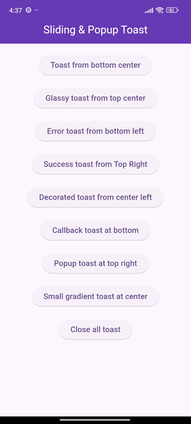
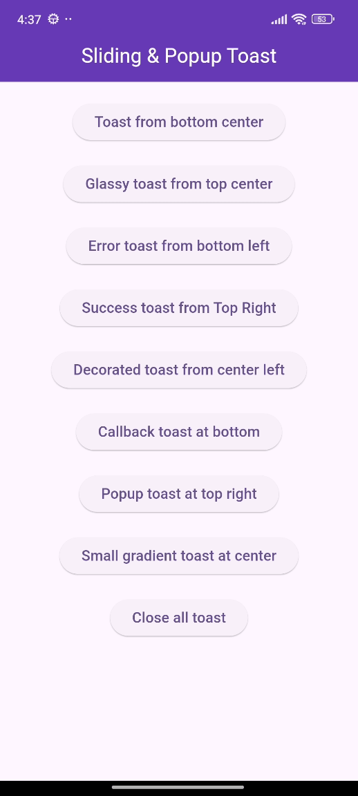
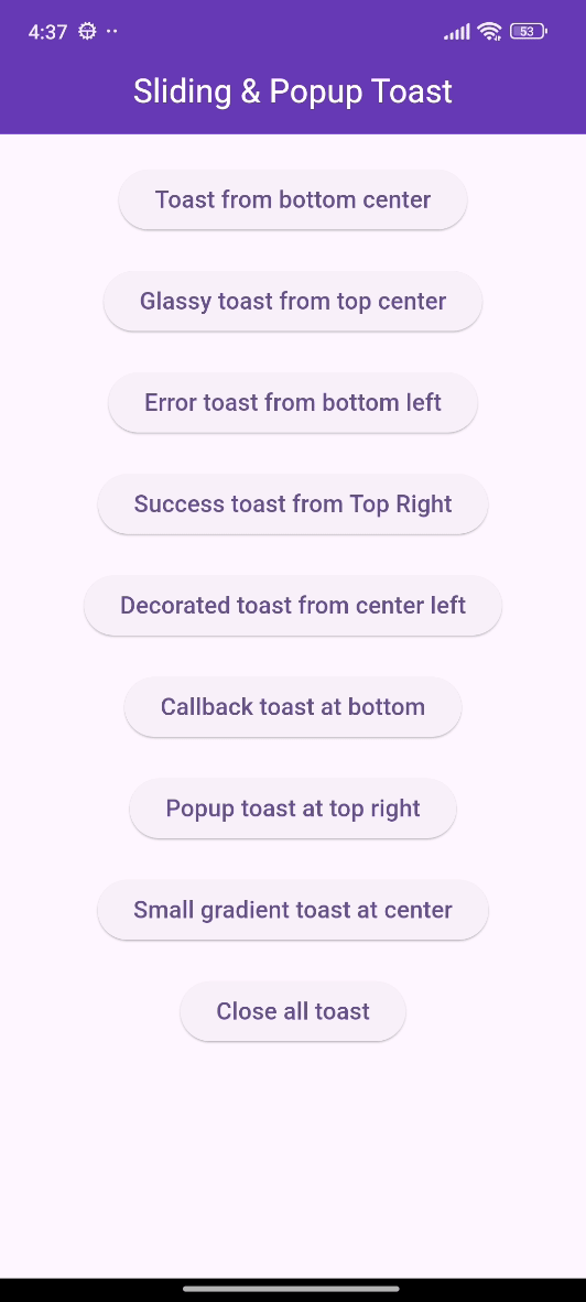
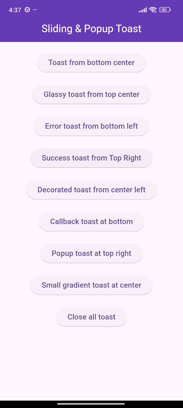
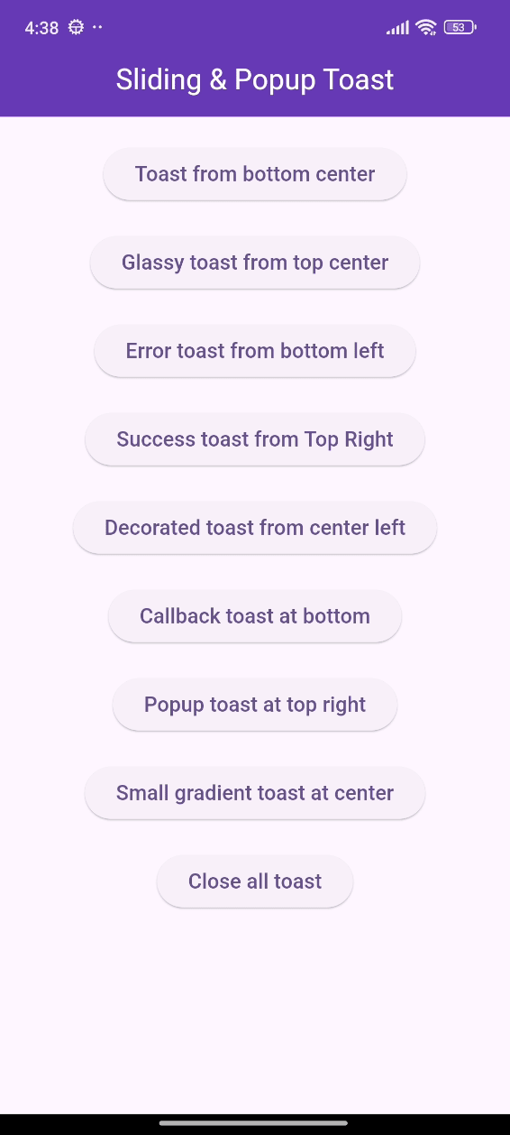
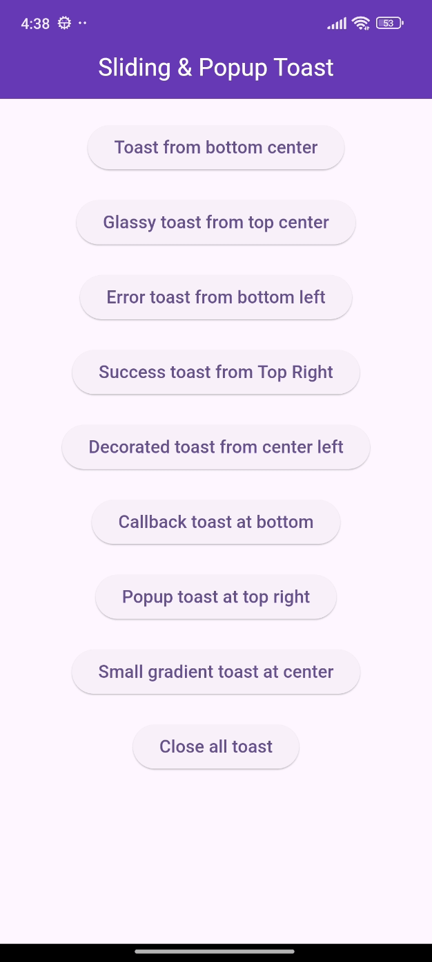
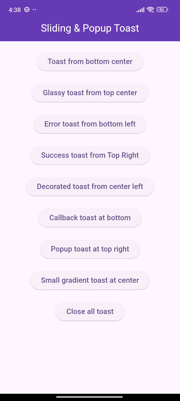
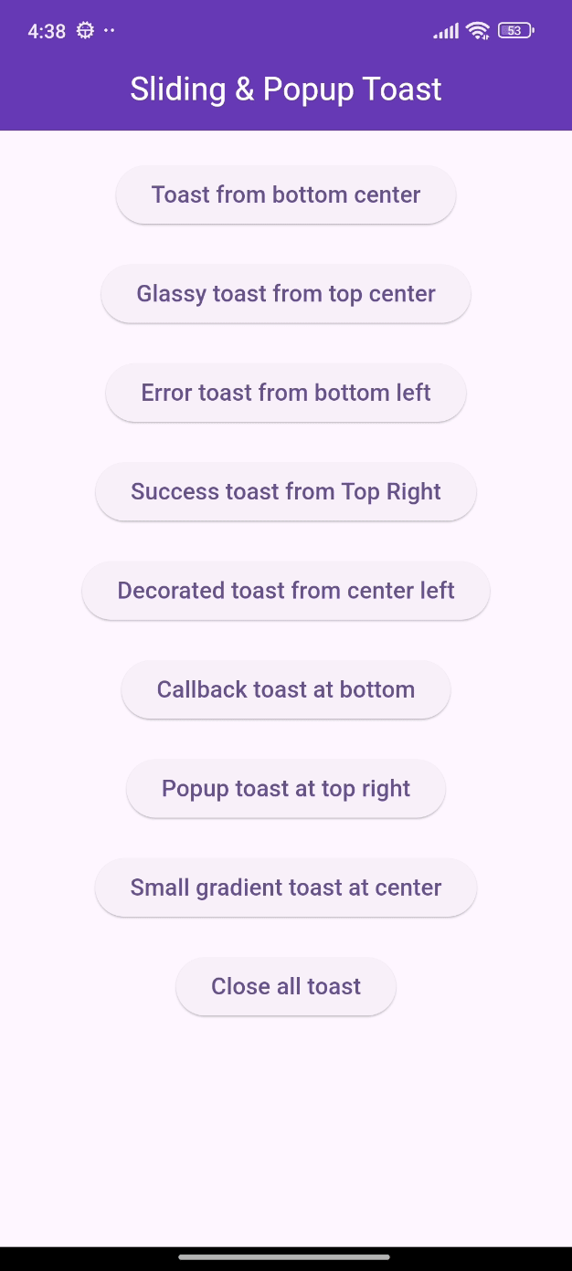
🎨 Screenshots

🎯 Features
- Show sliding toasts, modify sliding behaviors
- Show popup toasts, disable or modify fading and scaling behaviors
- Change toast's alignment positions and sliding toast's sliding directions
- Define animation and display duration, max height and width, padding
- Set title, leading, trailing widgets and make title width dynamic or expanded
- Disable the progressbar in sliding toast if needed
- Use glassmorphism/gradient/decorated background or default success and error toast
- Slide any direction to dismiss sliding toast and vertically for popup toast
- Dismiss an individual or all toasts programmatically
- Pause the animation with long press and release it to continue
- Execute a function after the toast is tapped or disposed
- Disable Multiple tapping to execute 'onTap' callback only one time
- Initialize context or overlay state early for persistent toast availability
⚙️ Getting Started
Add the following line to pubspec.yaml:
dependencies:
  flutter_sliding_toast: ^1.5.3
🚀 Usage
class MyHomePage extends StatelessWidget {
  const MyHomePage({super.key});

  @override
  Widget build(BuildContext context) {
    return Scaffold(
      appBar: AppBar(
        iconTheme: const IconThemeData(color: Colors.white),
        title: const Text('Sliding & Popup Toast'),
        centerTitle: true,
      ),
      body: SafeArea(
        child: Column(
          mainAxisAlignment: MainAxisAlignment.center,
          children: [
            const SizedBox(width: double.maxFinite),
            ElevatedButton(
              onPressed: () {
                InteractiveToast.slide(
                  context: context,
                  leading: _leadingWidget(),
                  title: const Text(
                    "Hi there! I'm a sliding toast 😎. "
                    'Dismiss me by sliding upward.',
                  ),
                  trailing: _trailingWidget(),
                  toastStyle: const ToastStyle(titleLeadingGap: 10),
                  toastSetting: const SlidingToastSetting(
                    displayDuration: Duration(seconds: 2),
                    toastStartPosition: ToastPosition.top,
                    toastAlignment: Alignment.topCenter,
                  ),
                );
              },
              child: _textWidget('Sliding toast from top center'),
            ),
            const SizedBox(height: 30),
            ElevatedButton(
              onPressed: () {
                final overlayState = Overlay.of(context);
                InteractiveToast.pop(
                  overlayState: overlayState,
                  title: const Text(
                    "Hi! I'm a popup toast 🐺. "
                    'I have fading and scaling effect.',
                  ),
                  trailing: _trailingWidget(),
                  toastSetting: const PopupToastSetting(
                    animationDuration: Duration(seconds: 1),
                    displayDuration: Duration(seconds: 3),
                  ),
                );
              },
              child: _textWidget('Popup toast at bottom center'),
            ),
          ],
        ),
      ),
    );
  }

  Text _textWidget(String text) =>
      Text(text, style: const TextStyle(fontSize: 16));

  Icon _trailingWidget() => const Icon(Icons.person, color: Colors.deepPurple);

  Container _leadingWidget() {
    return Container(
      width: 40,
      height: 40,
      decoration: BoxDecoration(
        shape: BoxShape.circle,
        color: Colors.purple,
        boxShadow: [
          BoxShadow(
            color: Colors.black.withAlpha(25),
            spreadRadius: 3,
            blurRadius: 4,
          ),
        ],
      ),
      alignment: Alignment.center,
      child: const Text('🦄', style: TextStyle(fontSize: 20)),
    );
  }
}
❤️ Additional information
Pull requests are welcomed!
If you encounter any problems or you have any ideas, feel free to open an issue: