Flutter Scalify 🚀

The Intelligent Scaling Engine for Flutter.
A complete, high-performance responsive system — not just a sizing tool. Scale your entire UI across Mobile, Web, and Desktop with simple extensions, smart container queries, and zero overhead.
📑 Table of Contents
| Section | Description |
|---|---|
| ⚡️ Why Scalify? | Full feature checklist |
| 📦 Installation | Setup guide |
| 🚀 Quick Start | First integration |
| ⚙️ ScalifyConfig | Foundation — design dimensions, breakpoints, performance |
| 📚 API Cheat Sheet | All extensions at a glance |
| 💻 Complete Example | Full working code |
| 📏 Best Practices | Which extension for which element |
| 🎨 Theme Auto-Scaling | One-line theme scaling |
| 📱 Screen Breakpoints | 6-tier breakpoint reference |
| — Widgets — | |
| 🚀 Core Layout Widgets | Grid, Flex, Layout, Visibility, Builder |
| 📦 Container Queries | ContainerQuery, AdaptiveContainer |
| 🧱 ScalifyBox | Local container scaling |
| 🧩 ScalifySection | Split-screen scaling |
| 🛡️ AppWidthLimiter | Ultra-wide protection |
| 🔤 ResponsiveText | Auto-resize text |
| 📏 ResponsiveSpacing | Design token spacing |
| 🔍 ScalifyDebugOverlay | Debug metrics panel |
| 🌐 ResponsiveNavigation | Bottom/Rail/Sidebar |
| 🔄 ResponsiveWrap | Auto line-wrapping |
| 🖼️ ResponsiveImage | Per-screen images |
| 🎭 AnimatedResponsiveTransition | Smooth layout switching |
| 📊 ResponsiveTable | DataTable ↔ Cards |
| 🧮 ResponsiveConstraints | Per-screen BoxConstraints |
| 🏗️ ScalifySliver | SliverAppBar/Header/Persistent |
| — Reference — | |
| 🔄 Live Resizing | Desktop/Web resize handling |
| 🧠 Engine Internals | Performance deep-dive |
| 📋 Migration Guide | v2.x → v3.0.0 |
| 🧪 Testing | 312 tests |
⚡️ Why Scalify?
| Feature | Scalify |
|---|---|
| O(1) Inline Math (vm:prefer-inline) | ✅ |
| Container Queries (Rebuild by parent size) | ✅ |
| 4K/Ultra-Wide Smart Dampening | ✅ |
| Responsive Grid System (6-Tier) | ✅ |
| Builder Pattern (Above MaterialApp) | ✅ |
| InheritedModel (Granular Rebuild) | ✅ |
| Debounce on Resize (Desktop/Web) | ✅ |
| Section Scaling (ScalifySection) | ✅ |
| Local Scaler (ScalifyBox) | ✅ |
| 6 Screen Types (Watch → Large Desktop) | ✅ |
| Theme Auto-Scaling (One line) | ✅ |
| Percentage Scaling (.pw .hp) | ✅ |
| Responsive Text (Auto-resize + ShortText) | ✅ |
| Design Token Spacing (xs → xxl) | ✅ |
| Debug Overlay (Draggable, Live Metrics) | ✅ |
| Adaptive Navigation (Bottom/Rail/Sidebar) | ✅ |
| Responsive Wrap (Auto line-wrapping) | ✅ |
| Responsive Image (Per-screen sources) | ✅ |
| Animated Transitions (Smooth layout switch) | ✅ |
| Responsive Table (DataTable ↔ Cards) | ✅ |
| Responsive Constraints (Per-screen BoxConstraints) | ✅ |
| Sliver Widgets (AppBar/Header/Persistent) | ✅ |
Simple .w .h .sp Extensions |
✅ |
| Zero External Dependencies | ✅ |
| 312 Tests Passing | ✅ |
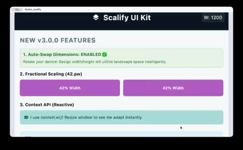
🖼️ Responsive Preview

📦 Installation
dependencies:
  flutter_scalify: ^3.1.0
flutter pub get
🚀 Quick Start
✅ Recommended: Builder Pattern (ScalifyProvider wraps MaterialApp)
This is the best practice for maximum performance. Placing ScalifyProvider above MaterialApp prevents cascading rebuilds when screen size changes.
import 'package:flutter/material.dart';
import 'package:flutter_scalify/flutter_scalify.dart';

void main() => runApp(const MyApp());

class MyApp extends StatelessWidget {
  const MyApp({super.key});

  @override
  Widget build(BuildContext context) {
    return ScalifyProvider(
      config: const ScalifyConfig(
        designWidth: 375,    // Your Figma/XD design width
        designHeight: 812,   // Your Figma/XD design height
      ),
      builder: (context, child) => MaterialApp(
        theme: ThemeData.light().scale(context), // 🎨 Auto-scale theme
        home: child,
      ),
      child: const HomeScreen(),
    );
  }
}
Alternative: Child Pattern (ScalifyProvider inside MaterialApp)
MaterialApp(
  builder: (context, child) {
    return ScalifyProvider(
      config: const ScalifyConfig(designWidth: 375, designHeight: 812),
      child: child ?? const SizedBox(),
    );
  },
  home: const HomeScreen(),
);
💡 Tip: The builder pattern is recommended because it puts
ScalifyProvideraboveMaterialApp, so changing window size doesn't rebuildMaterialAppitself.
⚙️ ScalifyConfig — Full Reference
This is the foundation of Scalify. Every developer should understand
ScalifyConfigfirst — it controls design dimensions, breakpoints, font clamping, scaling bounds, 4K protection, and performance tuning. All other features depend on these settings.
ScalifyConfig(
  // ─── 📐 Design Baseline ──────────────────────────────────────────
  // These values should match your UI design file (e.g., Figma, XD).
  // Scalify calculates scale factors by comparing actual screen size
  // to these reference dimensions.
  designWidth: 375.0,             // Your design's reference width in pixels
  designHeight: 812.0,            // Your design's reference height in pixels

  // ─── 📱 Breakpoints ──────────────────────────────────────────────
  // Define exact pixel boundaries for each screen type.
  // These control when ResponsiveGrid, ResponsiveVisibility,
  // ResponsiveNavigation, etc. switch their layout.
  watchBreakpoint: 300.0,         // < 300px = Watch
  mobileBreakpoint: 600.0,        // 300–600px = Mobile
  tabletBreakpoint: 900.0,        // 600–900px = Tablet
  smallDesktopBreakpoint: 1200.0, // 900–1200px = Small Desktop
  desktopBreakpoint: 1800.0,      // 1200–1800px = Desktop
  //                               // > 1800px = Large Desktop

  // ─── 🔡 Font Control ─────────────────────────────────────────────
  // These ensure font sizes remain readable on all devices.
  // .fz extension uses these bounds for clamping.
  minFontSize: 6.0,               // Minimum allowed font size (floor)
  maxFontSize: 256.0,             // Maximum allowed font size (ceiling)
  respectTextScaleFactor: true,   // Respect system accessibility text scaling

  // ─── 📏 Scale Bounds ──────────────────────────────────────────────
  // Prevent extreme scaling that would distort the UI.
  // E.g., on a 4K monitor, the scale might be 5.0x — maxScale caps it.
  minScale: 0.5,                  // UI never scales below 50%
  maxScale: 4.0,                  // UI never scales above 400%

  // ─── 🛡️ 4K / Ultra-Wide Protection ───────────────────────────────
  // On very wide screens (e.g., 3840px), raw scaling would make text
  // enormous. Smart Dampening kicks in above the threshold width.
  memoryProtectionThreshold: 1920.0,  // Width where dampening starts
  highResScaleFactor: 0.65,           // Dampening strength (0.0–1.0)
  //   0.0 = full dampening (scale stops growing)
  //   1.0 = no dampening (linear scaling continues)
  //   0.65 = balanced (recommended)

  // ─── ⚡ Performance Tuning ────────────────────────────────────────
  // These prevent excessive widget rebuilds during window resizing
  // (Desktop/Web). Most apps can use defaults.
  debounceWindowMillis: 120,          // Wait 120ms after last resize event
  rebuildScaleThreshold: 0.01,        // Ignore scale changes < 1%
  rebuildWidthPxThreshold: 4.0,       // Ignore width changes < 4px
  enableGranularNotifications: false, // Enable InheritedModel aspect filtering

  // ─── 🔄 Orientation ──────────────────────────────────────────────
  // If true, swaps designWidth/designHeight in landscape orientation.
  // Useful for apps that have separate landscape designs.
  autoSwapDimensions: false,

  // ─── 🔧 Minimum Window Width ──────────────────────────────────────
  // If > 0, enables horizontal scrolling when the window is narrower
  // than this value. Prevents content from being crushed on tiny windows.
  minWidth: 0.0,

  // ─── 🏷️ Legacy Compatibility ─────────────────────────────────────
  // Only needed when migrating from v1.x with ContainerQuery tier system.
  legacyContainerTierMapping: false,
  showDeprecationBanner: true,        // Shows debug banner when legacy = true
)
📐 What Each Setting Affects
| Setting | What it controls | Default |
|---|---|---|
designWidth / designHeight |
Base reference for .w, .h, .s, .fz etc. |
375 / 812 |
watchBreakpoint → desktopBreakpoint |
ScreenType classification for all responsive widgets |
See above |
minFontSize / maxFontSize |
.fz clamping range |
6 / 256 |
minScale / maxScale |
Scale factor bounds for all extensions | 0.5 / 4.0 |
memoryProtectionThreshold |
4K dampening activation width | 1920 |
highResScaleFactor |
Dampening strength on ultra-wide | 0.65 |
debounceWindowMillis |
Resize debounce for Desktop/Web | 120 |
rebuildScaleThreshold |
Minimum scale change to trigger rebuild | 0.01 |
rebuildWidthPxThreshold |
Minimum px change to trigger rebuild | 4.0 |
💡 Most apps only need to set
designWidthanddesignHeight. All other values have smart defaults.
📚 API Cheat Sheet
1. Size & Font
| Extension | Example | Description |
|---|---|---|
.w |
100.w |
Width — Scales based on screen width ratio |
.h |
50.h |
Height — Scales based on screen height ratio |
.s |
20.s |
Size — General scaling (min of width/height) |
.fz |
16.fz |
Font Size — Scaled + clamped + accessibility |
.iz |
24.iz |
Icon Size — Proportional icon scaling |
.r |
12.r |
Radius — Based on min(scaleWidth, scaleHeight) |
.si |
10.si |
Scaled Int — Rounded integer for native APIs |
.sc |
16.sc |
Scale — Alias for .s |
.ui |
16.ui |
UI — Alias for .s |
2. Percentage Scaling
| Extension | Example | Description |
|---|---|---|
.pw |
50.pw |
50% of screen width |
.hp |
25.hp |
25% of screen height |
3. Spacing (SizedBox)
| Extension | Example | Output |
|---|---|---|
.sbh |
20.sbh |
SizedBox(height: 20.h) |
.sbw |
10.sbw |
SizedBox(width: 10.w) |
.sbhw() |
20.sbhw(width: 10) |
SizedBox(height: 20.h, width: 10.w) |
.sbwh() |
10.sbwh(height: 20) |
SizedBox(width: 10.w, height: 20.h) |
4. Padding (EdgeInsets)
| Extension | Example | Output |
|---|---|---|
.p |
16.p |
EdgeInsets.all(16.s) |
.ph |
16.ph |
EdgeInsets.symmetric(horizontal: 16.w) |
.pv |
16.pv |
EdgeInsets.symmetric(vertical: 16.h) |
.pt |
16.pt |
EdgeInsets.only(top: 16.h) |
.pb |
16.pb |
EdgeInsets.only(bottom: 16.h) |
.pl |
16.pl |
EdgeInsets.only(left: 16.w) |
.pr |
16.pr |
EdgeInsets.only(right: 16.w) |
List Shorthand:
[20, 10].p      // EdgeInsets.symmetric(horizontal: 20.w, vertical: 10.h)
[10, 5, 10, 5].p // EdgeInsets.fromLTRB(10.w, 5.h, 10.w, 5.h)
5. Border Radius
| Extension | Example | Output |
|---|---|---|
.br |
12.br |
BorderRadius.circular(12.r) |
.brt |
12.brt |
Top corners only |
.brb |
12.brb |
Bottom corners only |
.brl |
12.brl |
Left corners only |
.brr |
12.brr |
Right corners only |
6. Context API (for const widgets)
When widgets are inside a const tree and can't use global extensions, use context:
context.w(100)    // Width scaling
context.h(50)     // Height scaling
context.r(12)     // Radius (min of scaleWidth/scaleHeight)
context.sp(16)    // Scale factor
context.fz(18)    // Font size (clamped + accessibility)
context.iz(24)    // Icon size
context.s(10)     // General scale
context.pw(50)    // 50% of screen width
context.hp(25)    // 25% of screen height
💻 Complete Example
Container(
  padding: [20, 10].p,           // Symmetric padding
  width: 300.w,                   // Responsive width
  height: 200.h,                  // Responsive height
  decoration: BoxDecoration(
    color: Colors.white,
    borderRadius: 20.brt,         // Top border radius
    boxShadow: [
      BoxShadow(
        color: Colors.black12,
        offset: Offset(0, 4.s),   // Scaled offset
        blurRadius: 10.s,
      )
    ],
  ),
  child: Column(
    children: [
      Icon(Icons.star, size: 32.iz),                                  // Scaled icon
      16.sbh,                                                          // Spacing
      Text("Scalify", style: TextStyle(fontSize: 24.fz)),             // Scaled font
      8.sbh,
      Row(
        mainAxisAlignment: MainAxisAlignment.center,
        children: [
          Text("Start", style: TextStyle(fontSize: 14.fz)),
          8.sbw,                                                       // Width spacing
          Icon(Icons.arrow_forward, size: 16.iz),
        ],
      )
    ],
  ),
)
📏 Best Practices — Consistent UI
Use the right extension for each element to maintain a consistent UI across all screen sizes:
| Element | Use | Why |
|---|---|---|
| Text / Fonts | .fz |
Scaled + clamped + accessibility |
| Icons | .iz / .s |
Proportional to screen |
| Button height | .s |
❌ Never .h — distorts on wide screens |
| Input field height | .s |
❌ Never .h — text overflows |
| Container width | .w |
Follows screen width |
| Container height | .s |
Stays proportional |
| Horizontal padding | .w |
Follows width |
| Vertical spacing | .h |
Adapts to screen height |
| General spacing | .s |
Balanced proportional |
| Border radius | .r / .br |
Uses min(scaleW, scaleH) |
⚠️ Common Mistake: Using
.hfor button/input heights causes them to shrink on wide screens (where height < width), making text overflow.✅ Fix: Use
.s— it usesmin(scaleWidth, scaleHeight)which stays balanced.
// ❌ Wrong — height shrinks on wide screens
SizedBox(height: 48.h, child: ElevatedButton(...))

// ✅ Correct — stays proportional everywhere
SizedBox(height: 48.s, child: ElevatedButton(...))
🎨 Theme Auto-Scaling
Scale your entire app theme with one line — no need to add .fz to every text widget.
ScalifyProvider(
  builder: (context, child) => MaterialApp(
    theme: ThemeData.light().scale(context),  // ✨ One line!
    home: child,
  ),
  child: const HomeScreen(),
)
💡 Automatically skips scaling when
scaleFactor == 1.0for zero overhead.
📱 Screen Breakpoints
┌──────────────┬─────────────────┬──────────────────────────┐
│  Screen Type │   Width Range   │        Enum Value        │
├──────────────┼─────────────────┼──────────────────────────┤
│  Watch       │     < 300px     │  ScreenType.watch        │
│  Mobile      │  300px - 600px  │  ScreenType.mobile       │
│  Tablet      │  600px - 900px  │  ScreenType.tablet       │
│  Small DT    │  900px - 1200px │  ScreenType.smallDesktop │
│  Desktop     │ 1200px - 1800px │  ScreenType.desktop      │
│  Large DT    │    > 1800px     │  ScreenType.largeDesktop │
└──────────────┴─────────────────┴──────────────────────────┘
🚀 Responsive Widgets
ResponsiveGrid — The Ultimate Grid
Supports Manual Columns (per screen type) and Auto-Fit (dynamic data).
Manual Mode:
ResponsiveGrid(
  spacing: 16,
  runSpacing: 16,
  watch: 1,
  mobile: 2,
  tablet: 3,
  smallDesktop: 3,
  desktop: 4,
  largeDesktop: 5,
  children: [/* widgets */],
)
Auto-Fit Mode (API data):
ResponsiveGrid(
  minItemWidth: 150,
  itemCount: products.length,
  itemBuilder: (context, index) => ProductCard(data: products[index]),
)
Sliver Mode (infinite scroll):
CustomScrollView(
  slivers: [
    ResponsiveGrid(
      useSliver: true,
      mobile: 2,
      desktop: 4,
      itemCount: 100,
      itemBuilder: (context, i) => ItemCard(i),
    ),
  ],
)
ResponsiveFlex — Row ↔ Column
Automatically switches between Row and Column based on screen width.
ResponsiveFlex(
  switchOn: ScreenType.mobile,    // Column on mobile, Row on larger
  spacing: 20,
  flipOnRtl: true,                // RTL support
  children: [
    UserAvatar(),
    UserInfo(),
  ],
)
Custom breakpoint:
ResponsiveFlex(
  breakpoint: 600,                // Column when width < 600
  children: [Widget1(), Widget2()],
)
ResponsiveLayout — Orientation Switch
ResponsiveLayout(
  portrait: Column(children: [Image(), Bio()]),
  landscape: Row(children: [Image(), Bio()]),
)
ResponsiveVisibility — Show/Hide by Screen Type
// Whitelist: Show ONLY on mobile
ResponsiveVisibility(
  visibleOn: [ScreenType.mobile],
  child: MobileNavBar(),
)

// Blacklist: Hide on desktop
ResponsiveVisibility(
  hiddenOn: [ScreenType.desktop, ScreenType.largeDesktop],
  replacement: DesktopSidebar(),   // Optional replacement widget
  child: MobileDrawer(),
)
ResponsiveBuilder — Direct Data Access
ResponsiveBuilder(
  builder: (context, data) {
    return Text("Screen: ${data.screenType} — ${data.width.toInt()}px");
  },
)
Conditional Logic — valueByScreen
final columns = context.valueByScreen<int>(
  mobile: 2,
  tablet: 3,
  desktop: 4,
  largeDesktop: 6,
);
📦 Container Queries
ContainerQuery — Rebuild by Parent Size
Unlike MediaQuery which reads the screen size, ContainerQuery reads the parent widget's size. Perfect for reusable components.
ContainerQuery(
  breakpoints: [200, 400, 800],
  onChanged: (prev, current) => print("Tier: ${current.tier}"),
  builder: (context, query) {
    if (query.isMobile) return CompactCard();
    if (query.isTablet) return MediumCard();
    return FullCard();
  },
)
QueryTier values: xs, sm, md, lg, xl, xxl
AdaptiveContainer — Tier-Based Widgets
AdaptiveContainer(
  breakpoints: [200, 500],
  xs: Icon(Icons.home),                    // < 200px
  sm: Column(children: [Icon(), Text()]),  // 200-500px
  lg: Row(children: [Icon(), Text(), Button()]),  // > 500px
)
🧱 ScalifyBox — Local Scaling
Scale elements relative to a specific container instead of the screen. Perfect for credit cards, game UIs, and embedded components.
ScalifyBox(
  referenceWidth: 320,
  referenceHeight: 200,
  fit: ScalifyFit.contain,    // width | height | contain | cover
  builder: (context, ls) {
    return Container(
      width: ls.w(300),         // Local width scaling
      height: ls.h(180),        // Local height scaling
      padding: ls.p(20),        // Local padding
      decoration: BoxDecoration(
        borderRadius: ls.br(12), // Local border radius
      ),
      child: Column(
        children: [
          Text("VISA", style: TextStyle(fontSize: ls.fz(18))),
          ls.sbh(10),            // Local spacing
        ],
      ),
    );
  },
)
LocalScaler API:
| Method | Description |
|---|---|
ls.w(value) |
Local width scaling |
ls.h(value) |
Local height scaling |
ls.s(value) |
Local general scaling |
ls.fz(value) |
Local font size (clamped) |
ls.iz(value) |
Local icon size |
ls.si(value) |
Rounded int |
ls.p(value) |
EdgeInsets.all |
ls.ph(value) |
Horizontal padding |
ls.pv(value) |
Vertical padding |
ls.br(value) |
BorderRadius.circular |
ls.r(value) |
Radius.circular |
ls.sbh(value) |
SizedBox(height:) |
ls.sbw(value) |
SizedBox(width:) |
ls.scaleFactor |
Current scale value |
🧩 ScalifySection — Independent Section Scaling
Creates an independent scaling context for any part of your UI. Essential for split-screen / master-detail layouts where each section should scale based on its own width.
Row(
  children: [
    // Sidebar: scales based on 300px width
    SizedBox(
      width: 300,
      child: ScalifySection(child: Sidebar()),
    ),
    // Main content: scales based on remaining width
    Expanded(
      child: ScalifySection(child: MainContent()),
    ),
  ],
)
💡 Tip: Inside a
ScalifySection, use context-based extensions (context.fz(16),context.w(100)) instead of global extensions (16.fz,100.w) for accurate section-local scaling.
Full Master-Detail Example:
class MasterDetailLayout extends StatelessWidget {
  @override
  Widget build(BuildContext context) {
    final width = MediaQuery.sizeOf(context).width;

    // Mobile: bottom navigation
    if (width < 900) {
      return Scaffold(
        body: MainPages(),
        bottomNavigationBar: BottomNav(),
      );
    }

    // Desktop: sidebar + content — each scales independently
    return Row(
      children: [
        SizedBox(
          width: 300,
          child: ScalifySection(child: Sidebar()),
        ),
        Expanded(
          child: ScalifySection(child: MainPages()),
        ),
      ],
    );
  }
}
🛡️ AppWidthLimiter — Ultra-Wide Protection
Centers and constrains your app on ultra-wide monitors.
AppWidthLimiter(
  maxWidth: 1400,
  minWidth: 360,               // Enables horizontal scroll below 360px
  horizontalPadding: 16,
  backgroundColor: Color(0xFFE2E8F0),
  child: YourApp(),
)
🔤 ResponsiveText — Smart Auto-Resizing Text
A text widget that automatically shrinks font size to fit available space, and optionally shows shorter text on small screens.
Basic Usage
ResponsiveText(
  'Welcome to our Amazing Application',
  style: TextStyle(fontSize: 18.fz),
  maxLines: 2,
)
Auto-Resize (Shrink to Fit)
ResponsiveText(
  'This long heading will shrink to fit any container width',
  style: TextStyle(fontSize: 24.fz, fontWeight: FontWeight.bold),
  autoResize: true,        // Enables auto-shrinking
  minFontSize: 12,         // Never shrinks below 12px
  maxLines: 1,
)
Short Text for Small Screens
ResponsiveText(
  'Welcome to our Premium Shopping Experience',
  shortText: 'Welcome',   // Shows on mobile/watch
  style: TextStyle(fontSize: 20.fz),
)
API Reference
| Parameter | Type | Default | Description |
|---|---|---|---|
text |
String |
required | The full text to display |
shortText |
String? |
null |
Abbreviated text for small screens |
autoResize |
bool |
false |
Enable auto font-size shrinking |
minFontSize |
double |
8.0 |
Floor for auto-resize |
stepGranularity |
double |
0.5 |
Precision of resize steps |
maxLines |
int? |
null |
Maximum number of lines |
overflow |
TextOverflow |
ellipsis |
Overflow behavior |
💡 Performance: When
autoResizeisfalse, noLayoutBuilderis used — zero overhead.
📏 ResponsiveSpacing — Design Token System
A unified spacing system with predefined, scaled values — like design tokens in Figma.
Setup (Optional)
// Customize spacing values (or use defaults: 4, 8, 16, 24, 32, 48)
ScalifySpacing.init(const SpacingScale(
  xs: 4,
  sm: 8,
  md: 16,
  lg: 24,
  xl: 32,
  xxl: 48,
));
Usage
Column(
  children: [
    Text('Title', style: TextStyle(fontSize: 24.fz)),
    Spacing.sm.gap,         // SizedBox(height: 8 * scaleFactor)
    Text('Subtitle'),
    Spacing.md.gap,         // SizedBox(height: 16 * scaleFactor)
    Text('Body text'),
  ],
)

Container(
  padding: Spacing.lg.insets,    // EdgeInsets.all(24 * scaleFactor)
  margin: Spacing.sm.insetsH,   // EdgeInsets.symmetric(horizontal: 8.s)
  child: Content(),
)
Spacing API
| Extension | Output | Example |
|---|---|---|
.gap |
SizedBox(height: scaled) |
Spacing.md.gap |
.gapW |
SizedBox(width: scaled) |
Spacing.sm.gapW |
.gapAll |
SizedBox(width: s, height: s) |
Spacing.lg.gapAll |
.value |
double (raw scaled value) |
Spacing.xl.value |
.insets |
EdgeInsets.all(scaled) |
Spacing.md.insets |
.insetsH |
EdgeInsets.symmetric(horizontal:) |
Spacing.lg.insetsH |
.insetsV |
EdgeInsets.symmetric(vertical:) |
Spacing.sm.insetsV |
.insetsT |
EdgeInsets.only(top:) |
Spacing.md.insetsT |
.insetsB |
EdgeInsets.only(bottom:) |
Spacing.md.insetsB |
.insetsL |
EdgeInsets.only(left:) |
Spacing.sm.insetsL |
.insetsR |
EdgeInsets.only(right:) |
Spacing.sm.insetsR |
Default Scale Values
| Tier | Value | Use Case |
|---|---|---|
xs |
4 | Tight spacing, chip gaps |
sm |
8 | List item padding, small gaps |
md |
16 | Card padding, section gaps |
lg |
24 | Section spacing, content margins |
xl |
32 | Large section gaps |
xxl |
48 | Page-level spacing |
💡 All spacing values are automatically scaled via
GlobalResponsive.scaleFactor.
🔍 ScalifyDebugOverlay — Developer Tools
A draggable, collapsible debug panel showing live responsive metrics. Zero overhead in release builds.
Usage
ScalifyProvider(
  builder: (context, child) => MaterialApp(
    home: ScalifyDebugOverlay(
      child: child!,
    ),
  ),
  child: const HomeScreen(),
)
What It Shows
┌─────────────────────────────────┐
│ 📱 MOBILE                       │
│ 📐 Size     375 × 812           │
│ ⚖️  Scale    1.000               │
│ ↔️  ScaleW   1.000               │
│ ↕️  ScaleH   1.000               │
│ 🔤 TextSF   1.00                │
│ 🔄 Rebuilds 3                   │
└─────────────────────────────────┘
Features
- 🎨 Color-coded screen type indicator
- 🖱️ Draggable — move anywhere on screen
- 📐 Collapsible — tap header to toggle
- 🛡️ Zero production cost — uses
kDebugModeguard - 🎯 RepaintBoundary — isolated repaints
API
| Parameter | Type | Default | Description |
|---|---|---|---|
enabled |
bool |
true |
Enable/disable (still debug-only) |
initialTop |
double |
50.0 |
Initial Y position |
initialRight |
double |
16.0 |
Initial X position |
🌐 ResponsiveNavigation — Adaptive Navigation
Automatically switches between BottomNavigationBar, NavigationRail, and a sidebar drawer based on screen size.
Usage
class MyApp extends StatefulWidget {
  @override
  State<MyApp> createState() => _MyAppState();
}

class _MyAppState extends State<MyApp> {
  int _selectedIndex = 0;

  final _pages = [
    const HomePage(),
    const SearchPage(),
    const ProfilePage(),
  ];

  @override
  Widget build(BuildContext context) {
    return ResponsiveNavigation(
      destinations: const [
        NavDestination(icon: Icons.home, label: 'Home'),
        NavDestination(icon: Icons.search, label: 'Search'),
        NavDestination(
          icon: Icons.person,
          label: 'Profile',
          badge: 3,  // Badge support!
        ),
      ],
      selectedIndex: _selectedIndex,
      onChanged: (i) => setState(() => _selectedIndex = i),
      body: _pages[_selectedIndex],
    );
  }
}
Navigation Modes
┌───────────┬───────────────────┬─────────────────────┐
│  Screen   │   Navigation      │    Breakpoint        │
├───────────┼───────────────────┼─────────────────────┤
│  Mobile   │  BottomNavBar     │  ≤ railBreakpoint    │
│  Tablet   │  NavigationRail   │  ≤ sidebarBreakpoint │
│  Desktop  │  Sidebar Drawer   │  > sidebarBreakpoint │
└───────────┴───────────────────┴─────────────────────┘
Custom Bottom Navigation
Use bottomNavBuilder for full UI control over the bottom navigation bar:
ResponsiveNavigation(
  destinations: destinations,
  selectedIndex: _index,
  onChanged: (i) => setState(() => _index = i),
  body: pages[_index],
  bottomNavBuilder: (context, destinations, selected, onChanged) {
    return BottomNavigationBar(
      currentIndex: selected,
      onTap: onChanged,
      items: destinations.map((d) => BottomNavigationBarItem(
        icon: Icon(d.icon),
        label: d.label,
      )).toList(),
    );
  },
)
Sidebar Footer, Header & Hidden Items
Add custom widgets to the sidebar and hide specific destinations from it:
ResponsiveNavigation(
  destinations: [
    NavDestination(icon: Icons.home, label: 'Home'),
    NavDestination(icon: Icons.search, label: 'Search'),
    NavDestination(
      icon: Icons.person,
      label: 'Profile',
      showInSidebar: false,  // ✅ Hidden from sidebar, visible in bottom nav
    ),
  ],
  selectedIndex: _index,
  onChanged: (i) => setState(() => _index = i),
  body: pages[_index],
  sidebarHeader: Padding(
    padding: EdgeInsets.all(16),
    child: Row(
      children: [Icon(Icons.apps), SizedBox(width: 8), Text('My App')],
    ),
  ),
  sidebarFooter: ListTile(
    leading: CircleAvatar(child: Text('A')),
    title: Text('Alaa Hassan'),
    subtitle: Text('Admin'),
  ),
)
Nested Navigation
ResponsiveNavigation supports nested navigation — the sidebar stays fixed while tab content navigates independently:
ResponsiveNavigation(
  destinations: destinations,
  selectedIndex: _index,
  onChanged: (i) => setState(() => _index = i),
  body: IndexedStack(
    index: _index,
    children: [
      Navigator(  // Each tab has its own navigation stack
        key: _navKeys[0],
        onGenerateRoute: (_) => MaterialPageRoute(
          builder: (_) => ListPage(navKey: _navKeys[0]),
        ),
      ),
      Navigator(key: _navKeys[1], /* ... */),
    ],
  ),
)
💡 Key: Use
IndexedStack+ per-tabNavigatorwithGlobalKey<NavigatorState>to preserve tab state and enable push/pop within each tab while the sidebar remains visible.
API Reference
| Parameter | Type | Default | Description |
|---|---|---|---|
destinations |
List<NavDestination> |
required | Nav items |
selectedIndex |
int |
required | Current selection |
onChanged |
ValueChanged<int> |
required | Selection callback |
body |
Widget |
required | Main content |
bottomNavBuilder |
BottomNavBuilder? |
null |
Full custom bottom nav UI |
sidebarHeader |
Widget? |
null |
Widget above sidebar items |
sidebarFooter |
Widget? |
null |
Widget below sidebar items |
drawerWidth |
double |
280.0 |
Sidebar width |
railExtended |
bool |
false |
Rail shows labels inline |
showLabels |
bool |
true |
Show rail labels |
elevation |
double |
0.0 |
Surface elevation |
railBreakpoint |
ScreenType |
mobile |
Bottom→Rail switch |
sidebarBreakpoint |
ScreenType |
smallDesktop |
Rail→Sidebar switch |
backgroundColor |
Color? |
theme | Background color |
selectedColor |
Color? |
primary | Selected item color |
NavDestination Properties
| Property | Type | Default | Description |
|---|---|---|---|
icon |
IconData |
required | Icon for the destination |
label |
String |
required | Label text |
selectedIcon |
IconData? |
null |
Icon when selected |
badge |
int? |
null |
Badge count (shows as chip) |
showInSidebar |
bool |
true |
Whether to show in sidebar mode |
🔄 ResponsiveWrap — Smart Auto-Wrapping
A widget that lays out children horizontally and wraps to the next line automatically when space runs out — perfect for chips, tags, and button groups.
Usage
ResponsiveWrap(
  spacing: 12,
  runSpacing: 8,
  children: [
    FilterChip(label: Text('All')),
    FilterChip(label: Text('Clothes')),
    FilterChip(label: Text('Electronics')),
    FilterChip(label: Text('Shoes')),
    FilterChip(label: Text('Books')),
  ],
)
API
| Parameter | Type | Default | Description |
|---|---|---|---|
children |
List<Widget> |
required | Widgets to layout |
spacing |
double |
8.0 |
Horizontal gap (auto-scaled) |
runSpacing |
double |
8.0 |
Vertical gap between lines |
alignment |
WrapAlignment |
start |
Main axis alignment |
crossAxisAlignment |
WrapCrossAlignment |
center |
Cross axis alignment |
scaleSpacing |
bool |
true |
Scale spacing via .s |
padding |
EdgeInsetsGeometry? |
null |
Outer padding |
💡 Unlike
ResponsiveFlex(Row↔Column),ResponsiveWrapwraps items line by line without switching direction.
🖼️ ResponsiveImage — Screen-Adaptive Images
Displays different image sources based on screen type, optimizing memory and visual quality.
Usage
ResponsiveImage(
  mobile: AssetImage('assets/banner_sm.webp'),
  tablet: AssetImage('assets/banner_md.webp'),
  desktop: AssetImage('assets/banner_lg.webp'),
  fit: BoxFit.cover,
  height: 200.s,
  borderRadius: BorderRadius.circular(12),
)
With Placeholder & Auto-Optimize
ResponsiveImage(
  mobile: NetworkImage('https://example.com/sm.jpg'),
  desktop: NetworkImage('https://example.com/lg.jpg'),
  autoOptimize: true,  // Decodes at display size to save memory
  width: 300.w,
  height: 200.s,
  placeholder: Center(child: CircularProgressIndicator()),
  errorWidget: Icon(Icons.broken_image),
)
API
| Parameter | Type | Default | Description |
|---|---|---|---|
mobile |
ImageProvider |
required | Image for mobile (fallback) |
tablet |
ImageProvider? |
null |
Image for tablet |
desktop |
ImageProvider? |
null |
Image for desktop |
fit |
BoxFit |
cover |
How to fit the image |
autoOptimize |
bool |
false |
Decode at display size |
placeholder |
Widget? |
null |
Loading placeholder |
errorWidget |
Widget? |
null |
Error fallback |
borderRadius |
BorderRadius? |
null |
Rounded corners |
💡 Fallback chain:
desktop → tablet → mobile— always displays something.
🎭 AnimatedResponsiveTransition — Smooth Layout Switching
Animates smoothly between different responsive layouts when the screen type changes. Essential for polished Desktop/Web experiences.
Usage
AnimatedResponsiveTransition(
  duration: Duration(milliseconds: 300),
  transition: ResponsiveTransitionType.fadeSlide,
  mobile: CompactCard(),
  tablet: MediumCard(),
  desktop: ExpandedCard(),
)
Available Transitions
| Type | Visual Effect |
|---|---|
ResponsiveTransitionType.fade |
Simple fade between layouts |
ResponsiveTransitionType.fadeSlide |
Fade + horizontal slide |
ResponsiveTransitionType.scale |
Scale up/down transition |
ResponsiveTransitionType.fadeScale |
Fade + subtle scale |
Custom Transition
AnimatedResponsiveTransition(
  mobile: MobileLayout(),
  desktop: DesktopLayout(),
  customTransitionBuilder: (child, animation) {
    return RotationTransition(turns: animation, child: child);
  },
)
API
| Parameter | Type | Default | Description |
|---|---|---|---|
mobile |
Widget |
required | Mobile layout (fallback) |
tablet |
Widget? |
null |
Tablet layout |
desktop |
Widget? |
null |
Desktop layout |
duration |
Duration |
300ms |
Animation duration |
curve |
Curve |
easeInOut |
Animation curve |
transition |
ResponsiveTransitionType |
fade |
Transition type |
customTransitionBuilder |
Function? |
null |
Custom override |
💡 Animation only triggers on ScreenType change — not on sub-pixel resize events.
📊 ResponsiveTable — Adaptive Data Display
A table that automatically switches between a full DataTable on desktop and a card list on mobile. Supports sorting, column hiding, and custom card layouts.
Basic Usage
ResponsiveTable(
  columns: ['Name', 'Price', 'Status', 'Date'],
  rows: [
    ['iPhone 15', '\$999', 'Available', '2024-01-15'],
    ['MacBook Pro', '\$1999', 'Sold Out', '2024-02-20'],
    ['AirPods', '\$249', 'Available', '2024-03-10'],
  ],
  hiddenColumnsOnMobile: [3],  // Hide 'Date' on mobile
)
Custom Mobile Cards
ResponsiveTable(
  columns: ['Name', 'Price', 'Status'],
  rows: products.map((p) => [p.name, p.price, p.status]).toList(),
  mobileCardBuilder: (context, row, headers) => Card(
    child: ListTile(
      leading: Icon(Icons.shopping_bag),
      title: Text(row[0].toString()),
      subtitle: Text(row[1].toString()),
      trailing: Chip(label: Text(row[2].toString())),
    ),
  ),
  onRowTap: (index, row) => print('Tapped: $row'),
)
With Sorting
ResponsiveTable(
  columns: ['Name', 'Price'],
  rows: data,
  showSortIndicator: true,
  sortColumnIndex: _sortIndex,
  sortAscending: _ascending,
  onSort: (column, ascending) {
    setState(() {
      _sortIndex = column;
      _ascending = ascending;
      _sortData();
    });
  },
)
Modes
┌──────────┬───────────────────────────┐
│  Screen  │   Display Mode            │
├──────────┼───────────────────────────┤
│  Mobile  │  Card list (lazy loaded)  │
│  Tablet  │  Full DataTable           │
│  Desktop │  Full DataTable           │
└──────────┴───────────────────────────┘
API
| Parameter | Type | Default | Description |
|---|---|---|---|
columns |
List<String> |
required | Column headers |
rows |
List<List<dynamic>> |
required | Row data |
mobileCardBuilder |
Function? |
null |
Custom card builder |
hiddenColumnsOnMobile |
List<int>? |
null |
Columns to hide |
onRowTap |
Function? |
null |
Row tap callback |
tableBreakpoint |
ScreenType |
mobile |
Card→Table switch |
showSortIndicator |
bool |
false |
Show sort arrows |
onSort |
Function? |
null |
Sort callback |
horizontalScroll |
bool |
true |
Scroll on overflow |
cardSpacing |
double |
8.0 |
Gap between cards |
💡 Mobile cards use
ListView.builderfor lazy rendering — O(visible) performance even with 1000+ rows.
🧮 ResponsiveConstraints — Screen-Adaptive Constraints
Applies different BoxConstraints based on screen type — precise control over min/max dimensions per device.
Usage
ResponsiveConstraints(
  mobile: BoxConstraints(maxWidth: 350, minHeight: 100),
  tablet: BoxConstraints(maxWidth: 500, minHeight: 120),
  desktop: BoxConstraints(maxWidth: 800, minHeight: 150),
  child: ProductCard(),
)
Centered with Alignment
ResponsiveConstraints(
  alignment: Alignment.center,
  mobile: BoxConstraints(maxWidth: 350),
  desktop: BoxConstraints(maxWidth: 600),
  child: LoginForm(),
)
With Scaled Constraints
ResponsiveConstraints(
  scaleConstraints: true,  // Values multiply by scaleFactor
  mobile: BoxConstraints(maxWidth: 300),
  desktop: BoxConstraints(maxWidth: 700),
  child: ContentArea(),
)
API
| Parameter | Type | Default | Description |
|---|---|---|---|
mobile |
BoxConstraints |
required | Constraints for mobile |
tablet |
BoxConstraints? |
null |
Constraints for tablet |
desktop |
BoxConstraints? |
null |
Constraints for desktop |
alignment |
AlignmentGeometry? |
null |
Align constrained child |
scaleConstraints |
bool |
false |
Scale values by scaleFactor |
🏗️ ScalifySliver — Responsive Sliver Widgets
A complete set of responsive Sliver widgets for CustomScrollView. Includes 3 widgets:
ScalifySliverAppBar
A responsive SliverAppBar with per-screen expanded heights.
CustomScrollView(
  slivers: [
    ScalifySliverAppBar(
      title: 'My Store',
      mobileExpandedHeight: 200,
      desktopExpandedHeight: 350,
      flexibleBackground: Image.asset('assets/banner.jpg', fit: BoxFit.cover),
      pinned: true,
    ),
    // ... more slivers
  ],
)
ScalifySliverHeader
Displays different sliver widgets based on screen type.
ScalifySliverHeader(
  mobile: SliverToBoxAdapter(child: CompactSearchBar()),
  desktop: SliverToBoxAdapter(child: ExpandedSearchBar()),
)
ScalifySliverPersistentHeader
A responsive sticky header with adjustable max/min heights.
ScalifySliverPersistentHeader(
  mobileMaxHeight: 60,
  desktopMaxHeight: 100,
  pinned: true,
  builder: (context, shrinkOffset, overlapsContent) {
    final progress = shrinkOffset / 40;
    return Container(
      color: Colors.blue.withAlpha((200 * (1 - progress)).toInt()),
      child: Center(child: Text('Sticky Header')),
    );
  },
)
Full Example
CustomScrollView(
  slivers: [
    ScalifySliverAppBar(
      title: 'Products',
      mobileExpandedHeight: 180,
      desktopExpandedHeight: 300,
      flexibleBackground: Image.network(bannerUrl, fit: BoxFit.cover),
    ),
    ScalifySliverPersistentHeader(
      mobileMaxHeight: 50,
      desktopMaxHeight: 80,
      builder: (_, __, ___) => FilterBar(),
    ),
    ResponsiveGrid(
      useSliver: true,
      mobile: 2,
      desktop: 4,
      itemCount: products.length,
      itemBuilder: (ctx, i) => ProductCard(products[i]),
    ),
  ],
)
ScalifySliverAppBar API
| Parameter | Type | Default | Description |
|---|---|---|---|
title |
String |
required | Title text |
mobileExpandedHeight |
double |
200.0 |
Height on mobile |
tabletExpandedHeight |
double? |
null |
Height on tablet |
desktopExpandedHeight |
double? |
null |
Height on desktop |
flexibleBackground |
Widget? |
null |
Background widget |
pinned |
bool |
true |
Stay visible on scroll |
floating |
bool |
false |
Show on scroll up |
stretch |
bool |
true |
Stretch on over-scroll |
🔄 Live Resizing (Desktop & Web)
For instant UI updates while dragging the window:
Option 1: ResponsiveBuilder (Recommended)
ResponsiveBuilder(
  builder: (context, data) {
    return Scaffold(
      body: Center(
        child: Text("${data.width.toInt()}px", style: TextStyle(fontSize: 20.fz)),
      ),
    );
  },
)
Option 2: Direct Subscription
@override
Widget build(BuildContext context) {
  context.responsiveData;  // 👈 Subscribe to resize events
  return Scaffold(/* ... */);
}
🧠 Advanced: How the Engine Works
Configurable Rebuild Tolerance
Scalify uses a dual-tolerance system to prevent unnecessary rebuilds:
rebuildWidthPxThreshold(default 4.0px) — Ignores sub-pixel size changesrebuildScaleThreshold(default 0.01) — Ignores scale changes < 1%
Screen: 375px → 377px (2px diff < 4px threshold)
Scale:  1.000 → 1.005 (0.005 diff < 0.01 threshold)
→ No rebuild! ✅
Internally, Quantized IDs (×1000) are still used for InheritedModel aspect-based comparisons to ensure fast integer equality checks.
InheritedModel Aspects
Enable granular notifications to rebuild widgets only when specific data changes:
// Only rebuilds when screen TYPE changes (not on every pixel resize)
ScalifyProvider.of(context, aspect: ScalifyAspect.type);

// Only rebuilds when scale FACTOR changes
ScalifyProvider.of(context, aspect: ScalifyAspect.scale);

// Only rebuilds when text scale changes (accessibility)
ScalifyProvider.of(context, aspect: ScalifyAspect.text);
Enable in config:
ScalifyConfig(enableGranularNotifications: true)
Debounce on Resize
On Desktop/Web, window resizing fires hundreds of events per second. Scalify debounces platform-driven resize events with a configurable window (debounceWindowMillis, default 120ms), calculating the layout once after the user stops dragging. Parent-driven updates (e.g., didChangeDependencies) remain synchronous for instant response.
// Disable debounce for instant updates:
ScalifyConfig(debounceWindowMillis: 0)

// Increase debounce for weaker devices:
ScalifyConfig(debounceWindowMillis: 200)
Nested Providers & Performance (observeMetrics)
When nesting ScalifyProvider (e.g., for a split-screen section), the inner provider should not listen to window resize events directly, as this creates a "double debounce" race condition with the parent provider, causing UI lag.
To fix this, set observeMetrics: false on the nested provider:
ScalifyProvider(
  config: sectionConfig,
  observeMetrics: false, // ⚡️ Disables internal resize listener
  child: SectionContent(),
)
This ensures the inner provider updates synchronously when its parent rebuilds, resulting in 60fps performance during window resizing. ScalifySection handles this automatically.
4K Smart Dampening
For screens wider than memoryProtectionThreshold (default 1920px):
Normal: scale = screenWidth / designWidth
4K:     scale = thresholdScale + (excessWidth / designWidth × dampFactor)
This prevents text from becoming 5× the intended size on ultra-wide monitors.
📋 Migration from v2.x → v3.0.0
1. Builder Pattern (Recommended)
- MaterialApp(
-   builder: (context, child) => ScalifyProvider(child: child),
-   home: HomeScreen(),
- )
+ ScalifyProvider(
+   builder: (context, child) => MaterialApp(home: child),
+   child: const HomeScreen(),
+ )
2. Context API for const Widgets
- // Won't update in const trees
- Text("Hi", style: TextStyle(fontSize: 16.fz))

+ // Always updates via context
+ Builder(
+   builder: (context) => Text(
+     "Hi",
+     style: TextStyle(fontSize: context.sp(16)),
+   ),
+ )
3. Percentage Scaling (New)
SizedBox(width: 50.pw)   // 50% of screen width
SizedBox(height: 25.hp)  // 25% of screen height
4. Theme Scaling (New)
MaterialApp(
  theme: ThemeData.light().scale(context),
)
🧪 Testing
The package includes 312 comprehensive tests covering all widgets, extensions, and edge cases:
flutter test --reporter compact
# 00:04 +312: All tests passed!
Test Coverage by Feature
| Feature | Tests |
|---|---|
Core Extensions (.w, .h, .s, .fz, etc.) |
50 |
| ResponsiveGrid | 30+ |
| ResponsiveVisibility | 15+ |
| ResponsiveFlex | 15+ |
| ResponsiveText | 8 |
| ResponsiveSpacing | 12 |
| ScalifyDebugOverlay | 4 |
| ResponsiveNavigation | 11 |
| ResponsiveWrap | 10 |
| ResponsiveImage | 11 |
| AnimatedResponsiveTransition | 12 |
| ResponsiveTable | 9 |
| ResponsiveConstraints | 9 |
| ScalifySliver (AppBar/Header/Persistent) | 10 |
| Container Queries, ScalifyBox, etc. | 30+ |
Author
Alaa Hassan Damad
- Email: alaahassanak772@gmail.com
- Country: Iraq
License
MIT License — see LICENSE for details.
Libraries
- flutter_scalify
- The Intelligent Scaling Engine for Flutter. Scalify provides a high-performance engine to scale UI elements across Mobile, Web, and Desktop with zero overhead.
- responsive_scale/adaptive_container
- responsive_scale/animated_responsive_transition
- responsive_scale/app_width_limiter
- responsive_scale/container_query
- responsive_scale/global_responsive
- responsive_scale/responsive_builder
- responsive_scale/responsive_constraints
- responsive_scale/responsive_data
- responsive_scale/responsive_extensions
- responsive_scale/responsive_flex
- responsive_scale/responsive_grid
- responsive_scale/responsive_helper
- responsive_scale/responsive_image
- responsive_scale/responsive_layout
- responsive_scale/responsive_spacing
- responsive_scale/responsive_table
- responsive_scale/responsive_text
- responsive_scale/responsive_visibility
- responsive_scale/responsive_wrap
- responsive_scale/scalify_box
- responsive_scale/scalify_builder
- responsive_scale/scalify_config
- responsive_scale/scalify_debug_overlay
- responsive_scale/scalify_provider
- responsive_scale/scalify_section
- responsive_scale/scalify_sliver
- responsive_scale/theme_extension