Flutter Responsive Debugger


A powerful, professional-grade Flutter package that provides an interactive overlay for testing app responsiveness across different devices, orientations, font scales, and more - all without rebuilding or switching emulators.
✨ Features
🎯 Professional UI Components
- Draggable Debug Toggle: Floating button that can be positioned anywhere on screen
- Organized Control Panels: Clean, categorized interface with proper visual hierarchy
- Enum-Driven Architecture: Type-safe, maintainable code structure
📱 Comprehensive Device Testing
- Complete Device Dropdown: Access all 15+ predefined devices organized by category
- Device Categories: Phones 📱, Tablets 📱, Desktops 🖥️, Custom ⚙️
- Device Information: Real-time display of dimensions and pixel density
- Popular Devices: iPhone 13/14, Pixel 7, iPad 10th Gen, MacBook Pro, and more
🎛️ Advanced Controls
- Orientation Toggle: Seamless portrait/landscape switching with visual indicators
- Font Scale Control: Preset chips (Small, Normal, Large, Extra Large, Huge, Accessibility) + custom slider (50%-300%)
- Visual Debug Options: Layout bounds overlay, safe area simulation with toggle switches
- Platform Override: Test iOS, Android, macOS, Windows, Linux, and Web behaviors
- Real-time Updates: All changes apply instantly without app restart
🛡️ Developer Experience
- Debug Mode Only: Automatically disabled in release builds for production safety
- Cross-Platform: Works on Android, iOS, Web, Windows, macOS, and Linux
- Memory Efficient: Minimal performance impact on your app
- Easy Integration: Single widget wrapper - no complex setup required
- Professional Design: Beautiful, non-intrusive interface that complements your app
- Layout Bounds Visualization: Real-time red border overlay to debug widget boundaries
🚀 Getting Started
Installation
Add this to your package's pubspec.yaml file:
dependencies:
  flutter_responsive_debugger: ^1.0.7
Then run:
flutter pub get
Basic Usage
Wrap your app with ResponsiveDebugger:
import 'package:flutter/foundation.dart';
import 'package:flutter/material.dart';
import 'package:flutter_responsive_debugger/flutter_responsive_debugger.dart';

void main() {
  runApp(
    ResponsiveDebugger(
      enabled: kDebugMode, // Only enable in debug mode
      child: MyApp(),
    ),
  );
}

class MyApp extends StatelessWidget {
  @override
  Widget build(BuildContext context) {
    return MaterialApp(
      title: 'My App',
      home: MyHomePage(),
    );
  }
}
How to Use
- Look for the floating blue button (📱) on your screen
- Tap it to open the responsive debugger panel
- Select a device preset or enter custom dimensions
- Try different orientations and font scales
- Enable layout bounds to see widget boundaries
- Test platform-specific behaviors with platform override
📱 Supported Devices
Phones
- iPhone SE (3rd gen) - 375×667
- iPhone 13/14 - 390×844
- iPhone 13/14 Pro Max - 428×926
- Pixel 7 - 412×915
- Pixel 7 Pro - 412×892
- Samsung Galaxy S23 - 384×854
Tablets
- iPad (10th gen) - 820×1180
- iPad Pro 11" - 834×1194
- iPad Pro 12.9" - 1024×1366
- Pixel Tablet - 1600×2560
Desktop
- MacBook Air 13" - 1440×900
- MacBook Pro 14" - 1512×982
- Desktop 1080p - 1920×1080
- Desktop 1440p - 2560×1440
🎛️ Controls
Device Simulation
- Device Presets: Choose from predefined device configurations
- Custom Size: Enter specific width and height dimensions
- Orientation: Toggle between portrait and landscape
Typography & Accessibility
- Font Scale: Adjust from 0.5x to 3.0x with preset options:
- Small (0.8x)
- Normal (1.0x)
- Large (1.2x)
- Extra Large (1.4x)
- Huge (1.6x)
- Accessibility (2.0x)
Visual Debugging
- Layout Bounds: Show red borders around all widgets
- Safe Area: Simulate device-specific safe areas (notches, etc.)
- Zoom Level: Scale the entire UI from 0.5x to 2.0x
Platform Testing
- Platform Override: Test platform-specific code paths
- Android
- iOS
- macOS
- Windows
- Linux
- Web
🔧 Advanced Usage
Programmatic Control
You can control the debugger programmatically using the DebuggerController:
import 'package:provider/provider.dart';
import 'package:flutter_responsive_debugger/flutter_responsive_debugger.dart';

// Access the controller
final controller = context.read<DebuggerController>();

// Set a specific device
controller.setDevice(Devices.findByName('iPhone 13/14'));

// Change orientation
controller.setOrientation(DebugOrientation.landscape);

// Set font scale
controller.setFontScale(1.5);

// Toggle layout bounds
controller.toggleLayoutBounds();

// Reset all settings
controller.reset();
Export/Import Configurations
// Export current configuration
final config = controller.toJson();

// Save to preferences, file, etc.
prefs.setString('debug_config', jsonEncode(config));

// Later, restore configuration
final savedConfig = jsonDecode(prefs.getString('debug_config') ?? '{}');
controller.fromJson(savedConfig);
Custom Device Configurations
final customDevice = DeviceConfig(
  name: 'My Custom Device',
  size: Size(400, 700),
  pixelRatio: 2.0,
  safeArea: EdgeInsets.only(top: 30, bottom: 20),
  category: DeviceCategory.phone,
  platform: DebugPlatform.android,
);

controller.setDevice(customDevice);
🧪 Testing
The package includes comprehensive tests:
# Run all tests
flutter test

# Run with coverage
flutter test --coverage
🛡️ Safety
The debugger automatically disables itself in release builds:
// Safe - will not show in production
ResponsiveDebugger(
  enabled: kDebugMode, // This is false in release builds
  child: MyApp(),
)

// You can also explicitly disable it
ResponsiveDebugger(
  enabled: false,
  child: MyApp(),
)
🎨 Customization
Responsive Extensions
The package includes helpful extensions for responsive design:
import 'package:flutter_responsive_debugger/flutter_responsive_debugger.dart';

// Check device type
if (context.isPhone) {
  // Phone-specific layout
} else if (context.isTablet) {
  // Tablet-specific layout
}

// Responsive values
final padding = context.responsive<double>(
  xs: 8.0,
  sm: 12.0,
  md: 16.0,
  lg: 24.0,
  fallback: 16.0,
);

// Show widgets conditionally
Text('Desktop only').showOn(desktop: true, phone: false, tablet: false)
Screen Utilities
import 'package:flutter_responsive_debugger/flutter_responsive_debugger.dart';

// Get current breakpoint
final breakpoint = context.breakpoint; // 'xs', 'sm', 'md', 'lg', 'xl', 'xxl'

// Check breakpoint
if (context.matchesBreakpoint('lg')) {
  // Large screen layout
}

// Get recommended padding
final padding = context.recommendedPadding;
📖 Examples
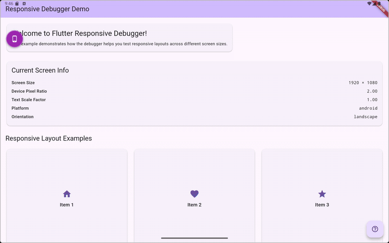
Check out the example directory for a complete demo app showing all features.
🤝 Contributing
Contributions are welcome! Please feel free to submit a Pull Request.
- Fork the repository
- Create your feature branch (
git checkout -b feature/AmazingFeature) - Commit your changes (
git commit -m 'Add some AmazingFeature') - Push to the branch (
git push origin feature/AmazingFeature) - Open a Pull Request
📝 License
This project is licensed under the MIT License - see the LICENSE file for details.
🙏 Acknowledgments
- Inspired by browser developer tools and responsive design testing needs
- Built with ❤️ for the Flutter community