Flutter Progress Status
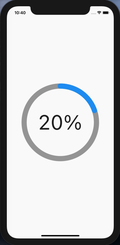
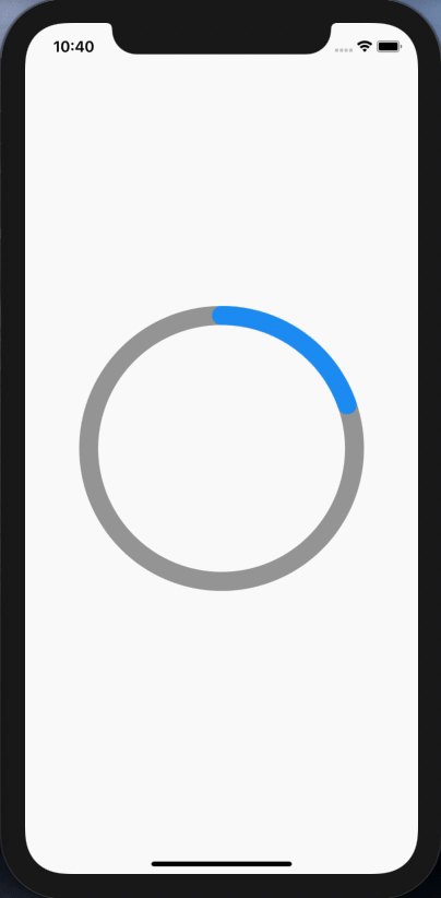
A simple widget that can be used to display progress status of a task, use the provided properties to customise the way you like.
How to use
ProgressStatus(
  radius: 150,
  strokeWidth: 20,
  fillValue: 50,
)
Properties
-
radius
Use this to set the size of the circle default minimum = 15.0 and default maximum = deviceWidth will be applied. -
fillValue
Use this to set the fill position. -
fillColor
Use this to set the fill color where default is blue color. -
backgroundColor
Use this to set the track background color where default is grey color. -
isStrokeCapRounded
Use this to set if stroke cap is rounded, default is true. -
strokeWidth
Use this to set the width of the track default is 5.0. -
showCenterText
Use this to show/hide the percentage in the middle of the circle, default is true. -
centerTextStyle
Use this to style the center text. -
centerTextAlignment
Use this to position the center text inside the circle. -
animationDuration
Use this to set the duration of the animation, default is 1 second. -
animationCurve
Use this to set the curve for the animation, default is Curves.fastOutSlowIn.