Flutter popup card

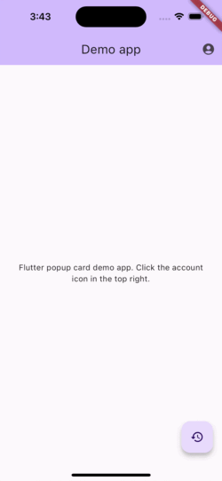
A lightweight plugin to create a card or custom widget that can popup overtop of your main app.
Usage
This plugin is based off the showDialog function built in to Flutter and operates very similarly.
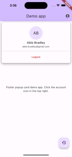
To show a popup use showPopupCard.
Use the PopupCard widget for a Material style look.
This sample shows how to show a simple yellow popup card:
showPopupCard(
  context: context,
  builder: (context) {
    return PopupCard(
      elevation: 8,
      color: Colors.yellow,
      shape: RoundedRectangleBorder(
        borderRadius: BorderRadius.circular(12.0),
      ),
      child: const Padding(
        padding: EdgeInsets.all(16.0),
        child: Text('This is a popup card'),
      ),
    );
  },
  offset: const Offset(-16, 70),
  alignment: Alignment.topRight,
  useSafeArea: true,
  dimBackground: true,
);
Positioning
You can position the popup in two ways:
- Screen-aligned (default): uses
alignmentandoffsetagainst the screen. - Anchor-aligned: uses
anchorKeyto position relative to a widget, then appliesalignmentandoffset.
This sample anchors a popup to an IconButton:
final GlobalKey accountButtonKey = GlobalKey();

IconButton(
  key: accountButtonKey,
  icon: const Icon(Icons.account_circle_rounded),
  onPressed: () {
    showPopupCard(
      context: context,
      anchorKey: accountButtonKey,
      alignment: Alignment.bottomRight,
      offset: const Offset(0, 8),
      useSafeArea: true,
      dimBackground: true,
      builder: (context) {
        return const PopupCard(
          child: Padding(
            padding: EdgeInsets.all(16),
            child: Text('Anchored popup'),
          ),
        );
      },
    );
  },
);
For anchor-aligned popups, alignment controls which side/corner of the popup
attaches to the anchor widget. For example:
Alignment.bottomLeft: popup opens below the anchor from the left side.Alignment.bottomRight: popup opens below the anchor from the right side.Alignment.topLeft: popup opens above the anchor from the left side.Alignment.topRight: popup opens above the anchor from the right side.
The popup is clamped to stay on screen, and offset is applied after anchor positioning.
See full example app: Example App Code.