flutter_material_showcase
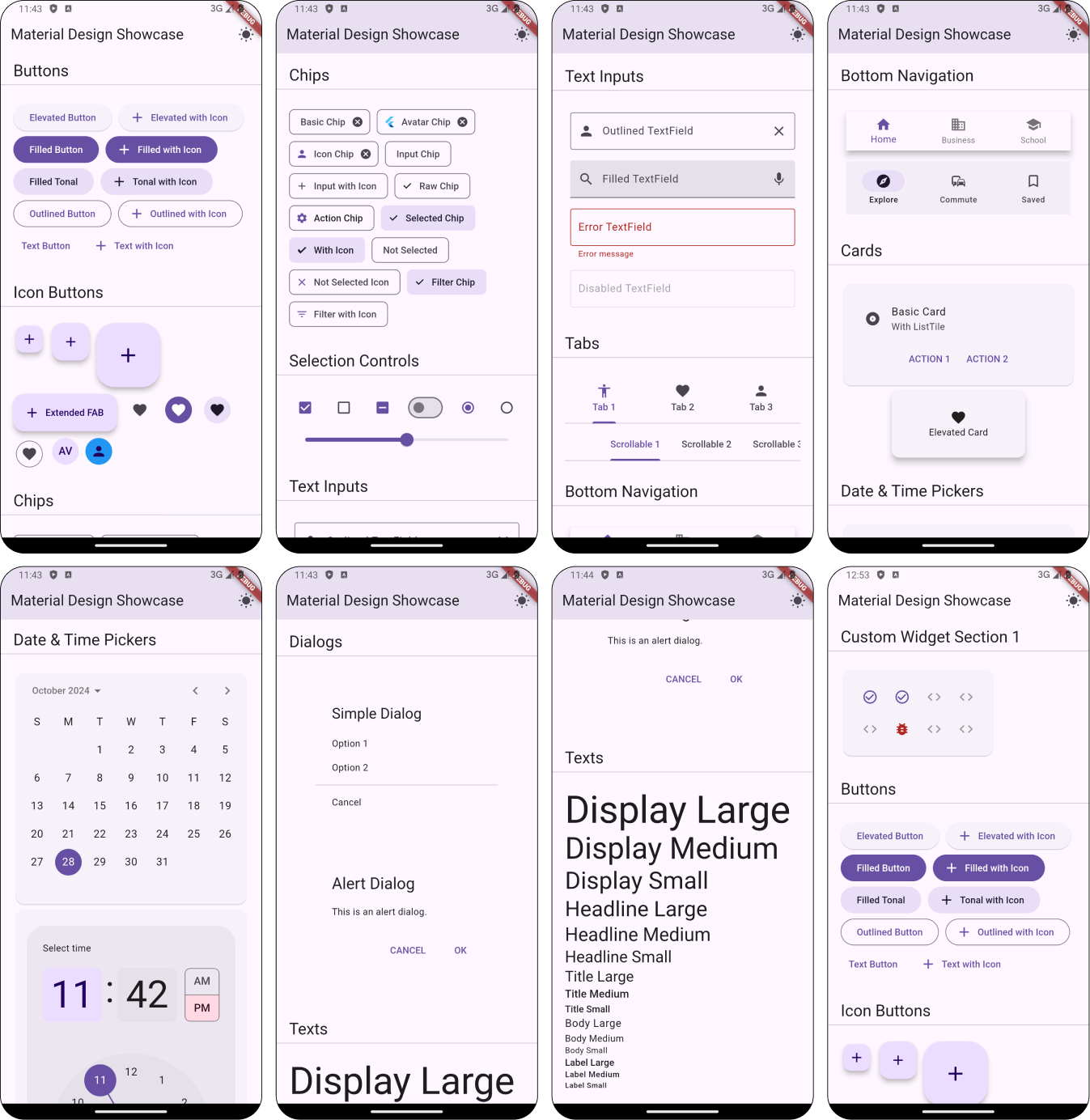
Material Design components showcase for Flutter apps.
This project is based on Ataul's Material Design Components Showcase Android project, but for Flutter!
You can use this Flutter package to preview your ThemeData and see how it looks like with different Material Widgets.

Usage
Add the MaterialShowcase Widget somewhere in your app:
MaterialApp(
  title: 'Flutter Demo',
  theme: ThemeData(
    primarySwatch: Colors.blue,
  ),
  home: Scaffold(
    body: MaterialShowcase(),
  ),
);
You can also add individual component sections to your project for preview like MaterialShowcaseButtons() widget. For complete list of available widgets, checkout lib/components folder.
If you have custom themed widgets, you can also preview them in the showcase by adding MaterialShowcaseSection in customSections property:
MaterialApp(
  title: 'Flutter Demo',
  theme: ThemeData(
    primarySwatch: Colors.blue,
  ),
  home: Scaffold(
    body: MaterialShowcase(
      customSections: [
        // You can add multiple sections here
        MaterialShowcaseSection(
          title: 'Custom Widget Section 1',
          child: CustomWidget(),
        ),
      ],
    ),
  ),
);
Then play with the different parameters in ThemeData and see how it looks like.
Contributing
- Additions to the
MaterialShowcaseWidget are welcome. - Documentation improvements are welcome.
License
MIT License

Copyright (c) 2024 Miguel Beltran
Miguel Beltran - beltran.work