Grid Layout (CSS) for Flutter
Embracing a grid layout as part of an adaptive design strategy is a pivotal step toward creating a versatile and user-centric digital experience. Grids provide the structure needed to maintain visual consistency, prioritize content, and seamlessly adapt to diverse screen sizes. Whether you're designing a digital interface, harnessing the potential of grid layouts is essential for delivering an exceptional user experience across the ever-expanding landscape of devices and displays.
Features
- Basic implementation of CSS Grid.
Getting started
flutter pub add flutter_grid_layout
Simple Sample
GridContainer(
  columns: [0.2, null, 0.2],
  rows: [0.2, null, 0.2],
  children: [
    GridItem(
      start: const Size(1, 1),
      end: const Size(2, 2),
      child: Container(color: Colors.red),
    )
  ],
),

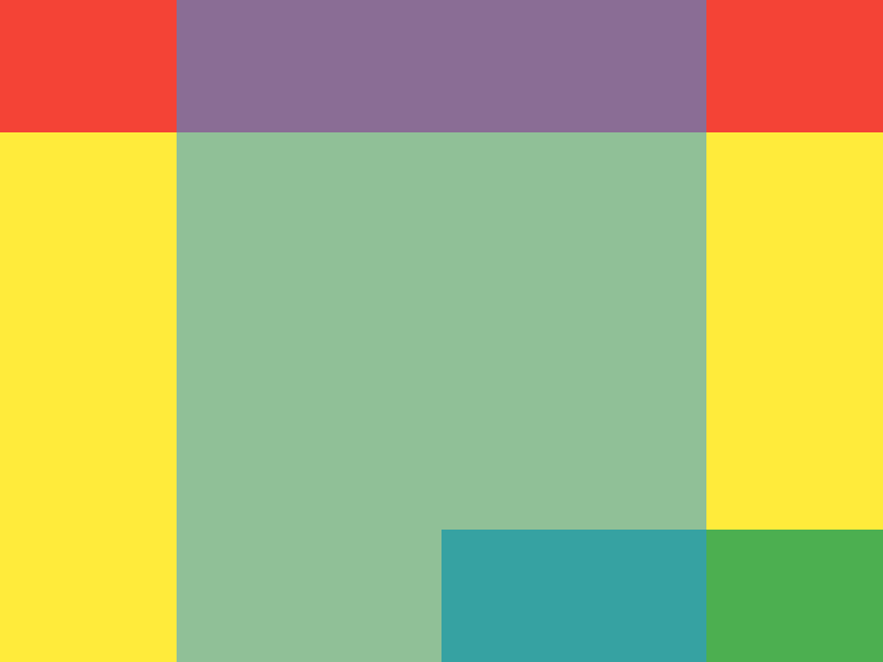
Multiple Items with different layers
GridContainer(
  columns: [0.2, 0.3, 0.3, 0.2],
  rows: [0.2, 0.3, 0.3, 0.2],
  children: [
    GridItem(
      start: const Size(0, 0),
      end: const Size(4, 1),
      child: Container(color: Colors.red),
    ),
    GridItem(
      start: const Size(1, 0),
      end: const Size(3, 4),
      order: 1,
      child: Container(color: Colors.blue.withOpacity(0.5)),
    ),
    GridItem(
      start: const Size(2, 3),
      end: const Size(4, 4),
      child: Container(color: Colors.green),
    ),
  ],
),
Support (Sponsorship)
Sponsorship would serve as an investment in the continuous evolution and improvement of open-sources projects carried
out by the terCAD team. So, if you'd like to contribute financially towards the efforts, please consider these options:
Or, treat me to :coffee:.