Glass Morphism Kit
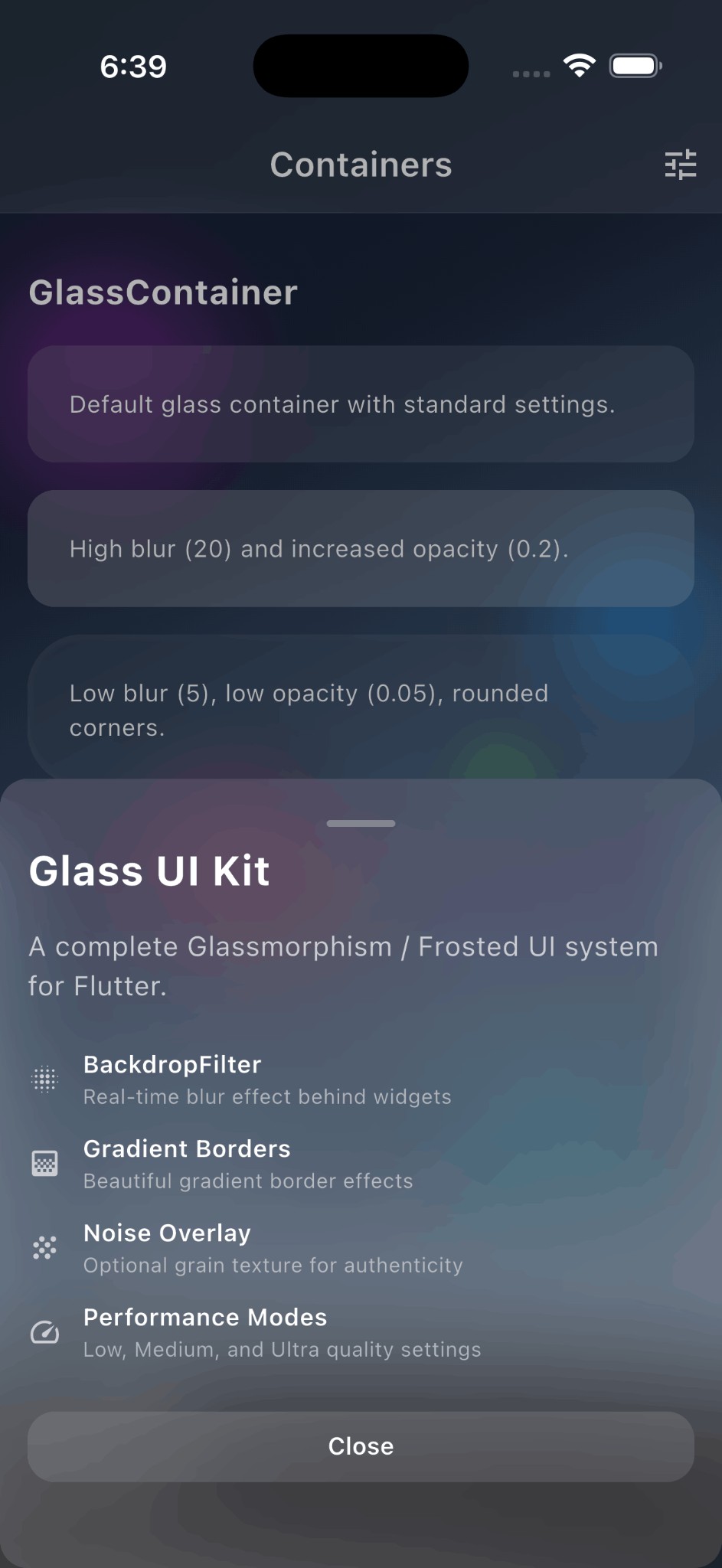
A complete Glassmorphism / Frosted Glass UI system for Flutter inspired by Apple's design language. Create beautiful frosted glass effects with blur, translucency, and subtle borders.

Features
- Apple-style frosted glass - Authentic glassmorphism matching iOS/macOS aesthetics
- High-performance blur - Optimized
BackdropFilterwith cachedImageFilter - Multiple components - Container, Card, Button, BottomSheet, AppBar
- Animated transitions - Smooth implicit animations for all properties
- Performance modes - Low and Medium quality settings
- Zero dependencies - Pure Flutter, no external packages
- Fully customizable - Blur, opacity, colors, borders, and more
Screenshots
| Screenshot | Description |
|---|---|
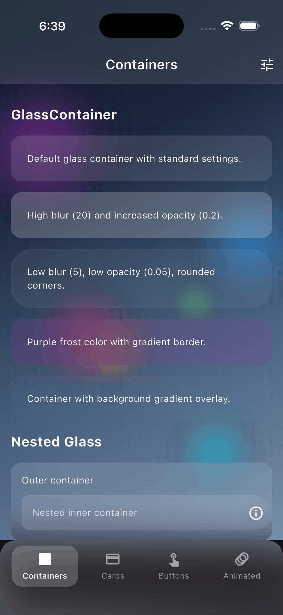
| Containers | Frosted glass containers with blur effect |
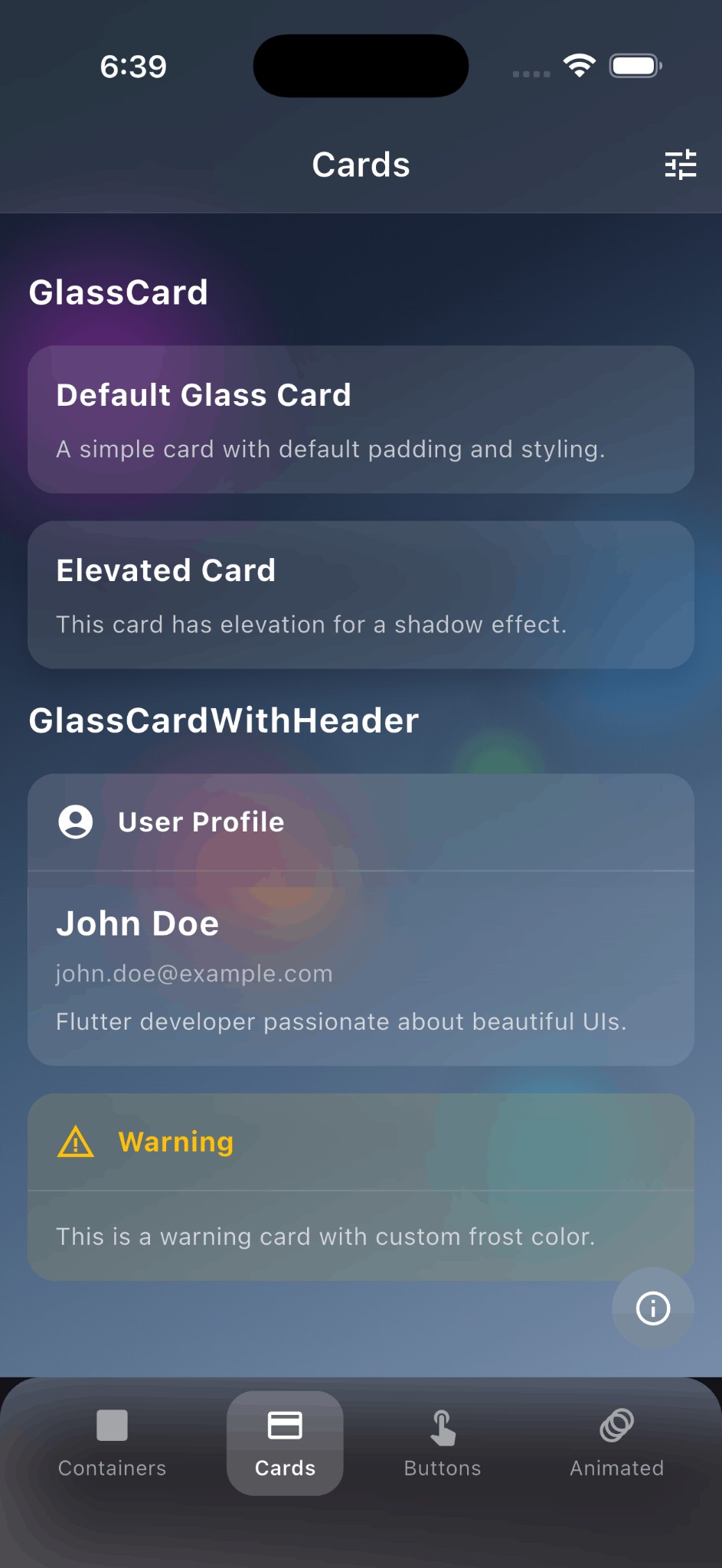
| Cards | Glass cards with headers and elevation |
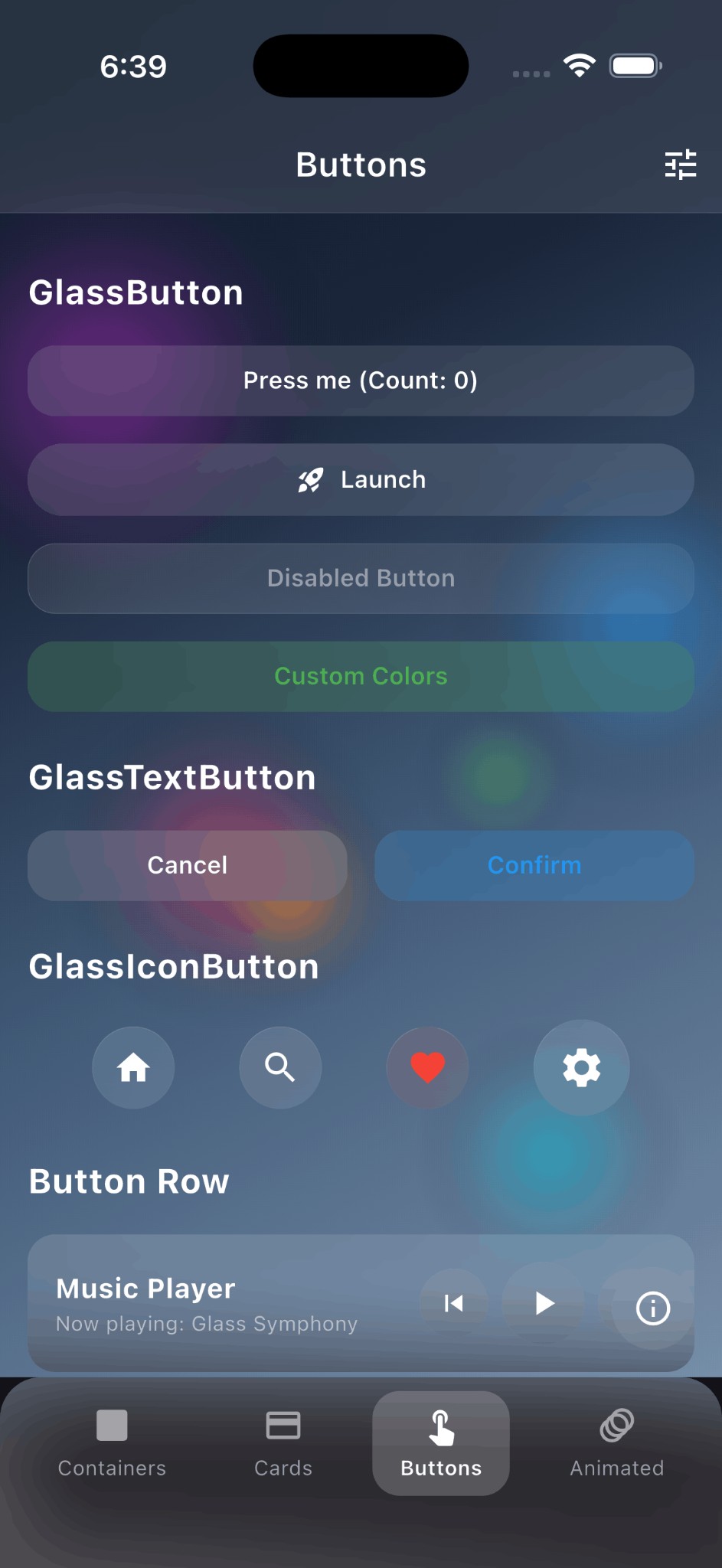
| Buttons | Interactive glass buttons with press animation |
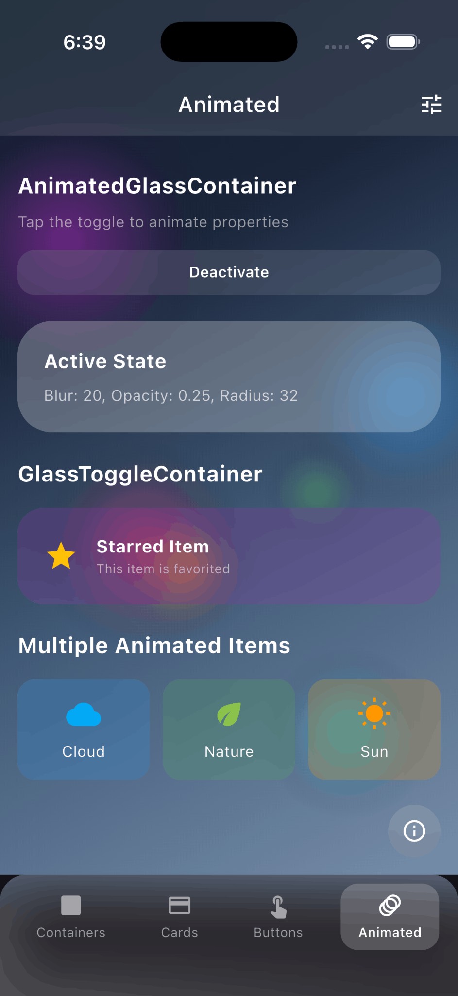
| Animated | Animated glass containers with smooth transitions |
| Bottom Sheet | Modal bottom sheet with glass effect |
Installation
Add this to your package's pubspec.yaml file:
dependencies:
  flutter_glass_ui_kit: ^1.0.5
Or install via command line:
flutter pub add flutter_glass_ui_kit
Quick Start
import 'package:flutter_glass_ui_kit/flutter_glass_ui_kit.dart';

// Wrap your app with GlassTheme
GlassTheme(
  data: GlassThemeData.dark(),
  child: MaterialApp(...),
)

// Use glass containers
GlassContainer(
  child: Text('Hello Glass'),
)
Components
GlassContainer
The core container widget with frosted glass effect.
GlassContainer(
  blur: 80.0,
  opacity: 0.1,
  borderRadius: BorderRadius.circular(16),
  padding: EdgeInsets.all(16),
  child: Text('Frosted Glass'),
)
GlassCard
A card widget with glass styling and optional elevation.
GlassCard(
  elevation: 8,
  child: Column(
    children: [
      Text('Card Title'),
      Text('Card content goes here'),
    ],
  ),
)
With header:
GlassCardWithHeader(
  header: Text('Profile'),
  content: Text('User information here'),
)
GlassButton
Interactive button with press animation and haptic feedback.
GlassButton(
  onPressed: () => print('Pressed!'),
  child: Text('Click Me'),
)

// Icon button
GlassIconButton(
  icon: Icons.favorite,
  onPressed: () {},
)

// Text button
GlassTextButton(
  text: 'Submit',
  onPressed: () {},
)
GlassAppBar
App bar with frosted glass effect.
Scaffold(
  extendBodyBehindAppBar: true, // Important!
  appBar: GlassAppBar(
    title: Text('Glass App Bar'),
    actions: [
      IconButton(icon: Icon(Icons.search), onPressed: () {}),
    ],
  ),
  body: ...,
)
GlassBottomSheet
Keyboard-aware modal bottom sheet.
showGlassBottomSheet(
  context: context,
  builder: (context) => GlassBottomSheet(
    child: Column(
      mainAxisSize: MainAxisSize.min,
      children: [
        Text('Bottom Sheet Title'),
        GlassButton(
          onPressed: () => Navigator.pop(context),
          child: Text('Close'),
        ),
      ],
    ),
  ),
);
Scrollable variant:
showGlassScrollableBottomSheet(
  context: context,
  header: Text('Options'),
  children: [
    ListTile(title: Text('Option 1')),
    ListTile(title: Text('Option 2')),
  ],
);
AnimatedGlassContainer
Smoothly animate property changes.
AnimatedGlassContainer(
  blur: isActive ? 80.0 : 40.0,
  opacity: isActive ? 0.15 : 0.1,
  duration: Duration(milliseconds: 300),
  child: Text('Animated'),
)
Toggle container:
GlassToggleContainer(
  isActive: isSelected,
  activeBlur: 80,
  inactiveBlur: 40,
  activeFrostColor: Colors.blue,
  inactiveFrostColor: Colors.white,
  child: Text('Toggle me'),
)
Theming
GlassTheme
Provide consistent styling across your app:
GlassTheme(
  data: GlassThemeData(
    blur: 80.0,
    opacity: 0.1,
    performance: GlassPerformance.medium,
    borderRadius: BorderRadius.circular(20),
    frostColor: Colors.white,
  ),
  child: MaterialApp(...),
)
Preset Themes
// Dark theme (recommended for colorful backgrounds)
GlassTheme(
  data: GlassThemeData.dark(),
  child: ...,
)

// Light theme
GlassTheme(
  data: GlassThemeData.light(),
  child: ...,
)
Performance Modes
Control rendering quality with GlassPerformance:
GlassContainer(
  performance: GlassPerformance.medium,
  child: Text('Full quality'),
)
| Mode | Blur | Description |
|---|---|---|
| Low | 50% | Reduced blur for better performance |
| Medium | 100% | Full blur with gradients |
Use low for:
- Lists with many glass items
- Low-end devices
- Complex UIs with multiple glass layers
Customization
Properties
| Property | Type | Default | Description |
|---|---|---|---|
blur |
double | 80.0 | Blur sigma (higher = more frosted) |
opacity |
double | 0.1 | Frost color opacity (lower = more transparent) |
borderRadius |
BorderRadius | 16.0 | Corner radius |
borderWidth |
double | 0.5 | Border stroke width |
borderGradient |
Gradient | white gradient | Gradient for border highlight |
frostColor |
Color | white | Tint color for the glass |
performance |
GlassPerformance | medium | Rendering quality |
Custom Colors
GlassContainer(
  frostColor: Colors.blue,
  opacity: 0.15,
  borderGradient: LinearGradient(
    colors: [
      Colors.blue.withOpacity(0.5),
      Colors.blue.withOpacity(0.1),
    ],
  ),
  child: ...,
)
Best Practices
-
Use
extendBodyBehindAppBar: truewhen usingGlassAppBarto see content behind it. -
Use colorful backgrounds - Glass looks best over vibrant, colorful backgrounds where the blur effect is visible.
-
Keep opacity low (0.1-0.15) - Let the blur do the work, not the color overlay.
-
Choose appropriate performance mode:
- Use
lowfor lists with many glass items - Use
mediumfor hero elements and single containers
- Use
-
Avoid deep nesting of glass containers as each adds a blur layer.
Example
See the example directory for a complete demo application.
cd example
flutter run
Requirements
- Flutter 3.10.0 or higher
- Dart 3.0.0 or higher
- No external dependencies
API Reference
Core Widgets
GlassContainer- Base glass containerGlassCard- Glass card with paddingGlassCardWithHeader- Card with header sectionGlassButton- Interactive glass buttonGlassIconButton- Circular icon buttonGlassTextButton- Text-only buttonGlassBottomSheet- Modal bottom sheetGlassScrollableBottomSheet- Scrollable bottom sheetGlassAppBar- Glass app barGlassSliverAppBar- Sliver variant
Animation
AnimatedGlassContainer- Implicit animationsGlassToggleContainer- Two-state toggle
Theming
GlassTheme- InheritedWidget for themingGlassThemeData- Theme configurationGlassPerformance- Quality modes
Utilities
GlassBorderPainter- Custom border painterGlassNoiseOverlay- Grain texture (optional)
Author
Divyansh Vishwakarma
- GitHub: @DivyanshVish
- LinkedIn: Divyansh Vishwakarma
- Instagram: @vishwakarma.divyansh
Contributing
Contributions are welcome! Please read our contributing guidelines before submitting a PR.
License
This project is licensed under the MIT License - see the LICENSE file for details.
Acknowledgments
- Inspired by Apple's iOS and macOS design language
- Built with Flutter's
BackdropFilterandImageFilter
Libraries
- flutter_glass_ui_kit
- A complete Glassmorphism / Frosted UI system for Flutter.