Floating Bottom Bar
A Flutter package for building floating bottom widgets (tab bars, action bars, custom containers) that react to scroll direction.


 |
 |
 |
|---|---|---|
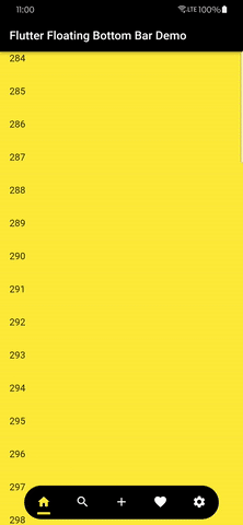
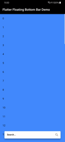
| A floating tab bar | A floating search bar | A basic example |
 |
|---|
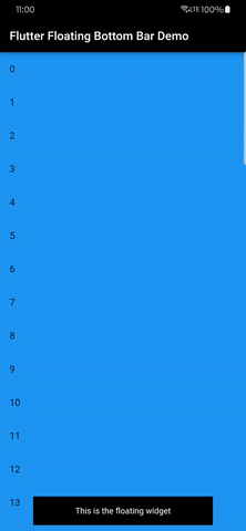
| A floating tab bar with a FAB |
Features
- Floating bottom widget that shows/hides based on scroll direction.
- Optional back-to-top icon.
- Full customization of alignment, shape, animation, color, and decoration.
- Optional imperative control via
BottomBarController. - Optional visibility events via
onVisibilityChanged. - Backward-compatible defaults (existing UIs do not need changes).
Installation
dependencies:
  flutter_floating_bottom_bar: ^1.4.0
Basic Usage
import 'package:flutter/material.dart';
import 'package:flutter_floating_bottom_bar/flutter_floating_bottom_bar.dart';

BottomBar(
  child: const Padding(
    padding: EdgeInsets.all(16),
    child: Text(
      'This is the floating widget',
      textAlign: TextAlign.center,
      style: TextStyle(color: Colors.white),
    ),
  ),
  body: (context, controller) => ListView.builder(
    controller: controller,
    itemBuilder: (context, index) => ListTile(title: Text('Item $index')),
  ),
)
Programmatic Control (New in 1.4.0)
final bottomBarController = BottomBarController();

BottomBar(
  controller: bottomBarController,
  onVisibilityChanged: (isVisible) {
    debugPrint('Bottom bar visible: $isVisible');
  },
  scrollDeltaThreshold: 8,
  iconTooltip: 'Scroll to top',
  child: const SizedBox(height: 56, child: Center(child: Text('Bottom Bar'))),
  body: (context, scrollController) => ListView.builder(
    controller: scrollController,
    itemBuilder: (context, index) => ListTile(title: Text('Row $index')),
  ),
);

// Later:
bottomBarController.hide();
bottomBarController.show();
bottomBarController.toggle();
await bottomBarController.scrollToStart();
await bottomBarController.scrollToEnd();
Key Properties
bodyandchild(required)controller(optional): imperative show/hide/scroll controlonVisibilityChanged(optional): listen to visible/hidden changesscrollDeltaThreshold(optional): ignore tiny scroll deltas to reduce flickericonSemanticLabelandiconTooltip(optional): accessibility hooks for icon action- Existing properties remain available:
barColor,barDecoration,iconDecoration,duration,curve,width,offset,barAlignment,showIcon,reverse,scrollOpposite,hideOnScroll,respectSafeArea,fit, andclip
Compatibility
- Developed and tested with Flutter
3.41.4(via FVM). - Package constraints remain broad to support compatible Flutter 3.x projects.
Example
See example/example.md and the repository demo app for full UI samples.
Issues and Contributions
- Bugs/feature requests: github.com/codenameakshay/flutter-floating-bottom-bar/issues
- Contributions: see CONTRIBUTING.md