Component
Creating Flutter component.
Installing
-
Add dependency to
pubspec.yamlGet the latest version in the 'Installing' tab on pub.dev
  dependencies:
      flutter_components: <latest-version>
- Import the package
import 'package:flutter_components/flutter_component.dart';
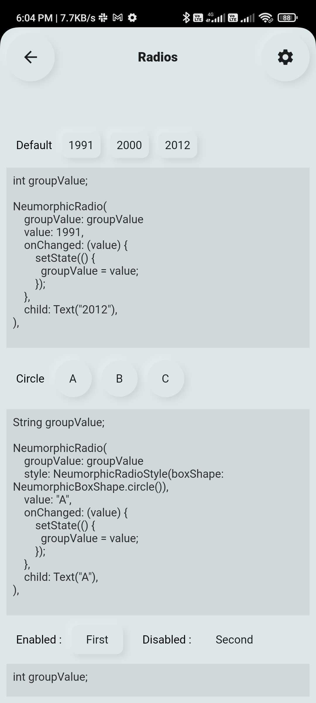
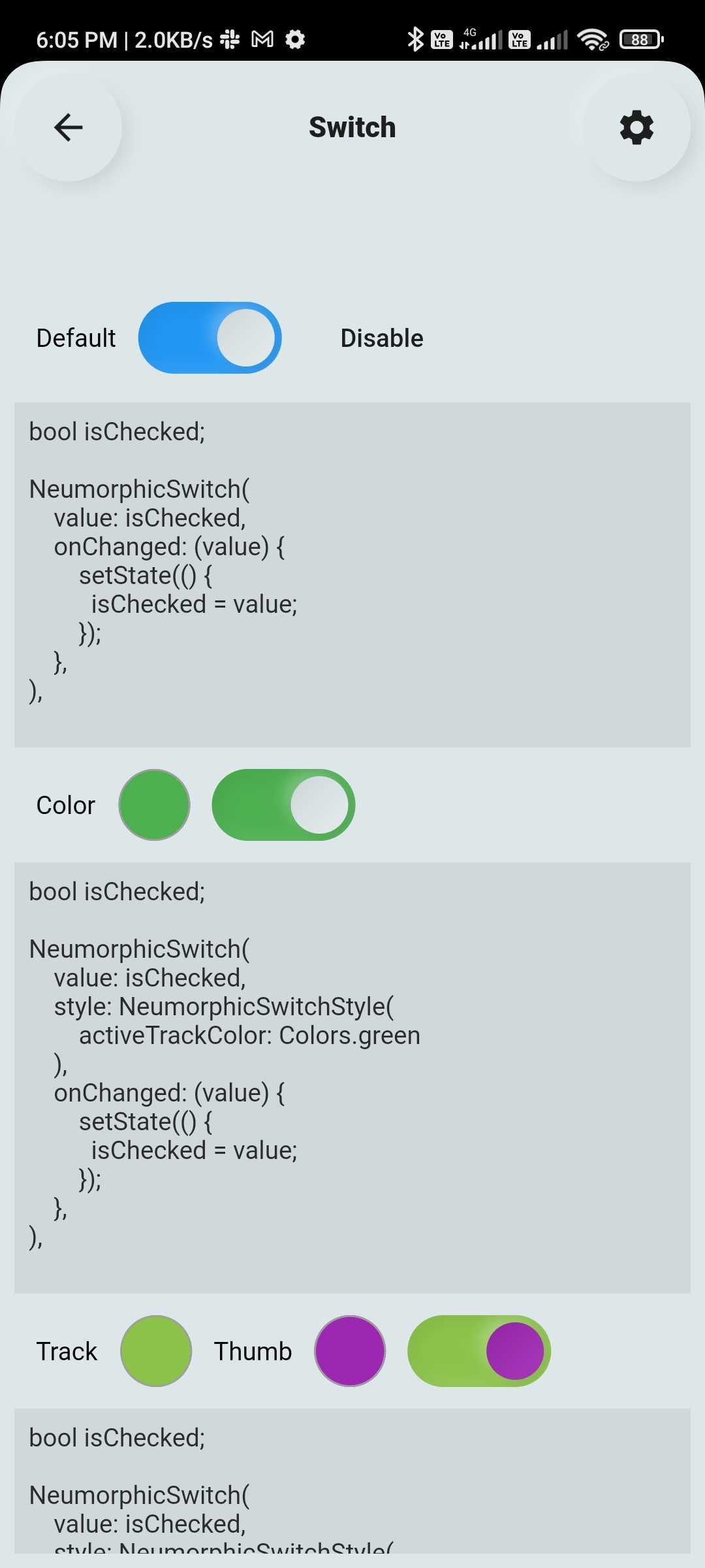
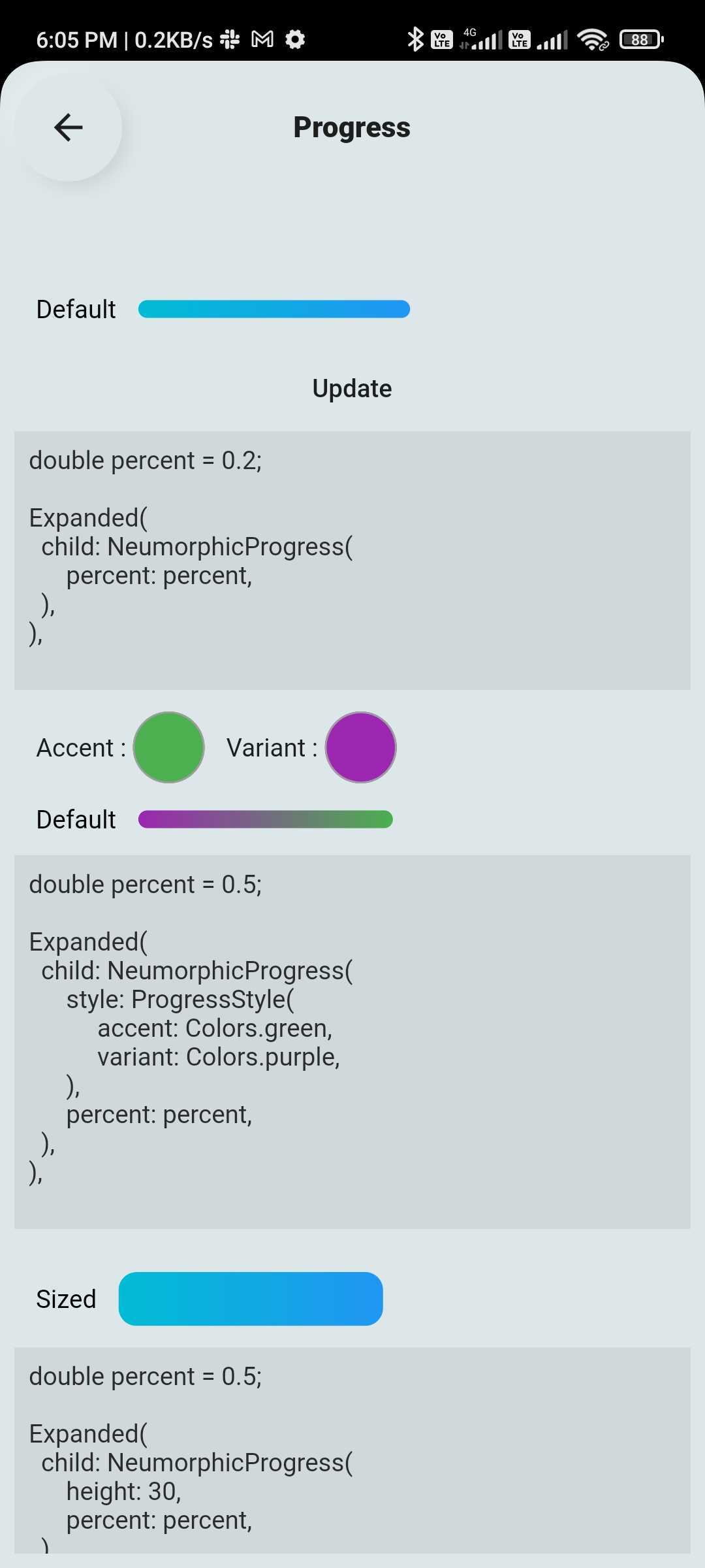
1) Neumorphic Widgets
| Screenshot | Screenshot | Screenshot |
|---|---|---|
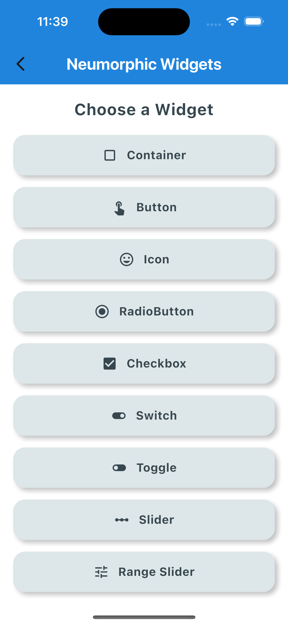 |
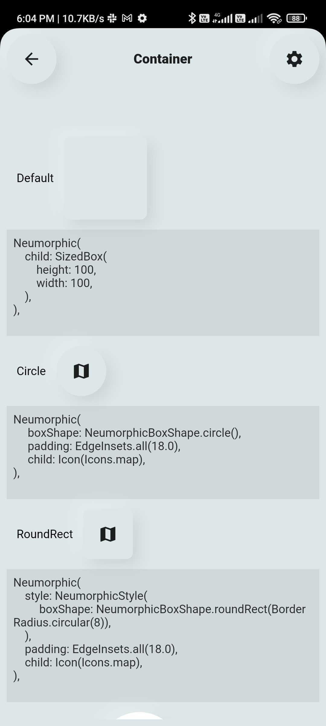 |
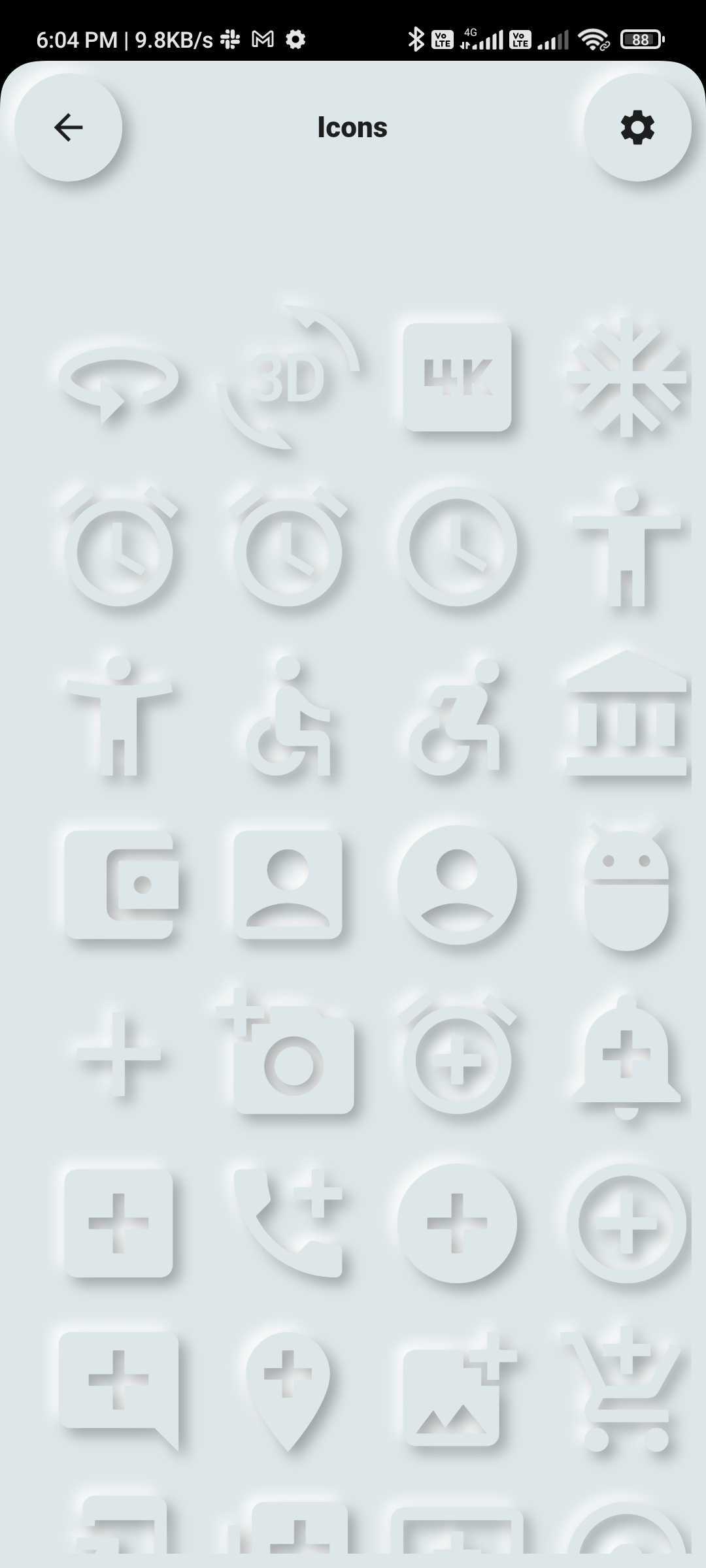 |
| Screenshot | Screenshot | Screenshot |
|---|---|---|
 |
 |
 |
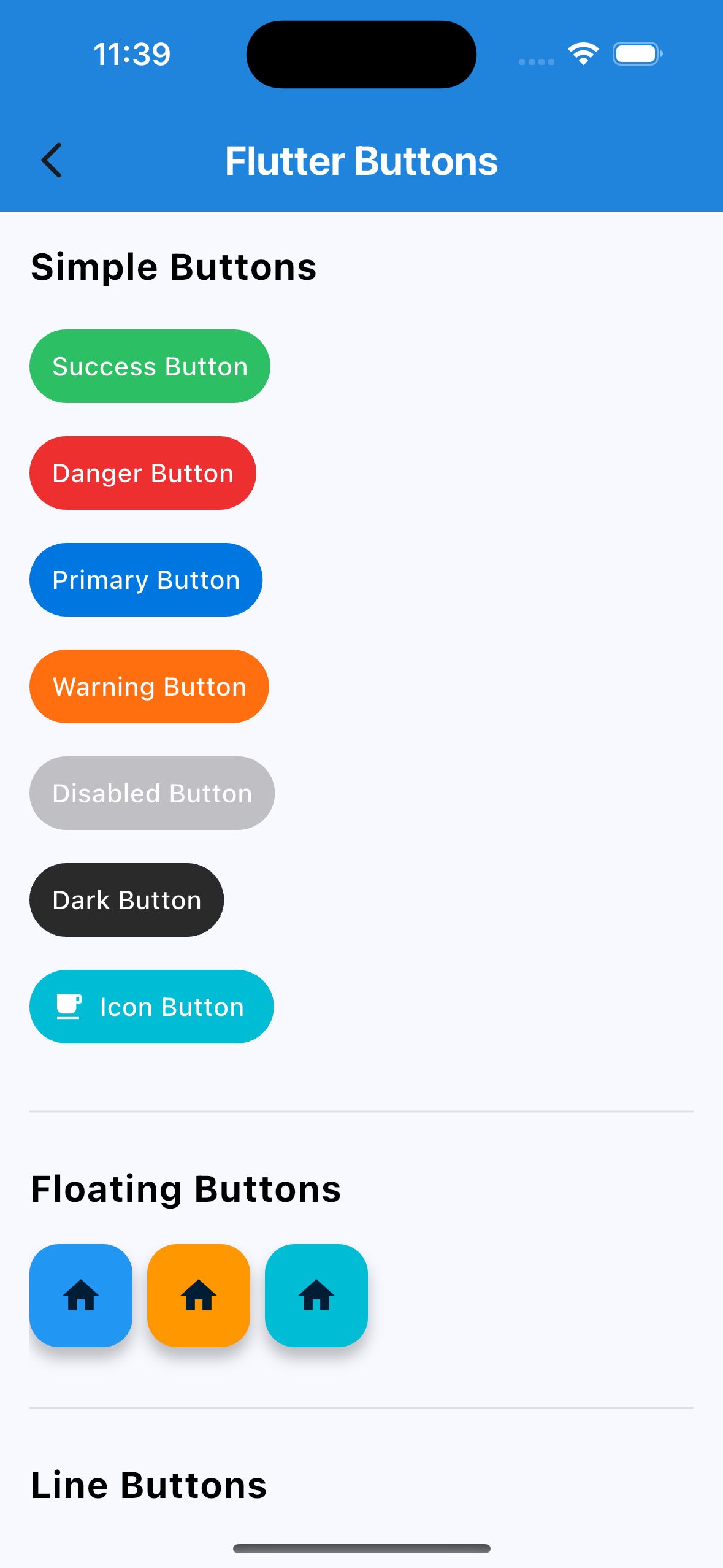
2) Buttons
| Screenshot | Screenshot | Screenshot |
|---|---|---|
 |
 |
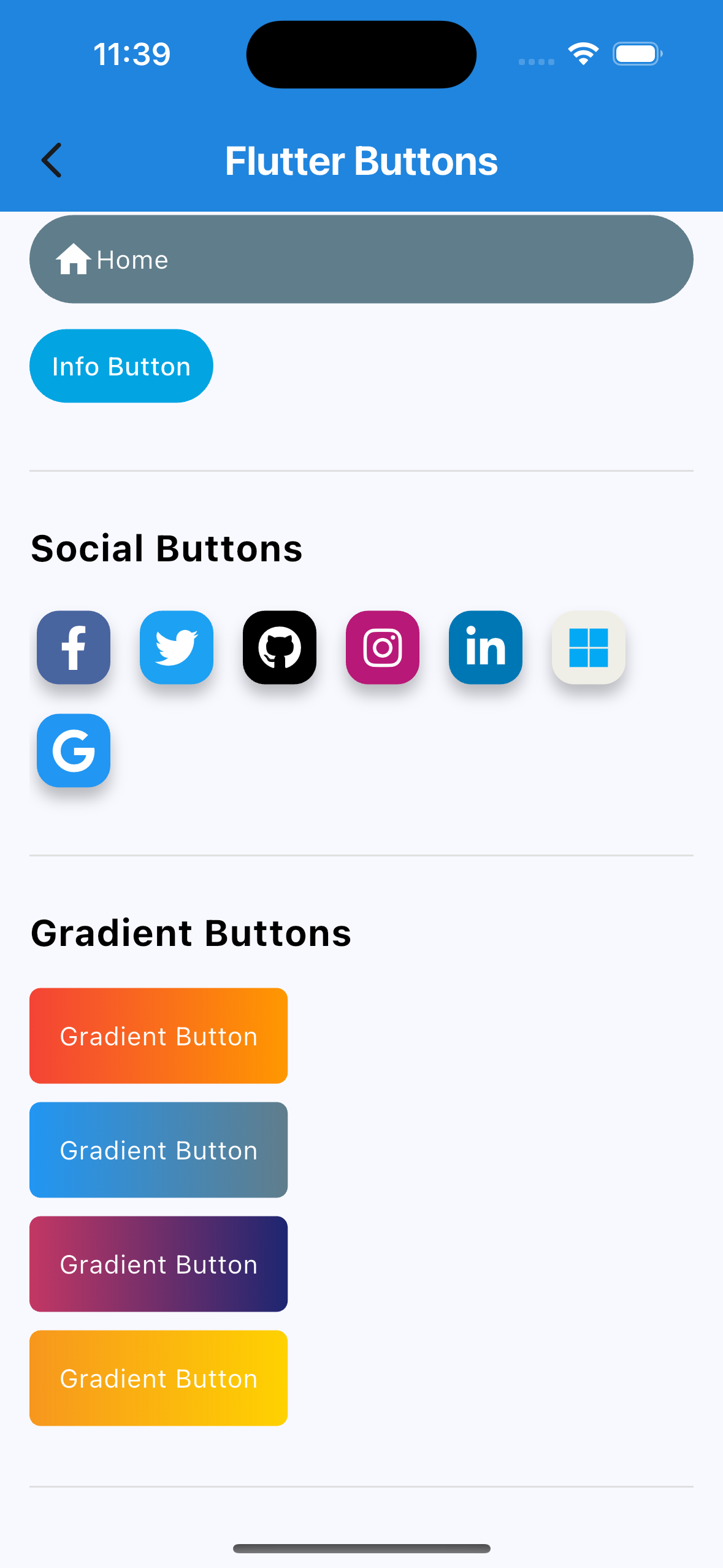 |
How to use
import 'package:flutter/material.dart';
import 'package:flutter_components/flutter_component.dart';

void main() => runApp(MyApp());

class MyApp extends StatelessWidget {
  const MyApp({Key? key}) : super(key: key);
  // This widget is the root of your application.
  @override
  Widget build(BuildContext context) {
    return MaterialApp(
      title: 'Flutter Buttons',
      theme: ThemeData(
        primarySwatch: Colors.blue,
      ),
      home: const Buttons(),
    );
  }
}

class Buttons extends StatefulWidget {
  @override
  _ButtonsPageState createState() => _ButtonsPageState();
}

class _ButtonsPageState extends State<Buttons> {
  @override
  Widget build(BuildContext context) {
    return Scaffold(
      body: Container(
        width: double.infinity,
        padding: const EdgeInsets.symmetric(horizontal: 20, vertical: 20),
        child: SingleChildScrollView(
          child: Column(
            children: [
Simple Buttons
             customContainer(
                 child: SuccessButton(
               title: "Success Button",
               onPressed: () {},
             )),
Icon Button
             customContainer(
               child: ButttonWithIcon(
                 icon: Icons.local_cafe,
                 title: "Icon Button",
                 color: Colors.white,
                 buttonColor: Colors.cyan,
                 onPressed: () {},
               ),
             ),
Floating Button
             Wrap(
               children: [
                 FloatingIconButton(
                   icon: Icons.home,
                   onPressed: () {},
                   buttonColor: Colors.orange,
                 ),
                 FloatingIconButton(
                   icon: Icons.home,
                   onPressed: () {},
                   buttonColor: Colors.cyan,
                   color: Colors.white,
                 )
               ],
             ),
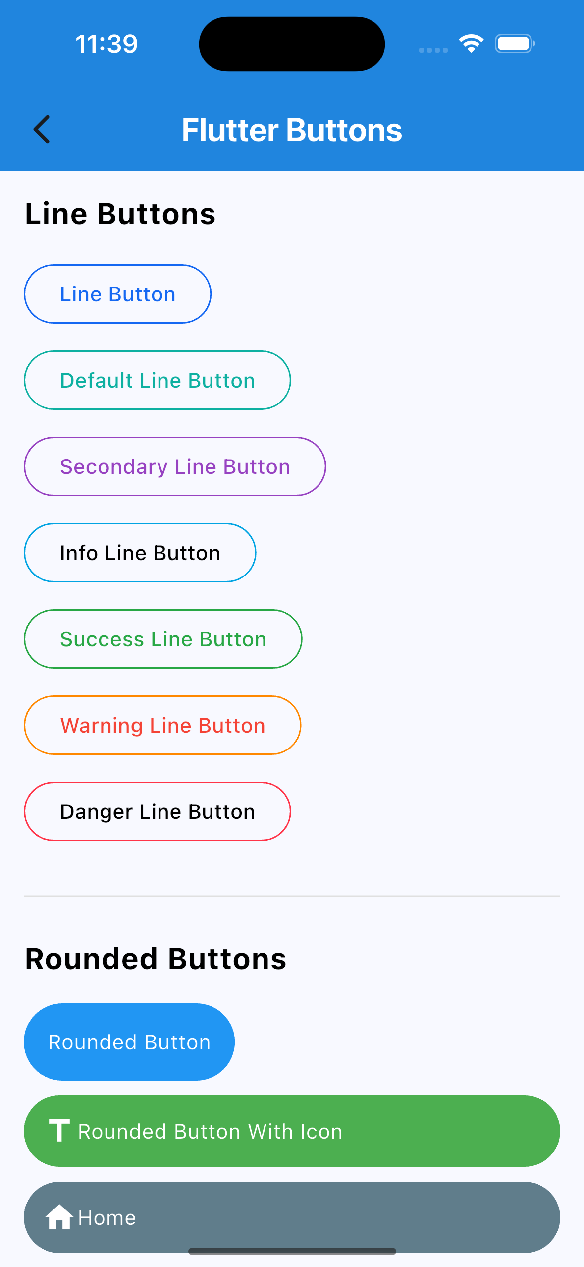
Line Button
             customContainer(
                 child: PrimaryLineButton(
               onPressed: () {},
               title: "Line Button",
             )),
             customContainer(
                 child: InfoLineButton(
               textColor: Colors.black,
               onPressed: () {},
               title: "Info Line Button",
             )),
Rounded Button
             customContainer(
                 child: RoundedButtonWithIcon(
               onPressed: () {},
               icon: Icons.title,
               title: "Rounded Button With Icon",
               buttonColor: Colors.green,
             )),
Social Button
             Wrap(
               children: <Widget>[
                 FacebookButton(
                   onPressed: () {},
                 ),
                 TwitterButton(
                   onPressed: () {},
                 ),
               ],
             ),
             SignInWithEmail(
               onPressed: () {},
             ),
             SignInWithGoogle(
               onPressed: () {},
             ),
             SignInWithMicrosoft(
               onPressed: () {},
             ),
             SignInWithApple(
               onPressed: () {},
             ),
            )),
Gradiant Button
             customContainer(
                 child: GradientButton(
               onPressed: () {},
               splashColor: Colors.orange,
               colors: const [
                 Colors.red,
                 Colors.orange,
               ],
               title: "Gradient Button",
             )),
           ],
         ),
       ),
     ),
   );
 }
}
Main Contributors
 Varsani Princy |
 Baldha Kevin |
Libraries
- Container/Module/colors
- Container/Module/decoration/cache/abstract_neumorphic_painter_cache
- Container/Module/decoration/cache/neumorphic_emboss_painter_cache
- Container/Module/decoration/cache/neumorphic_painter_cache
- Container/Module/decoration/neumorphic_box_decoration_helper
- Container/Module/decoration/neumorphic_decoration_painter
- Container/Module/decoration/neumorphic_decorations
- Container/Module/decoration/neumorphic_emboss_decoration_painter
- Container/Module/decoration/neumorphic_text_decoration_painter
- Container/Module/decoration/neumorphic_text_decorations
- Container/Module/light_source
- Container/Module/neumorphic_box_shape
- Container/Module/neumorphic_icons
- Container/Module/shape
- Container/Module/shape/beveled_path_provider
- Container/Module/shape/circle_path_provider
- Container/Module/shape/neumorphic_path_provider
- Container/Module/shape/path/flutter_logo_path_provider
- Container/Module/shape/rect_path_provider
- Container/Module/shape/rrect_path_provider
- Container/Module/shape/stadium_path_provider
- Container/Module/theme/app_bar
- Container/Module/theme/inherited_neumorphic_theme
- Container/Module/theme/neumorphic_theme
- Container/Module/theme/theme
- Container/Module/theme/theme_wrapper
- Container/Module/widget/animation/animated_scale
- Container/Module/widget/app
- Container/Module/widget/app_bar
- Container/Module/widget/background
- Container/Module/widget/checkbox
- Container/Module/widget/clipper/neumorphic_box_shape_clipper
- Container/Module/widget/container
- Container/Module/widget/icon
- Container/Module/widget/indicator
- Container/Module/widget/progress
- Container/Module/widget/radio
- Container/Module/widget/range_slider
- Container/Module/widget/slider
- Container/Module/widget/switch
- Container/Module/widget/text
- Container/Module/widget/toggle
- flutter_component