A Flutter package for building responsive grid layouts with ease. Works seamlessly on mobile, web, and desktop.
Features
- 📱 Responsive grid system
- 🎨 Easy customization
- ⚡ Lightweight & flexible
- 🌍 Works on mobile, web, and desktop
Getting started
- To use this plugin, add
flutgridas a dependency in your pubspec.yaml file.
dependencies:
  flugrid: ^0.0.6
or run:
flutter pub add flutgrid
- Now in your Dart code, you can use:
import 'package:flutgrid/flutgrid.dart';
Examples
See the example for a full usage demo.
FULL CODE EXAMPLE
import 'package:flutter/material.dart';
import 'package:flutgrid/flutgrid.dart';

void main() {
  runApp(MyApp());
}

class MyApp extends StatelessWidget {
  @override
  Widget build(BuildContext context) {
    return MaterialApp(
      title: 'Flutgrid',
      home: MyPage(),
    );
  }
}

class MyPage extends StatelessWidget {
  @override
  Widget build(BuildContext context) {
    return Scaffold(
      body: Padding(
        padding: const EdgeInsets.all(16.0),
        child: FlutGrid(
          spacing: 10.0,
          runSpacing: 10.0,
          children: [
            FlutGridItem(
              xs: 12,
              sm: 6,
              md: 4,
              lg: 4,
              xl: 4,
              child: Container(
                height: 150,
                color: Colors.red.shade200,
                alignment: Alignment.center,
                child: Column(
                  crossAxisAlignment: CrossAxisAlignment.center,
                  mainAxisAlignment: MainAxisAlignment.center,
                  children: [
                    Text(
                      'Item 1',
                      textAlign: TextAlign.center,
                      style: TextStyle(fontWeight: FontWeight.bold),
                    ),
                    Text(
                      '(xs-12)(sm-6)(md-4)(lg-4)(xl-4)',
                      textAlign: TextAlign.center,
                    ),
                  ],
                ),
              ),
            ),
          ],
        ),
      ),
    );
  }
}
Widget Example Code
FlutGrid(
  spacing: 10.0,
  runSpacing: 10.0,
  children: [
    FlutGridItem(
      xs: 12,
      sm: 6,
      md: 4,
      lg: 4,
      xl: 4,
      child: Container(
        height: 150,
        color: Colors.red.shade200,
        alignment: Alignment.center,
        child: Column(
          crossAxisAlignment: CrossAxisAlignment.center,
          mainAxisAlignment: MainAxisAlignment.center,
          children: [
            Text(
              'Item 1',
              textAlign: TextAlign.center,
              style: TextStyle(fontWeight: FontWeight.bold),
            ),
            Text(
              '(xs-12)(sm-6)(md-4)(lg-4)(xl-4)',
              textAlign: TextAlign.center,
            ),
          ],
        ),
      ),
    ),
  ],
),
API Reference
🔹 FlutGrid
A responsive grid container that arranges FlutGridItem children based on screen size breakpoints.
FlutGrid({
  Key? key,
  double spacing = 0.0,
  double runSpacing = 0.0,
  required List<FlutGridItem> children,
})
Properties
| Property | Type | Default | Description |
|---|---|---|---|
spacing |
double |
0.0 |
Horizontal spacing between grid items |
runSpacing |
double |
0.0 |
Vertical spacing between rows |
children |
List<FlutGridItem> |
— | The grid items to display |
FlutGridItem
Defines how many grid columns a widget should span at each breakpoint.
FlutGridItem({
  Key? key,
  required Widget child,
  int xs = 12,
  int? sm,
  int? md,
  int? lg,
  int? xl,
})
Properties
| Property | Type | Default | Description |
|---|---|---|---|
xs |
int |
12 |
Columns occupied on extra-small screens (<576px) |
sm |
int? |
null |
Columns occupied on small screens (≥576px) |
md |
int? |
null |
Columns occupied on medium screens (≥768px) |
lg |
int? |
null |
Columns occupied on large screens (≥992px) |
xl |
int? |
null |
Columns occupied on extra-large screens (≥1200px) |
child |
Widget |
— | The widget inside the grid item |
Breakpoints
| Breakpoint | Screen Width (px) | Example Usage |
|---|---|---|
| xs | <576px |
Mobile small |
| sm | ≥576px |
Mobile large |
| md | ≥768px |
Tablet |
| lg | ≥992px |
Desktop |
| xl | ≥1200px |
Large screens |
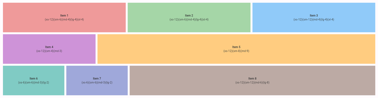
Screenshot
Additional information
####DEMO code example here