RatingBar class
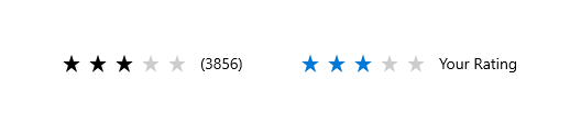
The rating bar allows users to view and set ratings that reflect degrees of satisfaction with content and services. Users can interact with the rating control with touch, pen, mouse, gamepad or keyboard. The follow guidance shows how to use the rating control's features to provide flexibility and customization.
See also:
- Inheritance
-
- Object
- DiagnosticableTree
- Widget
- StatefulWidget
- RatingBar
Constructors
-
RatingBar({Key? key, required double rating, ValueChanged<
double> ? onChanged, int amount = 5, Duration animationDuration = Duration.zero, Curve? animationCurve, IconData? icon, double? iconSize, Color? ratedIconColor, Color? unratedIconColor, String? semanticLabel, FocusNode? focusNode, bool autofocus = false, double starSpacing = 0}) -
Creates a new rating bar.
const
Properties
- amount → int
-
The amount of stars in the bar. The default amount is 5
final
- animationCurve → Curve?
-
The curve of the animation. If
null, uses ThemeData.animationCurvefinal - animationDuration → Duration
-
The duration of the animation
final
- autofocus → bool
-
True if this widget will be selected as the initial focus when no other
node in its scope is currently focused.
final
- focusNode → FocusNode?
-
An optional focus node to use as the focus node for this widget.
final
- hashCode → int
-
The hash code for this object.
no setterinherited
- icon → IconData?
-
The icon used in the bar. If
null, uses Icons.star_rate_sharpfinal - iconSize → double?
-
The size of the icon. If
null, uses IconThemeData.sizefinal - key → Key?
-
Controls how one widget replaces another widget in the tree.
finalinherited
-
onChanged
→ ValueChanged<
double> ? -
Called when the rating is changed.
If this is
null, the RatingBar will not detect touch inputsfinal - ratedIconColor → Color?
-
The color of the icons that are rated. If
null, uses ThemeData.accentColorfinal - rating → double
-
The current rating of the bar.
It must be more or equal to 0 and less than amount
final
- runtimeType → Type
-
A representation of the runtime type of the object.
no setterinherited
- semanticLabel → String?
-
Semantic label for the bar
final
- starSpacing → double
-
The space between each icon
final
- unratedIconColor → Color?
-
The color of the icons that are not rated. If
null, usesThemeData.disabledfinal
Methods
-
createElement(
) → StatefulElement -
Creates a StatefulElement to manage this widget's location in the tree.
inherited
-
createState(
) → _RatingBarState -
Creates the mutable state for this widget at a given location in the tree.
override
-
debugDescribeChildren(
) → List< DiagnosticsNode> -
Returns a list of DiagnosticsNode objects describing this node's
children.
inherited
-
debugFillProperties(
DiagnosticPropertiesBuilder properties) → void -
Add additional properties associated with the node.
override
-
noSuchMethod(
Invocation invocation) → dynamic -
Invoked when a nonexistent method or property is accessed.
inherited
-
toDiagnosticsNode(
{String? name, DiagnosticsTreeStyle? style}) → DiagnosticsNode -
Returns a debug representation of the object that is used by debugging
tools and by DiagnosticsNode.toStringDeep.
inherited
-
toString(
{DiagnosticLevel minLevel = DiagnosticLevel.info}) → String -
A string representation of this object.
inherited
-
toStringDeep(
{String prefixLineOne = '', String? prefixOtherLines, DiagnosticLevel minLevel = DiagnosticLevel.debug}) → String -
Returns a string representation of this node and its descendants.
inherited
-
toStringShallow(
{String joiner = ', ', DiagnosticLevel minLevel = DiagnosticLevel.debug}) → String -
Returns a one-line detailed description of the object.
inherited
-
toStringShort(
) → String -
A short, textual description of this widget.
inherited
Operators
-
operator ==(
Object other) → bool -
The equality operator.
inherited