TabView class
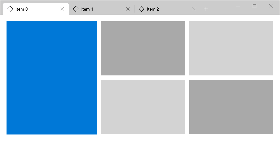
The TabView control is a way to display a set of tabs and their respective content. TabViews are useful for displaying several pages (or documents) of content while giving a user the capability to rearrange, open, or close new tabs.
There must be enough space to render the tabview.
See also:
- Inheritance
Constructors
-
TabView({Key? key, required int currentIndex, ValueChanged<
int> ? onChanged, required List<Tab> tabs, required List<Widget> bodies, void onNewPressed()?, IconData addIconData = Icons.add, bool shortcutsEnabled = true, ReorderCallback? onReorder, bool showScrollButtons = true, double minTabWidth = _kMinTileWidth, double maxTabWidth = _kMaxTileWidth}) -
Creates a tab view.
const
Properties
- addIconData → IconData
-
The icon of the new button
final
-
bodies
→ List<
Widget> -
The bodies of the tabs. This must have the same
length of tabs
final
- currentIndex → int
-
The index of the tab to be displayed
final
- hashCode → int
-
The hash code for this object.
no setterinherited
- isReorderEnabled → bool
-
Whether reordering is enabled or not. To enable it,
make sure
widget.onReorderis not null.no setter - key → Key?
-
Controls how one widget replaces another widget in the tree.
finalinherited
- maxTabWidth → double
-
The max width a tab can have. Must not be negative
and must be greater than minTabWidth. Default to
240 logical pixels
final
- minTabWidth → double
-
The min width a tab can have. Must not be negative.
Default to 100 logical pixels.
final
-
onChanged
→ ValueChanged<
int> ? -
Whether another tab was requested to be displayed
final
- onNewPressed → (void Function()?)
-
Called when the new button is pressed or when the
shortcut
Ctrl + Tis executed.final - onReorder → ReorderCallback?
-
Called when the tabs are reordered. If null,
reordering is disabled. It's disabled by default.
final
- runtimeType → Type
-
A representation of the runtime type of the object.
no setterinherited
- shortcutsEnabled → bool
-
Whether the following shortcuts are enabled:
final
- showNewButton → bool
-
Whenever the new button should be displayed.
no setter
- showScrollButtons → bool
-
Whether the buttons that scroll forward or backward
should be displayed, if necessary. Defaults to true
final
-
tabs
→ List<
Tab> -
The tabs to be displayed. This must have the same
length of bodies
final
Methods
-
build(
BuildContext context) → Widget -
Describes the part of the user interface represented by this widget.
override
-
createElement(
) → StatelessElement -
Creates a StatelessElement to manage this widget's location in the tree.
inherited
-
debugDescribeChildren(
) → List< DiagnosticsNode> -
Returns a list of DiagnosticsNode objects describing this node's
children.
inherited
-
debugFillProperties(
DiagnosticPropertiesBuilder properties) → void -
Add additional properties associated with the node.
override
-
noSuchMethod(
Invocation invocation) → dynamic -
Invoked when a nonexistent method or property is accessed.
inherited
-
toDiagnosticsNode(
{String? name, DiagnosticsTreeStyle? style}) → DiagnosticsNode -
Returns a debug representation of the object that is used by debugging
tools and by DiagnosticsNode.toStringDeep.
inherited
-
toString(
{DiagnosticLevel minLevel = DiagnosticLevel.info}) → String -
A string representation of this object.
inherited
-
toStringDeep(
{String prefixLineOne = '', String? prefixOtherLines, DiagnosticLevel minLevel = DiagnosticLevel.debug}) → String -
Returns a string representation of this node and its descendants.
inherited
-
toStringShallow(
{String joiner = ', ', DiagnosticLevel minLevel = DiagnosticLevel.debug}) → String -
Returns a one-line detailed description of the object.
inherited
-
toStringShort(
) → String -
A short, textual description of this widget.
inherited
Operators
-
operator ==(
Object other) → bool -
The equality operator.
inherited