Flow Stepper Widget
A lightweight, highly-customizable Flutter stepper/indicator widget with modern design and full styling control.
Screenshots
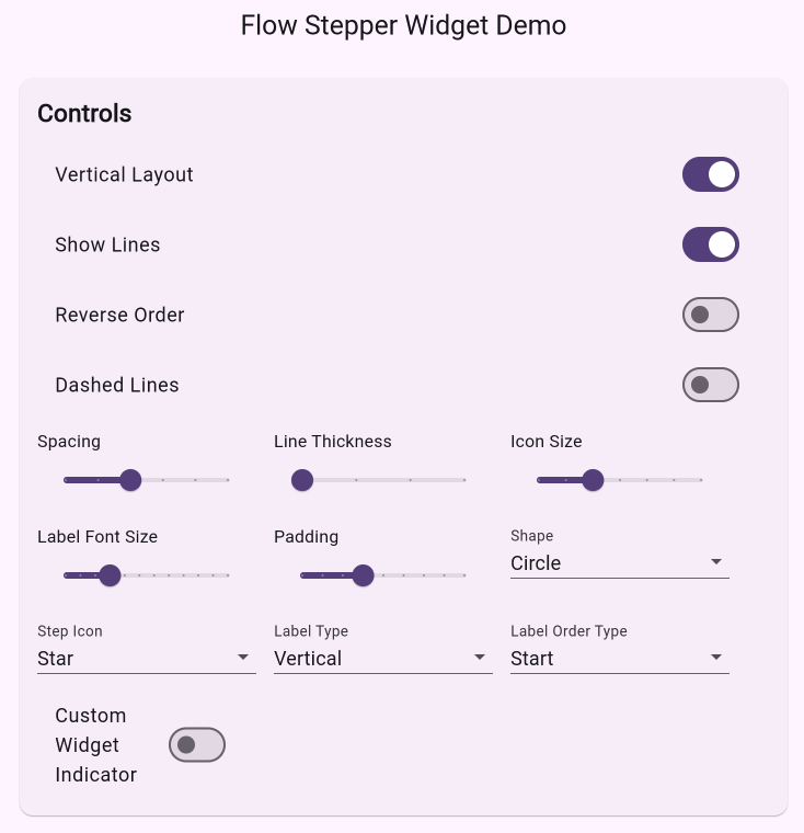 |
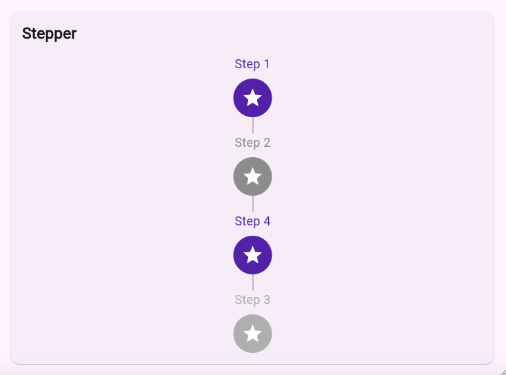 |
|---|
Features
- Vertical and horizontal layouts with flexible label positioning
- Customizable step indicators and labels
- Animated state transitions with configurable duration
- Dashed or solid connecting lines with adjustable thickness
- RTL/LTR support for internationalization
- Full accessibility support with semantic labels
- Material Design 3 ready
- Extensive customization options for colors, sizes, and shapes
- Support for custom builders for indicators, labels, and icons
- Custom line painter support for advanced line styling
Installation
Add this to your package's pubspec.yaml file:
dependencies:
  flow_stepper_widget: any
Quick Start
import 'package:flutter/material.dart';
import 'package:flow_stepper_widget/flow_stepper_widget.dart';

class MyWidget extends StatelessWidget {
  @override
  Widget build(BuildContext context) {
    return FlowStepperWidget(
      steps: [
        FlowStep(
          id: 'profile',
          label: 'Complete profile',
          icon: Icons.person,
          active: true,
        ),
        FlowStep(
          id: 'staff',
          label: 'Add staff (min. 1)',
          icon: Icons.group_add,
        ),
        FlowStep(
          id: 'services',
          label: 'Add services',
          icon: Icons.build,
        ),
        FlowStep(
          id: 'schedule',
          label: 'Set working days',
          icon: Icons.schedule,
        ),
        FlowStep(
          id: 'payment',
          label: 'Add payment (IBAN)',
          icon: Icons.payment,
          enabled: false,
        ),
      ],
      direction: Axis.vertical,
      spacing: 24,
      lineColor: Colors.grey.shade300,
      lineThickness: 1,
      dashPattern: [4, 2],
      activeStepColor: Colors.pink,
      inactiveStepColor: Colors.grey,
      disabledStepColor: Colors.grey.shade400,
      stepIconSize: 32,
      stepTextStyle: TextStyle(fontSize: 16),
      stepShape: CircleBorder(),
      stepPadding: EdgeInsets.all(12),
      stepAnimationDuration: Duration(milliseconds: 300),
      onStepTap: (id, active) => print('$id is now $active'),
      onStepLongPress: (id) => showTooltipFor(id),
    );
  }
}
Customization
Step Properties
Each step can be customized individually with its own styling:
FlowStep(
  id: 'unique_id',
  label: 'Step Label',
  icon: Icons.star,
  active: true,
  enabled: true,
  activeColor: Colors.blue,
  inactiveColor: Colors.grey,
  disabledColor: Colors.grey.shade400,
  iconSize: 32,
  textStyle: TextStyle(fontSize: 16),
  shape: CircleBorder(),
  padding: EdgeInsets.all(12),
  animationDuration: Duration(milliseconds: 300),
  semanticLabel: 'Accessibility label',
)
Widget Properties
The main widget supports extensive customization options:
FlowStepperWidget(
  // Required
  steps: [...],

  // Layout
  direction: Axis.vertical,  // or Axis.horizontal
  labelType: LabelType.vertical,  // or LabelType.horizontal
  labelOrderType: LabelOrderType.start,  // or LabelOrderType.end
  spacing: 24,

  // Line Styling
  lineColor: Colors.grey,
  lineThickness: 1,
  dashPattern: [4, 2],  // for dashed lines
  showLines: true,

  // Step Styling
  activeStepColor: Colors.blue,
  inactiveStepColor: Colors.grey,
  disabledStepColor: Colors.grey.shade400,
  stepIconSize: 32,
  stepTextStyle: TextStyle(fontSize: 16),
  stepShape: CircleBorder(),
  stepPadding: EdgeInsets.all(12),
  stepAnimationDuration: Duration(milliseconds: 300),

  // Behavior
  reverse: false,
  textDirection: TextDirection.ltr,

  // Callbacks
  onStepTap: (id, active) => print('$id is now $active'),
  onStepLongPress: (id) => showTooltipFor(id),

  // Custom Builders
  indicatorBuilder: (context, step) => CustomIndicator(step),
  labelBuilder: (context, step) => CustomLabel(step),
  stepIconBuilder: (context, isActive, color, size) => CustomIcon(isActive, color, size),
  linePainter: CustomLinePainter(),
)
Advanced Usage
Custom Line Painter
You can create custom line painters for advanced line styling:
class CustomLinePainter extends CustomPainter {
  @override
  void paint(Canvas canvas, Size size) {
    // Your custom painting logic
  }

  @override
  bool shouldRepaint(covariant CustomPainter oldDelegate) => false;
}
Custom Builders
The widget supports custom builders for complete control over the appearance:
// Custom indicator builder
Widget customIndicatorBuilder(BuildContext context, FlowStep step) {
  return Container(
    // Your custom indicator implementation
  );
}

// Custom label builder
Widget customLabelBuilder(BuildContext context, FlowStep step) {
  return Text(
    step.label,
    // Your custom label styling
  );
}

// Custom icon builder
Widget customIconBuilder(BuildContext context, bool isActive, Color color, double size) {
  return Icon(
    isActive ? Icons.check_circle : Icons.circle_outlined,
    color: color,
    size: size,
  );
}
Contributing
Contributions are welcome! Please feel free to submit a Pull Request.
License
This project is licensed under the MIT License - see the LICENSE file for details.