FloatingActionBubble class
A material design floating action menu button.
A floating action menu button is a circular icon button that hovers over content to promote a primary action with a expanded menu in the application. Floating action buttons are most commonly used in the Scaffold.floatingActionButton field.
Use at most a single floating action menu button per screen. Floating action
buttons should be used for positive actions such as "create", "share", or
"navigate". (If more than one floating action button is used within a
Route, then make sure that each button has a unique heroTag, otherwise
an exception will be thrown.)
If the onPressed callback is null, then the button will be disabled and
will not react to touch. It is highly discouraged to disable a floating
action button as there is no indication to the user that the button is
disabled. Consider changing the backgroundColor if disabling the floating
action button.
{@tool dartpad}
This example shows how to display a FloatingActionButton in a
Scaffold, with a pink backgroundColor and a thumbs up Icon.
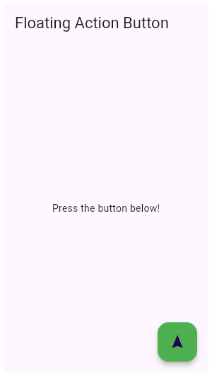
** See code in examples/api/lib/material/floating_action_button/floating_action_button.0.dart ** {@end-tool}
{@tool dartpad}
This example shows how to make an extended FloatingActionButton in a
Scaffold, with a pink backgroundColor, a thumbs up Icon and a
Text label that reads "Approve".
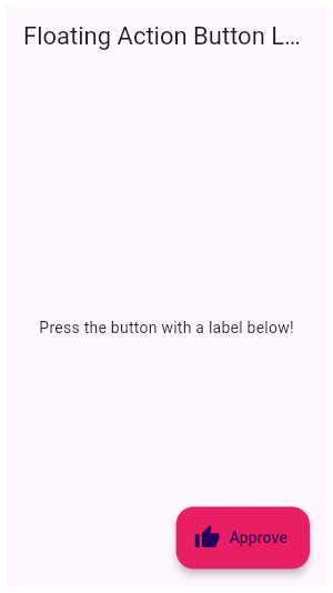
** See code in examples/api/lib/material/floating_action_button/floating_action_button.1.dart ** {@end-tool}
See also:
- Scaffold, in which floating action menu buttons typically live.
- ElevatedButton, a filled button whose material elevates when pressed.
- material.io/design/components/buttons-floating-action-button.html
- Inheritance
-
- Object
- DiagnosticableTree
- Widget
- StatefulWidget
- AnimatedWidget
- FloatingActionBubble
Constructors
-
FloatingActionBubble({Key? key, required List<
Bubble> items, required void onPress(), required Color iconColor, required Color backGroundColor, required Animation animation, Object? herotag, IconData? iconData, AnimatedIconData? animatedIconData}) -
const
Properties
- animatedIconData → AnimatedIconData?
-
final
- backGroundColor → Color
-
final
- hashCode → int
-
The hash code for this object.
no setterinherited
- herotag → Object?
-
final
- iconColor → Color
-
final
- iconData → IconData?
-
final
-
items
→ List<
Bubble> -
final
- key → Key?
-
Controls how one widget replaces another widget in the tree.
finalinherited
- listenable → Listenable
-
The Listenable to which this widget is listening.
finalinherited
- onPress → void Function()
-
final
- runtimeType → Type
-
A representation of the runtime type of the object.
no setterinherited
Methods
-
build(
BuildContext context) → Widget -
Override this method to build widgets that depend on the state of the
listenable (e.g., the current value of the animation).
override
-
buildItem(
BuildContext context, int index) → Widget -
createElement(
) → StatefulElement -
Creates a StatefulElement to manage this widget's location in the tree.
inherited
-
createState(
) → State< AnimatedWidget> -
Subclasses typically do not override this method.
inherited
-
debugDescribeChildren(
) → List< DiagnosticsNode> -
Returns a list of
DiagnosticsNodeobjects describing this node's children.inherited -
debugFillProperties(
DiagnosticPropertiesBuilder properties) → void -
Add additional properties associated with the node.
inherited
-
noSuchMethod(
Invocation invocation) → dynamic -
Invoked when a nonexistent method or property is accessed.
inherited
-
toDiagnosticsNode(
{String? name, DiagnosticsTreeStyle? style}) → DiagnosticsNode -
Returns a debug representation of the object that is used by debugging
tools and by DiagnosticsNode.toStringDeep.
inherited
-
toString(
{DiagnosticLevel minLevel = DiagnosticLevel.info}) → String -
A string representation of this object.
inherited
-
toStringDeep(
{String prefixLineOne = '', String? prefixOtherLines, DiagnosticLevel minLevel = DiagnosticLevel.debug}) → String -
Returns a string representation of this node and its descendants.
inherited
-
toStringShallow(
{String joiner = ', ', DiagnosticLevel minLevel = DiagnosticLevel.debug}) → String -
Returns a one-line detailed description of the object.
inherited
-
toStringShort(
) → String -
A short, textual description of this widget.
inherited
Operators
-
operator ==(
Object other) → bool -
The equality operator.
inherited