FlexibleWrap


FlexibleWrap is a Flutter widget that provides an advanced wrap layout with flexible spacing and RTL support. It automatically distributes available space between items in a row, similar to Wrap widget but with additional features
Perfect for implementing uniform grid layouts like product cards, image galleries, or any UI that requires evenly-spaced wrapped items.
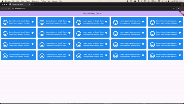
Showcase
Features
- Dynamic Wrapping: Automatically wraps widgets onto the next line based on the available space.
- Expanded Items: Expands the items to fill the available space on the row.
- RTL Support: Provides support for right-to-left text direction, ensuring proper layout and alignment for RTL languages.
- Customizable Spacing: Control both horizontal and vertical spacing between items
- One Row Expansion: Option to expand items when they fit in a single row
Note: We currently support only items that have the same width; height direction is not supported yet
Benchmarks: GridView vs. FlexibleWrap
| Feature | GridView | FlexibleWrap |
|---|---|---|
| Description | A layout that arranges items in a grid format. | It automatically distributes available space between items in a row. |
| Usage | Efficient for uniform item sizes. | Ideal for dynamic item sizes and wrapping. |
| Performance | Better performance with a builder pattern. | Currently does not support a builder; uses children instead. |
| Screen Recording |
Installation
Add this to your package's pubspec.yaml file:
dependencies:
  flexible_wrap: ^latest_version
Then run:
$ flutter pub get
Example Demo
Check out the live demo of FlexibleWrap at https://bixat.github.io/flexible_wrap/
Usage
First, import the package:
import 'package:flexible_wrap/flexible_wrap.dart';
Here's a basic example of how to use FlexibleWrap:
class MyHomePage extends StatefulWidget {
  const MyHomePage({super.key, required this.title});

  final String title;

  @override
  State<MyHomePage> createState() => _MyHomePageState();
}

class _MyHomePageState extends State<MyHomePage> {
  final spacing = 12.0;
  @override
  Widget build(BuildContext context) {
    return Scaffold(
      appBar: AppBar(
        backgroundColor: Theme.of(context).colorScheme.inversePrimary,
        title: Text(widget.title),
      ),
      body: SingleChildScrollView(
        child: FlexibleWrap(
          spacing: spacing,
          runSpacing: spacing,
          textDirection: TextDirection.rtl,
          children: List.generate(20, (int index) {
            return Container(
              height: 100,
              width: 300,
              decoration: BoxDecoration(
                  color: Colors.blue, borderRadius: BorderRadius.circular(8.0)),
              child: const Center(
                child: ListTile(
                  title: Text(
                    "Lorem Ipsum is simply dummy text",
                    style: TextStyle(color: Colors.white),
                    overflow: TextOverflow.ellipsis,
                  ),
                  subtitle: Text(
                    "Lorem Ipsum has been the industry's standard",
                    style: TextStyle(color: Colors.white),
                    overflow: TextOverflow.ellipsis,
                  ),
                  leading: Icon(
                    Icons.insert_emoticon,
                    color: Colors.white,
                    size: 60.0,
                  ),
                  trailing: Icon(
                    Icons.favorite,
                    color: Colors.white,
                  ),
                ),
              ),
            );
          }).toList(),
        ),
      ),
    );
  }
}
Important Implementation Note
When using FlexibleWrap with dynamic dimensions (height, width, or item count), you should add a ValueKey to force widget rebuilds when these properties change:
FlexibleWrap(
  key: ValueKey('$itemHeight-$itemWidth-$itemCount'), // Force rebuild when dimensions change
  spacing: spacing,
  runSpacing: runSpacing,
  isOneRowExpanded: isOneRowExpanded,
  textDirection: isRTL ? TextDirection.rtl : TextDirection.ltr,
  children: [
    // Your widgets here
  ],
)
Why is this needed?
The ValueKey ensures that Flutter recognizes the widget as "changed" when dimensions are updated, forcing a complete rebuild of the render object. This is particularly important when:
- Child widget dimensions change dynamically
- The number of children changes
- Layout properties are modified at runtime
Without the ValueKey, Flutter's widget tree optimization might prevent the render object from properly updating, leading to visual inconsistencies where dimension changes don't immediately reflect in the UI.
Customization
FlexibleWrap offers several customization options to tailor the layout to your needs:
Parameters
| Parameter | Type | Default | Description |
|---|---|---|---|
children |
List<Widget> |
Required | The widgets to display in the wrap layout |
spacing |
double |
0.0 |
Horizontal space between children |
runSpacing |
double |
0.0 |
Vertical space between runs |
textDirection |
TextDirection |
null |
The text direction for RTL support |
isOneRowExpanded |
bool |
false |
Whether to expand items when they fit in one row |
Common Use Cases
- Grid Layout:
FlexibleWrap(
  spacing: 8.0,
  runSpacing: 8.0,
  children: items,
)
- RTL Support:
FlexibleWrap(
  spacing: 8.0,
  textDirection: TextDirection.rtl,
  children: items,
)
Contributing
We welcome contributions to FlexibleWrap! Here's how you can help:
- Fork the repository
- Create your feature branch (
git checkout -b feature/amazing-feature) - Commit your changes (
git commit -m 'Add some amazing feature') - Push to the branch (
git push origin feature/amazing-feature) - Open a Pull Request
Please make sure to update tests and documentation as appropriate.
License
FlexibleWrap is licensed under the MIT License. See the LICENSE file for details.