flex_menu_button
A customizable and lightweight Flutter dropdown menu button designed to be used in AppBars, Toolbars, or anywhere you want quick access to menu actions. It supports icons, text, headers, footers, dividers, custom widgets, flexible alignment, and full style control.
Features
• Works out of the box — no dependencies
•Custom icon, label, text styles
•Optional header and footer widgets
•Dropdown alignment and screen-side flipping
•Custom width, max height, padding, and scrolling
•Optional custom widgets, dividers, and trailing elements
•Tooltip customization
•Fully modular, easy to extend
Installation
Add this to your pubspec.yaml:
dependencies:
  flex_menu_button: ^<latest_version>
Then run:
flutter pub get
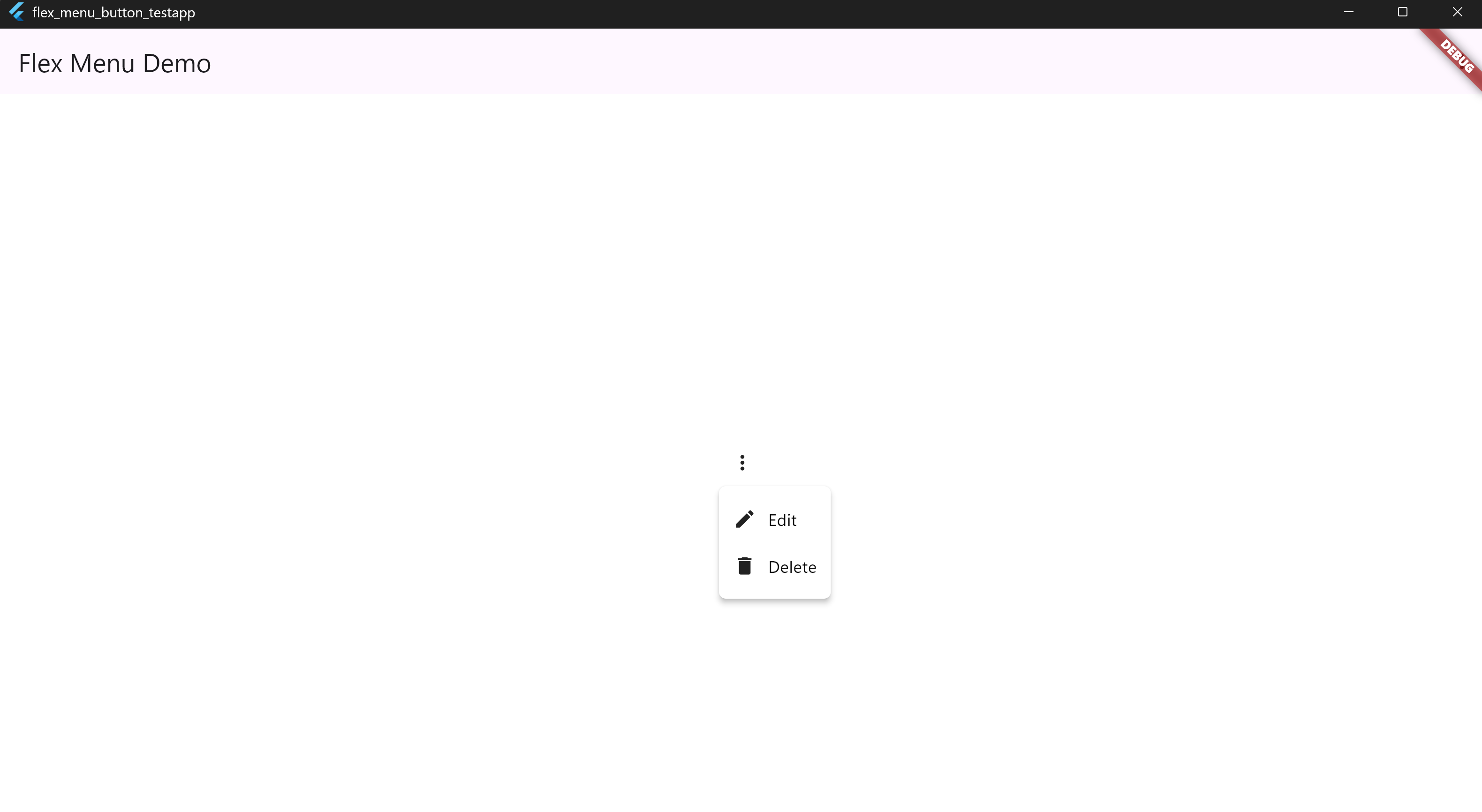
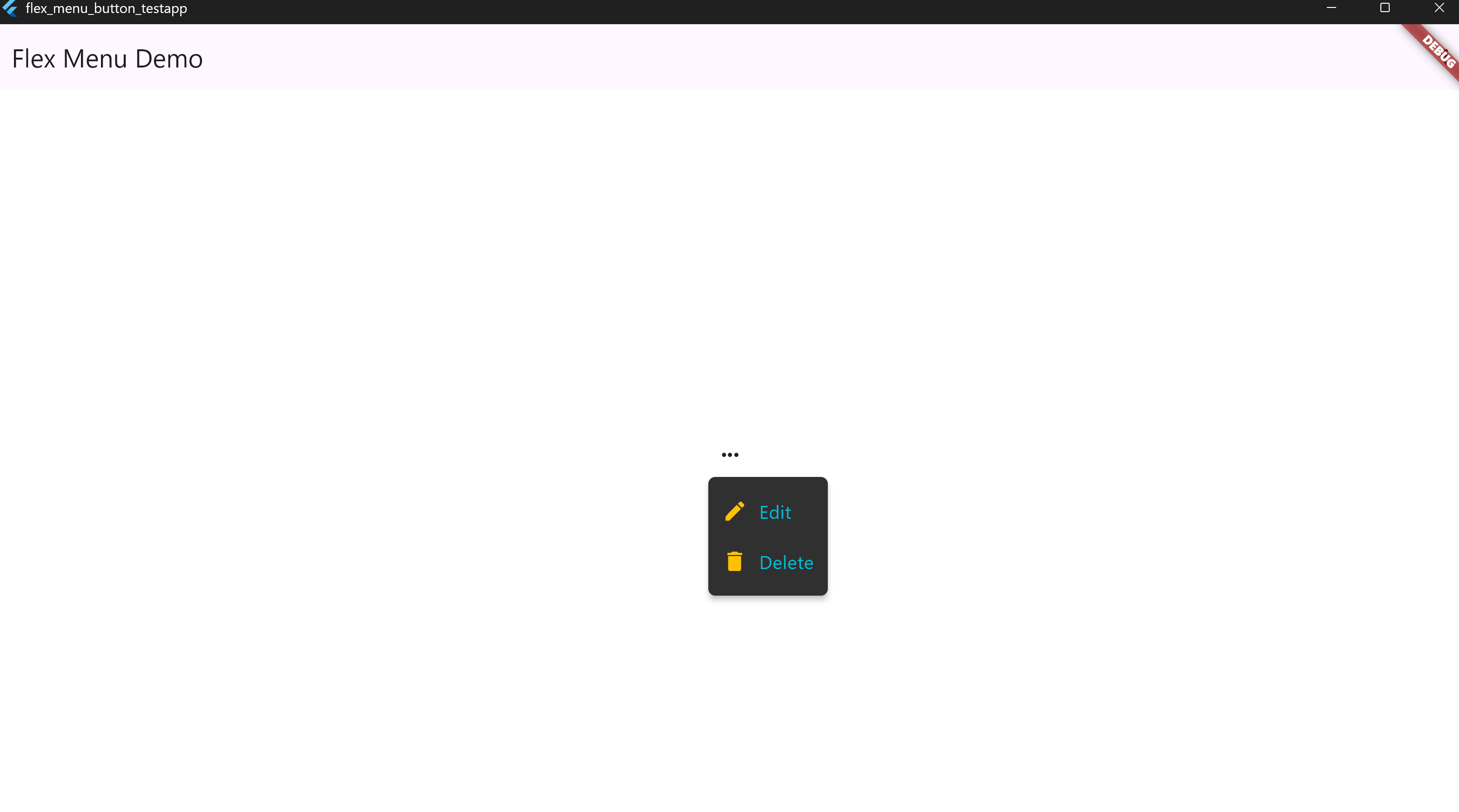
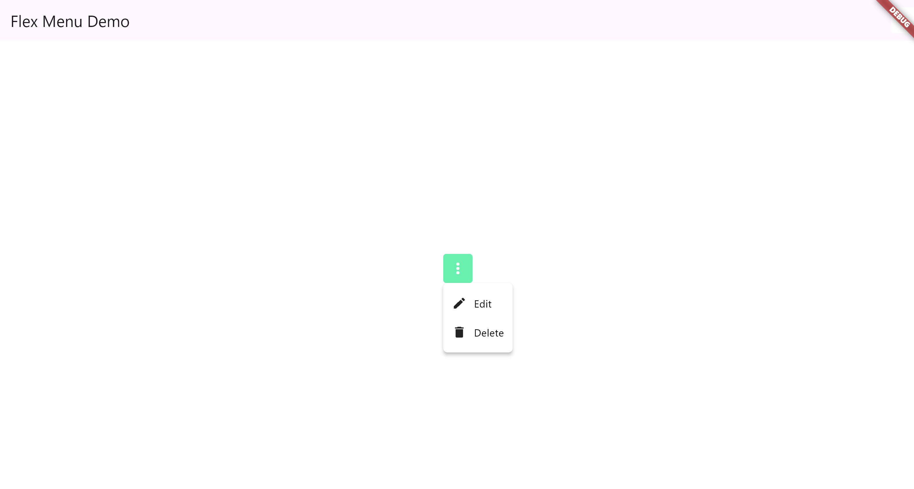
• 1. Basic Usage
MenuDropdownButton(
  tooltip: 'Options',
  icon: Icon(Icons.more_vert),
  items: [
    MenuItem(icon: Icon(Icons.edit), label: 'Edit', onTap: () {}),
    MenuItem(icon: Icon(Icons.delete), label: 'Delete', onTap: () {}),
  ],
)
📸 Screenshot:
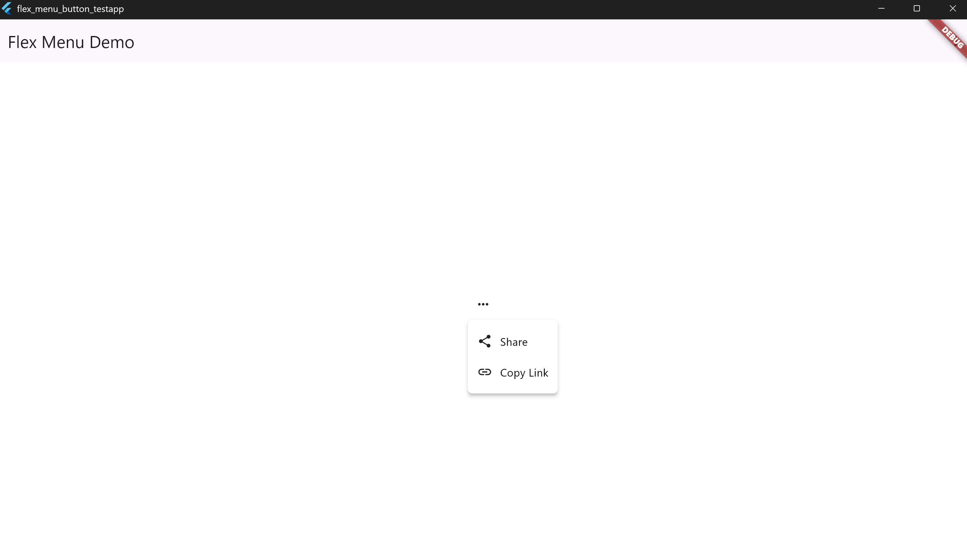
• 2. Menu Alignment Options
MenuDropdownButton(
  tooltip: 'Align Center',
  icon: Icon(Icons.more_horiz),
  config: MenuDropdownConfig(
    alignment: MenuAlignment.center,
  ),
  items: [
    MenuItem(icon: Icon(Icons.share), label: 'Share', onTap: () {}),
    MenuItem(icon: Icon(Icons.link), label: 'Copy Link', onTap: () {}),
  ],
)
📸 Screenshot:
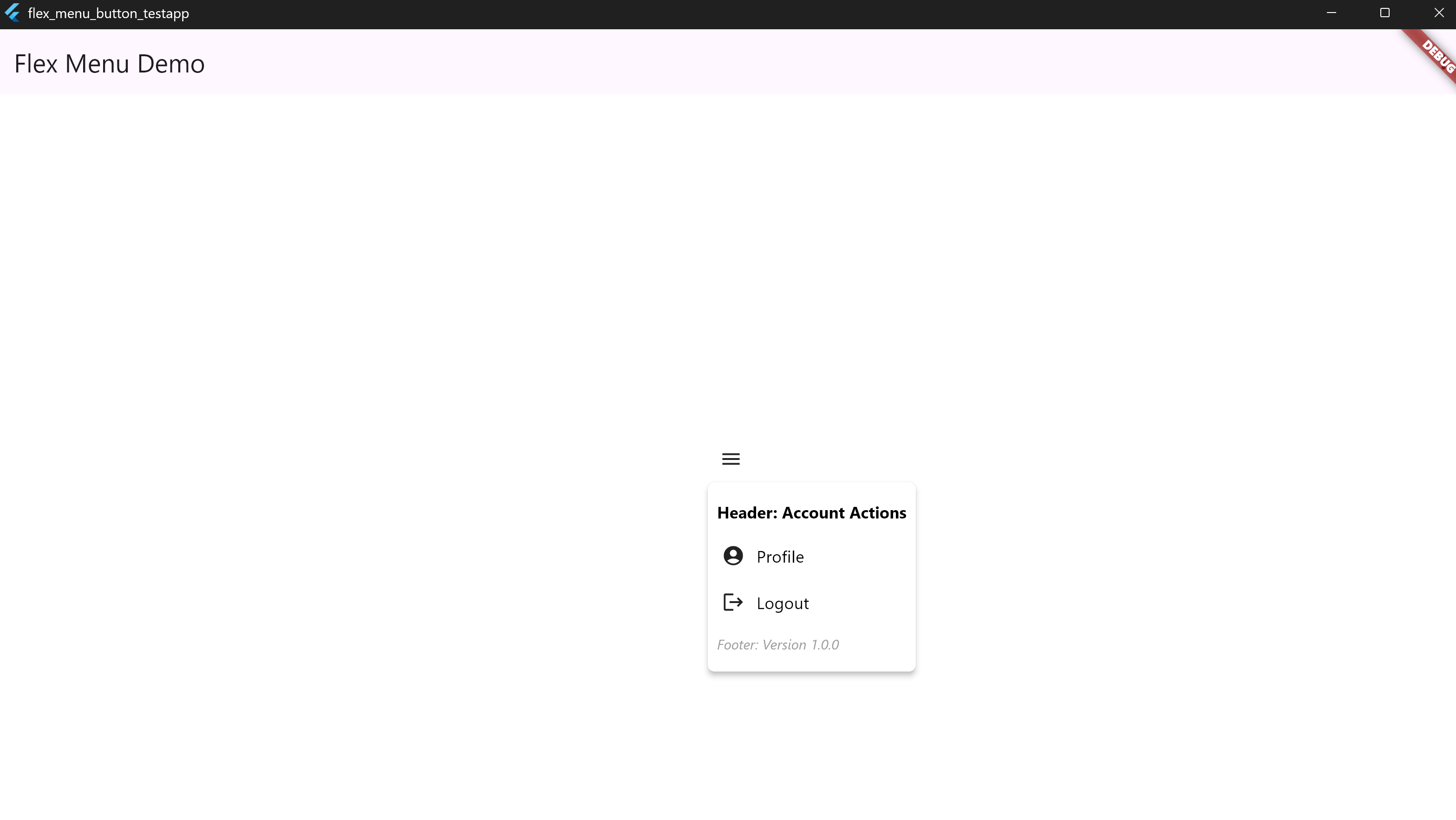
• 3. Header & Footer
MenuDropdownButton(
  tooltip: 'Menu with Header/Footer',
  icon: Icon(Icons.menu),
  header: Padding(
    padding: EdgeInsets.all(8),
    child: Text('Header: Account Actions', style: TextStyle(color: Colors.white)),
  ),
  footer: Padding(
    padding: EdgeInsets.all(8),
    child: Text('Footer: Version 1.0.0', style: TextStyle(color: Colors.grey)),
  ),
  items: [
    MenuItem(icon: Icon(Icons.account_circle), label: 'Profile'),
    MenuItem(icon: Icon(Icons.logout), label: 'Logout'),
  ],
)
📸 Screenshot:
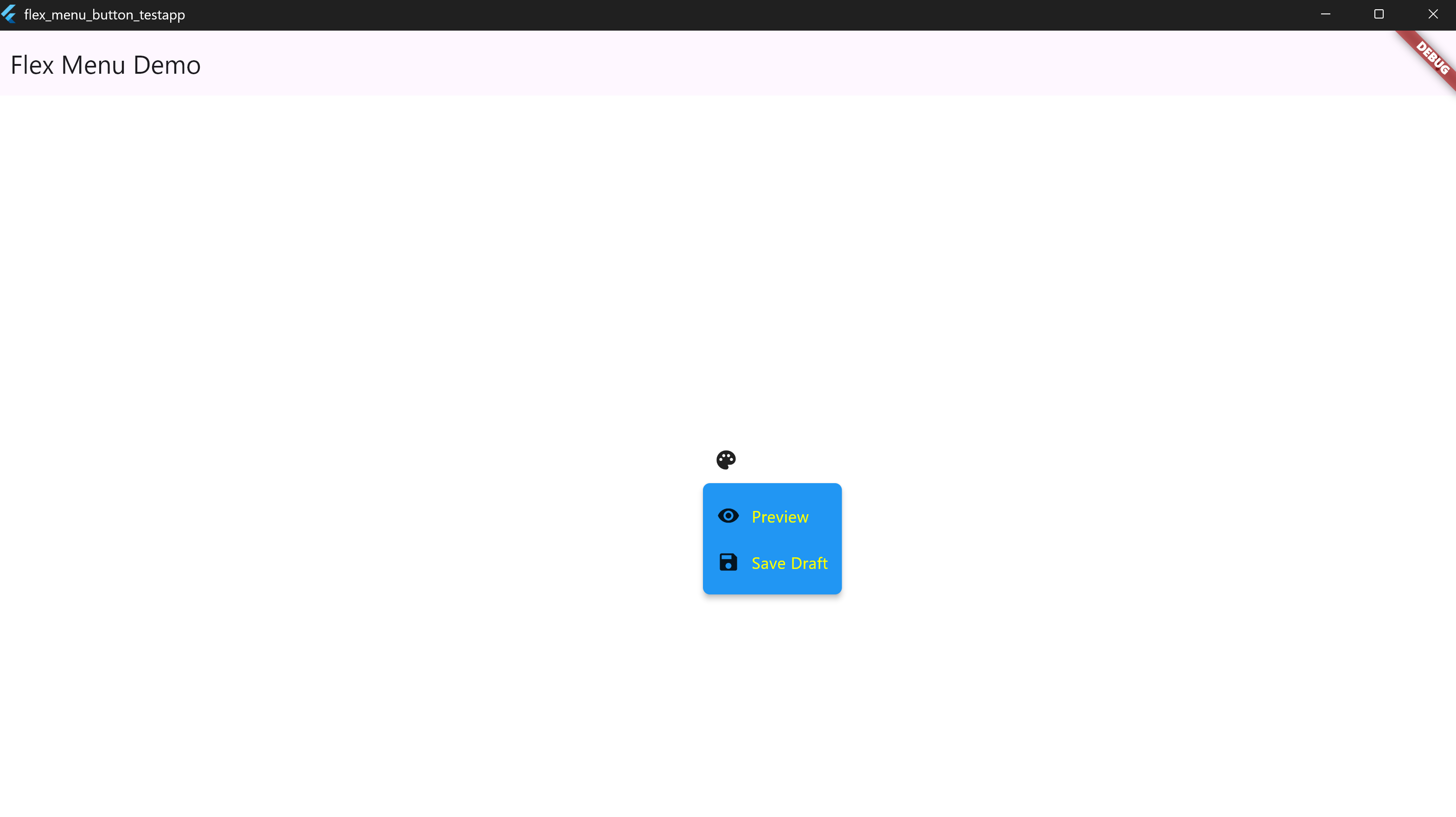
• 4. Custom Colors and Text Styles
MenuDropdownButton(
  tooltip: 'Styled Menu',
  icon: Icon(Icons.palette),
  config: MenuDropdownConfig(
    backgroundColor: Colors.blue,
    labelTextStyle: TextStyle(color: Colors.yellowAccent),
    tooltipBackgroundColor: Colors.black87,
    tooltipTextColor: Colors.white,
  ),
  items: [
    MenuItem(icon: Icon(Icons.visibility), label: 'Preview'),
    MenuItem(icon: Icon(Icons.save), label: 'Save Draft'),
  ],
)
📸 Screenshot:
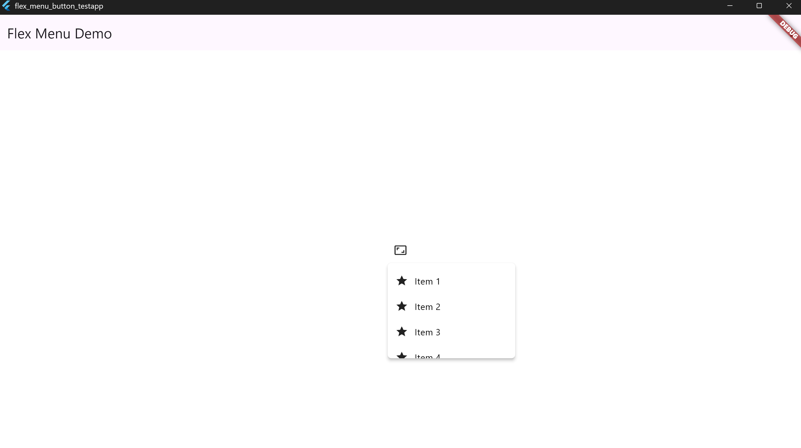
• 5. Fixed Width and Max Height
MenuDropdownButton(
  tooltip: 'Sized Menu',
  icon: Icon(Icons.aspect_ratio),
  config: MenuDropdownConfig(
    width: 200,
    maxHeight: 150,
  ),
  items: List.generate(
    10,
    (i) => MenuItem(icon: Icon(Icons.star), label: 'Item ${i + 1}'),
  ),
)
📸 Screenshot:
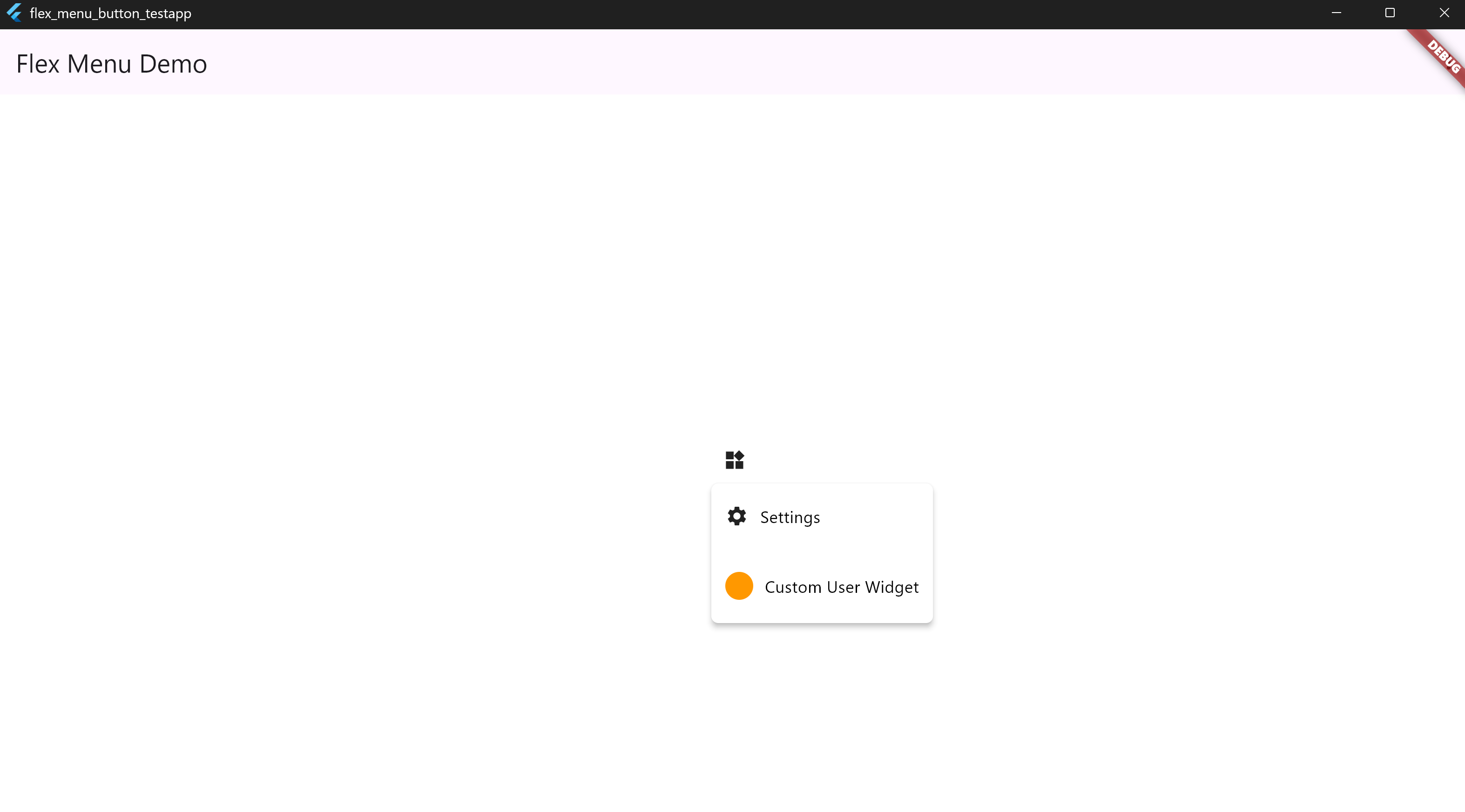
• 6. Divider and Custom Widgets
MenuDropdownButton(
  tooltip: 'Custom Items',
  icon: Icon(Icons.widgets),
  items: [
    MenuItem(icon: Icons.settings, label: 'Settings'),
    MenuItem(isDivider: true),
    MenuItem(
      customWidget: Padding(
        padding: EdgeInsets.all(12),
        child: Row(
          children: [
            CircleAvatar(radius: 12, backgroundColor: Colors.orange),
            SizedBox(width: 10),
            Text('Custom User Widget', style: TextStyle(color: Colors.white)),
          ],
        ),
      ),
    ),
  ],
)
📸 Screenshot:
• 7. Custom Icon Color & Size for the Root Button
MenuDropdownButton(
  icon: Icon(Icons.more_vert),
  tooltip: "Menu",
  iconColor: Colors.red,
  iconSize: 30,
  items: [
    MenuItem(icon: Icon(Icons.settings), label: 'Settings'),
    MenuItem(icon: Icon(Icons.logout), label: 'Logout'),
  ],
)
📸 Screenshot:

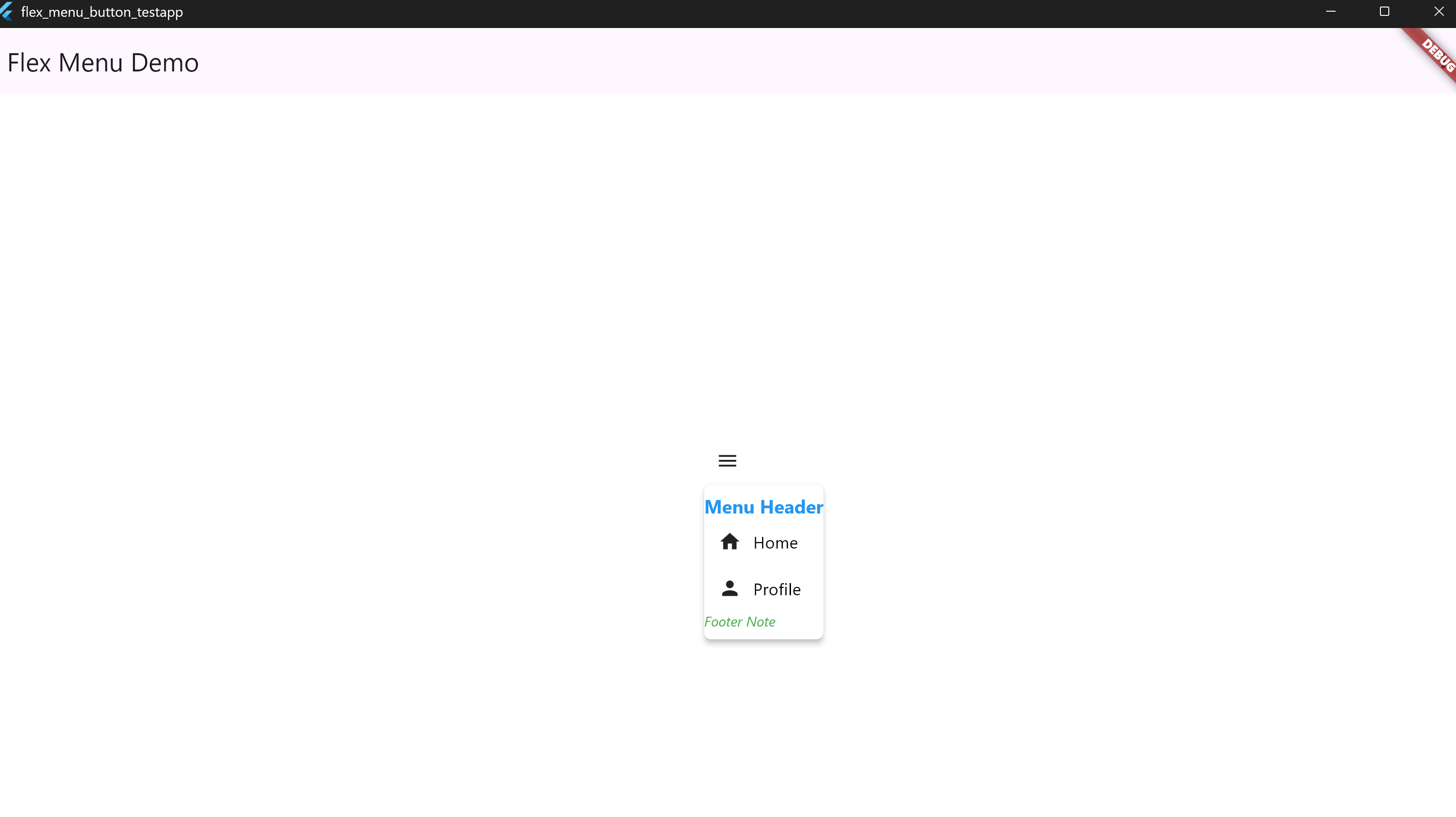
• 8. Custom Header & Footer Styles
MenuDropdownButton(
  icon: Icon(Icons.menu),
  tooltip: "Menu",
  header: Text('Menu Header'),
  footer: Text('Footer Note'),
  config: MenuDropdownConfig(
    headerTextStyle: TextStyle(
      color: Colors.blue,
      fontSize: 16,
      fontWeight: FontWeight.bold,
    ),
    footerTextStyle: TextStyle(
      color: Colors.green,
      fontSize: 12,
      fontStyle: FontStyle.italic,
    ),
  ),
  items: [
    MenuItem(icon: Icon(Icons.home), label: 'Home'),
    MenuItem(icon: Icon(Icons.person), label: 'Profile'),
  ],
)
📸 Screenshot:
• 9. Custom Tooltip Colors
MenuDropdownButton(
  icon: Icon(Icons.info),
  tooltip: "Info Tooltip",
  tooltipTextColor: Colors.black,
  tooltipBackgroundColor: Colors.yellow,
  items: [
    MenuItem(icon: Icon(Icons.help), label: 'Help'),
  ],
)
📸 Screenshot:

• 10. Label and Icon Colors for Items
MenuDropdownButton(
  icon: Icon(Icons.more_horiz),
  tooltip: "Options",
  items: [
    MenuItem(icon: Icon(Icons.edit), label: 'Edit'),
    MenuItem(icon: Icon(Icons.delete), label: 'Delete'),
  ],
  config: MenuDropdownConfig(
    backgroundColor: Colors.grey[850]!,
    itemIconColor: Colors.amber, // icon color
    labelTextStyle: TextStyle(color: Colors.cyan, fontSize: 16), // text style
    iconSize: 22,
  ),
)
📸 Screenshot:
• 11. Root Text Instead of Icon
MenuDropdownButton(
  tooltip: 'Open Menu',
  label: 'Menu',
  labelTextStyle: TextStyle(
    fontSize: 16,
    fontWeight: FontWeight.bold,
    color: Colors.blue,
  ),
  items: [
    MenuItem(icon: Icon(Icons.settings), label: 'Settings'),
    MenuItem(icon: Icon(Icons.logout), label: 'Logout'),
  ],
)
📸 Screenshot:

• 12. Root Icon + Text Combination
MenuDropdownButton(
  tooltip: 'Open Panel',
  icon: Icon(Icons.menu),
  rootText: 'Dashboard',
  rootTextStyle: TextStyle(
    fontSize: 15,
    color: Colors.deepPurple,
  ),
  items: [
    MenuItem(icon: Icon(Icons.dashboard), label: 'Overview'),
    MenuItem(icon: Icon(Icons.analytics), label: 'Reports'),
  ],
)
📸 Screenshot:
• 13. Custom Icon widget
MenuDropdownButton(
              buttonColor: Colors.greenAccent,
              tooltip: 'Options',
              icon: Icon(
                Icons.more_vert,
                color: Colors.white,
              ),
              items: [
                MenuItem(icon: Icon(Icons.edit), label: 'Edit', onTap: () {}),
                MenuItem(icon: Icon(Icons.delete), label: 'Delete', onTap: () {}),
              ],
            )
📸 Screenshot:
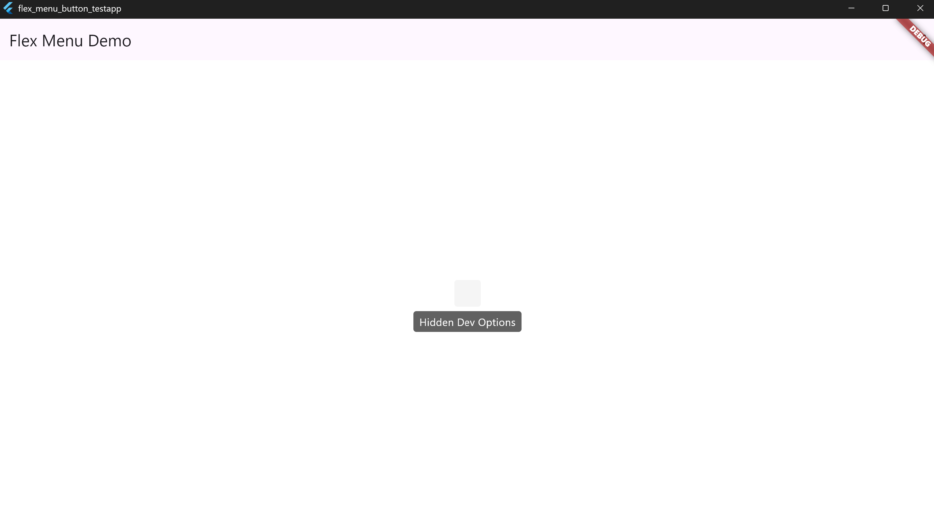
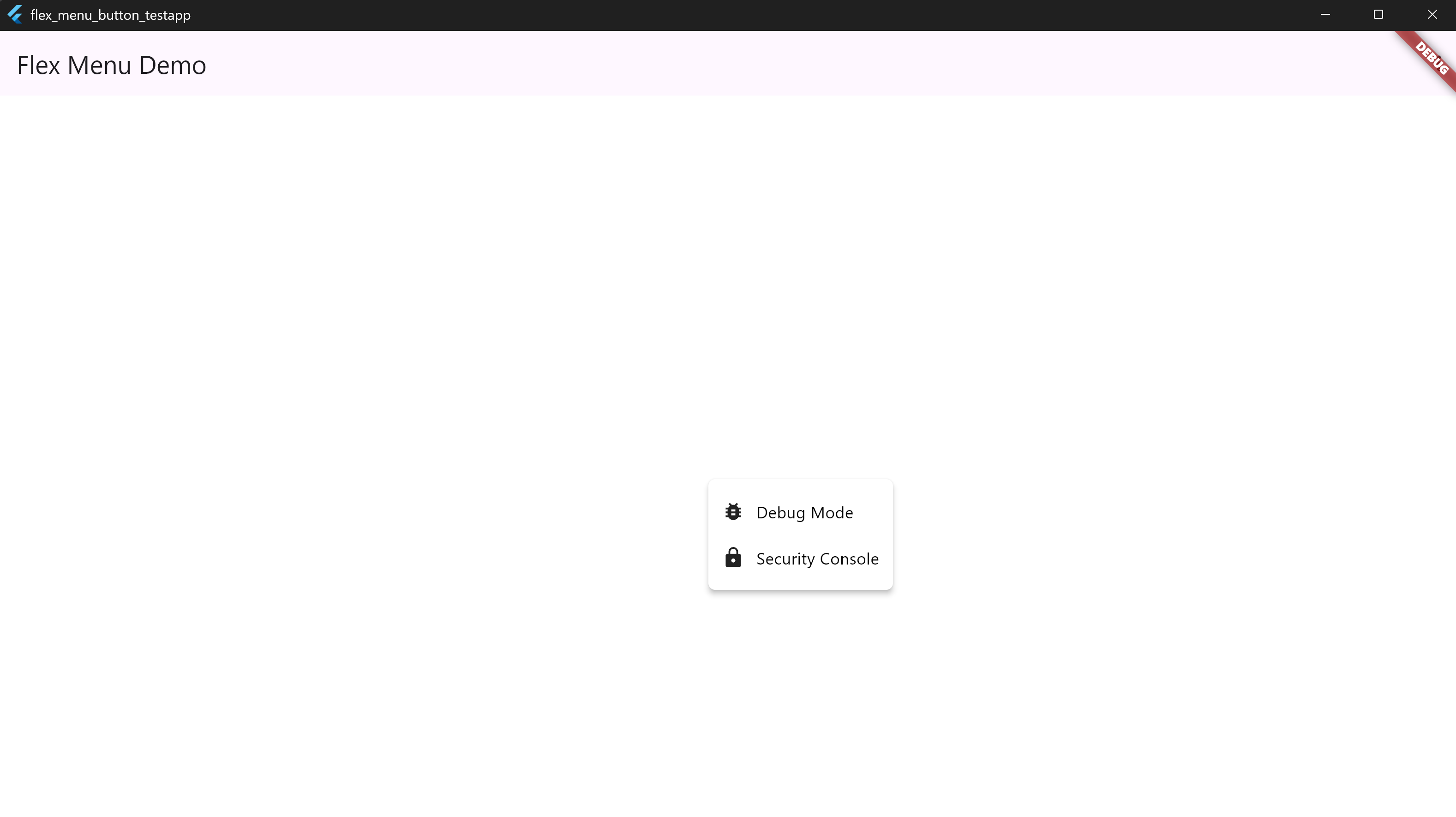
• 14. Invisible Trigger (Secret Function Example)
MenuDropdownButton(
  tooltip: 'Hidden Dev Options',
  items: [
    MenuItem(icon: Icon(Icons.bug_report), label: 'Debug Mode'),
    MenuItem(icon: Icon(Icons.lock), label: 'Security Console'),
  ],
)
📸 Screenshots:
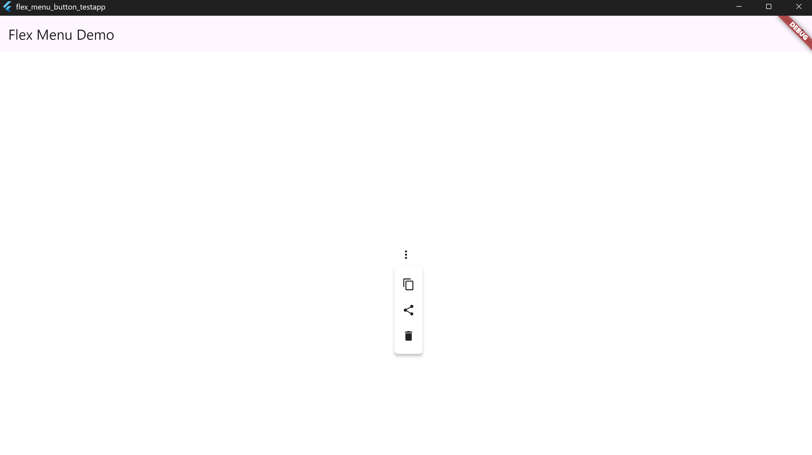
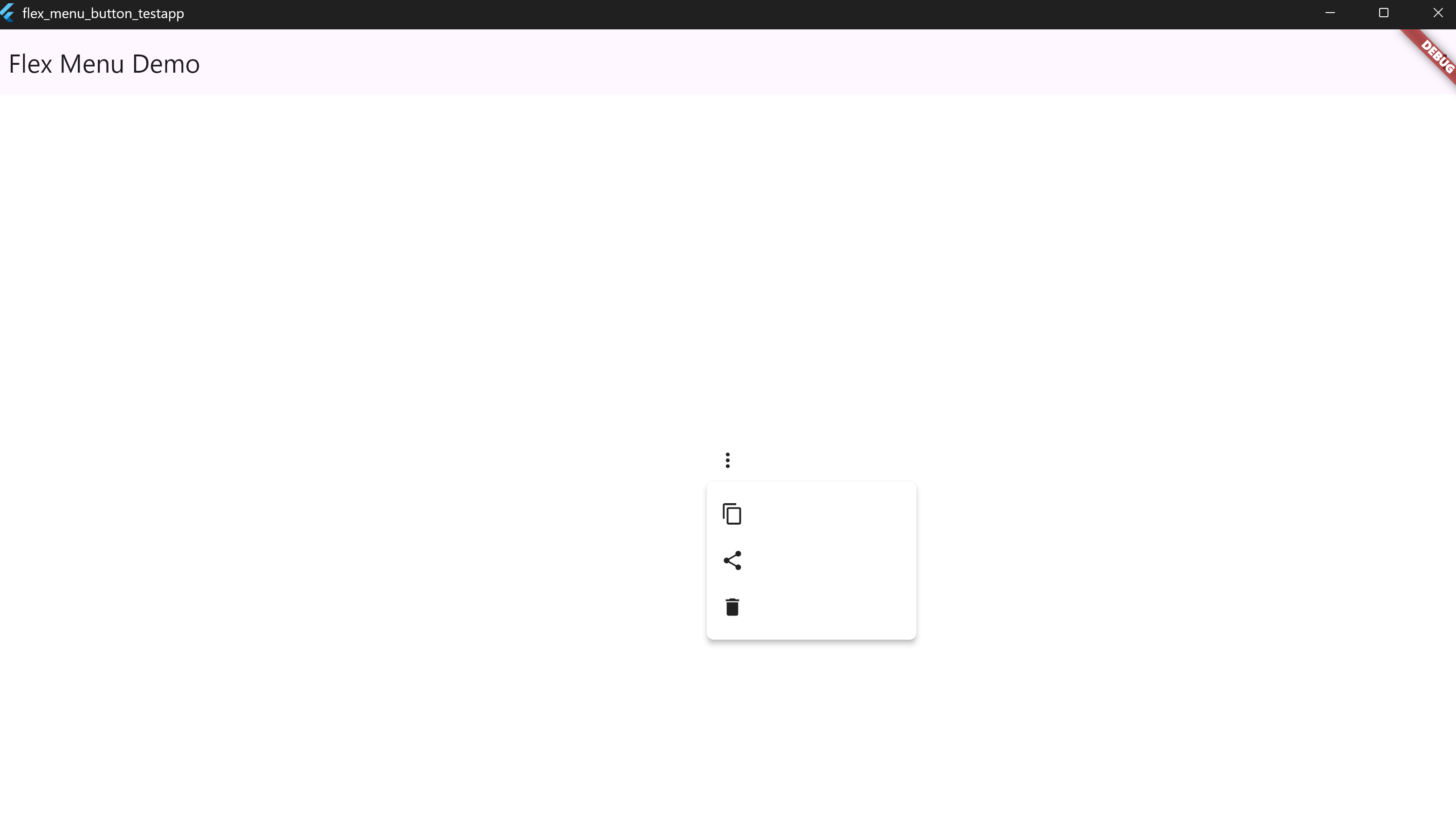
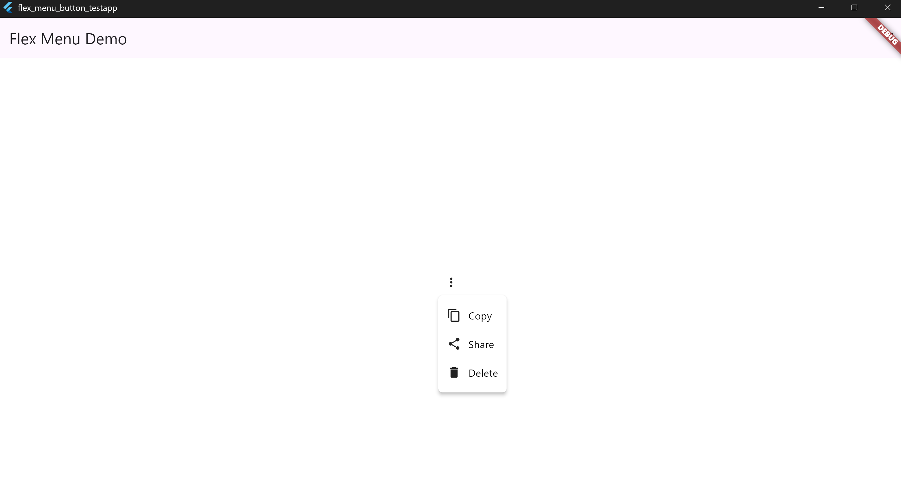
• 15. Dropdown Size Customization & Auto-Resizing
The flex_menu_button widget supports both automatic content-based sizing and manual width control.
🔍 Visual Comparison
| Icon Only (Auto) | Icon Only (Fixed Width) | Icon + Text (Auto) |
|---|---|---|
 |
 |
 |
✅ Example 1 – Icons Only (Auto-Sized)
MenuDropdownButton(
  icon: Icon(Icons.more_vert),
  tooltip: 'Options',
  config: MenuDropdownConfig(),
  items: [
    MenuItem(icon: Icon(Icons.copy), label: ''),
    MenuItem(icon: Icon(Icons.share), label: ''),
    MenuItem(icon: Icon(Icons.delete), label: ''),
  ],
)
📸 Screenshot:
✅ Example 2 – Icons Only (Fixed Width)
MenuDropdownButton(
  icon: Icon(Icons.more_vert),
  tooltip: 'Options',
  config: MenuDropdownConfig(
    width: 180,
  ),
  items: [
    MenuItem(icon: Icon(Icons.copy), label: ''),
    MenuItem(icon: Icon(Icons.share), label: ''),
    MenuItem(icon: Icon(Icons.delete), label: ''),
  ],
)
📸 Screenshot:
✅ Example 3 – Icons + Text (Auto-Sized)
MenuDropdownButton(
  icon: Icon(Icons.more_vert),
  tooltip: 'Options',
  config: MenuDropdownConfig(),
  items: [
    MenuItem(icon: Icon(Icons.copy), label: 'Copy'),
    MenuItem(icon: Icon(Icons.share), label: 'Share'),
    MenuItem(icon: Icon(Icons.delete), label: 'Delete'),
  ],
)
📸 Screenshot:
📝 Note:
If you don't specify a width in MenuDropdownConfig, the dropdown will scale based on the largest element (icon, label, or trailing widget). You can override this with a fixed width value if layout consistency is preferred.