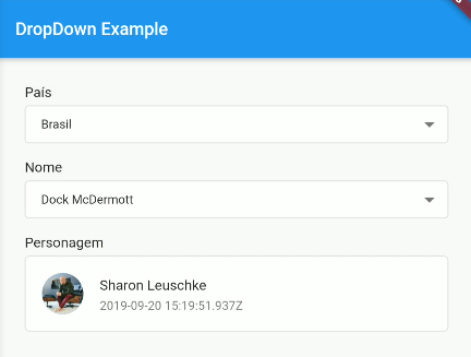
FindDropdown package - [ver em português]
Simple and robust FindDropdown with item search feature, making it possible to use an offline item list or filtering URL for easy customization.

Versions
Flutter 3.41.x / Dart 3.x: 1.0.2 or more
Null Safety (Dart 2.x): 1.0.0 – 1.0.1
Non Null Safety: 0.2.3 or less
RxDart 0.23.x or less: 0.1.7+1
pubspec.yaml
find_dropdown: ^1.0.2
Requires
sdk: ">=3.0.0 <4.0.0"and Flutter 3.41.x+.
Import
import 'package:find_dropdown/find_dropdown.dart';
Simple implementation
FindDropdown<String>(
  items: const ["Brasil", "Itália", "Estados Unidos", "Canadá"],
  label: "País",
  onChanged: (String? item) => log('$item'),
  selectedItem: "Brasil",
);
Multiple selectable items
FindDropdown<String>.multiSelect(
  items: const ["Brasil", "Itália", "Estados Unidos", "Canadá"],
  label: "País",
  onChanged: (List<String> items) => log('$items'),
  selectedItems: const ["Brasil"],
);
FindDropdownChip (display as Chip)
FindDropdownChip shows selected item(s) as Material Design Chip widgets. In multiSelect mode, each chip has a delete button.
// Single selection
FindDropdownChip<String>(
  items: const ["Brasil", "Itália", "Estados Unidos", "Canadá"],
  label: "País",
  selectedItem: "Brasil",
  onChanged: (String? item) => log('$item'),
);

// Multiple selection (each chip has onDeleted)
FindDropdownChip<String>.multiSelect(
  items: const ["Flutter", "Dart", "Widget", "Material"],
  label: "Tags",
  selectedItems: const ["Flutter", "Dart"],
  showClearButton: true,
  onChanged: (List<String> items) => log('$items'),
);
Use chipBuilder to customize each chip. Use FindDropdownChipState and GlobalKey for clear() and setSelectedItem().
Validation
FindDropdown<String>(
  items: const ["Brasil", "Itália", "Estados Unidos", "Canadá"],
  label: "País",
  onChanged: (String? item) => log('$item'),
  selectedItem: "Brasil",
  validate: (String? item) {
    if (item == null) return "Required field";
    if (item == "Brasil") return "Invalid item";
    return null; // null means no error
  },
);
Endpoint implementation (using Dio package)
FindDropdown<UserModel>(
  label: "Nome",
  onFind: (String filter) async {
    final response = await Dio().get<List<dynamic>>(
      "http://5d85ccfb1e61af001471bf60.mockapi.io/user",
      queryParameters: {"filter": filter},
    );
    return UserModel.fromJsonList(response.data ?? []);
  },
  onChanged: (UserModel? data) => log('$data'),
);
Clear selected items
final countriesKey = GlobalKey<FindDropdownState<String>>();

Column(
  children: [
    FindDropdown<String>(
      key: countriesKey,
      items: const ["Brasil", "Itália", "Estados Unidos", "Canadá"],
      label: "País",
      selectedItem: "Brasil",
      showSearchBox: false,
      onChanged: (selectedItem) => log("country: $selectedItem"),
    ),
    ElevatedButton(
      onPressed: () => countriesKey.currentState?.clear(),
      child: const Text('Limpar Países'),
    ),
  ],
)
Change selected items
final countriesKey = GlobalKey<FindDropdownState<String>>();

Column(
  children: [
    FindDropdown<UserModel>(
      label: "Nome",
      onFind: (String filter) => getData(filter),
      searchBoxDecoration: const InputDecoration(
        hintText: "Search",
        border: OutlineInputBorder(),
      ),
      onChanged: (UserModel? data) {
        log('$data');
        countriesKey.currentState?.setSelectedItem("Brasil");
      },
    ),
    FindDropdown<String>(
      key: countriesKey,
      items: const ["Brasil", "Itália", "Estados Unidos", "Canadá"],
      label: "País",
      selectedItem: "Brasil",
      showSearchBox: false,
      onChanged: (selectedItem) => log("country: $selectedItem"),
    ),
  ],
)
MORE EXAMPLES
Theme customization
You can customize colors and typography using FindDropdownThemeData:
FindDropdown<String>(
  items: const ["Brasil", "Itália", "Estados Unidos", "Canadá"],
  label: "País",
  onChanged: (item) => log('$item'),
  selectedItem: "Brasil",
  theme: FindDropdownThemeData(
    dropdownBackgroundColor: Colors.grey.shade100,
    dropdownBorderColor: Colors.blue,
    iconColor: Colors.blueGrey,
    validationErrorColor: Colors.orange,
    fontFamily: 'Roboto',
    selectedItemStyle: TextStyle(fontSize: 16, color: Colors.black87),
  ),
);
Properties: dropdownBackgroundColor, dropdownBorderColor, iconColor, selectedItemStyle, validationErrorColor, validationMessageStyle, fontFamily. All are optional; when omitted, default values are used.
Layout customization
You can customize the layout of the FindDropdown and its items. EXAMPLE
To customize the FindDropdown, we have the dropdownBuilder property, which takes a function with the parameters:
BuildContext context: current context;T item: Current item, where T is the type passed in the FindDropdown constructor.
To customize the items, we have the dropdownItemBuilder property, which takes a function with the parameters:
BuildContext context: current context;T item: Current item, where T is the type passed in the FindDropdown constructor.bool isSelected: Boolean that tells you if the current item is selected.
Attention
To use a template as an item type, you need to implement toString, equals and hashcode, as shown below:
class UserModel {
  final String id;
  final DateTime? createdAt;
  final String name;
  final String avatar;

  UserModel({
    required this.id,
    required this.createdAt,
    required this.name,
    required this.avatar,
  });

  @override
  String toString() => name;

  @override
  bool operator ==(Object other) => other is UserModel && other.id == id;

  @override
  int get hashCode => id.hashCode ^ name.hashCode ^ createdAt.hashCode;
}
Libraries
- find_dropdown
- find_dropdown_bloc
- find_dropdown_chip
- find_dropdown_theme
- rxdart/behavior_subject
- rxdart/defer
- rxdart/error_and_stacktrace
- rxdart/forwarding_sink
- rxdart/forwarding_stream
- rxdart/rx
- rxdart/start_with
- rxdart/start_with_error
- rxdart/subject
- rxdart/value_stream
- rxdart/value_wrapper
- validation_message_widget