Features
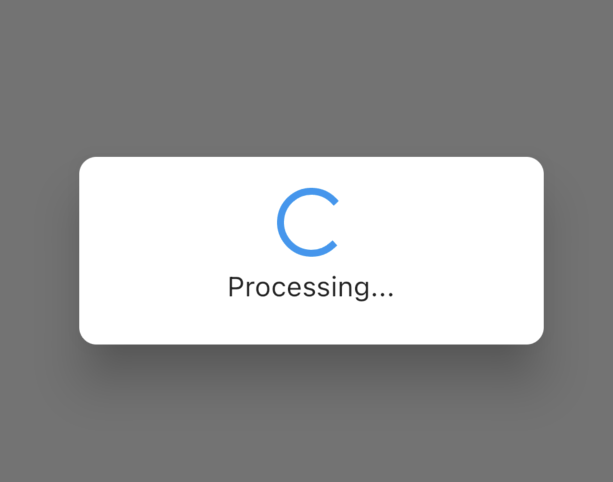
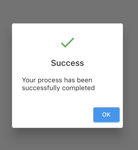
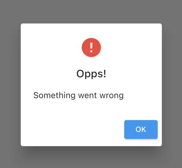
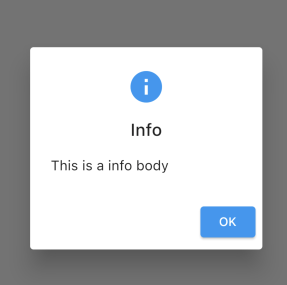
Info Dialog, Progress Dialog, Success Dialog, Fail Dialog, Error Dialog, Custom Action Dialog,
to use the desired dialog type on the desired screen and to close it according to the dialog type on the screen.
Dialogs contents support localization.
NOTE
You don't need to add localization under material app when using custom dialog. Where you use Custom Dialog you can add these fields from your localization variable or file.
Images
 |
 |
 |
 |
 |
 |
Usage
to main.dart file.
class MyApp extends StatefulWidget {
const MyApp({Key? key}) : super(key: key);
@override
State<MyApp> createState() => _MyAppState();
}
class _MyAppState extends State<MyApp> {
@override
Widget build(BuildContext context) {
return FDialog(
theme: ThemeData(),
child: MaterialApp(
builder: (context, child) {
FDialog.of(context)
.setLocalization(const Localization(
errorContent: 'Something went wrong',
errorTitle: 'Opps!',
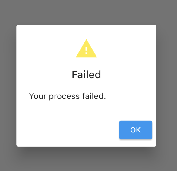
failedContent: 'Your process failed.',
failedTitle: 'Failed',
infoContent: 'This is a info body',
onCancelText: 'Cancel',
infoTitle: 'Info',
onConfirmText: 'OK',
processingContent: 'Processing...',
processingTitle: 'Process',
successTitle: 'Success',
successContent:
'Your process has been successfully completed',
));
return const Scaffold(
body: MyHomePage(),
);
},
),
);
}
}
To create a dialog
   FDialog.of(context)?.show(
              context,
              dialogType: DialogTypeEnums.success,
              icon: const Icon(
                Icons.safety_check_rounded,
              ),
              customPadding:
                  const EdgeInsets.all(20),
            );
To close the last Dialog shown on the screen.
FDialog.close(context);
To close a specific dialog that appears on the screen.
  FDialog.close(context,
                  DialogTypeEnums.progress);
To create custom dialog
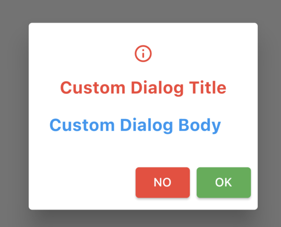
 FDialog.of(context).custom(
              context,
              icon: const Icon(
                Icons.info_outline_rounded,
                color: Colors.red,
              ),
              backgroundColor: Colors.white,
              isDismissible: false,
              customDialogTitle:
                  'Custom Dialog Title',
              customDialogBody:
                  'Custom Dialog Body',
              onConfirmText: 'OK',
              onCancelText: 'NO',
              onConfirmButtonStyle: ButtonStyle(
                  backgroundColor:
                      MaterialStateProperty.all(
                          Colors.green)),
              onCancelButtonStyle: ButtonStyle(
                  backgroundColor:
                      MaterialStateProperty.all(
                          Colors.red)),
              contentTextStyle: const TextStyle(
                  fontWeight: FontWeight.bold,
                  color: Colors.blue,
                  fontSize: 20),
              titleTextStyle: const TextStyle(
                  fontWeight: FontWeight.bold,
                  color: Colors.red,
                  fontSize: 20),
              onCancel: () {
                Navigator.pop(context);
              },
              onConfirm: () {
                Navigator.pop(context);
              },
            );
TODO
More dialog types and custom features will be added.