Flutter Emoji Alert
A new Stylish Emoji Alert with a wide variety of emojis, simple to implement and full customizable.
Features
- Single line basic alert with default emoji
- Add dynamic widgets not only text any widget you want
- Add buttons with their onPress handlers
- Choose the alert display behavior : Normal Alert or Bottom Sheet dialog
- Choose an emoji from a variety of emojis
Getting Started
To add emoji_alert to your project add this line to your pubspec.yaml
dependencies:
	emoji_alert: 1.0.0
Or you can reference the github repository directly
dependencies:
	emoji_alert:
		git: https://github.com/koukibadr/Emoji_Alert.git
Parameters
| Attribute | Type | Default Value | Required | Description |
|---|---|---|---|---|
| description | Widget | N/A | True | The alert body content |
| alertTitle | Widget | N/A | False | The alert top content |
| enableMainButton | bool | False | False | Display or not the popup's main button |
| enableSecondaryButton | bool | False | True | Whether display or not the secondary button |
| onSecondaryButtonPressed | Function | null | False | The function that will be invoked on pressing the secondary button |
| onMainButtonPressed | Function | null | False | The function that will be invoked on pressing the main button |
| emojiType | EMOJI_TYPE | HAPPY | False | the emoji that will be displayed possible values: ANGRY, CONFUSED, COOL, HAPPY, JOYFUL, LAUGHING, SAD, SCARED, SHOCKED, SMILE, WINK |
| height | double | 200 | False | the height of the popup |
| emojiSize | double | 80 | False | the size of the emoji |
| background | Color | White | False | the popup background color |
| mainButtonColor | Color | Blue | False | The main button background color |
| secondaryButtonColor | Color | Blue | False | the secondary button color, PS: an opacity value will be added to this color |
| mainButtonText | Text | Text("Confirm") |
False | the main button text |
| secondaryButtonText | Text | Text("Cancel") |
False | the secondary button text |
| buttonSize | double | 200 | False | buttons width size |
| cancelButtonColorOpacity | double | 0.2 | False | an opacity will be added to the secondary button background color |
| cancelable | bool | True | False | Whether the popup can be dismissed on pressing outside it or not |
| cornerRadiusType | CORNER_RADIUS_TYPES | BOTTOM_ONLY | False | the border radius type, possible values: BOTTOM_ONLY, TOP_ONLY, ALL_CORNERS, NONE |
| width | double | null | False | the popup width by default it's null |
Examples
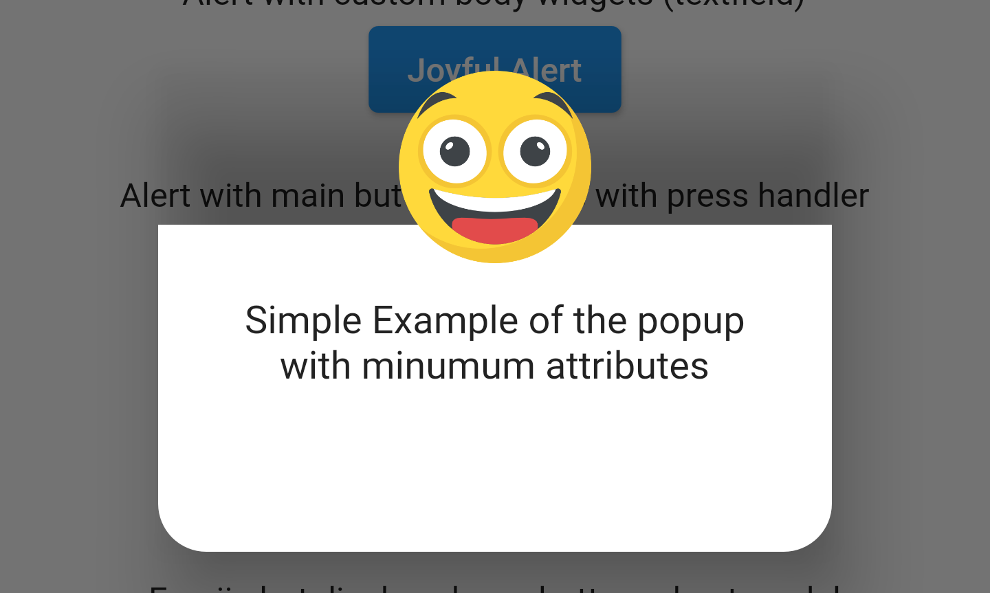
Simple alert with just a text in the body content
EmojiAlert(
	description:  Column(
		children: [
			Text("Simple Example of the popup"),
			Text("with minumum attributes"),
		],
)).displayAlert(context);
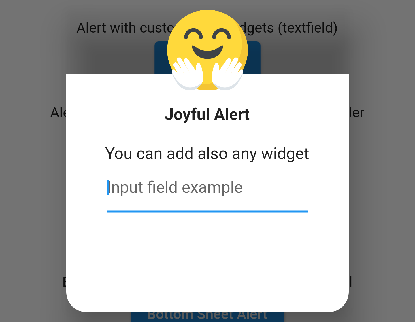
Example with custom widget in the popup content body
EmojiAlert(
	alertTitle: Text("Joyful Alert", style:  TextStyle(fontWeight:  FontWeight.bold)),
	description:  Column(
		children: [
			Text("You can add also any widget"),
			Container(
				width:  200,
				child:  TextField(
					decoration:  InputDecoration(hintText:  "Input field example"),
				)),
			],
	),
	cancelable:  true,
	emojiType:  EMOJI_TYPE.JOYFUL,
	height:  300,
).displayAlert(context);
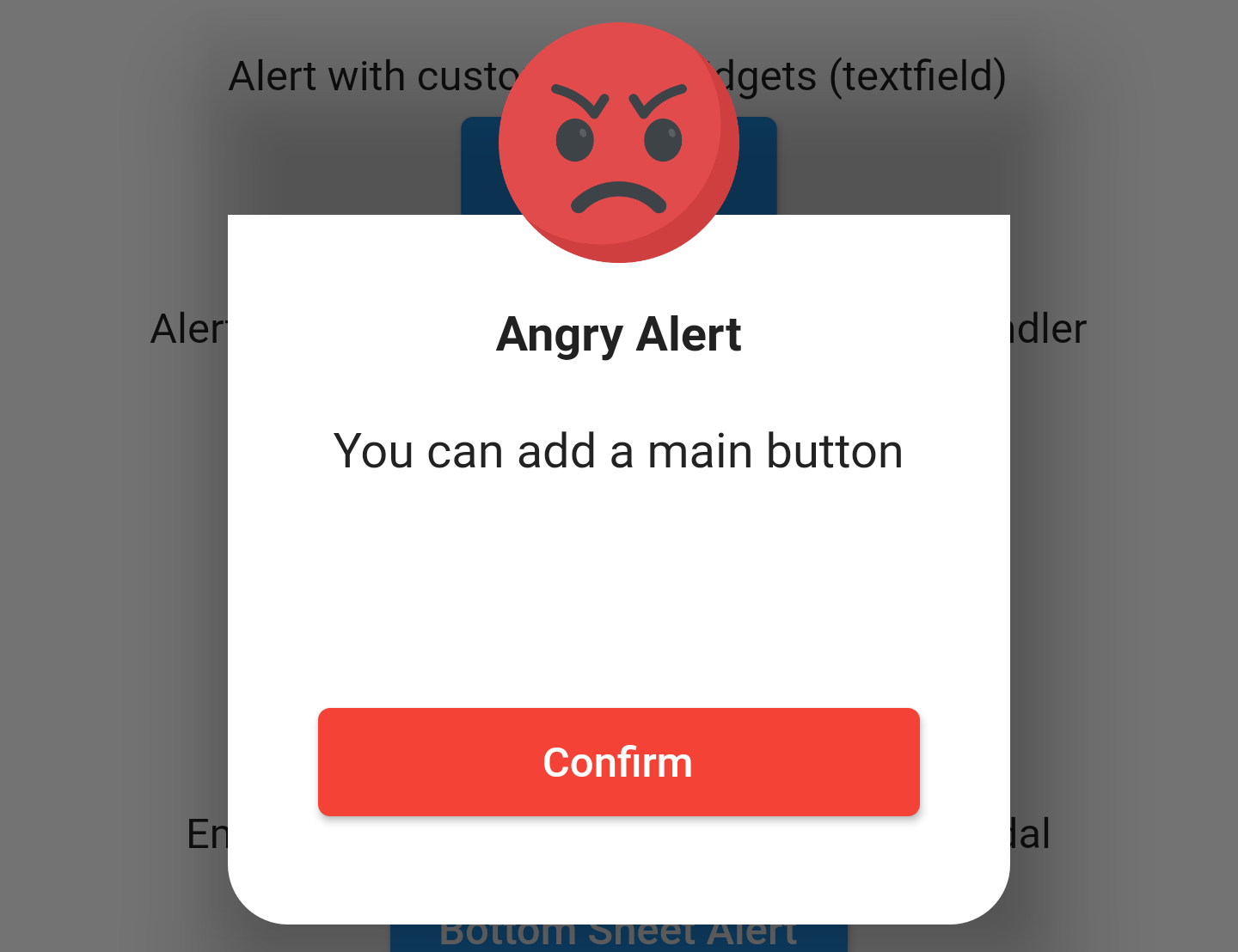
EmojiAlert(
	alertTitle: Text("Angry Alert", style:  TextStyle(fontWeight:  FontWeight.bold)),
	description:  Column(
		children: [
			Text("You can add a main button"),
		],
	),
	enableMainButton:  true,
	mainButtonColor:  Colors.red,
	onMainButtonPressed: () {
		print("Hello");
		Navigator.pop(context);
	},
	cancelable:  false,
	emojiType:  EMOJI_TYPE.ANGRY,
	height:  300,
).displayAlert(context);
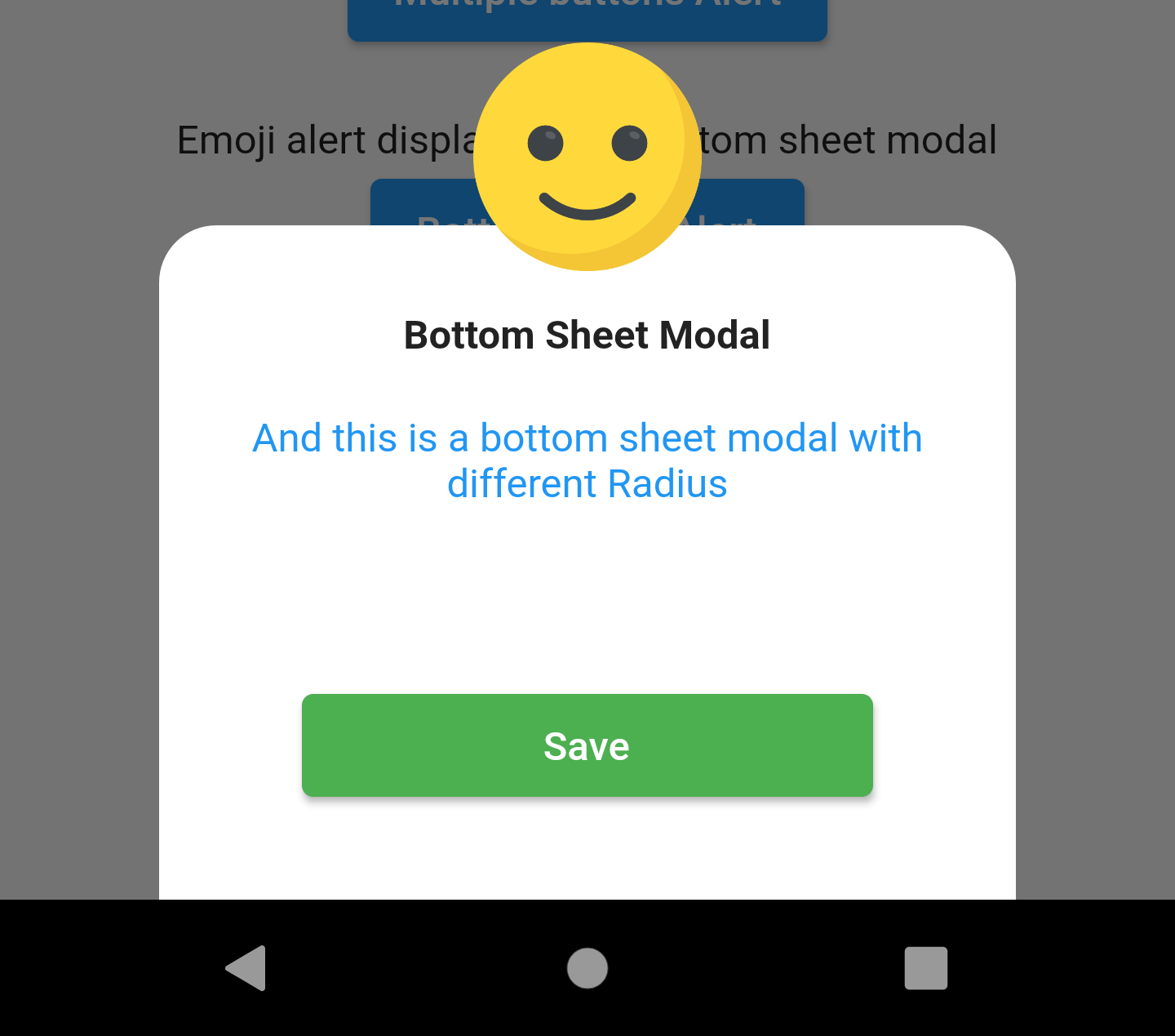
Bottom Sheet Modal
to display it as bottom sheet modal you need to use displayBottomSheet function
And you can display it as a bottom sheet modal, the code below is an example
EmojiAlert(
	alertTitle:  Text("Bottom Sheet Modal",
		style:  TextStyle(fontWeight:  FontWeight.bold)),
	description:  Column(
		children: [
			Text("And this is a bottom sheet modal with different Radius",
				style:  TextStyle(color:  Colors.blue),
				textAlign:  TextAlign.center,
			),
		],
	),
	enableMainButton:  true,
	cornerRadiusType:  CORNER_RADIUS_TYPES.TOP_ONLY,
	mainButtonColor:  Colors.green,
	mainButtonText:  Text("Save"),
	onMainButtonPressed: () {
		Navigator.pop(context);
	},
	cancelable:  true,
	emojiType:  EMOJI_TYPE.SMILE,
	width:  300,
	height:  300,
).displayBottomSheet(context);
Contribution
Of course the project is open source, and you can contribute to it repository link
- If you found a bug, open an issue.
- If you have a feature request, open an issue.
- If you want to contribute, submit a pull request.