Easy Dashboard
Provides an easy way to build dashboard layout for your app , but still yet very customizable .
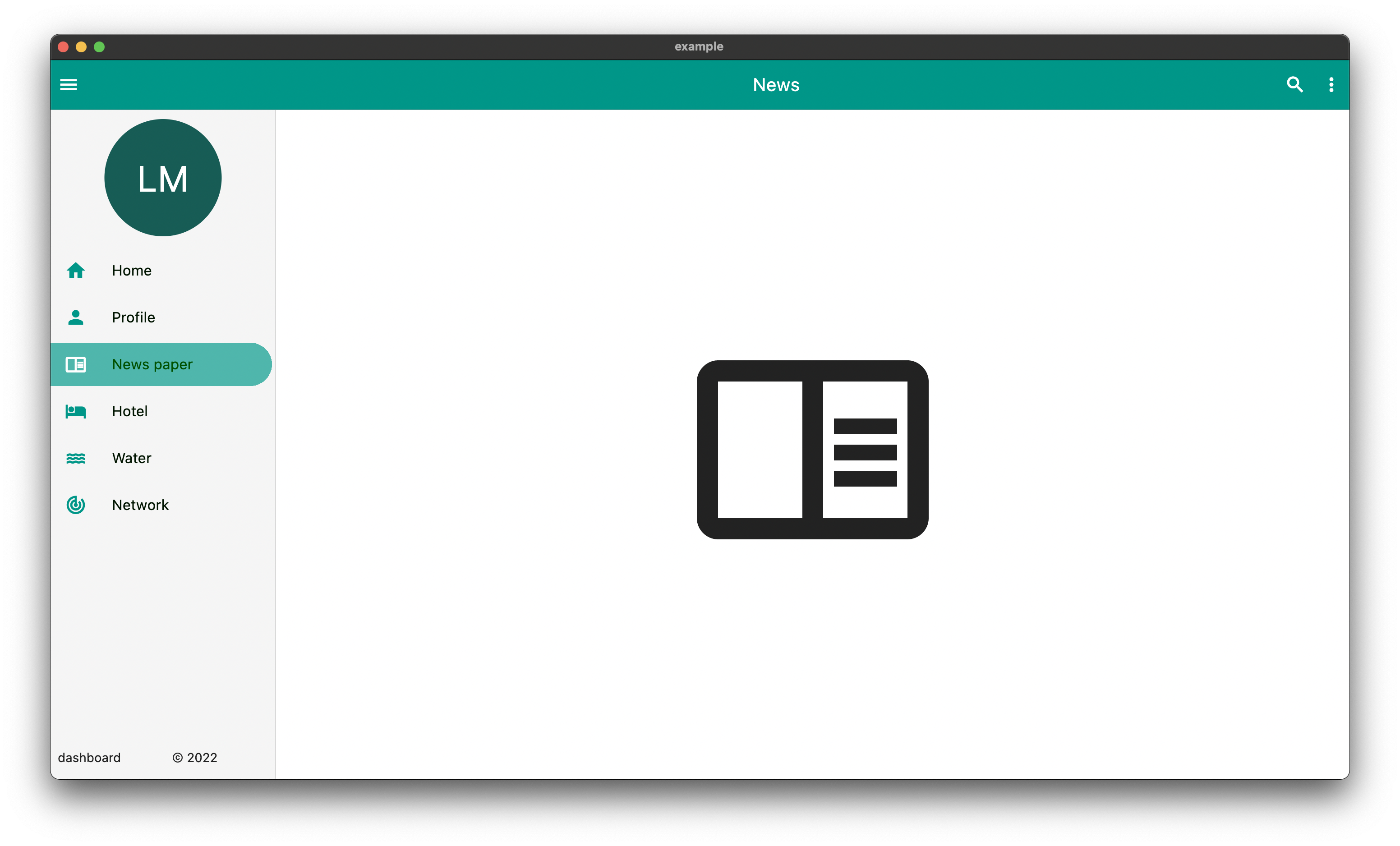
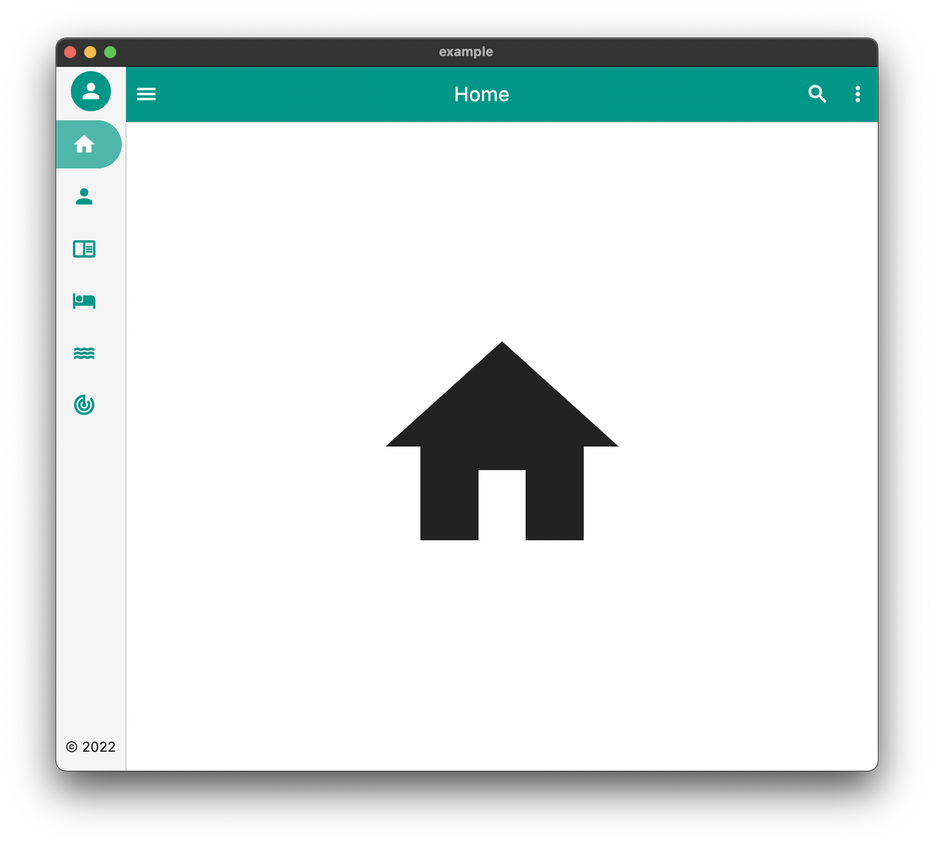
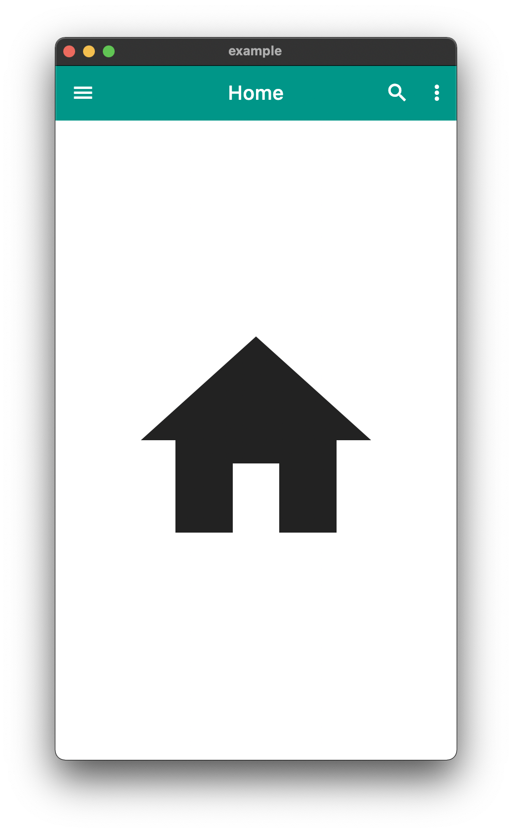
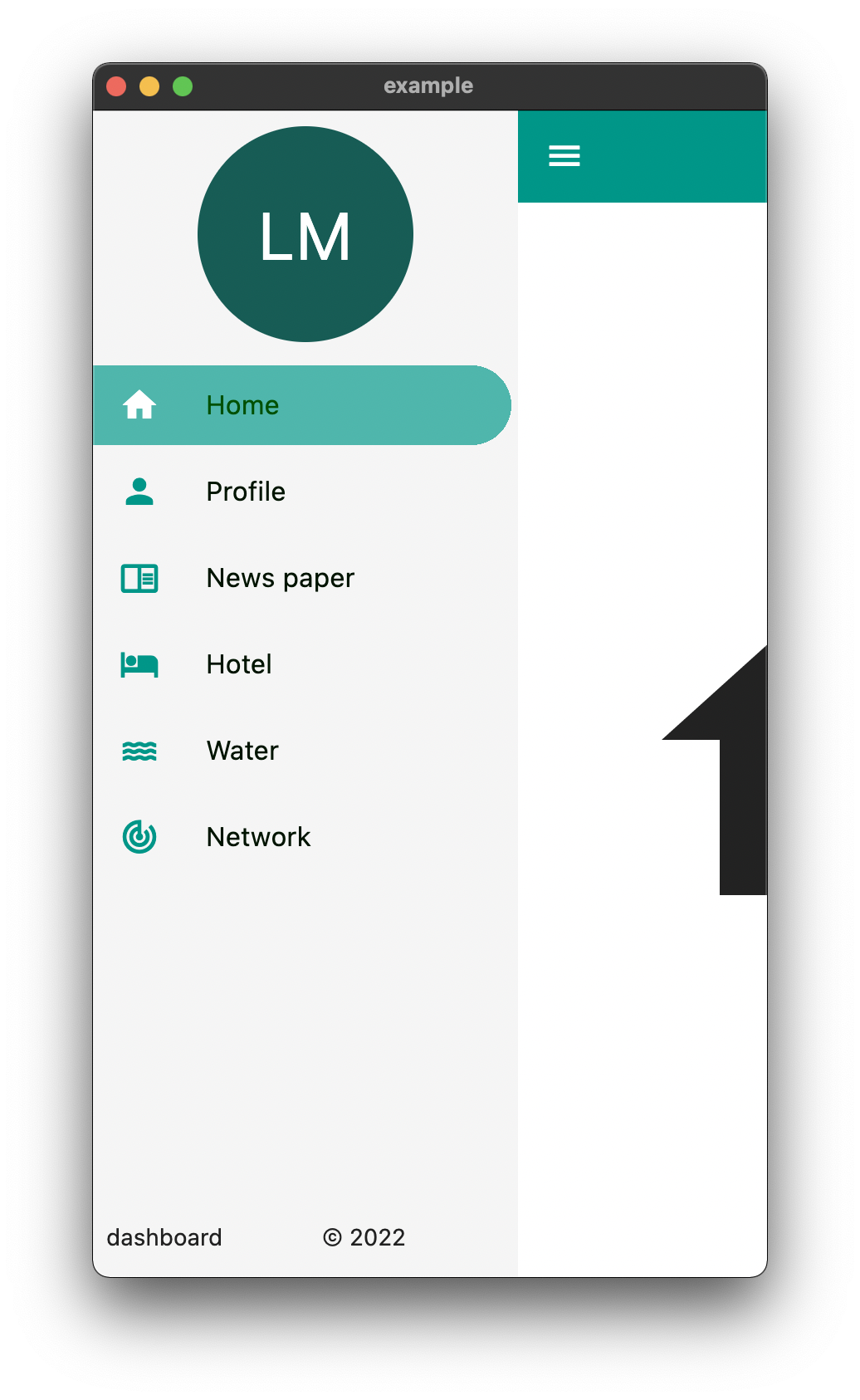
| DeskTop | Tablet | Mobile |
|---|---|---|
 |
 |
  |
The above is an example of an app created with the package
Example Usage
  Widget build(BuildContext context) {
    return EasyDashboard(
      controller: controller,
      navigationIcon: const Icon(Icons.menu, color: Colors.white),
      appBarActions: actions,
      centerTitle: true,
      appBarColor: Colors.teal,
      sideBarColor: Colors.grey.shade100,
      tabletView: const TabletView(
        fullAppBar: false,
        border: BorderSide(width: 0.5, color: Colors.grey),
      ),
      desktopView: const DesktopView(
        fullAppBar: true,
        border: BorderSide(width: 0.5, color: Colors.grey),
      ),
      drawer: (Size size, Widget? child) {
        return EasyDrawer(
          iconColor: Colors.teal,
          hoverColor: Colors.grey.shade300,
          tileColor: Colors.grey.shade100,
          selectedColor: Colors.black.withGreen(80),
          selectedIconColor: Colors.white,
          textColor: Colors.black.withGreen(20),
          selectedTileColor: Colors.teal.shade400.withOpacity(.8),
          tiles: tiles,
          topWidget: SideBox(
            scrollable: true,
            height: 150,
            child: topOpenWidget,
          ),
          bottomWidget: SideBox(
            scrollable: false,
            height: 50,
            child: bottomOpenWidget,
          ),
          bottomSmallWidget: SideBox(
            height: 50,
            child: bottomSmallWidget,
          ),
          topSmallWidget: SideBox(
            height: 50,
            child: topSmallWidget,
          ),
          size: size,
          onTileTapped: (body) {
            controller.switchBody(body);
          },
        );
      },
    );
  }
The above example can be found in the /example folder
API
| component | usage |
|---|---|
| body | The default body for the dashboard |
| duration | The Duration of the animation when the EasyDashboard is opened or closed among others. |
| mobileBreakpoint | The pixels at which the ui breaks into the mobile view |
| tabletBreakpoint | The pixels at which the ui breaks into the tablet view |
| mobileView | Display properties while in tablet view such as dashboard style |
| tabletView | Display properties while in tablet view such as dashboard style |
| desktopView | Display properties while in desktop view such as dashboard style |
| tabletMode | What to show when the mobile break point is reached, |
| mobileMode | What to show when the tablet break point is reached |
| desktopMode | What to show when the desktop break point is reached |
| floatingActionButtonLocation | Floating Action Button Location |
| floatingActionButton | Floating Action Button |
| systemOverlayStyle | System Overlay Style |
| floatingActionButtonAnimator | Floating Action Button Animator |
| appBarHeight | The height of the app bar |
| centerTitle | Whether or not the appbar title is centered |
| backgroundColor | General background color of the EasyDashboard |
| navigationIcon | The icon that will control the responsive navigation of the EasyDashboard |
| navigationIconSplashRadius | The splash radius of the navigation icon when pressed |
| appBarColor | The color of the app bar |
| sideBarColor | The color of the sidebar navigation |
| appBarActions | A list of Widgets for the AppBaractions |
| drawer | An drawer widget that will be displayed on the left side of the EasyDashboard. You can use the pre-built EasyDrawer to create a faster easier drawer . |
Issues and Feedback
This is a fairly new package
Please feel free to report any issues you face
Also PR's and additional feedback is appreciated
