dotted_decoration
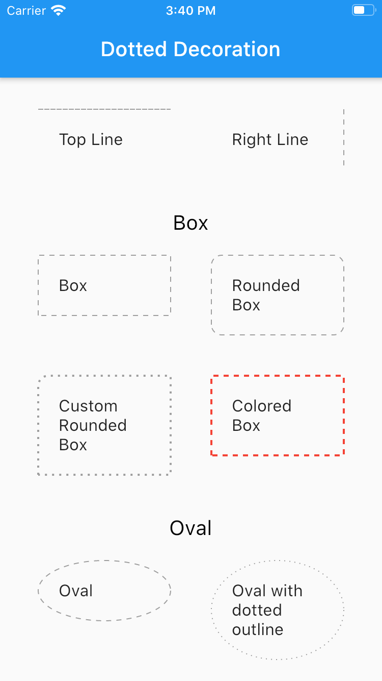
Dotted line decoration is custom decoration as simple as BoxDocoration can be used in Container widget to draw dotted divider, dotted border for rectangle, oval or circle.
Preview

Installing
To use this package, add dotted_decoration as a dependency in your pubspec.yaml file.
Usage
Create a container widget and assign DottedDecoration as decoration
Container(
    decoration: DottedDecoration()
    child: Text('Dotted Decoration')
)
Container(
    decoration: DottedDecoration()
    child: Text('Dotted Decoration')
)
To draw line
DottedDecoration(
  shape: Shape.line, linePosition: LinePosition.bottom),
To add rounded rection
DottedDecoration(
  shape: Shape.box,
  borderRadius: BorderRadius.circular(10), //remove this to get plane rectange
),
To add circle
//make sure width & height of container is same to get perfect circle or else it will end up in oval
DottedDecoration(shape: Shape.circle, dash: <int>[1, 4]);
Parameters
Shape
Kind of outline shape, default shape is Shape.line.
shape: Shape.line
shape: Shape.box
shape: Shape.oval
linePosition
Where line is located, default shape is LinePosition.bottom.
linePosition: LinePosition.bottom
linePosition: LinePosition.left
linePosition: LinePosition.right
linePosition: LinePosition.top
dash
Border line order, first in dash and second is space.
dash: <int>[2, 5]
strokeWidth
Line width.
strokeWidth: 2
color
Color of line, default shape is Colors.grey.
color: Colors.red