Dots Menu
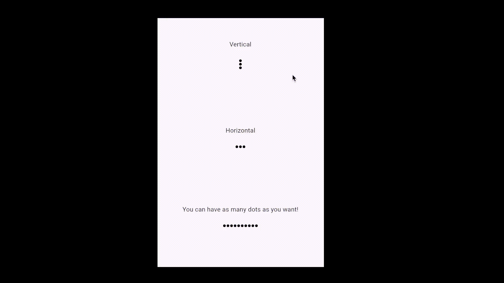
Demo
See the Dots Menu widget in action:
A Flutter widget that provides a beautiful, animated "dots menu" for actions, supporting both horizontal and vertical layouts. Easily customizable, it allows you to present a compact menu that expands to reveal action icons—perfect for contextual menus or action bars.
Motivation
Standard action menus in Flutter often require custom logic for animation, layout, and state management. This can add boilerplate and complexity, especially when you want a polished, animated, and reusable menu component.
DotsMenu abstracts away the animation and layout, letting you focus on your actions and UI. It’s ideal for cases where you want a minimal, modern menu that expands to show multiple actions.
Features
- Animated: Smoothly transitions between collapsed (dots) and expanded (action icons) states.
- Customizable: Control direction, colors, sizes, spacing, and more.
- Flexible: Supports any number of actions, each with its own icon, color, and callback.
- Declarative API: Manage expansion state from your parent widget for full control.
Getting Started
Add this to your package's pubspec.yaml file:
dependencies:
  dots_menu: ^1.0.0 # Use the latest version
Then, install packages from the command line:
flutter pub get
Usage
Import the package in your Dart code:
import 'package:dots_menu/dots_menu.dart';
Here is a simple example demonstrating how to use DotsMenu:
class MyHomePage extends StatefulWidget {
  const MyHomePage({super.key, required this.title});
  final String title;

  @override
  State<MyHomePage> createState() => _MyHomePageState();
}

class _MyHomePageState extends State<MyHomePage> {
  bool expanded = false;

  void setExpanded(bool value) => setState(() => expanded = value);

  @override
  Widget build(BuildContext context) {
    return Center(
      child: DotsMenu(
        expanded: expanded,
        direction: Axis.vertical,
        onTap: () => setExpanded(true),
        items: [
          DotsMenuIcon(
            backgroudColor: Colors.blue.shade100,
            child: const Icon(Icons.edit, size: 18),
            onTap: () {
              // Your edit action
              setExpanded(false);
            },
          ),
          DotsMenuIcon(
            backgroudColor: Colors.red.shade100,
            child: const Icon(Icons.delete, color: Colors.red, size: 18),
            onTap: () {
              // Your delete action
              setExpanded(false);
            },
          ),
          DotsMenuIcon(
            child: const Icon(Icons.close_rounded, size: 18),
            onTap: () => setExpanded(false),
          ),
        ],
      ),
    );
  }
}
Explanation
expanded: A boolean in your state controls whether the menu is expanded or collapsed.DotsMenu:- The
expandedproperty is bound to your state. The menu animates open/closed based on this value. - The
onTapcallback is called when the menu is tapped in its collapsed state, allowing you to expand it. - The
itemslist defines your action icons, each as aDotsMenuIconwith its own icon, color, and tap handler.
- The
DotsMenuIcon:- Each icon can have a background color, an icon widget, and an
onTapcallback. - When an action is tapped, you typically want to collapse the menu by setting
expandedtofalse.
- Each icon can have a background color, an icon widget, and an
This demonstrates a clean, declarative way to use an animated, customizable dots menu in your Flutter app.
Advanced Usage
- Direction: Use
direction: Axis.verticalfor a vertical menu, orAxis.horizontalfor a horizontal menu. - Customization: Adjust
dotColor,dotSize,childSize,childBackgroudColor,childPadding,childSpacing,curve, and more for your design. - Many Actions: You can provide as many
DotsMenuIconitems as you like.
DotsMenu(
  expanded: expanded,
  direction: Axis.horizontal,
  onTap: () => setExpanded(true),
  dotColor: Colors.grey,
  dotSize: 8.0,
  childBackgroudColor: Colors.white,
  childSize: 32.0,
  childPadding: 8.0,
  childSpacing: 6.0,
  curve: Curves.easeInOut,
  items: [
    DotsMenuIcon(
      backgroudColor: Colors.green.shade100,
      child: const Icon(Icons.share, color: Colors.green, size: 18),
      onTap: () {
        // Share action
        setExpanded(false);
      },
    ),
    DotsMenuIcon(
      backgroudColor: Colors.amber.shade100,
      child: const Icon(Icons.star, color: Colors.amber, size: 18),
      onTap: () {
        // Star action
        setExpanded(false);
      },
    ),
    DotsMenuIcon(
      child: const Icon(Icons.close_rounded, size: 18),
      onTap: () => setExpanded(false),
    ),
  ],
)
API Reference
DotsMenu
| Property | Type | Default | Description |
|---|---|---|---|
expanded |
bool |
— | Whether the menu is expanded (shows actions) or collapsed (dots). |
onTap |
VoidCallback |
— | Called when the menu is tapped in collapsed state. |
items |
List<DotsMenuIcon> |
— | List of action icons. |
direction |
Axis |
Axis.horizontal |
Layout direction. |
duration |
Duration |
Duration(milliseconds: 200) |
Animation duration. |
dotSpacing |
double |
2.0 |
Spacing between dots. |
dotSize |
double |
6.0 |
Size of each dot. |
dotColor |
Color |
Colors.black |
Color of the dots. |
childSpacing |
double |
4.0 |
Spacing between action icons. |
childPadding |
double |
6.0 |
Padding inside each action icon. |
childSize |
double |
28.0 |
Size of each action icon. |
childBackgroudColor |
Color |
Color(0xFFD6D6D6) |
Default background color for action icons. |
curve |
Curve |
Curves.easeIn |
Animation curve. |
DotsMenuIcon
| Property | Type | Default | Description |
|---|---|---|---|
child |
Widget |
— | The icon or widget to display. |
onTap |
VoidCallback? |
null | Called when the icon is tapped. |
backgroudColor |
Color? |
null | Background color for this icon only. |
This open-source package is proudly maintained by Statelysoft. If you're looking to build a high-quality application, we'd be happy to help.