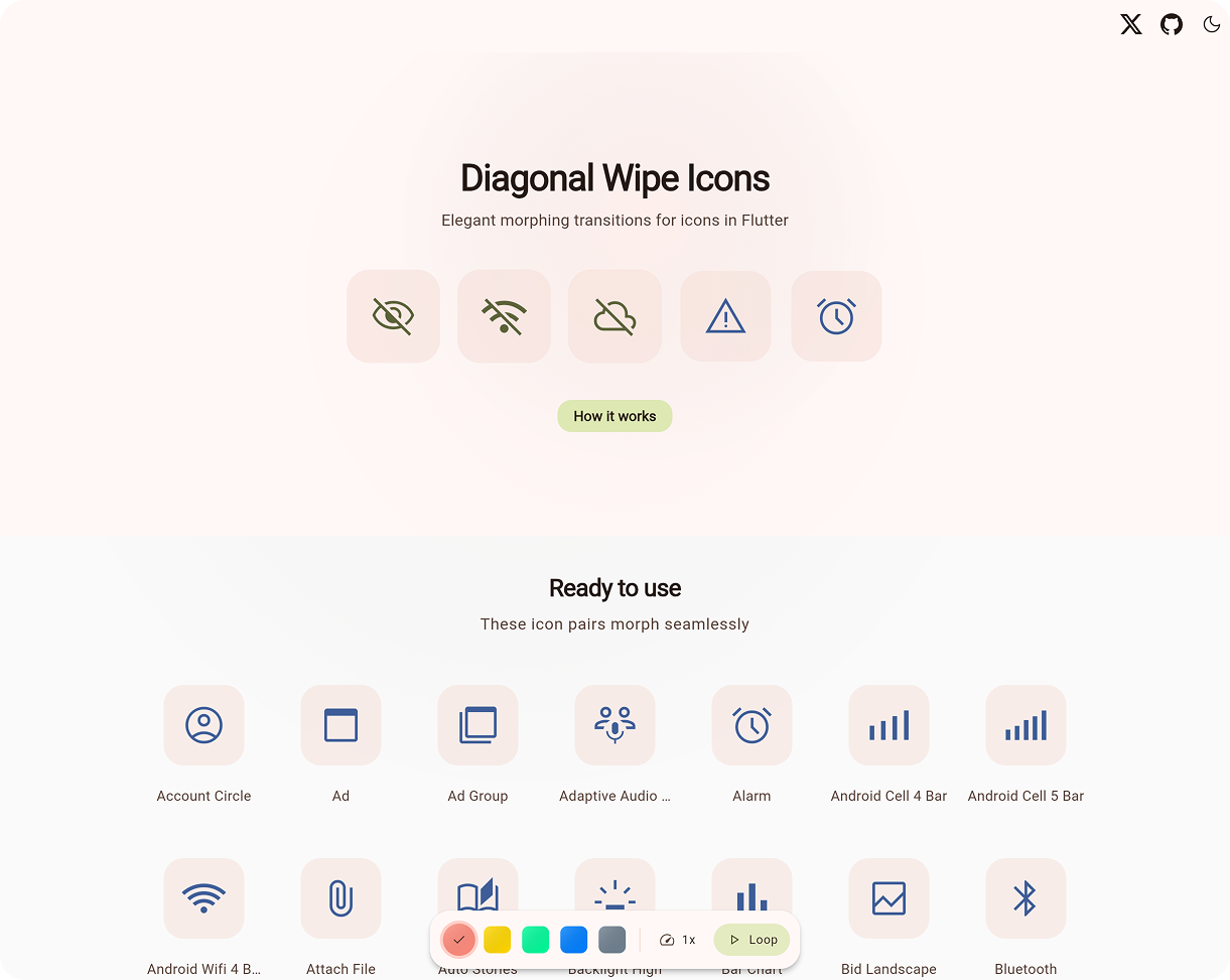
📖 What Is This?
Apple's SF Symbols makes it easy to add wipe icon transitions to iOS apps. Flutter does not ship that interaction out of the box, making it tempting to skip the animation entirely.
Diagonal Wipe Icon bridges this gap. It provides a polished component that blends two icon states with a moving mask, supporting 8 different wipe directions. Perfect for:
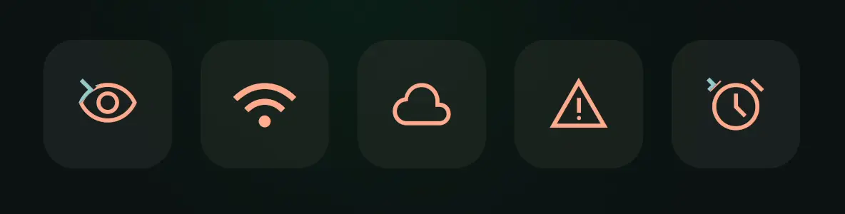
- 🎛️ Toggle controls (
mute,favorite,visible) - ⚙️ Settings screens with stateful icons
- ✨ Anywhere you want polished micro-interactions
Accessible & lightweight. Zero dependencies.
🚀 Quick Start
Add the package via terminal:
flutter pub add diagonal_wipe_icon
Or add it manually to your pubspec.yaml:
dependencies:
  diagonal_wipe_icon: ^0.1.1
Then, use it anywhere you would typically place an Icon, such as inside an IconButton or a GestureDetector:
import 'package:diagonal_wipe_icon/diagonal_wipe_icon.dart';

IconButton(
  onPressed: () => setState(() => isFavorite = !isFavorite),
  icon: AnimatedDiagonalWipe.icon(
    isWiped: isFavorite,
    baseIcon: Icons.favorite_border,
    wipedIcon: Icons.favorite,
    semanticsLabel: 'Favorite Toggle',
  ),
);
🧰 Choose The Right API
| If you have... | Use |
|---|---|
Two IconData values |
AnimatedDiagonalWipe.icon(...) |
| Two widgets | AnimatedDiagonalWipe(...) |
An Animation<double> and two widgets |
DiagonalWipeTransition(...) |
Key Properties
| Property | Description |
|---|---|
isWiped |
Which icon is fully visible (true/false state). |
baseIcon / wipedIcon |
The two icons to transition between. |
baseTint / wipedTint |
Optional colors. Inherits from IconTheme if null. |
size |
Optional size. Inherits from IconTheme if null. |
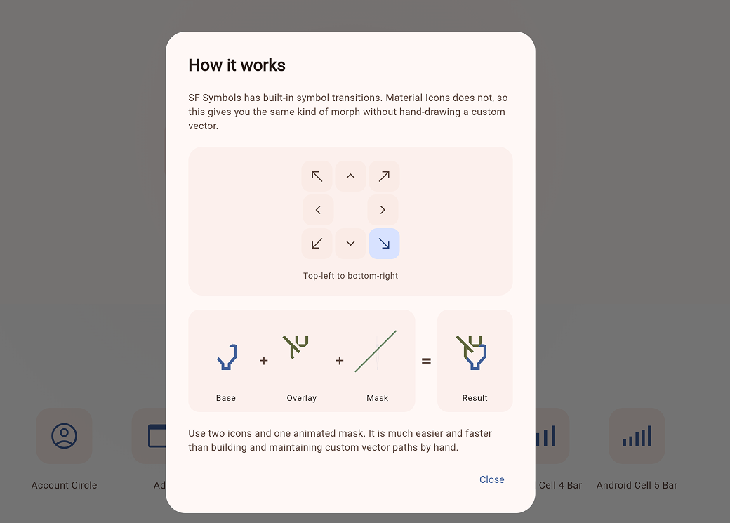
direction |
Defaults to bottomLeftToTopRight. |
animationStyle |
Timing constraints, curves, or disables animation entirely. |
🎨 Customization
AnimatedDiagonalWipe animates automatically when isWiped changes. You can deeply customize the transition timing and ease using animationStyle or tweak the exact direction and colors:
AnimatedDiagonalWipe.icon(
  // State and Icons
  isWiped: isMuted,
  baseIcon: Icons.volume_up,
  wipedIcon: Icons.volume_off,

  // Customization
  baseTint: Colors.teal,
  direction: WipeDirection.bottomLeftToTopRight, // 8 directions supported

  // Motion Presets
  animationStyle: const AnimationStyle(
    duration: Duration(milliseconds: 220),
    curve: Curves.fastOutSlowIn,
  ),
)
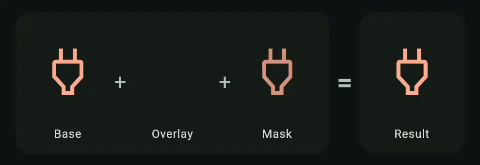
⚡ Performance & Under The Hood
The effect works by revealing one layer while clipping the other across a shared square box.
| Scenario | Performance |
|---|---|
At Rest (isWiped settled) |
Same as rendering a single static layer. |
| During Transition | Two clipped layers plus path updates. |
| Normal Usage | Flawless and smooth on modern devices. |
- ✅ Settled states bypass clipping overhead
- ✅ Respects system reduce-motion preferences by jumping to final state
❓ FAQ
- Why use this instead of
AnimatedSwitcher?
Use it when you want an icon transition to feel like a state change. If a simple cross-fade is enough,AnimatedSwitcheris a great fit. - Can I use custom widgets?
Yes! UseAnimatedDiagonalWipe(...)for arbitrary widgets, like aCircularProgressIndicator. - Run the Demo Locally:
cd example
flutter run -d chrome
🌍 Also Available For Compose
A Compose Multiplatform version lives in the companion repository: