Day Picker
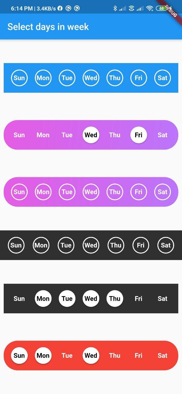
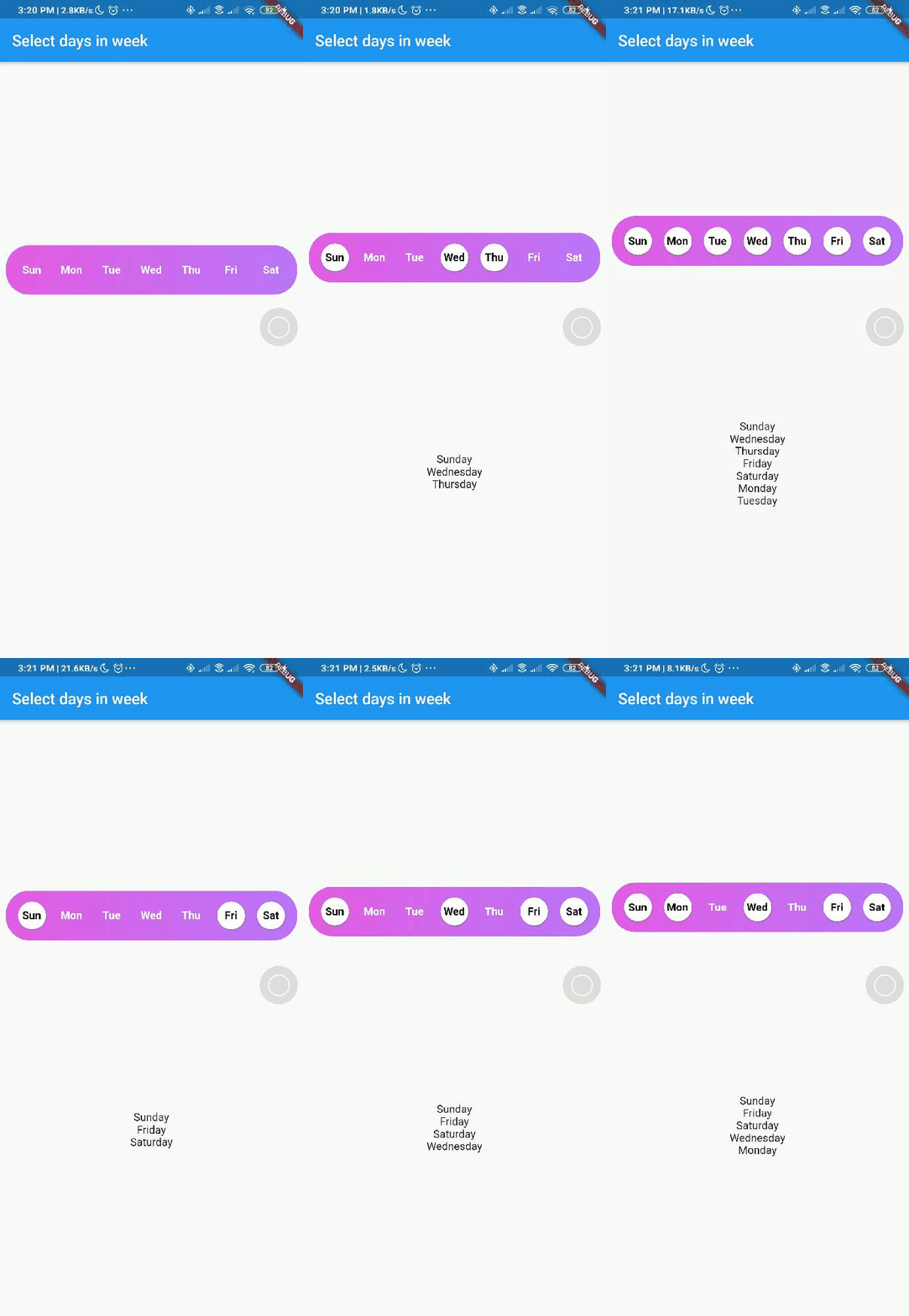
A Flutter widget library which helps us to select days in a week.
Screenshot


Usage
Add day_picker to your pubspec.yaml file.
    flutter:
      sdk: flutter
    day_picker: 2.2.0
import the package:
import 'package:day_picker/day_picker.dart';
Constructor for the day_picker is given below.
    SelectWeekDays({
    required this.onSelect,
    this.backgroundColor,
    this.fontWeight,
    this.fontSize,
    this.daysFillColor,
    this.daysBorderColor,
    this.selectedDayTextColor,
    this.unSelectedDayTextColor,
    this.border = true,
    this.boxDecoration,
    this.padding = 8.0,
    required this.days,
    Key? key,
  }) : super(key: key);
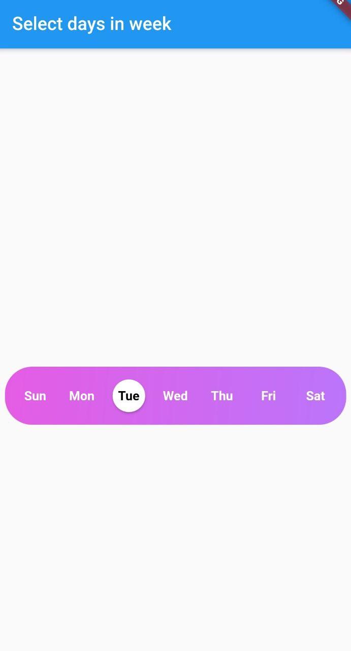
Example here creates a day_picker with below style with Gradient and no borders.

    List<DayInWeek> _days = [
    DayInWeek(
      "Sun",
    ),
    DayInWeek(
      "Mon",
    ),
    DayInWeek(
      "Tue",
      isSelected: true
    ),
    DayInWeek(
      "Wed",
    ),
    DayInWeek(
      "Thu",
    ),
    DayInWeek(
      "Fri",
    ),
    DayInWeek(
      "Sat",
    ),
  ];

  @override
  Widget build(BuildContext context) {
    return Scaffold(
      appBar: AppBar(
        title: Text("Select days in week"),
      ),
      body: Center(
        child: Padding(
          padding: const EdgeInsets.all(8.0),
          child: SelectWeekDays(
            fontSize: 14,
            fontWeight: FontWeight.w500,
            days: _days,
            border: false,
            boxDecoration: BoxDecoration(
              borderRadius: BorderRadius.circular(30.0),
              gradient: LinearGradient(
                begin: Alignment.topLeft,
                colors: [const Color(0xFFE55CE4), const Color(0xFFBB75FB)],
                tileMode:
                TileMode.repeated, // repeats the gradient over the canvas
              ),
            ),
            onSelect: (values) { // <== Callback to handle the selected days
              print(values);
            },
          ),
        ),
      ),
    );
  }
Pass a callback to the onSelect property with parameter of type List<String>.
Pass a list of days of type DayInWeek into days property
class DayInWeek {
  String dayName;
  bool isSelected = false;

  DayInWeek(this.dayName, {this.isSelected = false});
}
DayInWeek consist of two Properties dayName and isSelected.
By default isSelected value will be false
Example:
void handleOnSelect(List<String> value){
    //TODO: Manipulate the List of days selected
    print(value);
}
Customization
| Property | Type | Description |
|---|---|---|
| onSelect | List<String> |
Callback invoked when days are selected |
| days | List<DayInWeek> |
List of days that need to be passed |
| padding | double |
Padding between container and the buttons by default it is 8.0 |
| boxdecoration | BoxDecoration |
provides variety of ways to style the background containergradient, color, border radius |
| backgroundColor | Color |
Property to change the color of the container |
| fontSize | double |
Property to change size of font |
| fontWeight | FontWeight |
Property to change the font weight of text |
| daysFillColor | Color |
Property to change the color of rounded buttons when the days are selected |
| daysBorderColor | Color |
Property to change the border color of rounded button |
| selectedDayTextColor | Color |
property to change the text color of the selected days |
| unSelectedDayTextColor | Color |
property to change the text color when the days are not selected |
| border | bool |
Set this property to false if border is not needed around the rounded buttonsby default this property will be true |
With the implementation of the setDaysState method, developers can dynamically modify which days are selected within their application's code, even after the SelectWeekDays widget has already been constructed.
By utilizing the Global Key that is passed into the widget, one can easily update the selected dates as desired.
Contributions
Contributions of any kind are more than welcome😊! Feel free to fork and improve day_picker or open an issue.


