DayNightTimePicker
A day night time picker for Flutter with Zero Dependencies.
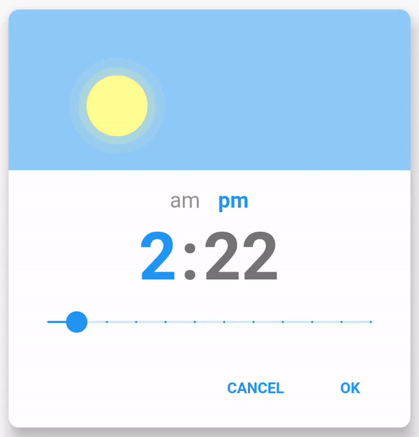
Default style:
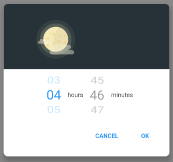
IOS style:
View it on pub.dev
Installation
Add to pubspec.yaml.
dependencies:
  day_night_time_picker:
Usage
To use plugin, just import package
import 'package:day_night_time_picker/day_night_time_picker.dart';
Example
TextButton(
    onPressed: () {
        Navigator.of(context).push(
            showPicker(
                context: context,
                value: _time,
                sunrise: TimeOfDay(hour: 6, minute: 0), // optional
                sunset: TimeOfDay(hour: 18, minute: 0), // optional
                duskSpanInMinutes: 120, // optional
                onChange: onTimeChanged,
            ),
        );
    },
    child: Text(
        "Open time picker",
        style: TextStyle(color: Colors.white),
    ),
),
Props
| Name | Description | Default |
|---|---|---|
| value | Required Display value. It takes in Time. |
|
| onChange | Required Return the new time the user picked as Time. |
|
| isInlinePicker | Whether to render an inline widget. | false |
| onChangeDateTime | Optional Return the new time the user picked as DateTime. |
|
| onCancel | Optional Custom callback for the Cancel button. Note: if provided, it will override the default behavior of the Cancel button. |
|
| is24HrFormat | Show the time in TimePicker in 24 hour format. | false |
| accentColor | Accent color of the TimePicker. | Theme.of(context).accentColor |
| unselectedColor | Color applied unselected options (am/pm, hour/minute). | Colors.grey |
| cancelText | Text displayed for the Cancel button. | cancel |
| okText | Text displayed for the Ok button. | ok |
| sunAsset | Image asset used for the Sun. | Asset provided |
| moonAsset | Image asset used for the Moon. | Asset provided |
| blurredBackground | Whether to blur the background of the Modal. |
false |
| barrierColor | Color of the background of the Modal. |
Colors.black45 |
| borderRadius | Border radius of the Container in double. | 10.0 |
| elevation | Elevation of the Modal in double. |
12.0 |
| dialogInsetPadding | Inset padding of the Modal in EdgeInsets. |
EdgeInsets.symmetric(horizontal: 40.0, vertical: 24.0) |
| barrierDismissible | Whether clicking outside should dismiss the Modal. |
true |
| showCancelButton | Whether to show the cancel button or not | true |
| iosStylePicker | Whether to display a IOS style picker (Not exactly the same). | false |
| hourLabel | The label to be displayed for hour picker. Only for iosStylePicker. |
'hours' |
| minuteLabel | The label to be displayed for minute picker. Only for iosStylePicker. |
'minutes' |
| minuteInterval | Steps interval while changing minute. Accepts TimePickerInterval enum. |
TimePickerInterval.ONE |
| secondInterval | Steps interval while changing minute. Accepts TimePickerInterval enum. |
TimePickerInterval.ONE |
| disableMinute | Disables the minute picker. | false |
| disableHour | Disables the hour picker. | false |
| minHour | Selectable minimum hour. | Defaults to 112hr or 024hr |
| maxHour | Selectable maximum hour. | Defaults to 1212hr or 2324hr |
| minMinute | Selectable minimum minute. | 0 |
| minSecond | Selectable minimum second. | 0 |
| maxMinute | Selectable maximum minute. | 59 |
| maxSecond | Selectable maximum second. | 59 |
| displayHeader | Whether to display the sun moon animation. | true |
| isOnValueChangeMode | Whether to hide okText, cancelText and return value on every onValueChange. Only for Inline widget | false |
| focusMinutePicker | Whether or not the minute picker is auto focus/selected. | false |
| themeData | ThemeData to use for the widget. | Theme.of(context) |
| okStyle | Ok button's text style. | const TextStyle(fontWeight: FontWeight.bold) |
| cancelStyle | Cancel button's text style. | const TextStyle(fontWeight: FontWeight.bold) |
| buttonStyle | Button's style. If cancelButtonStyle not provided, it applies to ok and cancel buttons. |
Theme.of(context).colorScheme.secondary |
| cancelButtonStyle | Cancel button style. | Theme.of(context).colorScheme.secondary |
| buttonsSpacing | Spacing between cancel and ok buttons. | 0 |
| wheelHeight | Only for createInlinePicker Height of the Wheel |
240 |
| hideButtons | Whether to hide the buttons (ok and cancel). | false |
| disableAutoFocusToNextInput | Whether to disable the auto focus to the next input after current input is selected. | false |
| width | Fixed width of the Picker container. | 300 (350 for iosStyle) |
| height | Fixed height of the Picker container. | 400 |
| sunrise | Sunrise time. | 400 |
| sunset | Sunset time. | 400 |
| duskSpanInMinutes | Dusk span in minutes. | 400 |
| settings | Optional Data that might be useful in constructing a Route. |
Contributors
Thanks goes to these wonderful people:


This project follows the all-contributors specification. Contributions of any kind welcome!
LICENCE
Copyright 2023 Subhamay Dutta

Licensed under the Apache License, Version 2.0 (the "License");
you may not use this file except in compliance with the License.
You may obtain a copy of the License at

    https://www.apache.org/licenses/LICENSE-2.0

Unless required by applicable law or agreed to in writing, software
distributed under the License is distributed on an "AS IS" BASIS,
WITHOUT WARRANTIES OR CONDITIONS OF ANY KIND, either express or implied.
See the License for the specific language governing permissions and
limitations under the License.
Libraries
- day_night_time_picker
- lib/ampm
- lib/common/display_value
- lib/common/display_wheel
- lib/common/filter_wrapper
- lib/common/wrapper_container
- lib/common/wrapper_dialog
- lib/constants
- lib/day_night_timepicker_android
- lib/day_night_timepicker_ios
- lib/daynight_timepicker
- lib/state/state_container
- lib/state/time
- lib/sun_moon
- lib/utils