Overview:
This Flutter package provides a collection of customizable DateTime pickers, including dropdowns, dialog boxes, and widget bases. With this package, developers can easily integrate date and time selection functionality into their Flutter applications with various customization options to suit their UI needs.
Features:
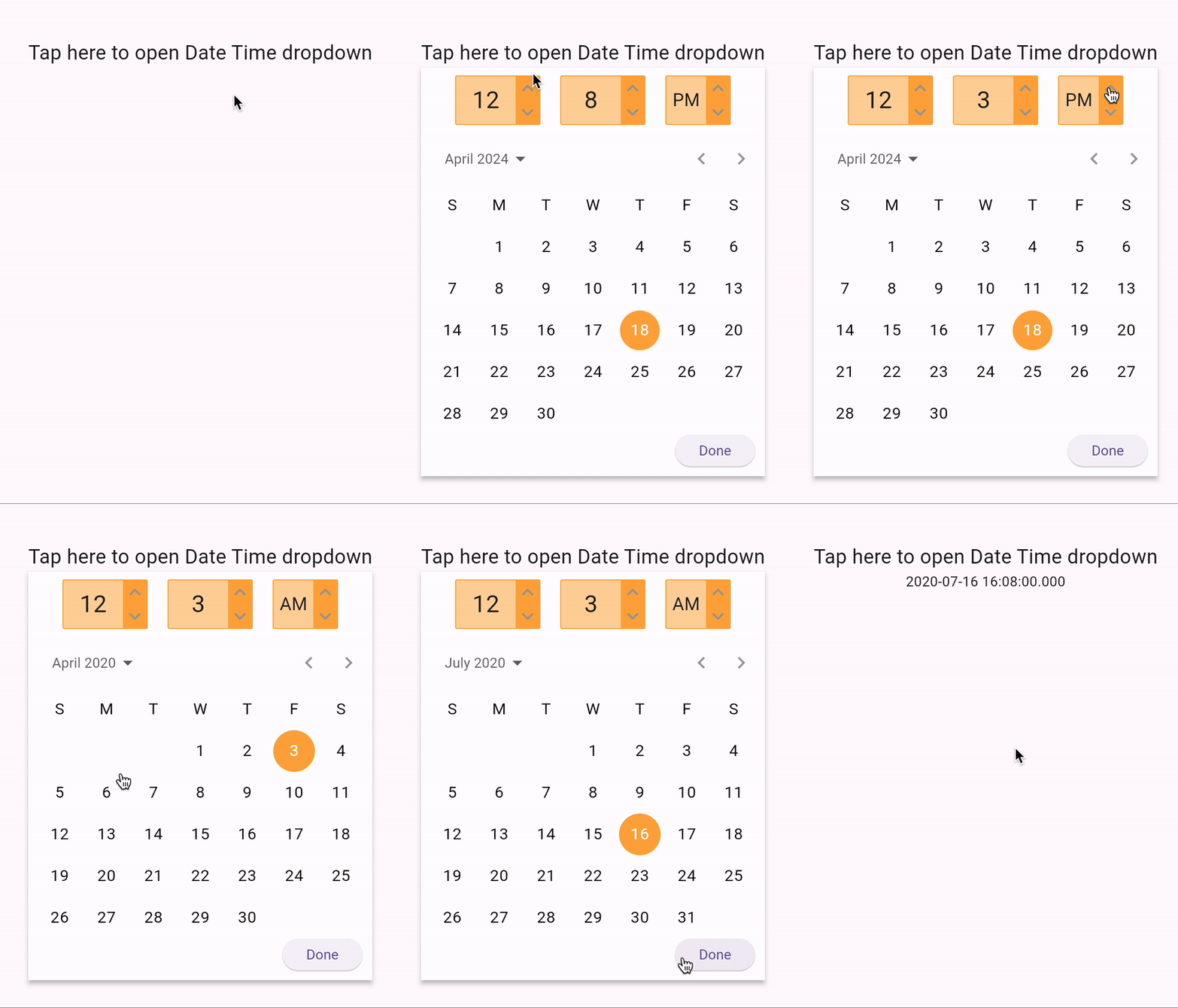
- Dropdown DateTime Picker: A dropdown widget that allows users to select dates and times conveniently.
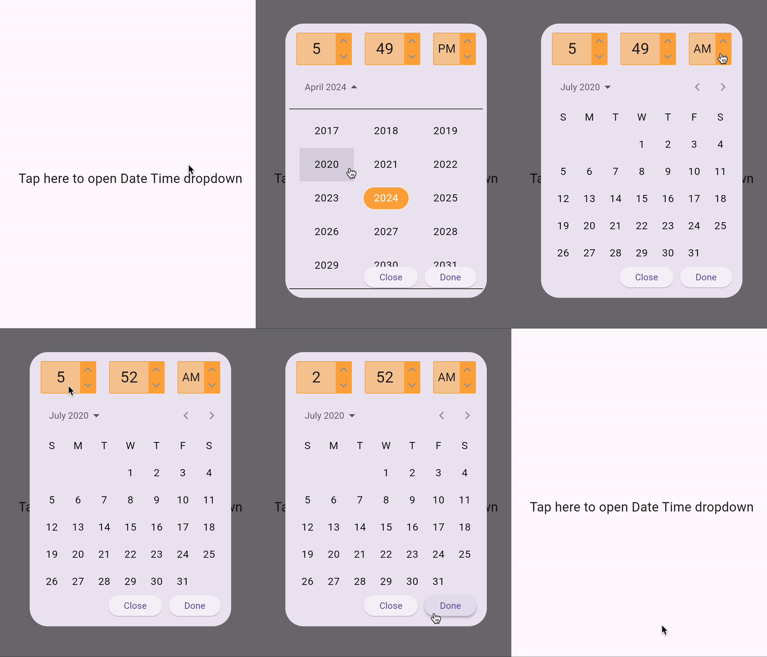
- Dialog Box DateTime Picker: A dialog box widget that pops up for date and time selection.
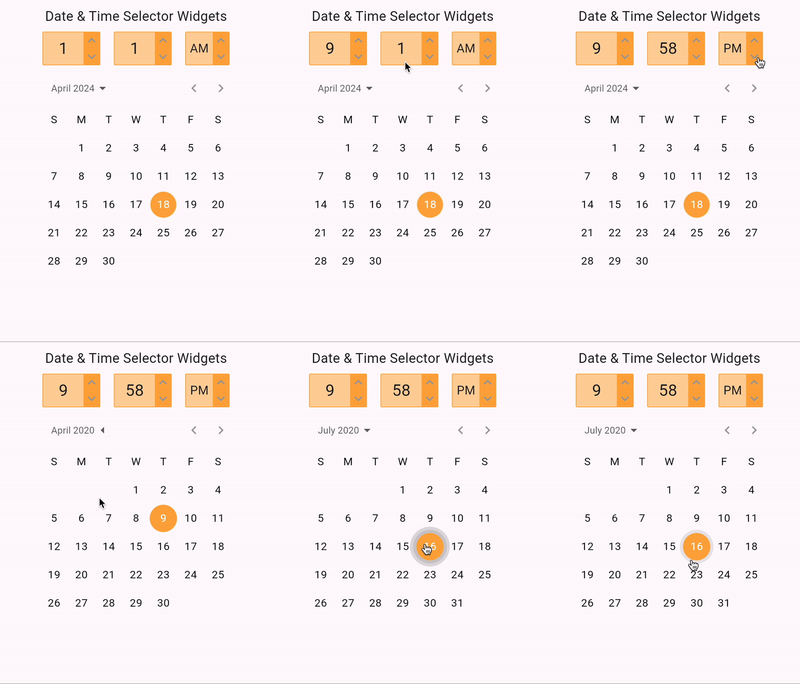
- Widget Base DateTime Picker: A basic widget that can be customized and integrated into different UI layouts for date and time selection.


Installation:
To use this package in your Flutter project, add it to your pubspec.yaml file:
dependencies:
  date_time_picker_ultra: ^version_number
Then, run flutter pub get to install the package.
Usage:
Import the package in your Dart file:
import 'package:flutter_datetime_picker/flutter_datetime_picker.dart';
Dropdown DateTime Picker:
  DateTimePickerUltraDropdown(
    selectedDate: DateTime.now(),
    initialTime: TimeOfDay.now(),
    showDatePicker: true,
    showTimePicker: true,
    onPress: (DateTime dateTime) {
      log(dateTime.toString());
    },
    iconColor: Colors.grey,
    color: Colors.orangeAccent,
  ),
Customization Options:
- showDatePicker (bool): Enable or disable the date picker.
- showTimePicker (bool): Enable or disable the time picker.
- title (String): Text displayed before opening the dropdown.
- titleWidget (Widget): Custom widget to replace the title text.
- onChangeDate (Function(DateTime)?): Callback function triggered when the date changes.
- onChangeTime (Function(DateTime)?): Callback function triggered when the time changes.
- onPress (Function(DateTime)?): Callback function triggered when the user selects a date and time.
- iconColor (Color): Color of the dropdown icon.
- color (Color): Background color of the dropdown widget.
- textColor (Color): Text color of the dropdown widget.
- borderRadius (double): Border radius of the dropdown widget.
- textBoxwidth (double): Width of the dropdown text box.
- selectedDate (DateTime?): Initially selected date.
- initialTime (TimeOfDay?): Initially selected time.
Dialog Box DateTime Picker:
  DateTimePickerUltraDialog(
    selectedDate: DateTime.now(),
    initialTime: TimeOfDay.now(),
    showDatePicker: true,
    showTimePicker: true,
    onPress: (DateTime dateTime) {
      log(dateTime.toString());
    },
    iconColor: Colors.grey,
    color: Colors.orangeAccent,
  ),
Customization Options:
- showDatePicker (bool): Enable or disable the date picker.
- showTimePicker (bool): Enable or disable the time picker.
- title (String): Text displayed before opening the dropdown.
- titleWidget (Widget?): Custom widget to replace the title text.
- onChangeDate (Function(DateTime)?): Callback function triggered when the date changes.
- onChangeTime (Function(DateTime)?): Callback function triggered when the time changes.
- onPress (Function(DateTime)?): Callback function triggered when the user selects a date and time.
- iconColor (Color): Color of the dropdown icon.
- color (Color): Background color of the dropdown widget.
- textColor (Color): Text color of the dropdown widget.
- borderRadius (double): Border radius of the dropdown widget.
- textBoxwidth (double): Width of the dropdown text box.
- selectedDate (DateTime?): Initially selected date.
- initialTime (TimeOfDay?): Initially selected time.
Widget Base Date Selector:
  DatePickerUltra(
    selectedDate: DateTime.now(),
    iconColor: Colors.grey,
    color: Colors.orangeAccent,
    onChange: (DateTime date) {
      log(date.toString());
    },
  ),
Customization Options:
- onChange (Function(DateTime)): Required callback function triggered when the date changes.
- iconColor (Color): Color of the dropdown icon.
- color (Color): Background color of the dropdown widget.
- selectedDate (DateTime?): Initially selected date.
Widget Base Time Selector:
  TimeSelectorUltra(
    selectedHour: 4,
    selectedMinute: 32,
    isAm: true,
    iconColor: Colors.grey,
    color: Colors.orangeAccent,
    onChange: (TimeOfDay timeOfDay) {
      log(timeOfDay.toString());
    },
  ),
Customization Options:
- selectedHour (int): Initially selected hour.
- selectedMinute (int): Initially selected minute.
- isAm (bool): Whether the selected time is in AM or PM.
- onChange (Function(TimeOfDay)): Callback function triggered when the time changes.
- iconColor (Color): Color of the dropdown icon.
- color (Color): Background color of the dropdown widget.
- textColor (Color): Text color of the dropdown widget.
- borderRadius (double): Border radius of the dropdown widget.
- textBoxwidth (double): Width of the dropdown text box.
Contributing:
Contributions are welcome! Feel free to submit issues or pull requests on GitHub.
License:
This package is licensed under the GNU General Public License v3.0 License.
Author:
Mudassir Mukhtar
Contact:


Acknowledgments:
Thank you to the Flutter community for their contributions and support.
Support:
For any questions or assistance, please reach out to the author or open an issue on GitHub.
Disclaimer:
This package is provided as-is without any warranty. Use it at your own discretion.