Custom Radio Group List
Flutter package to create list of radio button, by providing a list of objects it can be a String list or list of Objects.
Features
- Radio list can be generated using a String list
- Radio List can be generated using list of object.
- Selected item(String/Object) can be marked checked
- List can be marked disabled so that user cannot change its value.
- Scroll direction can be set to horizontal as well as vertical
- Able to set the color for radio button
- You can customize the label as per your needs
Getting started
In the pubspec.yaml of your flutter project, add the following dependency:
custom_radio_group_list: ^1.1.1
Import it to each file you use it in:
import 'package:custom_radio_group_list/custom_radio_group_list.dart';
Usage
Example 1
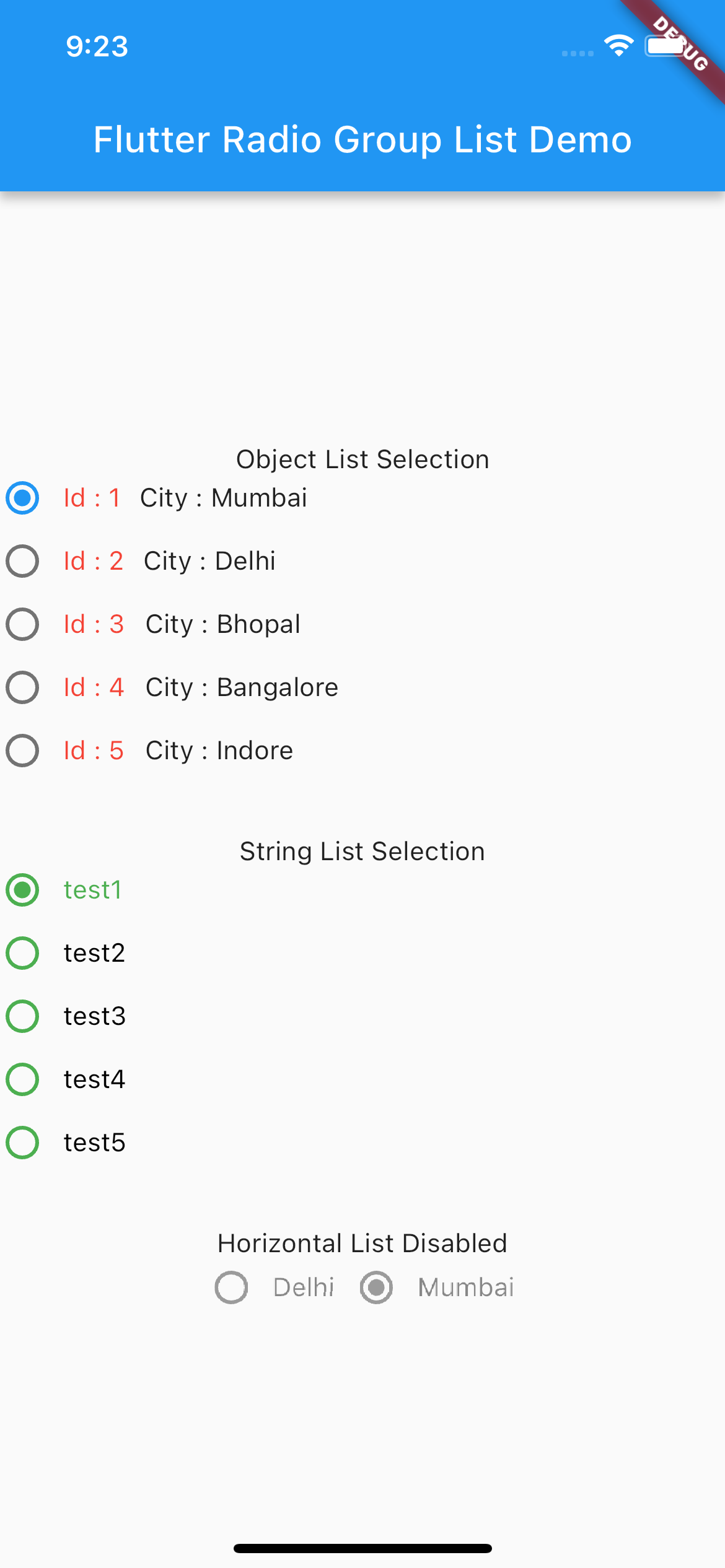
This example shows using an object list
          RadioGroup(
                  items: sampleList,
                  selectedItem: selectedItemNew,
                  onChanged: (value) {
                    selectedItemNew = value;
                    final snackBar = SnackBar(content: Text("$value"));
                    ScaffoldMessenger.of(context).showSnackBar(snackBar);
                  },
                  labelBuilder: (ctx, index) {
                    return Row(
                      children: [
                        Text(
                          'Id : ${sampleList[index].id}',
                          style: const TextStyle(color: Colors.red),
                        ),
                        const SizedBox(
                          width: 10,
                        ),
                        Text(
                          'City : ${sampleList[index].title}',
                        ),
                      ],
                    );
                  },
                  shrinkWrap: true,
                  disabled: false),
Example 2
This example shows use of String list.
          RadioGroup(
                  items: stringList,
                  onChanged: (value) {
                    print('Value : $value');
                    selectedItem = value;
                    final snackBar = SnackBar(content: Text("$value"));
                    ScaffoldMessenger.of(context).showSnackBar(snackBar);
                  },
                  selectedItem: selectedItem,
                  disabled: true,
                  shrinkWrap: true,
                  labelBuilder: (ctx, index) {
                    return Text(stringList[index]);
                  },
                ),
Example 3
This example shows disabled horizontal list.
          SizedBox(
                height: 30,
                child: RadioGroup(
                  items: hLisItem,
                  disabled: true,
                  scrollDirection: Axis.horizontal,
                  onChanged: (value) {
                    print('Value : $value');
                    hSelectedItem = value;
                    final snackBar = SnackBar(content: Text("$value"));
                    ScaffoldMessenger.of(context).showSnackBar(snackBar);
                  },
                  selectedItem: hSelectedItem,
                  shrinkWrap: true,
                  labelBuilder: (ctx, index) {
                    return Text(
                      hLisItem[index],
                    );
                  },
                ),
              ),
Sample
Please clone repository from
https://github.com/ashokv1337/custom_radio_group_list
Go to example folder and see the sample implementation.
Additional information
Feel Free to report any issue and feature.