custom_loading_loader
A highly customizable Flutter loading indicator that orbits one or more dots (or fully custom widgets) around a central image.

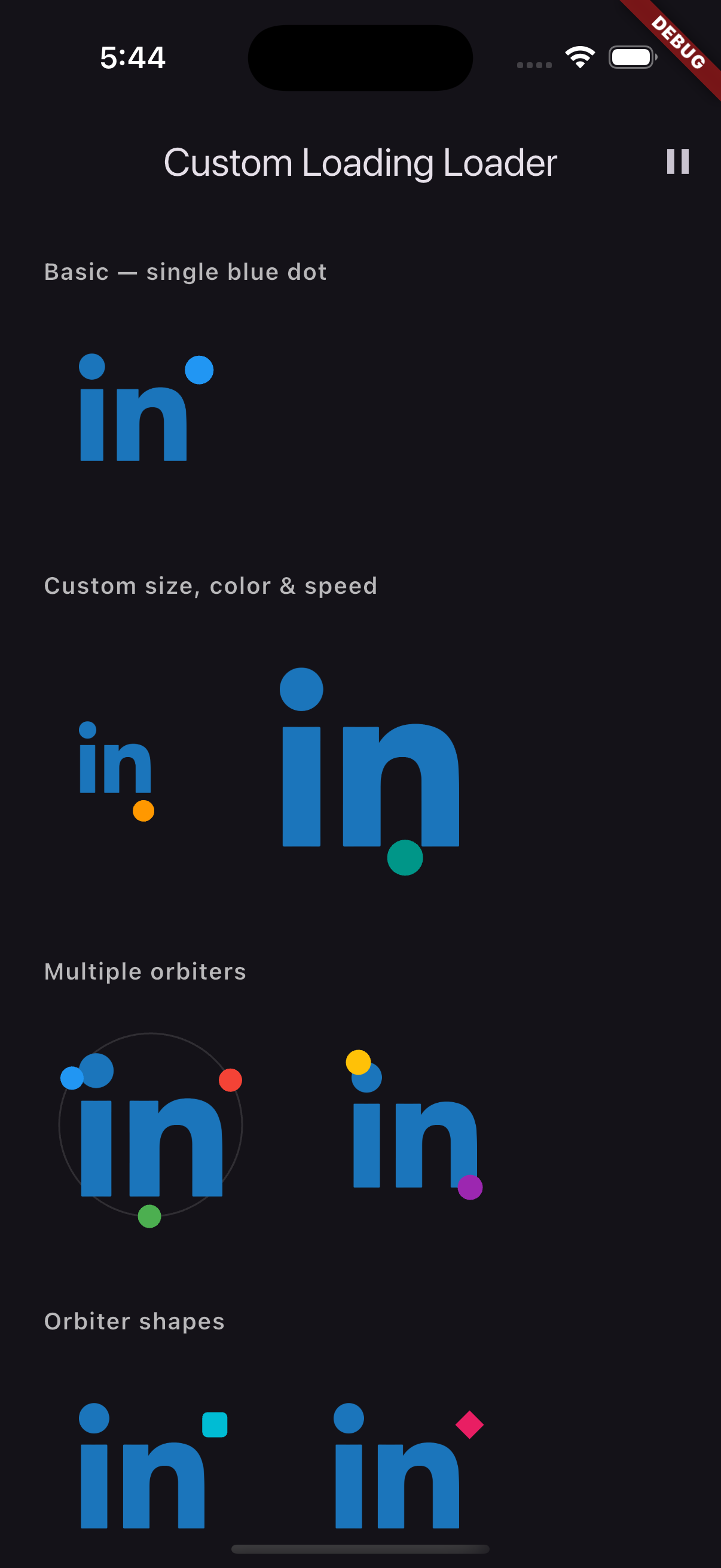
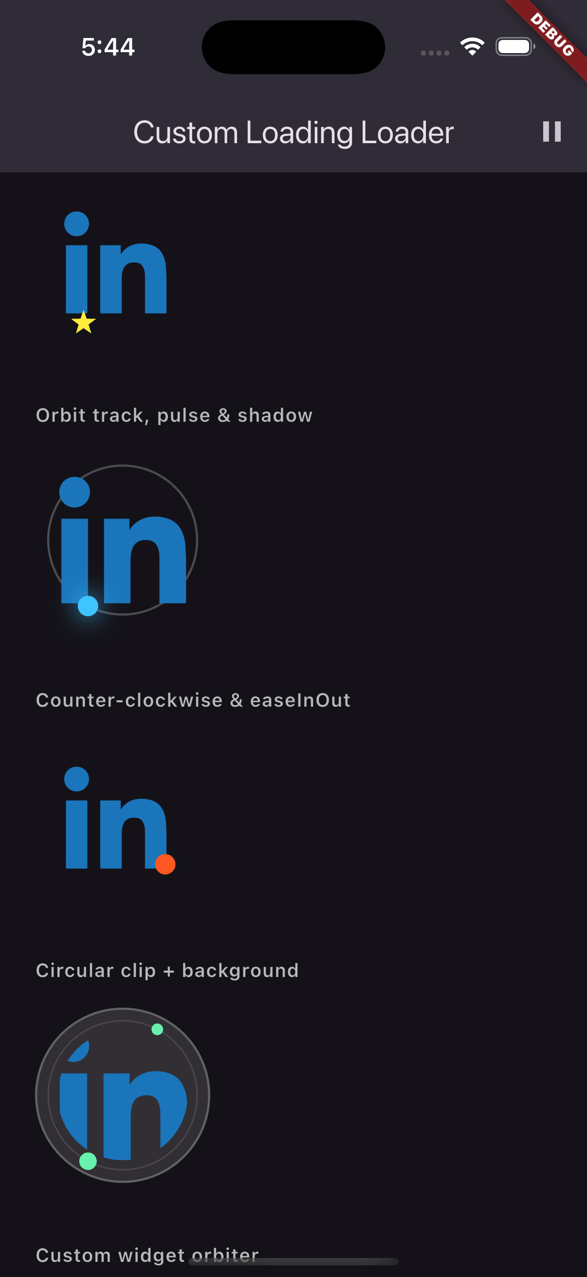
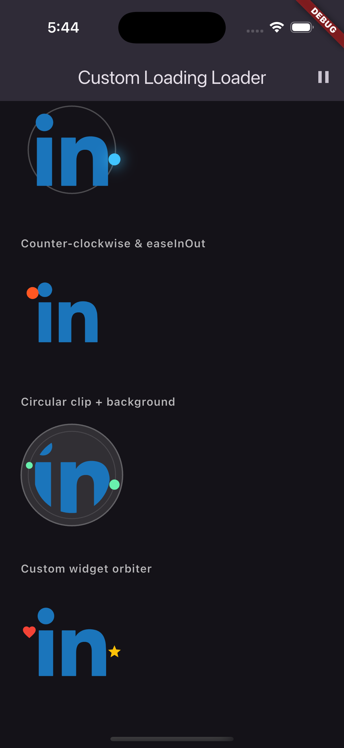
Screenshots
Features
| Feature | Details |
|---|---|
| Multiple orbiters | Spin any number of dots at configurable phase offsets |
| Orbiter shapes | circle, square, diamond, star |
| Custom orbiter widget | Pass any Widget instead of a built-in shape |
| Orbit track | Optional faint guide rail behind the orbiters |
| Image pulse | Gentle scale animation on the central image |
| Direction | Clockwise or counter-clockwise |
| Curve | linear, easeInOut, elastic, bounce |
| Pause/resume | paused flag – no widget rebuild needed |
| Cycle callback | onCycleComplete fires once per full orbit |
| Image clipping | Circular or rounded with imageRadius |
| Image background | imageDecoration for borders, backgrounds |
| Drop-shadows | Per-orbiter BoxShadow list |
Installation
dependencies:
  custom_loading_loader: ^1.0.0
Quick start
import 'package:custom_loading_loader/custom_loading_loader.dart';

// Minimal
CustomLoadingIndicator(
  image: AssetImage('assets/logo.png'),
)

// Full customization
CustomLoadingIndicator(
  image: AssetImage('assets/logo.png'),
  size: 120,
  imagePadding: const EdgeInsets.all(16),
  imageRadius: BorderRadius.circular(60),
  imageDecoration: BoxDecoration(
    color: Colors.white10,
    shape: BoxShape.circle,
  ),
  orbiters: const [
    OrbiterConfig(color: Colors.blue, size: 14),
    OrbiterConfig(color: Colors.red,  size: 10, phaseOffset: 0.5),
  ],
  orbitRadiusFactor: 0.9,
  duration: const Duration(milliseconds: 1200),
  clockwise: true,
  orbitCurve: OrbitCurve.easeInOut,
  showOrbitTrack: true,
  orbitTrackColor: Colors.white24,
  orbitTrackWidth: 1.5,
  pulseImage: true,
  pulseScale: 1.08,
  paused: false,
  onCycleComplete: () => print('orbit done'),
)
OrbiterConfig
| Property | Type | Default | Description |
|---|---|---|---|
color |
Color |
Colors.blue |
Dot color |
size |
double |
16.0 |
Dot diameter in pixels |
shape |
OrbiterShape |
.circle |
circle, square, diamond, star |
phaseOffset |
double |
0.0 |
Orbit position offset [0, 1) |
shadows |
List<BoxShadow>? |
null |
Drop-shadow(s) beneath the dot |
child |
Widget? |
null |
Replace the built-in shape with any widget |
Spacing multiple orbiters evenly
// 3 dots, 120° apart
orbiters: [
  OrbiterConfig(color: Colors.red,   phaseOffset: 0 / 3),
  OrbiterConfig(color: Colors.green, phaseOffset: 1 / 3),
  OrbiterConfig(color: Colors.blue,  phaseOffset: 2 / 3),
]
CustomLoadingIndicator — full API
| Property | Type | Default |
|---|---|---|
image (required) |
ImageProvider |
— |
size |
double |
100 |
imagePadding |
EdgeInsets |
EdgeInsets.all(20) |
imageFit |
BoxFit |
BoxFit.contain |
imageRadius |
BorderRadius? |
null |
imageDecoration |
BoxDecoration? |
null |
orbiters |
List<OrbiterConfig> |
single blue dot |
orbitRadiusFactor |
double |
0.85 |
duration |
Duration |
Duration(seconds: 2) |
clockwise |
bool |
true |
orbitCurve |
OrbitCurve |
.linear |
showOrbitTrack |
bool |
false |
orbitTrackColor |
Color? |
grey 20% |
orbitTrackWidth |
double |
1.0 |
pulseImage |
bool |
false |
pulseScale |
double |
1.08 |
paused |
bool |
false |
onCycleComplete |
VoidCallback? |
null |
Support
If this package helped you, consider buying me a coffee! ☕

Libraries
- custom_loading_loader
- A highly customizable Flutter loading indicator that orbits a dot (or custom widget) around a central image.