


Apple's iOS Liquid Glass blur & translucency design language — in Flutter.
A premium Flutter widget that replicates the native iOS frosted-glass material effect (UIBlurEffect.systemMaterial) with real-time backdrop blur, dynamic light/dark theme adaptation, and specular highlight rendering. Optimized for 120 Hz ProMotion displays.
Features
| Feature | Description |
|---|---|
| Native iOS blur | Real BackdropFilter + ImageFilter.blur — not a fake overlay. Content behind the glass is genuinely refracted. |
| Light & Dark mode | Automatically adapts to CupertinoTheme brightness. Light mode is matte & bright; dark mode is deep & contrasty. |
| Specular highlight | A configurable gradient "sheen" that gives the surface its liquid, alive feel. |
| ProMotion optimized | RepaintBoundary isolation ensures the blur compositing layer is re-rasterized independently — no scroll jank at 120 Hz. |
| Fully customizable | Override blurSigma, tintOpacity, borderRadius, borderColor, borderWidth, and specularGradient per-widget. |
| Theme interpolation | LiquidGlassThemeData.lerp() enables smooth animated transitions between any two theme configurations. |
| Pre-built bars | CupertinoLiquidGlassNavBar and CupertinoLiquidGlassBottomBar — drop-in replacements with safe-area handling. |
| Apple HIG compliant | Bottom bar with 56 pt height, 28 pt icons, 48 pt touch targets for comfortable interaction. |
| Rubber banding | Elastic scale animation (8%) on horizontal drag — the bar expands during swipe and springs back on release. |
| Glass icon effect | Dock-style magnification and glass refraction glow on icons as the selector passes over them. |
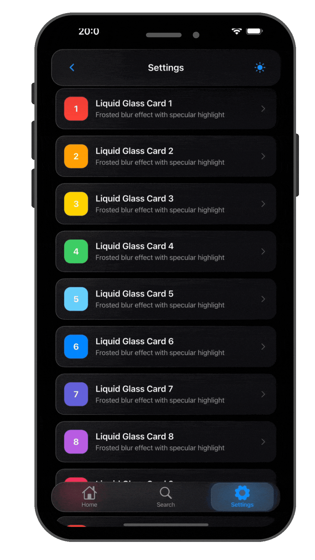
Preview
Getting started
Requirements
| Requirement | Minimum |
|---|---|
| Flutter | 3.27.0 |
| Dart SDK | 3.11.3 |
Installation
dependencies:
  cupertino_liquid_glass: ^0.4.0
flutter pub get
Usage
Basic — wrap any widget
import 'package:cupertino_liquid_glass/cupertino_liquid_glass.dart';

CupertinoLiquidGlass(
  child: Padding(
    padding: EdgeInsets.all(16),
    child: Text('Hello, Glass!'),
  ),
)
Custom blur & radius
CupertinoLiquidGlass(
  blurSigma: 40,
  tintOpacity: 0.3,
  borderRadius: BorderRadius.circular(32),
  edgeLightColor: Color(0x60FFFFFF),
  child: MyContent(),
)
Explicit dark theme
CupertinoLiquidGlass(
  theme: LiquidGlassThemeData.dark(),
  child: MyContent(),
)
Floating navigation bar
CupertinoLiquidGlassNavBar(
  leading: CupertinoButton(
    padding: EdgeInsets.zero,
    onPressed: () => Navigator.pop(context),
    child: Icon(CupertinoIcons.back),
  ),
  title: Text('Inbox'),
  trailing: CupertinoButton(
    padding: EdgeInsets.zero,
    onPressed: () {},
    child: Icon(CupertinoIcons.ellipsis_circle),
  ),
)
Bottom tab bar
CupertinoLiquidGlassBottomBar(
  currentIndex: _selectedTab,
  onTap: (i) => setState(() => _selectedTab = i),
  items: const [
    LiquidGlassBottomBarItem(
      icon: CupertinoIcons.house,
      activeIcon: CupertinoIcons.house_fill,
      label: 'Home',
    ),
    LiquidGlassBottomBarItem(
      icon: CupertinoIcons.search,
      label: 'Search',
    ),
    LiquidGlassBottomBarItem(
      icon: CupertinoIcons.gear_alt,
      activeIcon: CupertinoIcons.gear_alt_fill,
      label: 'Settings',
    ),
  ],
)
Animated theme transition
final theme = LiquidGlassThemeData.lerp(
  LiquidGlassThemeData.light(),
  LiquidGlassThemeData.dark(),
  animationController.value, // 0.0 → 1.0
);

CupertinoLiquidGlass(
  theme: theme,
  child: MyContent(),
)
API Reference
CupertinoLiquidGlass
The core widget. Wraps any child in a frosted-glass surface with backdrop blur.
| Parameter | Type | Default | Description |
|---|---|---|---|
child |
Widget |
required | Content inside the glass surface |
theme |
LiquidGlassThemeData? |
auto | Explicit theme (auto-resolves from brightness if null) |
blurSigma |
double? |
theme | Override blur intensity |
tintOpacity |
double? |
theme | Override tint layer opacity |
borderRadius |
BorderRadius? |
theme | Override corner radius |
edgeLightColor |
Color? |
theme | Override edge highlight color |
edgeShadowColor |
Color? |
theme | Override edge shadow color |
borderWidth |
double? |
theme | Override border width |
specularGradient |
Gradient? |
theme | Override specular highlight |
padding |
EdgeInsetsGeometry? |
null | Inner padding |
width |
double? |
null | Fixed width |
height |
double? |
null | Fixed height |
glowColor |
Color? |
null | Soft bloom glow around surface |
glowRadius |
double |
24.0 | Blur radius of glow |
LiquidGlassThemeData
| Factory / Method | Description |
|---|---|
LiquidGlassThemeData.light() |
Bright, matte preset matching UIBlurEffect.systemMaterial |
LiquidGlassThemeData.dark() |
Deep, contrasty preset matching UIBlurEffect.systemMaterialDark |
.copyWith(...) |
Returns a copy with specified fields replaced |
LiquidGlassThemeData.lerp(a, b, t) |
Linearly interpolates between two themes |
CupertinoLiquidGlassNavBar
A floating glass navigation bar with safe-area handling.
| Parameter | Type | Default | Description |
|---|---|---|---|
title |
Widget? |
null | Center title widget |
leading |
Widget? |
null | Left-side widget (back button, etc.) |
trailing |
Widget? |
null | Right-side widget (action button, etc.) |
theme |
LiquidGlassThemeData? |
auto | Glass theme override |
borderRadius |
BorderRadius? |
22 px | Corner radius |
horizontalMargin |
double |
8.0 | Horizontal margin from screen edges |
useSafeArea |
bool |
true | Include status bar padding |
CupertinoLiquidGlassBottomBar
A floating glass tab bar with safe-area handling.
| Parameter | Type | Default | Description |
|---|---|---|---|
items |
List<LiquidGlassBottomBarItem> |
required | Tab items |
currentIndex |
int |
0 | Selected tab index |
onTap |
ValueChanged<int>? |
null | Tab tap callback |
activeColor |
Color? |
primaryColor | Selected tab color |
inactiveColor |
Color? |
systemGrey | Unselected tab color |
theme |
LiquidGlassThemeData? |
auto | Glass theme override |
borderRadius |
BorderRadius? |
26 px | Corner radius |
horizontalMargin |
double |
8.0 | Horizontal margin from screen edges |
useSafeArea |
bool |
true | Include home indicator padding |
springDescription |
SpringDescription? |
Apple-like | Custom spring physics for selector animation |
Performance tips
- Avoid nesting multiple
CupertinoLiquidGlasswidgets inside each other — each one adds a compositing layer. - The widget already uses
RepaintBoundaryinternally; you don't need to add your own. - On older devices, consider reducing
blurSigma(e.g. 15–20) for smoother scrolling. - Use
CupertinoLiquidGlasson floating overlays (nav bars, cards, sheets) rather than full-screen backgrounds.
Example app
A complete demo app is included in the example/ directory. Run it with:
cd example
flutter run
Contributing
Contributions are welcome! Please open an issue first to discuss what you'd like to change.
- Fork the repository
- Create your feature branch (
git checkout -b feature/amazing-feature) - Commit your changes (
git commit -m 'Add amazing feature') - Push to the branch (
git push origin feature/amazing-feature) - Open a Pull Request
License
This project is licensed under the MIT License — see the LICENSE file for details.
Built with Flutter • Inspired by Apple's Human Interface Guidelines
Libraries
- cupertino_liquid_glass
- A premium Flutter package that replicates Apple's iOS Liquid Glass blur and translucency design language.