
cupertino_date_selector
A customizable Cupertino-style selector package for Flutter: modal bottom sheets, inline pages, or wheel-only embedding.
Table of contents
- Installation
- API overview
- Picker modes
- Callbacks & selection mode
- Modifiers
- Haptic feedback
- Inline controller
- Picker-only embedding
- Theming
- Modal-only options
- Testing this package
- Roadmap & possible extensions
- Notes for app developers
- Example app
- Screenshots (example gallery)
Installation
dependencies:
  cupertino_date_selector: ^0.0.6
flutter pub get
import 'package:cupertino_date_selector/cupertino_date_selector.dart';
API overview
| API | Use when |
|---|---|
CupertinoDateSelector.*(...).show(context) |
Standard iOS-style modal popup |
CupertinoDateSelectorWidget.*(...) |
Drop into a Scaffold / form (same chrome as modal: optional header + submit) |
CupertinoDateSelectorPickerBody |
You provide sheet chrome; only the wheels |
selector.buildPicker(context, value:, onChanged:) |
Same as picker body, imperative API |
Shared concepts:
- Theme:
CupertinoDateSelectorThemeDataon constructors. - Modifiers:
CupertinoDateSelectorModifierson everyCupertinoDateSelector.*andCupertinoDateSelectorWidget.*factory (optional, defaults are sensible). - Haptics: Wheel steps use
HapticFeedback.selectionClickby default on mobile/desktop; see Haptic feedback. - Submit button: Shown only if
onSubmitis non-null.
Picker modes
Each mode exists on both CupertinoDateSelector and CupertinoDateSelectorWidget:
| Constructor | Value type | Notes |
|---|---|---|
items |
int (index) |
Custom List<Widget> rows |
date |
DateTime |
CupertinoDatePicker date mode |
time |
DateTime |
minuteInterval, use24hFormat |
dateTime |
DateTime |
Date + time; min/max + minute interval |
year |
DateTime |
Year only (DateTime(year)) |
month |
DateTime |
Month only (DateTime(1, month)); localized month names |
monthYear |
DateTime |
Month + year; min/max normalized to avoid picker assertions |
duration |
Duration |
CupertinoTimerPicker |
Modal usage:
await CupertinoDateSelector.monthYear(
  initialDateTime: DateTime.now(),
  minDateTime: DateTime(2023, 1),
  maxDateTime: DateTime(2028, 12),
  onChange: (d) { /* live updates */ },
  onSubmit: (d) { /* confirm */ },
).show(context);
Inline usage:
CupertinoDateSelectorWidget.monthYear(
  initialDateTime: DateTime.now(),
  minDateTime: DateTime(2023, 1),
  maxDateTime: DateTime(2028, 12),
  onChanged: (d) { /* prefer widget naming */ },
  onSubmit: (d) { },
)
Callbacks & selection mode
onChange/onChanged: Selection updates (behavior depends on selection mode).onSubmit: User tapped the submit control; also used to pop the modal with the current value whencloseOnSubmitis true.onDismiss: Modal only — after the route completes (including barrier dismiss).
Selection mode
modifiers: CupertinoDateSelectorModifiers(selectionMode: …)
CupertinoDateSelectorSelectionMode.live(default): fireonChange/onChangedon every wheel movement.CupertinoDateSelectorSelectionMode.commitOnSubmit: no change callbacks while scrolling; on submit,onSubmitruns andonChange/onChangedruns once with the final value.
Modifiers
CupertinoDateSelectorModifiers groups cross-cutting options (avoids huge parameter lists):
| Field | Applies to | Purpose |
|---|---|---|
selectionMode |
Modal + widget | live vs commitOnSubmit |
enableHapticFeedback |
Modal + widget | HapticFeedback.selectionClick on wheel changes; omit for on (default) |
locale |
Month wheel | Base locale when formatting month names |
modalBarrierColor |
Modal show only |
showCupertinoModalPopup barrier |
useRootNavigator |
Modal show only |
Passed through to showCupertinoModalPopup |
monthLabelBuilder |
Month wheel | (month 1–12, Locale) => String; overrides intl |
semanticsLabel |
Picker region | Semantics wrapper for accessibility |
You can also pass enableHapticFeedback on any factory (bool?). Precedence: if the factory argument is non-null, it wins; else modifiers.enableHapticFeedback if non-null; else haptics are on.
Example:
CupertinoDateSelectorWidget.date(
  initialDateTime: DateTime.now(),
  onSubmit: (d) {},
  modifiers: const CupertinoDateSelectorModifiers(
    semanticsLabel: 'Choose date',
  ),
);
Disable explicitly:
CupertinoDateSelector.date(
  enableHapticFeedback: false,
  onSubmit: (d) {},
);
Haptic feedback
When haptics are enabled, each wheel selection change calls Flutter’s HapticFeedback.selectionClick.
| Platform | Behavior |
|---|---|
| iOS | Supported where the device provides haptic feedback. |
| Android | Supported via the platform vibrator. Add <uses-permission android:name="android.permission.VIBRATE" /> to your app’s AndroidManifest.xml so vibration is allowed (recommended for production apps). |
| Web | The package does not invoke haptics (no vibration API in the browser). |
| Desktop (macOS, Windows, Linux) | Flutter forwards to the platform; may be a no-op depending on hardware and OS settings. |
To turn haptics off globally for one picker, use enableHapticFeedback: false on the factory or CupertinoDateSelectorModifiers(enableHapticFeedback: false).
Inline controller (programmatic jump)
CupertinoDateSelectorController mirrors the value and bumps syncGeneration on jumpTo, so the inline widget rebuilds the wheel with a new initial position.
final c = CupertinoDateSelectorController();

CupertinoDateSelectorWidget.year(
  initialDateTime: DateTime(2020),
  minDateTime: DateTime(2010),
  maxDateTime: DateTime(2030),
  controller: c,
  onSubmit: (d) {},
);

c.jumpTo(DateTime(2025));
Picker-only embedding
Use your own drag handle, title, and buttons; only the wheels come from the package:
CupertinoDateSelectorPickerBody(
  selector: CupertinoDateSelector.items(
    items: const [Text('S'), Text('M'), Text('L')],
    selectedItemIndex: index,
  ),
  value: index,
  onChanged: (v) => setState(() => index = v as int),
);
Equivalent:
selector.buildPicker(context, value: index, onChanged: (v) => …);
Month names use intl and Localizations / modifiers.locale, unless you set monthLabelBuilder.
Theming
CupertinoDateSelectorThemeData includes:
- Container:
backgroundColor,topCornerRadius,dividerColor - Header:
headerPadding,headerTextStyle,closeIcon,closeIconColor - Items in custom wheels (year / month):
itemTextStyle,selectedWheelItemTextStyle(center row) - Submit:
buttonPadding,buttonColor,buttonTextStyle,defaultButtonText,buttonDecoration
theme: const CupertinoDateSelectorThemeData(
  defaultButtonText: 'Confirm',
  selectedWheelItemTextStyle: TextStyle(fontWeight: FontWeight.w600),
),
Modal-only options
On CupertinoDateSelector factories (not on CupertinoDateSelectorWidget):
dismissible,closeOnSubmit,onDismisslayoutDirectionfor the modal subtree- Barrier / navigator via modifiers:
modalBarrierColor,useRootNavigator
The modal route uses an internal StatefulBuilder so the submit action always sees the latest wheel value.
Testing this package
From the package root:
flutter test
flutter analyze
Automated coverage includes:
- All picker constructor types (
items,date,time,dateTime,year,month,monthYear,duration) - Widget smoke: each
CupertinoDateSelectorWidget.*mode builds - Submit hidden when
onSubmitis null commitOnSubmitvs liveonChangebehaviorCupertinoDateSelectorController.jumpToCupertinoDateSelectorPickerBodyandbuildPicker- Modifiers merged on selector; theme
copyWith monthLabelBuilder,semanticsLabel- Haptic default (
enableHapticFeedbackon when unset)
Roadmap & possible extensions
These items are not guaranteed to ship as-is; they sketch directions that would complement the current API (CupertinoDateSelector, CupertinoDateSelectorWidget, picker-only embedding, theme, modifiers, inline controller).
| Area | Idea |
|---|---|
| Forms | FormField<DateTime> / FormField<Duration> (and similar for custom items) with validation and error display wired to Flutter’s form system. |
| Field preset | A tappable row that shows a formatted value, opens the modal (or inline flow), and supports label, hint, error text, and disabled state—less boilerplate in settings and forms. |
| Modal control | Optional API to read or update the pending value while a modal is open, or to dismiss programmatically (inline already has CupertinoDateSelectorController for jumpTo). |
| Large screens | On tablet or desktop, optional centered dialog or anchored popover instead of a full-width bottom sheet, while keeping Cupertino styling. |
| Accessibility | Stronger semantics: announce committed values, clearer structure for combined date+time wheels, predictable focus order on web and desktop. |
| Power APIs | Hooks for per-column labels or styling in date-like modes, or filters such as skipping weekends or disabling specific dates (booking-style UIs). |
| Quality & docs | Golden tests for major modes and themes; short cookbook patterns (e.g. replacing Material showDatePicker / showTimePicker in a Cupertino-heavy app). |
Contributions or API proposals for any of the above are welcome via issues or pull requests on the repository.
Notes for app developers
- If you import
intlin the same library as Flutter’sTextDirection, use
import 'package:intl/intl.dart' hide TextDirection;
(intldefines its ownTextDirection, which conflicts withdart:ui). publish_tomust not be set in this package’spubspecwhen publishing (only the example usespublish_to: 'none').- Android haptics: for wheel vibration, include
android.permission.VIBRATEin your app manifest (see Haptic feedback).
Example app
example/lib/main.dart— buttons for every modal and inline screen.example/lib/recipes_screen.dart— picker-only layout, modifiers, controller.
Run:
cd example && flutter run
Screenshots (example gallery)
Captures from the sample app. Images load from the repo’s main branch (assets/). Previews are scaled to 280px wide for readability on pub.dev; open the raw PNG for full resolution.
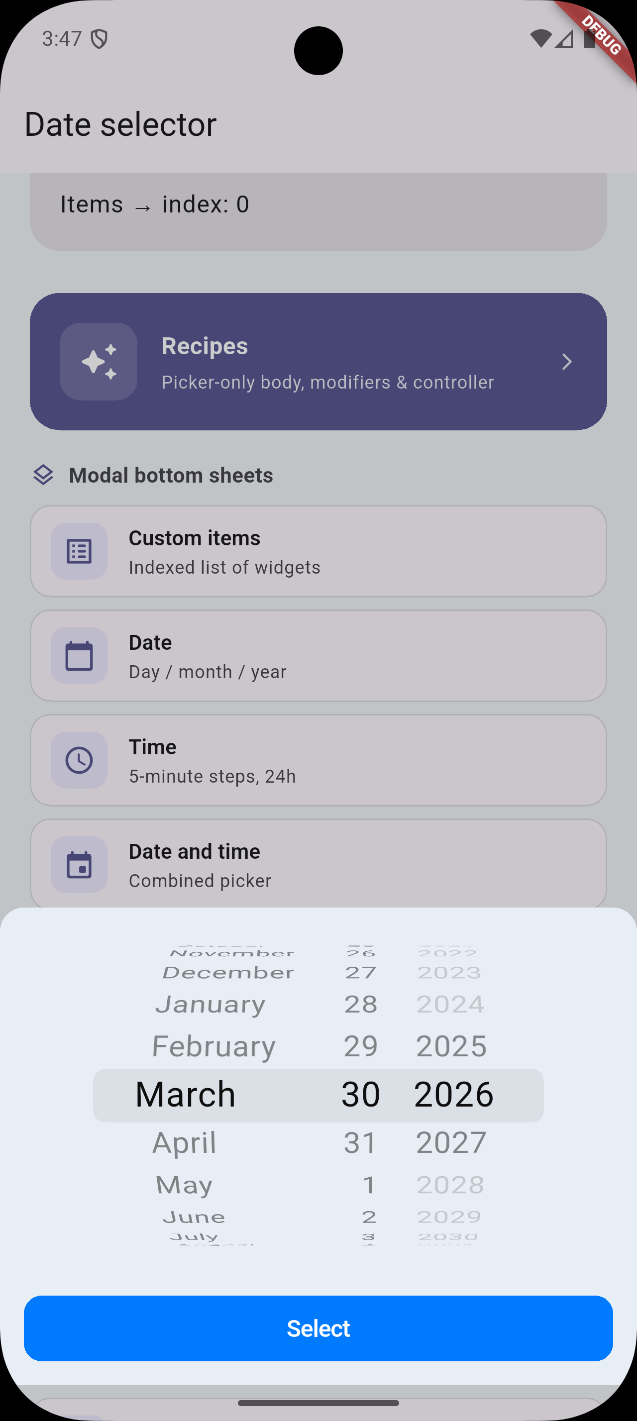
Home screen + modal bottom sheet
| Demo | Preview |
|---|---|
| Custom items |  |
| Date |  |
| Time |  |
| Date and time |  |
| Year |  |
| Month & year |  |
| Month & year (alt) |  |
| Month only |  |
| Duration |  |
| Design / custom month & year sheet |  |
Full-screen inline widget demos
| Screen | Preview |
|---|---|
| Month & year widget |  |
| Items widget |  |
| Date widget |  |
| Time widget |  |
| Year widget |  |
| Year widget (alt) |  |
| Month widget |  |
| Duration widget |  |