Description
A Flutter package that lets users select a country and state/region using searchable dropdowns. Supports iOS, Android, and Web.
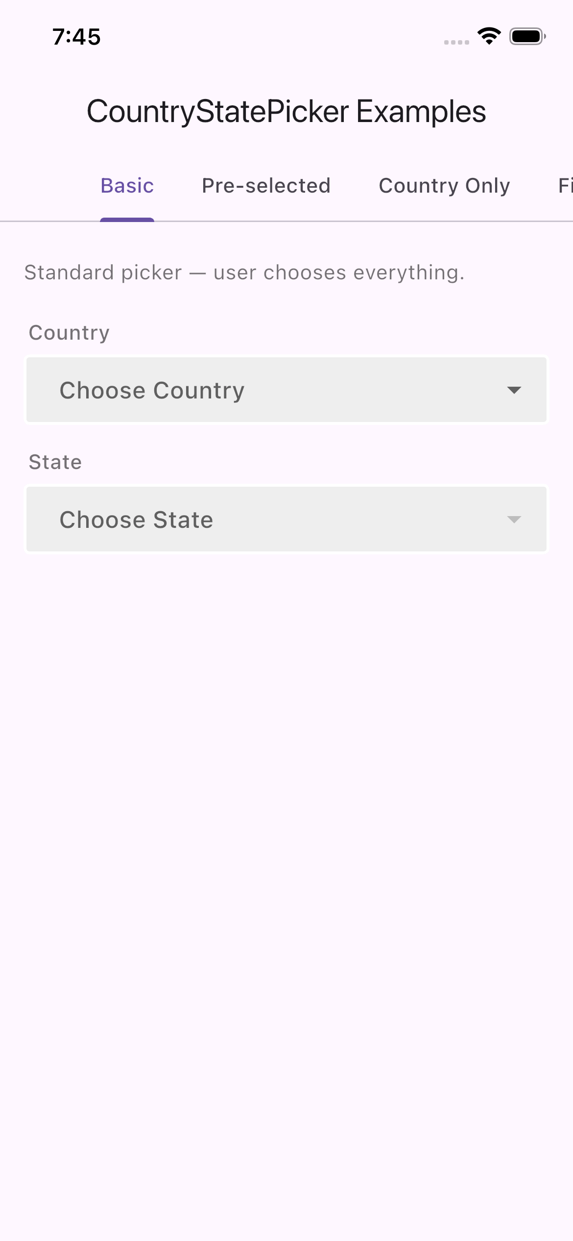
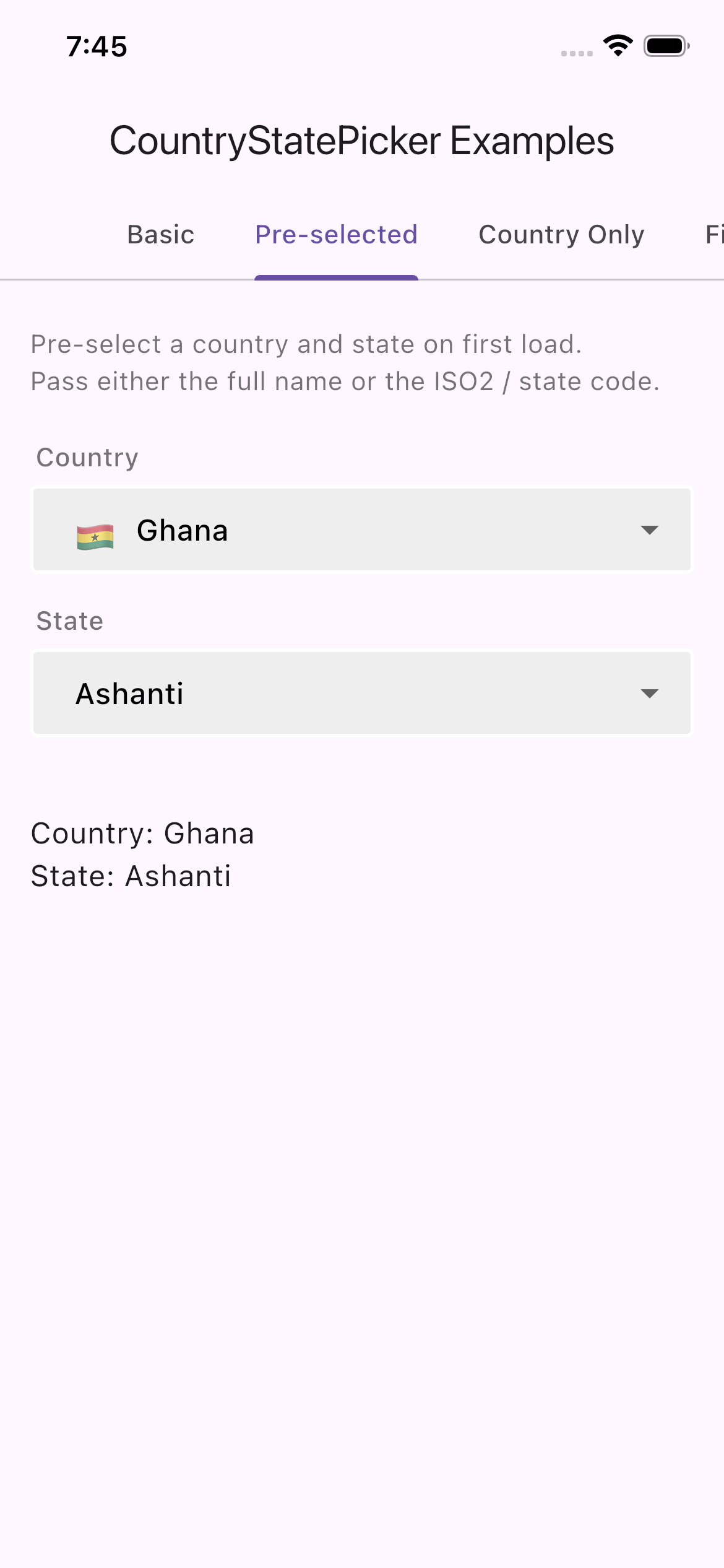
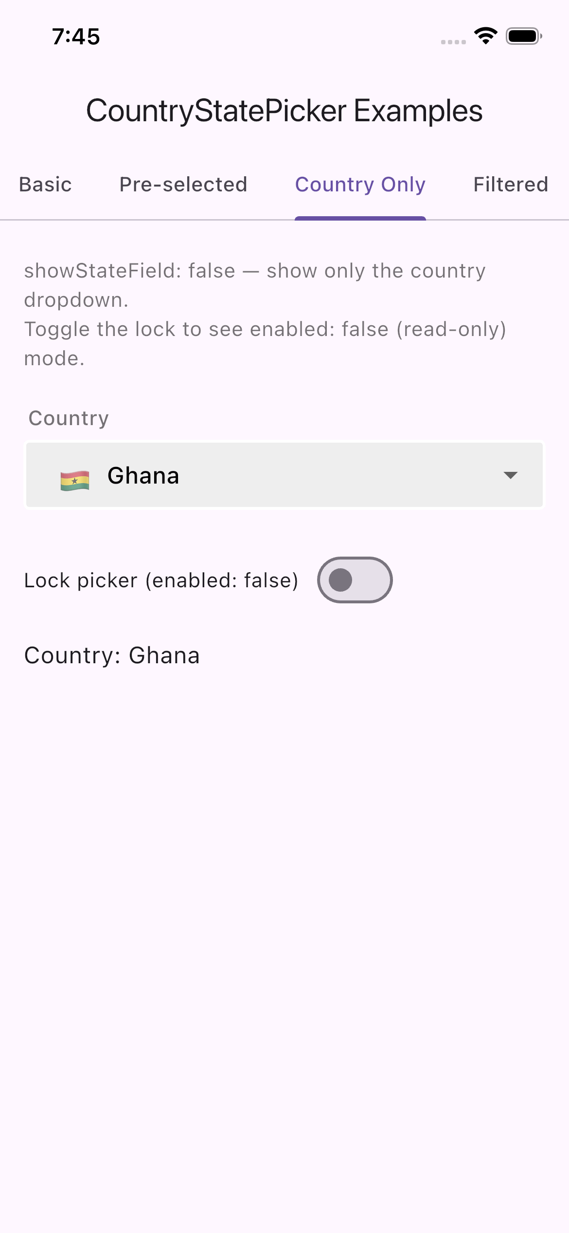
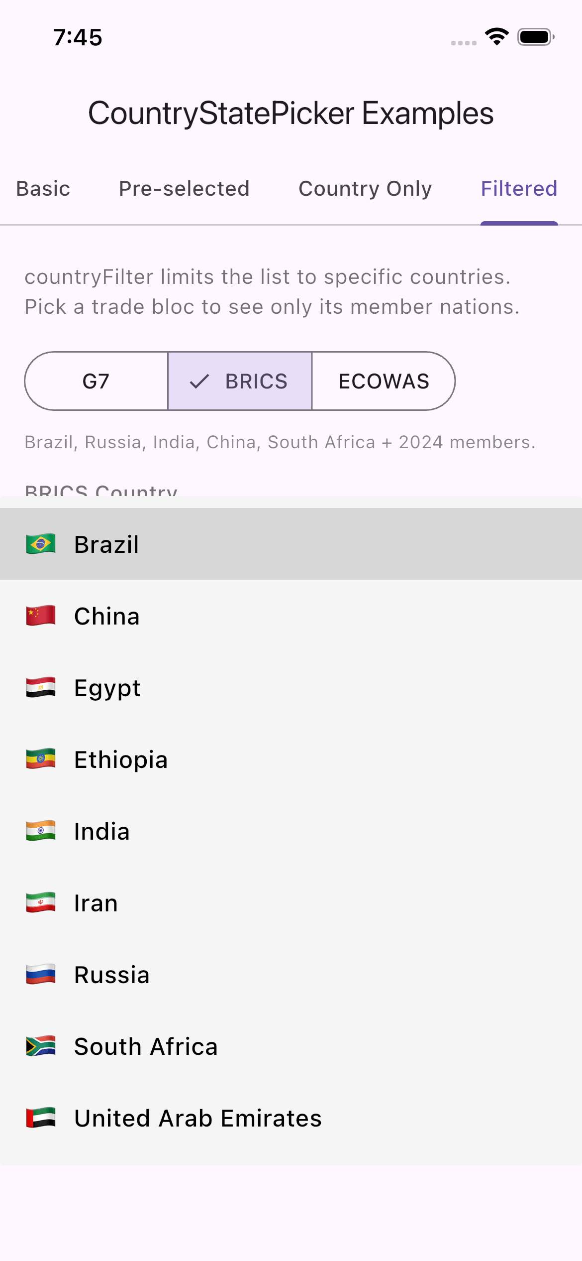
Screenshots
| Basic | Pre-selected | Country Only | Filtered |
|---|---|---|---|
 |
 |
 |
 |
Features
- Select Country with emoji flag
- Select State / Region for the chosen country
- Pre-select initial country and state on first load
- Hide the state dropdown (country-only mode)
- Disable / read-only mode
- Filter the country list to a custom subset
- Validate country and state on form submission
- Fast — country data is cached after the first load
Parameters
| Param | Required | Default | Type | Description |
|---|---|---|---|---|
onCountryChanged |
✅ | — | Function(String) |
Called when the user selects a country |
onStateChanged |
✅ | — | Function(String) |
Called when the user selects a state |
initialCountry |
❌ | — | String? |
Pre-select a country by name ("Ghana") or ISO2 code ("GH") |
initialState |
❌ | — | String? |
Pre-select a state by name or state code. Requires initialCountry |
showStateField |
❌ | true |
bool |
Set to false to hide the state dropdown (country-only mode) |
enabled |
❌ | true |
bool |
Set to false to make both dropdowns read-only |
countryFilter |
❌ | — | List<String>? |
Limit the country list to specific countries by name or ISO2 code |
countryLabel |
❌ | Label("Country") | Widget? |
Widget rendered above the country dropdown |
stateLabel |
❌ | Label("State") | Widget? |
Widget rendered above the state dropdown |
countryHintText |
❌ | "Choose Country" | String? |
Hint text for the country dropdown |
stateHintText |
❌ | "Choose State" | String? |
Hint text for the state dropdown |
noStateFoundText |
❌ | "No States Found" | String? |
Shown when the selected country has no states |
countryValidator |
❌ | — | ValidatorFunction? |
Validate country selection on form submit |
stateValidator |
❌ | — | ValidatorFunction? |
Validate state selection on form submit |
onCountryTap |
❌ | — | VoidCallback? |
Called when the country dropdown is tapped |
onStateTap |
❌ | — | VoidCallback? |
Called when the state dropdown is tapped |
inputDecoration |
❌ | built-in style | InputDecoration? |
Custom decoration applied to both dropdowns |
flagSize |
❌ | 22.0 | double? |
Size of the flag emoji on the selected-value label |
listFlagSize |
❌ | 22.0 | double? |
Size of the flag emoji in the dropdown list |
hintTextStyle |
❌ | — | TextStyle? |
Text style for hint / selected-value text |
itemTextStyle |
❌ | — | TextStyle? |
Text style for dropdown list items |
dropdownColor |
❌ | Colors.grey100 |
Color? |
Background color of the dropdown list |
elevation |
❌ | 0 | int? |
Elevation of the dropdown list |
isExpanded |
❌ | true |
bool? |
Whether the dropdown fills its parent width |
divider |
❌ | SizedBox(height: 10) | Widget? |
Widget between the country and state fields |
How To Use
-
Import the package
import 'package:country_state_picker/country_state_picker.dart'; -
Basic usage
CountryStatePicker( onCountryChanged: (country) => setState(() => _country = country), onStateChanged: (state) => setState(() => _state = state), ) -
Pre-select Ghana / Ashanti on load
CountryStatePicker( initialCountry: 'GH', // or "Ghana" initialState: 'Ashanti', // or state code onCountryChanged: (ct) => setState(() => _country = ct), onStateChanged: (st) => setState(() => _state = st), ) -
Country-only picker (no state dropdown)
CountryStatePicker( showStateField: false, onCountryChanged: (ct) => setState(() => _country = ct), onStateChanged: (_) {}, ) -
Restrict to specific countries
CountryStatePicker(
  countryFilter: const ['GH', 'NG', 'KE', 'ZA'],
  onCountryChanged: (ct) => setState(() => _country = ct),
  onStateChanged:  (st) => setState(() => _state   = st),
)
Todo
xSelect CountryxSelect StatexValidate Country and StatexPre-select initial valuesxCountry-only modexRead-only / disabled modexCountry filter