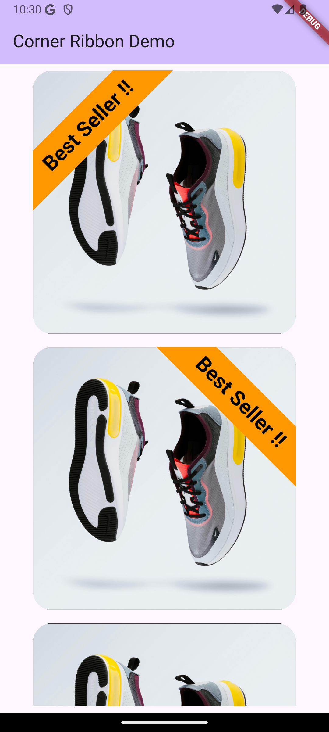
Corner Ribbon
Corner Ribbon is a Flutter widget that lets you add customizable ribbons to the corners or edges of any widget. Use it to highlight features like "SALE," "NEW," or any custom label on your widgets with ease.

Features
- Position ribbons at any corner: top-left, top-right, bottom-left, bottom-right.
- Supports horizontal and vertical placement along edges.
- Customizable colors, text styles, offset distance, and ribbon stroke width.
- Easily overlay ribbons on any child widget.
Getting Started
To use this package, ensure you have added the following dependency to your pubspec.yaml:
    dependencies:
      corner_ribbon: ^0.0.1
Then, run flutter pub get to install the package.
Usage
Here’s a basic example of how to use the CornerRibbon widget:
    import 'package:corner_ribbon/corner_ribbon.dart';
import 'package:flutter/material.dart';

void main() => runApp(MyApp());

class MyApp extends StatelessWidget {
  @override
  Widget build(BuildContext context) {
    return MaterialApp(
      home: Scaffold(
        appBar: AppBar(title: Text('Corner Ribbon Example')),
        body: Center(
          child: CornerRibbon(
            ribbonColor: Colors.red,
            text: "SALE",
            position: RibbonPosition.topRight,
            ribbonStroke: 75,
            cornerOffset: 10,
            textStyle: TextStyle(
              color: Colors.white,
              fontWeight: FontWeight.bold,
              fontSize: 14,
            ),
            child: Container(
              width: 200,
              height: 200,
              color: Colors.grey[300],
            ),
          ),
        ),
      ),
    );
  }
}
Properties
ribbonColor: Color of the ribbon background.text: Text displayed on the ribbon.position: Enum specifying the ribbon's position (e.g.,topLeft,bottomRight).ribbonStroke: Thickness of the ribbon.cornerOffset: Offset distance from the corner.textStyle: Customize font size, weight, and color.child: Widget over which the ribbon is displayed.
Additional Information
To contribute, submit issues, or suggest features, visit the GitHub repository.