cool_stepper_custom
CoolStepperCustom based on CoolStepper, a widget that displays a step by step sequence of operations that fixes some of the bugs and adds additional customization abilities.
Usage
To use this package, add cool_stepper_custom as a dependency in your pubspec.yaml file. And add this import to your file.
import 'package:cool_stepper/cool_stepper_custom.dart';
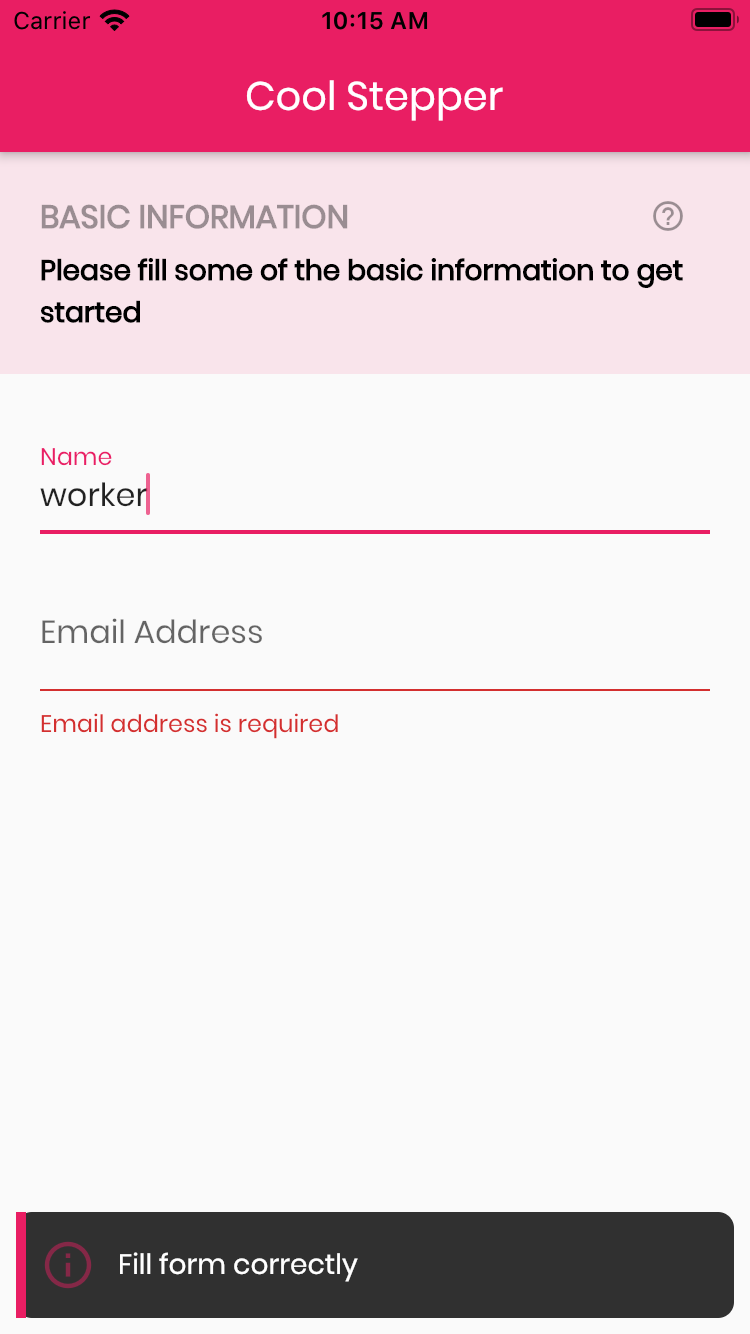
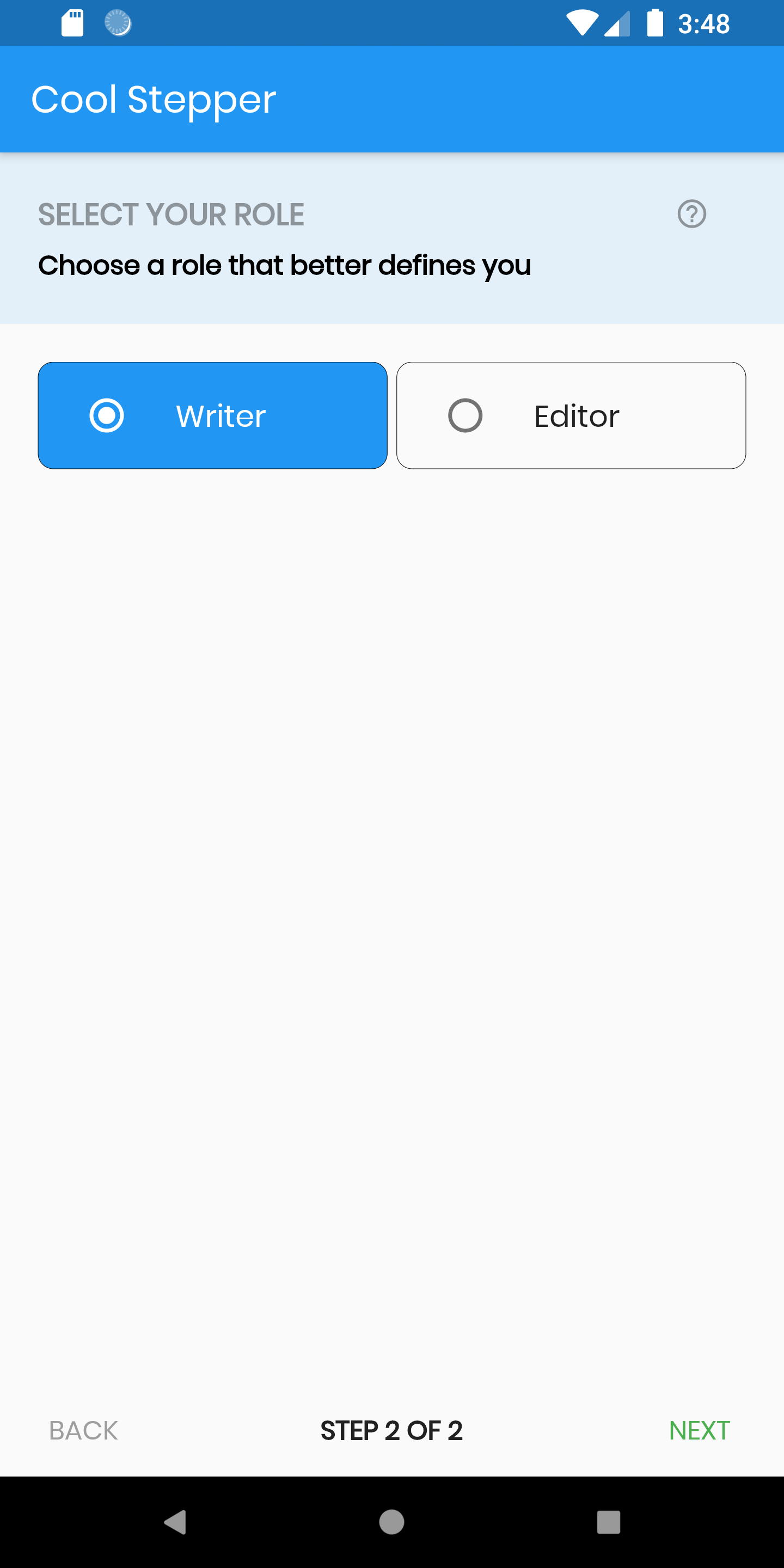
Screenshots

Example
CoolStepper(
   onCompleted: () {},
   steps: List<CoolStep>[
       CoolStep(
        title: "Basic Information",
        subtitle: "Please fill some of the basic information to get started",
        content: Container()
       ),
   ],
);
For each step, return a null, if you want the validation to pass or a String message which would be displayed if you set the showErrorSnackbar attribute to true.
validation: () {
          if (!_formKey.currentState!.validate()) {
            return 'Fill form correctly';
          }
          return null;
        },
CoolStepper Class
| Attribute | Data type | Description | Default Value |
|---|---|---|---|
| onCompleted | Void Function() | @required - A function that is triggers when all steps have been completed | Null |
| steps | List | @required | Null |
| config | CoolStepperConfig | Helps to customize your stepper | CoolStepperConfig(backText: "BACK", nextText: "NEXT", stepText: "STEP", ofText: "OF") |
| showErrorSnackbar | boolean | Shows a snakbar at the bottom of the page when a step validation fails if set to true | false |
CoolStepperConfig Properties
| Attribute | Data type | Description | Default Value |
|---|---|---|---|
| backText | String | The text that should be displayed for the back button | BACK |
| backTextStyle | TextStyle | The style for the back text | |
| backButtonStyle | ButtonStyle | The style for the back button | |
| backButtonPadding | EdgeInsetsGeometry | The padding for the back button | |
| nextText | String | The text that should be displayed for the next button | NEXT |
| nextTextStyle | TextStyle | The style for the next text | |
| nextButtonStyle | ButtonStyle | The style for the next button | |
| nextButtonPadding | EdgeInsetsGeometry | The padding for the next button | |
| finalText | String | The text that should be displayed for the next button on the final step | FINISH |
| finalTextStyle | TextStyle | The style for the final text | |
| finalButtonStyle | ButtonStyle | The style for the final button | |
| finalButtonPadding | EdgeInsetsGeometry | The padding for the final button | |
| stepText | String | The text that describes the progress | STEP |
| ofText | String | The text that describes the progress | OF |
| headerColor | Color | This is the background color of the header | Theme.of(context).primaryColor.withOpacity(0.1) |
| iconColor | Color | This is the color of the icon | Color.black38 |
| icon | Icon | This icon replaces the default icon | Icon(Icons.help_outline,size: 18,Colors.black38) |
| titleTextStyle | TextStyle | This is the textStyle for the title text | TextStyle(fontSize: 16.0,fontWeight: FontWeight.bold,color: Colors.black38) |
| subtitleTextStyle | TextStyle | This is the textStyle for the subtitle text | TextStyle(fontSize: 14.0,fontWeight: FontWeight.w600,color: Colors.black) |
| backTextList | List | A List of string that when supplied will override 'backText'. Must be one less than the number of steps since for the first step, the backText won't be visible | null |
| nextTextList | List | A List of string that when supplied will override 'nextText'Must be one less than the number of steps since the 'finalText' attribute is able to set the value for the final step's next button | null |