circular_time_range_picker
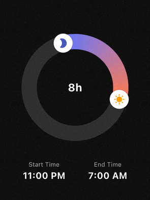
A highly customizable circular time range picker for Flutter. Perfect for use cases like sleep tracking, focus sessions, or scheduling, where users select a start and end time on a 24-hour clock face.
Features
- 24h Circular Selection: Intuitive 360-degree time range picking.
- Flexible Interaction:
- Drag the start handle to adjust the beginning.
- Drag the end handle to adjust the end.
- Drag the entire arc to shift the whole time range at once.
- Smart Snapping: Fully configurable
minuteInterval(e.g., 5, 10, 15, 30 min) with multiple snapping strategies (round,floor,ceil). - Highly Customizable UI:
- Support for Gradients on the range arc.
- Use Custom Widgets (Icons, Images) as handles.
- Adjustable stroke width, track colors, and handle sizes.
- Midnight Logic: Automatically calculates durations that cross the midnight threshold (e.g., 23:00 to 07:00).
Getting started
Add the package to your pubspec.yaml:
dependencies:
  circular_time_range_picker: ^0.1.0
Import it in your Dart code:
import 'package:circular_time_range_picker/circular_time_range_picker.dart';
Usage
Simple Example
The most basic implementation requires an initialValue and an onChanged callback.
CircularTimeRangePicker(
  initialValue: const TimeRangeValue(
    start: TimeOfDay(hour: 22, minute: 0),
    end: TimeOfDay(hour: 6, minute: 0),
  ),
  onChanged: (newRange) {
    print("New Duration: ${newRange.duration.inHours} hours");
  },
)
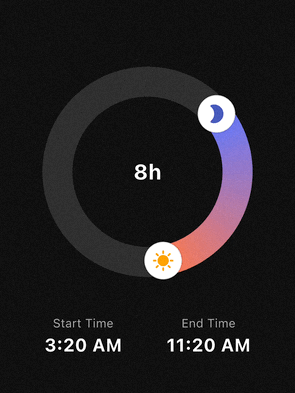
Advanced Styling & Snapping
You can use TimePickerStyle and SnapStrategy to match your app's design and UX requirements.
CircularTimeRangePicker(
  initialValue: _myRange,
  size: const Size(280, 280),
  minuteInterval: 15,
  snapStrategy: SnapStrategy.round,
  style: TimePickerStyle(
    trackColor: Colors.white10,
    rangeGradient: [Colors.indigoAccent, Colors.deepOrangeAccent],
    strokeWidth: 40,
    handlerRadius: 22,
    startHandlerWidget: const Icon(Icons.bed, color: Colors.indigo, size: 24),
    endHandlerWidget: const Icon(Icons.sunny, color: Colors.orange, size: 24),
  ),
  onChanged: (range) => setState(() => _myRange = range),
)
API Reference
CircularTimeRangePicker
CircularTimeRangePicker({
  Key? key,
  Size size = const Size(250, 250),
  required TimeRangeValue initialValue,
  TimePickerStyle style = const TimePickerStyle(),
  required void Function(TimeRangeValue) onChanged,
  int minuteInterval = 10,
  SnapStrategy snapStrategy = SnapStrategy.round,
})
initialValue: initial start/endTimeOfDay.onChanged: called whenever the user drags a handle or arc.minuteInterval:- “snap step” in minutes (e.g.
1,5,10,15,30,60). - Any
int >= 1is allowed, but divisors of 60 (1, 5, 10, 12, 15, 20, 30, 60) are recommended.
- “snap step” in minutes (e.g.
snapStrategy(SnapStrategy):SnapStrategy.round– snap to the nearest interval (default)SnapStrategy.floor– always snap downSnapStrategy.ceil– always snap upSnapStrategy.none– no snapping (in this caseminuteIntervalis ignored)
Internally, both:
- the displayed times and
- the handle positions (angles)
are snapped according to these settings, so the UI and values stay perfectly in sync.
TimeRangeValue
class TimeRangeValue {
  final TimeOfDay start;
  final TimeOfDay end;

  const TimeRangeValue({required this.start, required this.end});

  Duration get duration;
}
start/end: 24‑hour times.duration:- Computed as the forward difference from
starttoend. - Handles ranges that cross midnight (e.g.
23:00 → 07:00= 8 hours).
- Computed as the forward difference from
TimePickerStyle
class TimePickerStyle {
  final Color trackColor;
  final List<Color> rangeGradient;
  final double strokeWidth;
  final double handlerRadius;
  final Color handlerColor;
  final Widget? startHandlerWidget;
  final Widget? endHandlerWidget;

  const TimePickerStyle({
    this.trackColor = Colors.white10,
    this.rangeGradient = const [Colors.indigoAccent, Colors.deepOrangeAccent],
    this.strokeWidth = 30.0,
    this.handlerRadius = 18.0,
    this.handlerColor = Colors.white,
    this.startHandlerWidget,
    this.endHandlerWidget,
  });
}
trackColor: background ring color.rangeGradient: gradient along the active arc (start → end).strokeWidth: thickness of the ring.handlerRadius/handlerColor:- base circular handlers drawn by the painter.
startHandlerWidget/endHandlerWidget:- Optional custom widgets rendered on top of the handles, positioned so that their centers sit exactly on the ring.
Example:
style: TimePickerStyle(
  trackColor: const Color(0xFFEEEEEE),
  rangeGradient: const [Colors.blue, Colors.lightBlueAccent],
  strokeWidth: 40,
  handlerRadius: 20,
  handlerColor: Colors.white,
  startHandlerWidget: const Icon(Icons.bed, color: Colors.white),
  endHandlerWidget: const Icon(Icons.sunny, color: Colors.white),
),
FAQ
Q: How do I display the total duration in the center?
A: Wrap the CircularTimeRangePicker in a Stack and place a Text widget in the center. Since the picker's center is transparent, the text will be visible.
Q: Does it support 12-hour or 24-hour formats?
A: The picker always operates on a 24-hour logic (full circle), but you can format the output TimeOfDay to 12h or 24h format in your UI using timeOfDay.format(context).
License
This package is distributed under the MIT License. See LICENSE for details.
Libraries
- circular_time_range_picker
- A customizable Flutter package for picking time ranges on a circular dial.