
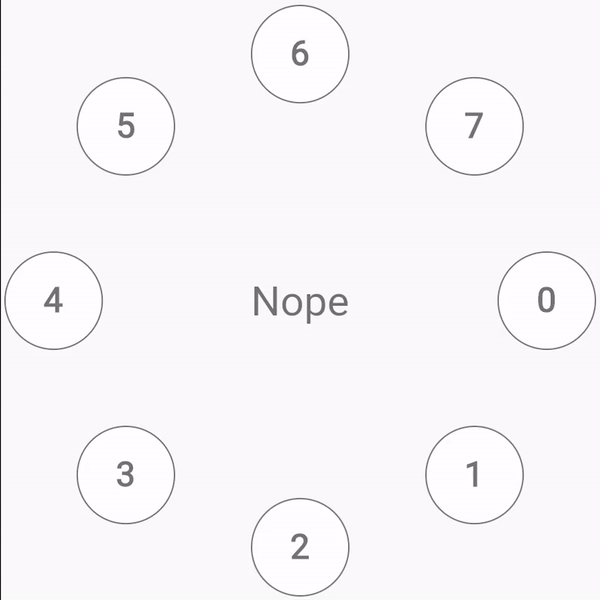
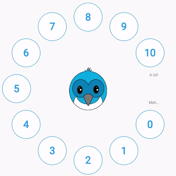
Allow your users to rate something in a circled shaped fashion.
Features
Using this package you can, among other things:
- Change the number of circles to select
- Change center widget that results from changing rating
- Place labels to guide your users about the rating system
Running examples
If yoy want to run labels.dart (wich is the one with the cutty Dash!), just remember create an assets/ folder on your project and copy the Dash images placed on example/assets of this folder.
Usage
Install the package and then depend on in. You can customize the widget changing these parameters
- numberOfCircles: number of indicators (in the examples are circles, but it can be any widget) to show to the user to him to select rating.
- centerWidgetBuilder: builder of the widget to be displayed at the center.
- avoidCircleNumber: number of the indicator to skip. Is if usefull in the case there is wanted to use labels.
- onIndexChanged: callback when user change selected index.
- indexOffset: offset that allows to shift indexes.
- isReversed: boolean that allows to render indicator widgets counterclockwise
- indicator: widget to be displayed as selector to the user. It can be used
CircleIndicatorwidget, that is part of this library. - indicatorRadius: radius of the indicator widget
- labels: labels to be displayed on the
avoidCircleNumberposition. it receibes aLabelsparameter. Checklabels.dartexample on/examplefolder.
CirclesRate(
    numberOfCircles: numberOfCircles,
    indicator: (index, selectedIndex) {
    bool isSelected = index == selectedIndex;
    return CircleIndicator(
        index: index,
        isSelected: isSelected,
        borderColor: getBorderColor(
        index: index,
        numberOfCircles: numberOfCircles,
        isSelected: isSelected,
        ),
        backgroundColor: getBackgroundColor(
        index: index,
        numberOfCircles: numberOfCircles,
        isSelected: isSelected,
        ),
        textColor: getTextColor(
        index: index,
        isSelected: isSelected,
        ),
    );
    },
    centerWidgetBuilder: (_, selectedIndex) {
    if (selectedIndex == null) {
        return const Text(
        'Nope',
        style: TextStyle(
            fontSize: 60,
            color: Colors.black54,
        ),
        );
    }
    return Text(
        selectedIndex.toString(),
        style: const TextStyle(
        fontSize: 70,
        color: Colors.black54,
        ),
    );
    },
)