circle_time_progress

A customizable gradient circular progress indicator for Flutter. Create beautiful circular timers, loaders, and progress indicators with gradients that enhance your UI on mobile, web, and desktop platforms.
✨ Features
✅ Smooth circular progress animation
✅ Fully customizable gradient colors
✅ Adjustable stroke width, size, and start angle
✅ Supports custom StrokeCap (e.g., round, butt, square)
✅ Designed for all Flutter platforms (Android, iOS, Web, macOS, Windows, Linux)
✅ Simple to integrate in seconds
📦 Installation
Add this to your pubspec.yaml:
dependencies:
  circle_time_progress: ^0.0.1
Then run:
flutter pub get
🚀 Usage
import 'package:circle_time_progress/circle_time_progress.dart';
import 'package:flutter/material.dart';

void main() => runApp(const MyApp());

class MyApp extends StatelessWidget {
  const MyApp({super.key});

  @override
  Widget build(BuildContext context) {
    return MaterialApp(
      home: Scaffold(
        appBar: AppBar(title: const Text('Gradient Circular Progress')),
        body: Center(
          child: GradientCircularProgressIndicator(
            value: 0.7, // 70% progress
            size: 150,
            strokeWidth: 12,
            gradient: const LinearGradient(
              colors: [Colors.purple, Colors.pink],
            ),
            backgroundColor: Colors.grey.shade300,
          ),
        ),
      ),
    );
  }
}
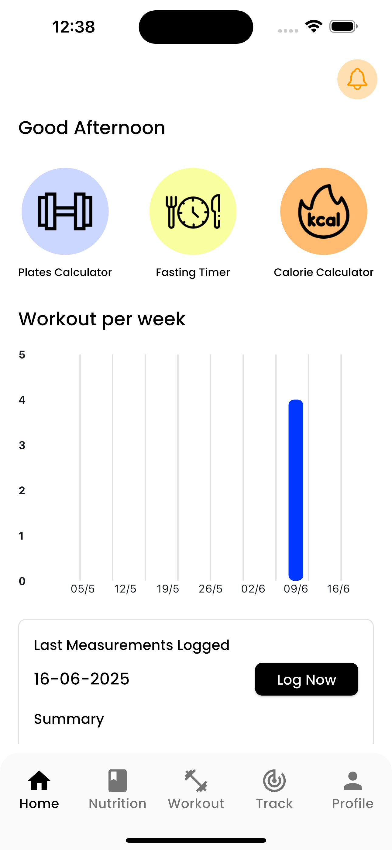
📷 Screenshots

🎬 Demo
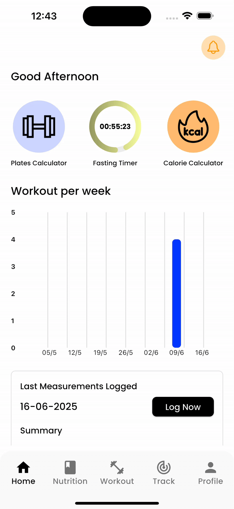
💡 When to use this package?
- Timers (e.g., workout, fasting, Pomodoro)
- Loading indicators with stylish gradients
- Circular progress bars for dashboards or analytics
- Custom clocks or time trackers
Wherever you want to visually display progress or time in a modern, beautiful circular form — this widget is perfect!
🌍 Platform support
| ✅ Android | ✅ iOS | ✅ Web | ✅ macOS | ✅ Windows | ✅ Linux |
|---|
🔗 Links
📜 License
This project is licensed under the MIT License.
🙌 Contributions
Feel free to open issues or submit pull requests to improve this package!