Chips Input Autocomplete
📚 Table of Contents
🚀 Features
- Dynamic Chip Creation: Users can type to create chips dynamically. Ideal for tags, contacts, or any categorization.
- Autocomplete Suggestions: Offers suggestions as the user types, based on predefined options.
- Customizable Appearance: Full control over the chip's appearance, including background, border, and text colors.
- Form Integration: Easily integrates with forms, allowing for validation and submission of chip data.
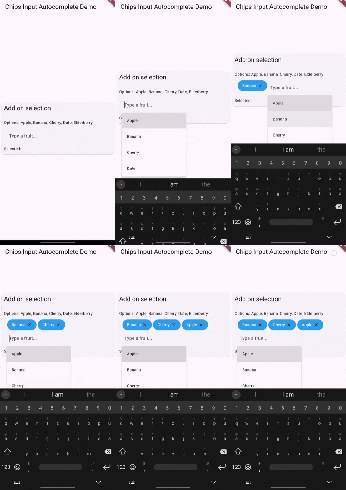
- Extensive Customization: Beyond styling, customize behavior like adding chips on selection, limiting selections, and more.
🏁 Getting Started
To get started with chips_input_autocomplete, check out the Installation and Usage. Detailed documentation under API reference.
🛠️ Usage
To use chips_input_autocomplete in your Flutter project, follow these steps:
Basic Chip Input
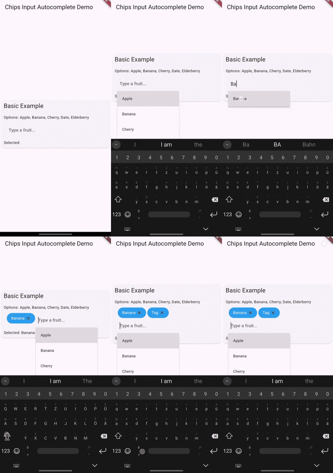
This example demonstrates how to create a basic chip input field where users can type to create chips dynamically.
const List<String> yourOptionsList = ['Option 1', 'Option 2', 'Option 3'];

ChipsInputAutocomplete(
  options: yourOptionsList,
)
Validate Input
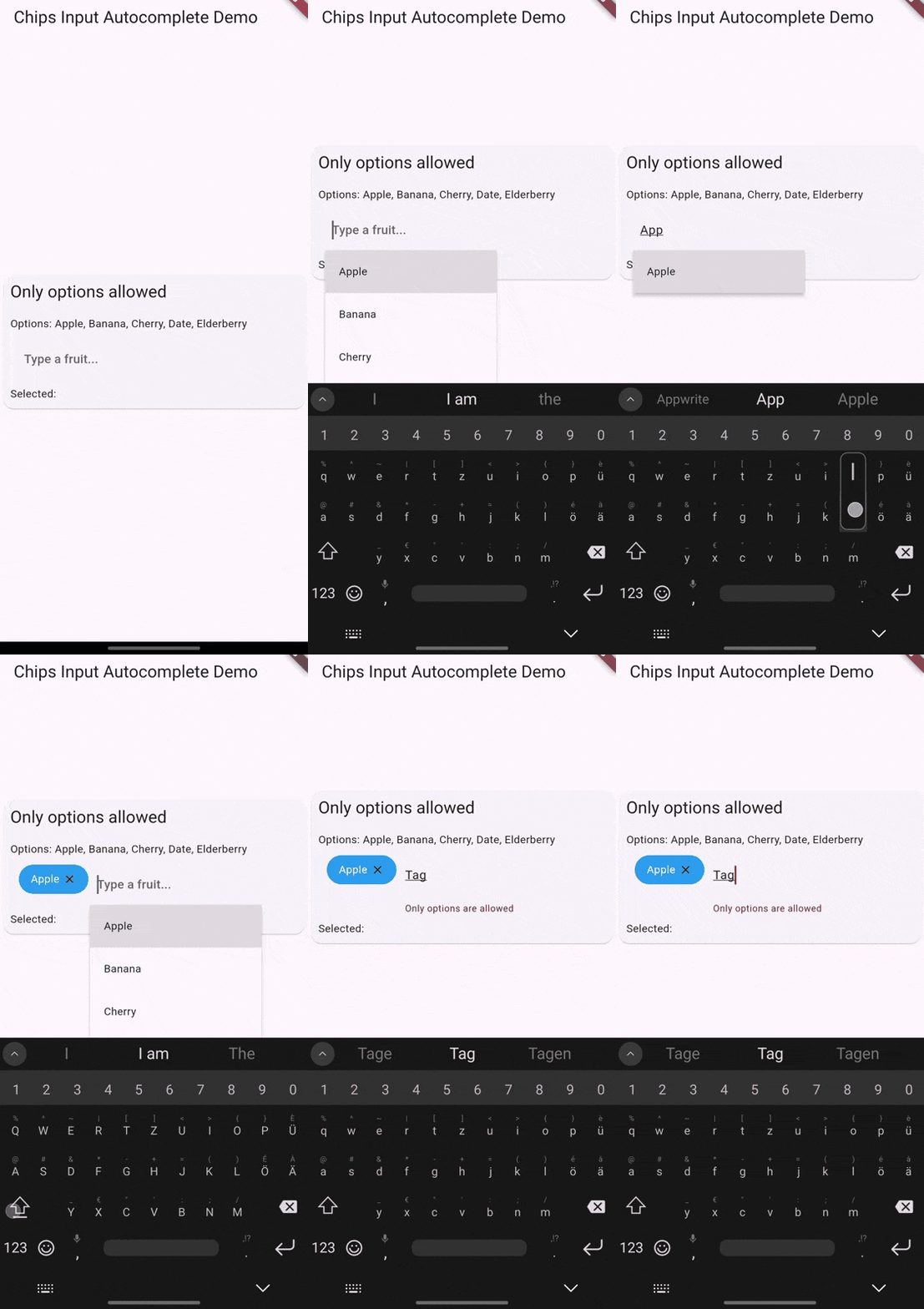
Only allow chips that match predefined options. This example uses a validation method to ensure only valid options are added as chips.
ChipsInputAutocomplete(
  options: yourOptionsList,
  validateInputMethod: (String? input) {
    if (yourOptionsList.contains(input)) {
      return null; // Input is valid
    } else {
      return 'Only predefined options are allowed'; // Input is invalid
    }
  },
)
Get chips data
Use a controller to get the selected chips data.
final ChipsAutocompleteController controller = ChipsAutocompleteController();

ChipsInputAutocomplete(
  controller: controller,
)

// Get selected chips data
List<String> selectedChips = controller.chips; // selectedChips = ['Chiptext 1', 'Chiptext 2']
Async fetched options
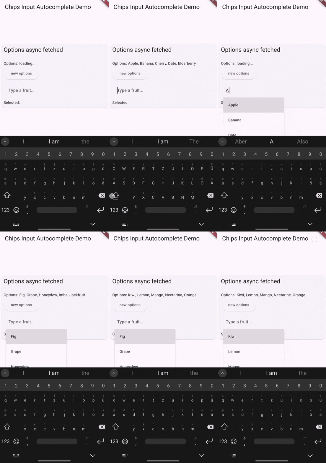
Use a controller to manage the options asynchronously. This example fetches options from an API and sets them in the controller.
final ChipsAutocompleteController controller = ChipsAutocompleteController();

@override
void initState() {
  getTagsOptions();
  super.initState();
}

Future<void> getTagsOptions() async {
  controller.options = await fetchTags();
}

ChipsInputAutocomplete(
  controller: controller,
)
For more detailed examples and usage, refer to the pub.dev example.
⚙️ Usage Examples
The appearance may differ from the current default theme. The following examples demonstrate the various configurations and behaviors of the chips_input_autocomplete widget. For current appearance, refer to the pub.dev example.


🧷 Parameters
Basic Configuration
controller: Manages chips, autocomplete options, and the textfield.options: A list of strings for autocomplete options. Can also be set via the controller.createCharacter: Character that triggers chip creation. (default:,)placeChipsSectionAbove: Determines if the chips section is above / left or below / right the textfield.
Chip Appearance
secondaryTheme: When true, uses a secondary theme for the chips. Based on the selected chip theme of material design 3.chipTheme: Theme for the chips. Defaults to material design 3. More Details under ChipThemeData.deleteIcon: Icon for deleting a chip. Defaults to a close icon. Can be null to remove.chipClipBehavior: Clip behavior for the chips. (default:Clip.none)deleteButtonTooltipMessage: Tooltip message for the delete button. (default:Delete)
Text Field Appearance and Configuration
focusNode: FocusNode for the textfield.decorationTextField: Style of the textfield.keyboardType: Keyboard type for the textfield.enableSuggestions: Whether to show suggestions.showCursor: Whether to show the cursor.cursorWidth: Width of the cursor.cursorColor: Color used for the cursor.cursorRadius: Radius of the cursor.cursorHeight: Height of the cursor.
Container Appearance
widgetContainerDecoration: Decoration for the main widget container.paddingInsideWidgetContainer: Padding inside the main widget container.spacing: Spacing between chips. (default:5.0)runSpacing: Spacing between lines of chips. If unset, defaults to spacing.optionsMaxWidth: Maximum width of the options view. Defaults to textfield width if unset.
Additional Configuration
initialChips: Initial chips to be displayed.autoFocus: Whether the widget should autofocus.formKey: Form key for accessing or validating the form outside the widget.validateInputMethod: Validation method returning a string if input is invalid. Null means always valid.validateChipsMethod: Validation method returning a string if all chips are invalid. Null means always valid.autovalidateMode: Autovalidate mode for the form. (default:AutovalidateMode.disabled)enabled: Whether the widget and textfield is enabled.addChipOnSelection: Adds a chip when an option is selected. If false, adds the option to the text field.showClearButton: Whether to show the clear IconButton.clearWithConfirm: Whether to show a confirmation dialog when clearing all chips.eraseKeyLabel: Key label used for erasing a chip. Defaults to Backspace.showOnlyUnselectedOptions: Whether to show only options that are not already selected. (default:true)
Callbacks and Event Handling
onChanged: Callback when the chips value changes.onChangedTextField: Callback when the text field changes.onEditingComplete: Callback when editing is complete.onSaved: Callback when the form is saved.onChipDeleted: Callback when a chip is deleted, with chip content and index.onChipAdded: Callback when a chip is added, with chip content.onChipsCleared: Callback when all chips are cleared.useDefaultOnChipDeleted: Whether to use the default onChipDeleted method. Maybe set to false for a different logic. For example, when chips are updated from a different source.useDefaultOnChipAdded: Whether to use the default onChipAdded method. Maybe set to false for a different logic. For example, when chips are updated from a different source.useDefaultOnChipsCleared: Whether to use the default onChipsCleared method. Maybe set to false for a different logic. For example, when chips are updated from a different source.
🧑💻 Author
Libraries
- chips_input_autocomplete
- The
chips_input_autocompletepackage provides a Flutter widget for creating customizable input fields with chips and autocomplete functionality. It is ideal for tagging, categorizing, or any scenario where user input can be broken down into smaller, manageable chips with the added benefit of autocomplete suggestions.


