Chative.IO Widget for Flutter
Chative.IO Widget is a Flutter package that provides an easy-to-use chat widget for your mobile applications. It allows you to integrate a customizable chat interface with minimal setup.
Requirements
- Dart sdk: ">=3.0.0"
- Flutter: ">=3.x"
- Android:
minSdkVersion >= 19,compileSdk >= 34, AGP version>= 7.3.0(use Android Studio - Android Gradle plugin Upgrade Assistant for help), support forandroidx(see AndroidX Migration to migrate an existing app) - iOS 12.0+:
--ios-language swift, Xcode version>= 15.0
Features
- Customizable Chat Interface: Tailor the chat widget to match your app's design.
- Programmatic Show/Hide: Easily display or hide the chat widget as needed.
- Custom Header Components: Add custom headers to enhance the chat experience.
- User Information Integration: Populate user details into live chat for personalized interactions.
- Adjustable Insets: Customize insets to accommodate different device sizes.
- Dart Support: Fully compatible with Dart for seamless integration.
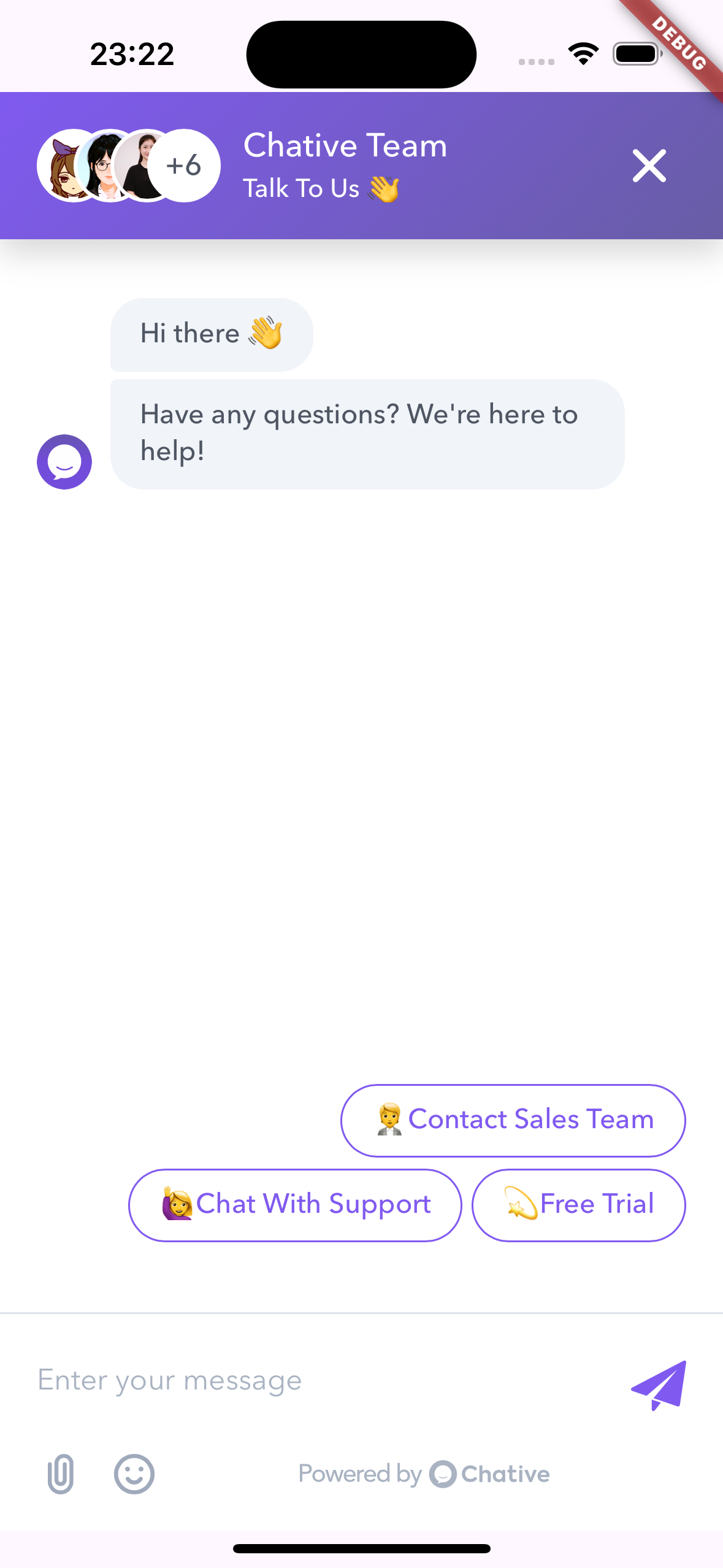
Screenshot

Installation
Add the chative_sdk package to your pubspec.yaml:
dependencies:
  flutter:
    sdk: flutter
  chative_sdk: ^x.x.x
Then, run:
flutter pub get --no-example
Note: This library already includes
webview_flutter. Ensure you follow the webview_flutter configuration instructions for your platform.
Usage
For more detailed examples, please refer to the example directory.
Here's a concise example of how to integrate the ChativeWidget into your Flutter application on a single screen:
import 'package:flutter/material.dart';
import 'package:chative_sdk/chative_sdk.dart';

void main() {
  runApp(const MyApp());
}

class MyApp extends StatelessWidget {
  const MyApp({super.key});

  @override
  Widget build(BuildContext context) {
    return MaterialApp(
      title: 'Chative.IO Flutter Demo',
      theme: ThemeData(
        colorScheme: ColorScheme.fromSeed(seedColor: Colors.deepPurple),
        useMaterial3: true,
      ),
      home: const HomeScreen(),
    );
  }
}

class HomeScreen extends StatefulWidget {
  const HomeScreen({super.key});

  @override
  State<HomeScreen> createState() => _HomeScreenState();
}

class _HomeScreenState extends State<HomeScreen> {
  final ChativeWidgetController _controller = ChativeWidgetController();

  final String channelId = 'YOUR_CHANNEL_ID';
  final Map<String, dynamic> user = {
    'user_id': 'UNIQUE_USER_ID',
    'user': {
      'email': 'abc@gmail.com',
      'first_name': 'Chative',
      'last_name': 'User',
      'phone': '1234567890',
      'custom_field': 'CUSTOMER_FIELD_VALUE'
    },
  };

  void _showChat() {
    _controller.show();
  }

  void _clearData() {
    _controller.clearData();
  }

  @override
  Widget build(BuildContext context) {
    return Scaffold(
      appBar: AppBar(
        title: const Text('Chative.IO Flutter Demo'),
      ),
      body: Stack(
        children: [
          Center(
            child: Column(
              mainAxisSize: MainAxisSize.min,
              children: [
                ElevatedButton(
                  onPressed: _showChat,
                  child: Text('Show Chat Widget'),
                ),
                const SizedBox(height: 20),
                ElevatedButton(
                  onPressed: _clearData,
                  child: Text('Clear Data'),
                ),
              ],
          )),
          ChativeWidget(
            channelId: channelId,
            controller: _controller,
            user: user,
            insetTop: 50,
            // insetBottom: 50,
            onClosed: () {
              print('Chat widget closed');
            },
            onLoaded: () {
              print('Chat widget loaded');
            },
            onNewMessage: (message) {
              print('New message received: $message');
            },
            onError: (message) {
              print('Error: $message');
            },
          ),
        ],
      ),
    );
  }
}
Explanation
-
Import Packages:
Import the necessary packages, includingchative_sdk. -
Initialize the App:
TheMyAppclass sets up theMaterialAppwith aHomeScreenas the home. -
Create the Chat Screen:
-
Controller Initialization:
InstantiateChativeWidgetControllerto manage the chat widget's state. -
User Information:
Define ausermap with necessary user details. -
Show Chat Widget:
AnElevatedButtontriggers theshow()method on the controller to display the chat widget. -
ChativeWidget Configuration:
TheChativeWidgetis placed within aStackto overlay it on top of the main content. Configure properties likechannelId,user,insetTop, and callback functions to handle different states and events.
-
Properties
| Property | Type | Required | Description |
|---|---|---|---|
channelId |
String |
Yes | The ID of the chat channel. |
user |
Map<String, dynamic> |
No | Information about the user, used for booting into live chat. |
headerWidget |
Widget |
No | Custom header component. |
containerDecoration |
BoxDecoration |
No | Custom decoration for the chat container. |
insetTop |
double |
No | Top inset (default: 20). |
insetBottom |
double |
No | Bottom inset (default: 20). |
onClosed |
VoidCallback |
No | Callback when the widget is closed. |
onLoaded |
VoidCallback |
No | Callback when the widget is loaded. |
onNewMessage |
Function(dynamic) |
No | Callback when a new message is received. |
onError |
Function(String) |
No | Callback when an error occurs. |
Methods
The following methods are available via the ChativeWidgetController:
show(): Display the chat widget.hide(): Hide the chat widget.injectJavascript(String script): Inject custom JavaScript into the chat widget.reload(): Reload the chat widget.clearData(): Clear data (localStorage) the chat widget
Example
// To show the chat widget
_controller.show();

// To hide the chat widget
_controller.hide();

// To reload the chat widget
await _controller.reload();
Customization
You can customize the appearance of the widget by providing a custom header component and container decoration:
ChativeWidget(
  controller: _controller,
  channelId: "your-channel-id",
  headerWidget: YourCustomHeader(),
  containerDecoration: BoxDecoration(
    color: Colors.grey,
    borderRadius: BorderRadius.circular(10),
  ),
)
Custom Header Example
class YourCustomHeader extends StatelessWidget {
  @override
  Widget build(BuildContext context) {
    return Container(
      color: Colors.blue,
      height: 50,
      child: Center(
        child: Text(
          'Chative Widget Header',
          style: TextStyle(
            color: Colors.white,
            fontSize: 20,
          ),
        ),
      ),
    );
  }
}
User Map Structure
| Key | Type | Required | Description |
|---|---|---|---|
user_id |
String |
Yes | A unique identifier for the user. Used to track the user's session in the chat. |
user.email |
String |
No | The user's email address. Optional, but recommended for better user identification. |
user.first_name |
String |
No | The user's first name. Optional, useful for personalized interactions. |
user.last_name |
String |
No | The user's last name. Optional, useful for personalized interactions. |
user.phone |
String |
No | The user's phone number. Optional, can be used for follow-up contact. |
user.[key: string] |
dynamic |
No | Any additional information about the user, represented as key-value pairs. Useful for custom data. |
License
Support
If you encounter any issues or have questions, please file an issue on the GitHub repository.
