📸 Gyro Camera Grid
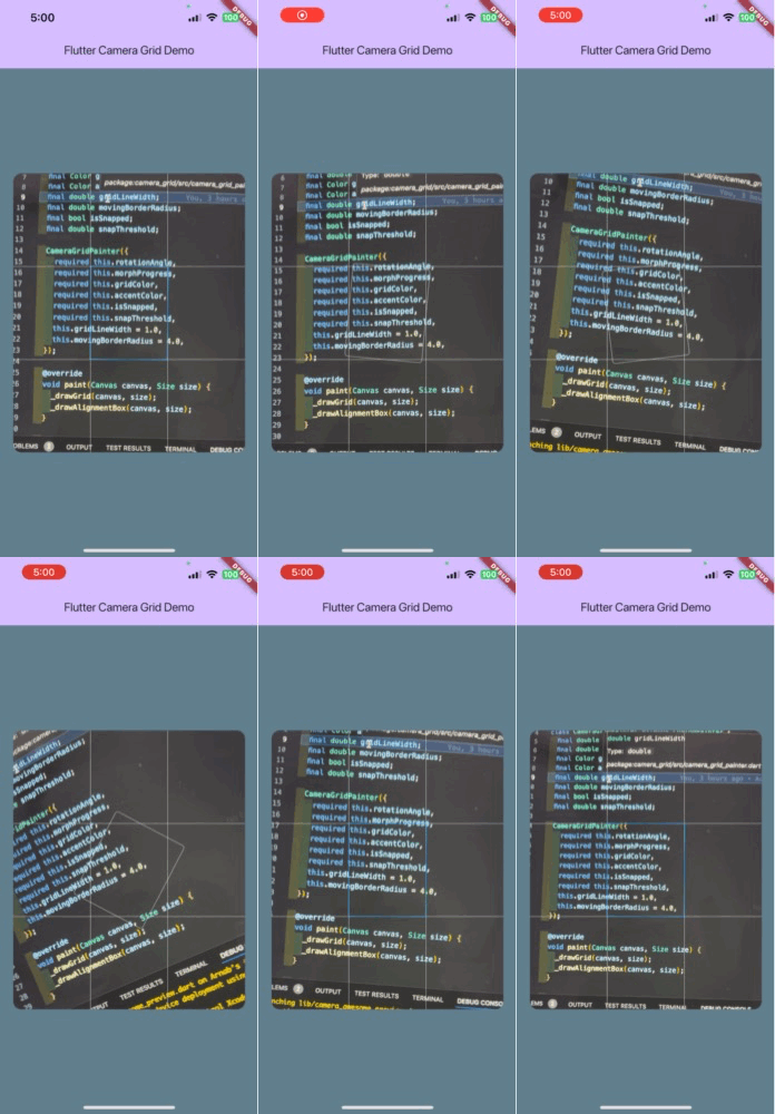
Hey there, Flutter enthusiasts! 👋 Welcome to the Gyro Camera Grid package. This nifty little widget adds a responsive grid overlay to your camera view that reacts to your device's orientation. Pretty cool, huh? 😎
🎉 Features
- Responsive grid overlay that follows device orientation
- Smooth transitions between portrait and landscape modes
- Customizable grid color, accent color, and line width
- Snapping behavior with adjustable threshold
- Easy to enable/disable without performance overhead
- Optional child widget for flexibility
📸 Screenshots

🚀 Getting Started
First things first, let's add this package to your project:
dependencies:
  camera_grid: ^0.0.2
Don't forget to run flutter pub get! 🏃♂️💨
🎨 How to Use
Using the Gyro Camera Grid is as easy as pie 🥧! You can use it with or without a child widget. Here are a couple of examples:
With camera_awesome package:
import 'package:flutter/material.dart';
import 'package:camera_awesome/camera_awesome.dart';
import 'package:camera_grid/camera_grid.dart';

CameraAwesomeBuilder.custom(
  saveConfig: SaveConfig.photo(),
  builder: (state, preview) => state.when(
    onPreparingCamera: (preparingCameraState) => Container(
      color: Colors.black,
    ),
    onPreviewMode: (previewCameraState) {
      return previewCameraState.focus();
    },
    onPhotoMode: (photoCompleteState) {
      return const CameraGrid();
    },
  ),
)
With camera package:
import 'package:flutter/material.dart';
import 'package:camera/camera.dart';
import 'package:camera_grid/camera_grid.dart';

CameraPreview(
  controller,
  child: const CameraGrid(),
)
⚙️ Customization
Want to make it your own? No problem! Here are the customization options:
child: Optional child widget (default: null)gridColor: The color of the grid lines (default: white)accentColor: The color of the alignment box when snapped (default: blue)gridLineWidth: The width of the grid lines (default: 1.0)movingBorderRadius: The border radius of the alignment box when moving (default: 4.0)morphDuration: The duration of the morphing animation (default: 150ms)morphCurve: The curve of the morphing animation (default: Curves.easeOutQuad)snapThreshold: The threshold for snapping in radians (default: 1.5 degrees)isGridEnabled: Toggle to enable/disable the grid overlay (default: true)
🆕 What's New in 0.0.2
- Made the child widget optional for more flexibility
- Improved performance by avoiding unnecessary initialization when grid is disabled
- Implemented a cleaner toggle mechanism using Dart 3's switch expression
- Enhanced customization options
🤔 Why This Package?
You might be wondering, "Is there something like this out there already?" Well, to be honest, I'm not sure! 😅 I created this package because I needed it for a project, and I thought, "Hey, maybe someone else could use this too!"
It's a simple Stack widget-based solution, nothing too fancy or groundbreaking. But sometimes, the simple things are just what we need, right? 🎯
🤝 Contributing
Found a bug? Have an idea for an improvement? Feel free to contribute! We're all in this together, after all. 🌟
- Fork the Project
- Create your Feature Branch (
git checkout -b feature/AmazingFeature) - Commit your Changes (
git commit -m 'Add some AmazingFeature') - Push to the Branch (
git push origin feature/AmazingFeature) - Open a Pull Request
📝 License
This project is licensed under the MIT License - see the LICENSE file for details.
Happy coding, and may your camera grids always be perfectly aligned! 📸✨