Box Hinter
Box Hinter container package lets you add a hint or explanation box to bring feature explanations to a user. It comes with a beautiful gradient container to your Flutter app.
Installation
- Add the latest version of package to your pubspec.yaml (and run
dart pub get):
dependencies:
  box_hinter: ^0.0.2
- Import the package and use it in your Flutter App.
import 'package:box_hinter/box_hinter.dart';
Example
There are a number of properties that you can modify:
- height
- width
- title
- subtitle
- gradient (color1 and color2)
- Functions of the incorporated buttons and the widget itself.
import 'package:flutter/material.dart';
import 'package:box_hinter/box_hinter.dart';
void main() => runApp(MyApp());
/// this is your APP Main screen configuration
class MyApp extends StatelessWidget {
MyApp({Key? key}) : super(key: key);
@override
Widget build(BuildContext context) {
return MaterialApp(
home: FancyScreen(),
);
}
}
/// this is a template to start building a UI
/// to start adding any UI you want change what comes after the [ body: ] tag below
class FancyScreen extends StatelessWidget {
const FancyScreen({Key? key}) : super(key: key);
@override
Widget build(BuildContext context) {
return Scaffold(
body: Container(
padding: EdgeInsets.all(32),
child: Center(
child: ElevatedButton(
child: const Text('Open the Widget!'),
onPressed: (){
openTheWidget(context);
},
),
)
),
);
}
Widget widgetTwo(){
return Center(
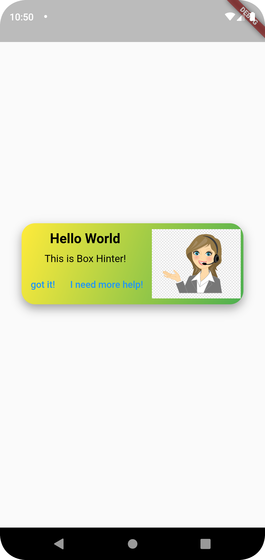
child: BoxHinter(// <-- SEE HERE, THIS IS WHERE WE USE OUR BOX
image: const NetworkImage(
'https://w7.pngwing.com/pngs/148/53/png-transparent-call-centre-customer-service-graphics-callcenteragent-call-center-man-comics-child-face.png',
scale: 7
),
title: 'Hello World',
color1: Colors.yellow,
color2: Colors.green,
subtitle: 'This is Box Hinter!',
contentSize: 15.0,
onPressed: (){},
onTap: (){},
titleColor: Colors.black,
subtitleColor: Colors.black,
),
);
}
Future openTheWidget(BuildContext context) => showDialog(
context: context,
builder: (context) => widgetTwo(),
);
}
|
Package image
Next Goals
-
x Add onTap for functions.
Now, you can specify the onTap and specify a function.
-
x Change font and color style for text.
Change color by specifying textcolor and subtitlecolor properties.
-
Specify a pre-designed set of actions in case a user does not understand a hint.
-
Fix small coloring bug when using the package as a pop-up widget.