Bottom Bar
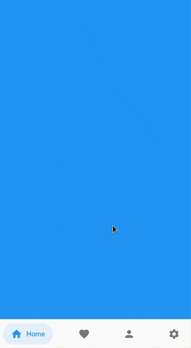
Bottom bar helps create an optimized bottom navigation bar with beautiful animations.
Content
Installation
Add bottom_bar to pubspec.yaml
dependencies:
  bottom_bar: ^2.0.5
Breaking Changes
darkActiveColoris removed to simplify the api. Instead, use PlatformBrightness to check dark mode and adjust the color accordingly
Usage
Import the Package
import 'package:bottom_bar/bottom_bar.dart';
Example
  int _currentPage = 0;
  final _pageController = PageController();

  @override
  Widget build(BuildContext context) {
    return Scaffold(
      body: PageView(
        controller: _pageController,
        children: [
          Container(color: Colors.blue),
          Container(color: Colors.red),
          Container(color: Colors.greenAccent.shade700),
          Container(color: Colors.orange),
        ],
        onPageChanged: (index) {
          // Use a better state management solution
          // setState is used for simplicity
          setState(() => _currentPage = index);
        },
      ),
      bottomNavigationBar: BottomBar(
        selectedIndex: _currentPage,
        onTap: (int index) {
          _pageController.jumpToPage(index);
          setState(() => _currentPage = index);
        },
        items: <BottomBarItem>[
          BottomBarItem(
            icon: Icon(Icons.home),
            title: Text('Home'),
            activeColor: Colors.blue,
          ),
          BottomBarItem(
            icon: Icon(Icons.favorite),
            title: Text('Favorites'),
            activeColor: Colors.red,
          ),
          BottomBarItem(
            icon: Icon(Icons.person),
            title: Text('Account'),
            activeColor: Colors.greenAccent.shade700,
          ),
          BottomBarItem(
            icon: Icon(Icons.settings),
            title: Text('Settings'),
            activeColor: Colors.orange,
          ),
        ],
      ),
    );
  }
Parameters
BottomBar
Creates a BottomBar that displays a list of BottomBarItem
Required:
- selectedIndex - Index of selected item
- items - List of BottomBarItem to display
- onTap - Fires when a BottomBarItem is tapped
Optional:
- backgroundColor - Background Color of
BottomBar - height - Height of
BottomBar - padding - Padding of
BottomBarcontainer - mainAxisAlignment - Describes how BottomBarItems are horizontally laid out
- curve -
Curveof animation - duration -
Durationof animation - border - Border of BottomBarItem's background color
- boxShadow -
BoxShadowofBottomBar - itemPadding -
Paddingof BottomBarItem's background color - textStyle -
TextStyleof title widget - showActiveBackgroundColor - Shows the background color of a selected BottomBarItem if set to true
BottomBarItem
Contains information about the item that BottomBar has to display
Required:
- icon -
IconofBottomBarItem - title - Title of
BottomBarItem(Typically a Text widget) - activeColor - Primary color of a selected
BottomBarItem
Optional:
- activeIconColor - Icon color of a selected
BottomBarItem - activeTitleColor - Text color of a selected
BottomBarItem - backgroundColorOpacity - Opacity of a selected
BottomBarItembackground color (Defaults to 15%) - inactiveIcon- Icon to display when
BottomBarItemis not active - inactiveColor - Primary color of
BottomBarItemwhen it is NOT selected
FAQ
My phone's notch is overlapping with BottomBar. How do I fix this?
- Simply wrap BottomBar with a SafeArea widget.
How do I change the overall color of BottomBarItem when in dark mode?
- You can use PlatformBrightness to check dark mode and adjust the color accordingly.
  @override
  Widget build(BuildContext context) {
    bool isDarkMode = MediaQuery.of(context).platformBrightness == Brightness.dark;

    BottomBarItem(
      activeColor: isDarkMode ? Colors.orange : Colors.blue, // Is dark mode true? (Yes -> Colors.orange | No -> Colors.blue)
    ),
  }
Community Support
If you have any suggestions or issues, feel free to open an issue
If you would like to contribute, feel free to create a PR