Big Tip
Display information to the user using a custom layout, that can be actionable.
This package aims to provide you a simple way to communicate information to the user, using custom views and a texts message. You can also customize colors, sizes and text style.
It displays a custom widget, usually a Icon widget, followed by a title and a subtitle text. If the child widget provided is in fact an Icon, a default icon theme will be applied, setting its size to 100, and using the caption text style's color to fill it.
There's also an optional action parameter, which provides the ability to call functions via a customizable button.
Example
If you want to take a deeper look at the example, take a look at the example folder provided with the project.
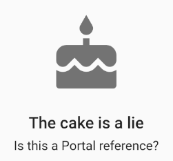
BigTip(
  child: Icon(Icons.cake),
  title: Text('The cake is a lie'),
  subtitle: Text('Is this a Portal reference?'),
),
You can also provide the user with the ability to interact with the view, via a FlatButton widget. To do that, you can make use of the action and actionCallback parameters of the widget. By default, this widget will be placed at the bottom of the view.
BigTip(
  child: Icon(Icons.cake),
  title: Text('The cake is a lie'),
  subtitle: Text('Is this a Portal reference?'),
  action: Text('CALL GABEN'),
  actionCallback: () => print('Ding dong'),
),
Getting Started
This project is a starting point for a Dart package, a library module containing code that can be shared easily across multiple Flutter or Dart projects.
For help getting started with Flutter, view our online documentation, which offers tutorials, samples, guidance on mobile development, and a full API reference.
Built with
- Flutter - Beautiful native apps in record time.
- Android Studio - Tools for building apps on every type of Android device.
- Visual Studio Code - Code editing. Redefined.
Authors
License
This project is licensed under the GNU GPL v3 License - see the LICENSE file for details.