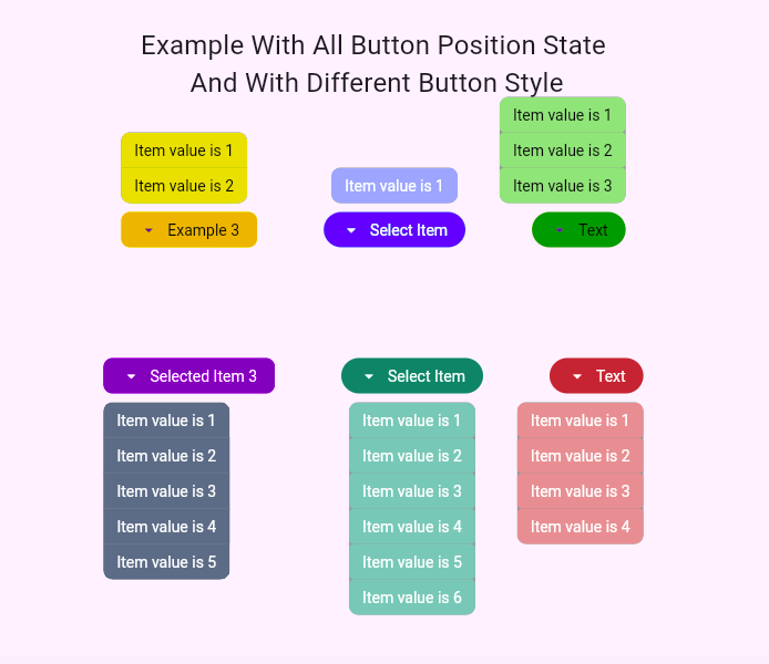
Basic DropDown Button
A highly customizable drop-down button widget for Flutter. This package offers two variants—one streamlined for ease-of-use and one with full customization—so you can integrate a stylish, adaptive drop-down button into your app with minimal hassle or with extensive control over every detail.
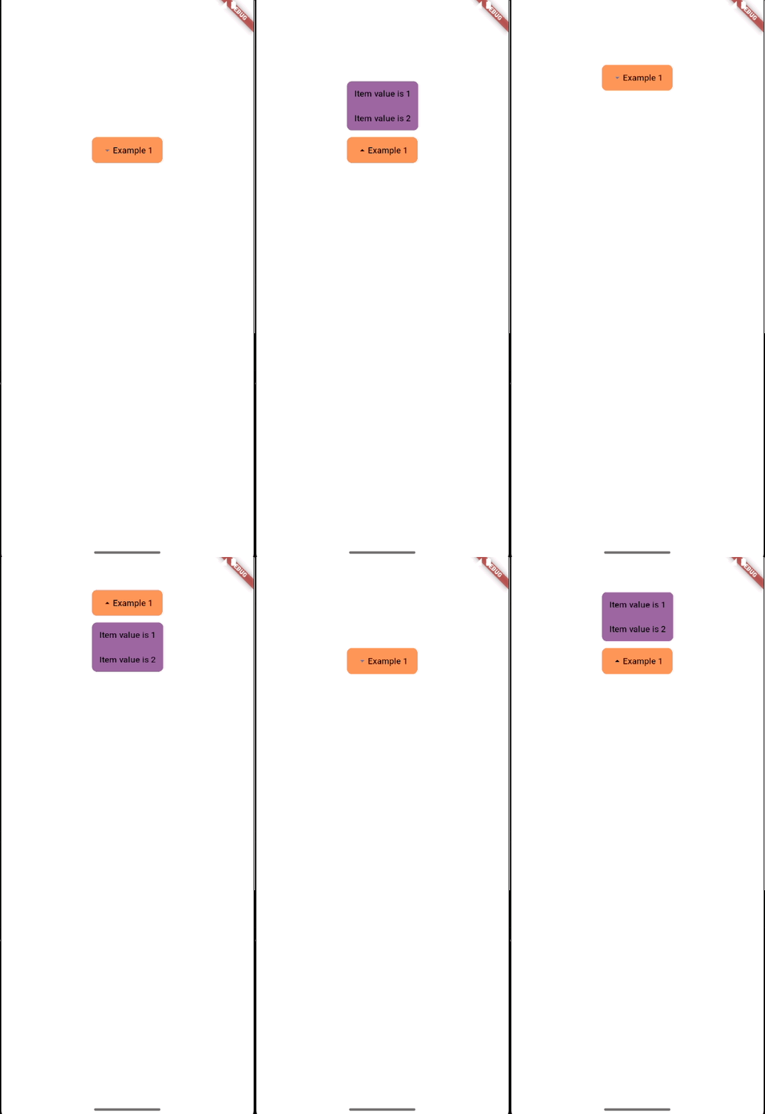
Preview
Overview
Custom DropDown Button provides two distinct implementations:
-
CustomDropDownButton
A simplified version that exposes only the most essential parameters for quick integration and basic customization. -
BasicDropDownButton
A more advanced version offering extensive customization options for both the button and its menu. This version is ideal if you need fine-grained control or want to build your own widget based on our implementation.
Features
1. Two Versions for Flexibility
-
CustomDropDownButton
- Simplified API: Designed for ease-of-use with most primary parameters preconfigured.
- Quick Integration: Ideal when you want a functional drop-down without specifying many properties.
-
BasicDropDownButton
- Advanced Customization: Offers a broader API with many parameters to tweak both the button and menu appearance and behavior.
- Custom Widget Development: Serves as an example for developers who want to create their own highly customizable widgets.
2. Automatic Menu Positioning
- Adaptive Layout: The widget automatically changes the menu's position based on available screen space.
- If there isn’t enough space below the button, the menu opens above.
- Conversely, if space above is limited, it opens below.
- Enhanced Usability: This dynamic positioning ensures that the menu is always fully visible, regardless of screen size or orientation.
3. Full Customization of Style and Widgets
- Button & Menu Styling:
- You can change the style or even replace the widget for both the button and the menu.
- Customize colors, shapes, padding, spacing, and more using Flutter's ButtonStyle API and other styling parameters.
4. Simplified API with CustomDropDownButton
- Minimal Configuration:
- When using
CustomDropDownButton, you don’t need to provide an extensive list of parameters—the majority of essential settings are already configured for you. - This makes it easier and faster to implement a drop-down button in your projects.
- When using
5. An Example for Custom Widget Development
- Learning Resource:
CustomDropDownButtoncan serve as a practical example of how to build and customize your own widget.- You can study its structure and even extend it using the more flexible
BasicDropDownButtonas a foundation.
Test Coverage and Flutter Version Support
This package has 100% test coverage, ensuring reliability and robustness. The tests have been executed on Flutter versions 3.16.0 and 3.29.0, confirming full support for these versions and all versions in between.
Example
CustomDropDownButton<int>(
  buttonStyle: ButtonStyle(
    backgroundColor:
        WidgetStatePropertyAll(Colors.blue[600]),
    padding: WidgetStatePropertyAll(
        const EdgeInsets.symmetric(horizontal: 16, vertical: 12)),
    textStyle: WidgetStatePropertyAll(const TextStyle(
      color: Colors.white,
      fontWeight: FontWeight.w400,
    )),
    shape: WidgetStatePropertyAll(
      RoundedRectangleBorder(
        borderRadius: BorderRadius.circular(20.0),
      ),
    ),
  ),
  buttonText: 'Select Item',
  position: DropDownButtonPosition.bottomCenter,
  buttonIconColor: Colors.black,
  buttonTextStyle: TextStyle(
    color: Colors.white,
  ),
  menuItems: List.generate(
    itemCount,
    (index) => CustomDropDownButtonItem(
      value: index + 1,
      text: 'Item value is ${index + 1}',
      onPressed: () => event(index),
      buttonStyle: ButtonStyle(
          backgroundColor: WidgetStatePropertyAll(Colors.blueGrey),
          textStyle: WidgetStatePropertyAll(const TextStyle(
          color: Colors.black,
          )),
          shape: WidgetStatePropertyAll(
            RoundedRectangleBorder(
                borderRadius: BorderRadius.zero,
            ),
          ),
      ),
      textStyle: TextStyle(
        color: Colors.white,
      ),
    ),
  ),
  menuBorderRadius: BorderRadius.circular(
    8,
  ),
  selectedValue: 1,
)


