🍞 Awesome Toast
A beautiful, customizable toast notification system for Flutter with automatic stacking, smooth animations, glassmorphism support, and full navigation persistence.
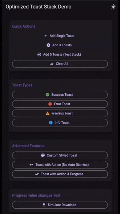
✨ Features
- 🎨 Customizable: Extensive styling options including colors, text styles, icons, and border radius.
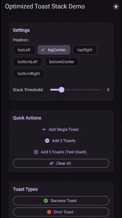
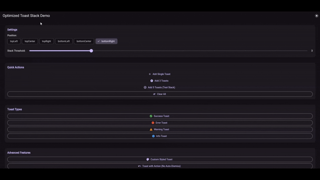
- 📚 Stacking: Smart automatic stacking behavior to keep your UI clean.
- 🌫️ Glassmorphism: Built-in blur support for beautiful, modern UIs.
- ⚡ Performance: Highly optimized rendering and layout logic.
- 🎬 Animations: Smooth entrance, exit, and stacking animations.
- 🧭 Navigation Persistence: Toasts remain visible and interactive across navigation events.
- 👆 Interactive: Support for action buttons and swipe-to-dismiss (with configurable resistance).
- 📱 Positioning: Adjust toast positions based on screen size or orientation.
🚀 Getting Started
Add awesome_toast to your pubspec.yaml:
dependencies:
  awesome_toast: ^2.0.1
Wrap your app with ToastProvider:
import 'package:awesome_toast/awesome_toast.dart';
import 'package:flutter/material.dart';

void main() {
  runApp(const MyApp());
}

class MyApp extends StatelessWidget {
  const MyApp({super.key});

  @override
  Widget build(BuildContext context) {
    return ToastProvider(
      child: MaterialApp(
        title: 'Awesome Toast Demo',
        home: const DemoScreen(),
      ),
    );
  }
}
📖 Usage
Basic Toasts
Use the convenience methods on ToastService.instance for standard success, error, warning, and info toasts.
// Success
ToastService.instance.success(
  'Success',
  'Your changes have been saved!',
);

// Error
ToastService.instance.error(
  'Error',
  'Something went wrong. Please try again.',
);

// Warning
ToastService.instance.warning(
  'Warning',
  'You have unsaved changes.',
);

// Info
ToastService.instance.info(
  'Info',
  'New update available.',
);
Advanced Configuration
You can configure the global behavior of the toast stack via ToastStackConfig.
ToastProvider(
  config: const ToastStackConfig(
    position: ToastPosition.topRight,
    stackThreshold: 3,
    animationCurve: Curves.easeInOutBack,
    defaultDuration: Duration(seconds: 4),
    blur: 5.0, // Enable glassmorphism
    iconColor: Colors.white,
    expandProgress: true, // Progress bar fills the background
  ),
  child: // ...
)
Custom Toasts (toastBuilder & contentBuilder)
You can fully customize the appearance of toasts.
Global Customization via toastBuilder:
Override the default look for all standard toasts in your app.
ToastProvider(
  config: ToastStackConfig(
    toastBuilder: (context,title,message,type,progress,dismiss,actions,dismissable,showProgress,) {
      return Container(
        padding: const EdgeInsets.all(16),
        color: Colors.black87,
        child: Column(
          children: [
            Text(title, style: const TextStyle(color: Colors.amber)),
            Text(message, style: const TextStyle(color: Colors.white)),
          ],
        ),
      );
    },
  ),
  child: // ...
)
One-off Customization via show:
Use ToastService.instance.show for completely custom widgets.
ToastService.instance.show(
  contentBuilder: (context, progress, dismiss, actions) {
    // 'progress' is a ValueNotifier<double> that goes from 0.0 to 1.0
    return Container(
      height: 100,
      color: Colors.deepPurple,
      child: Center(
        child: ElevatedButton(
          onPressed: dismiss,
          child: const Text('Close Custom Toast'),
        ),
      ),
    );
  },
  duration: const Duration(seconds: 5),
);
Non-Dismissable Toasts
You can make a toast persistent and resistant to swipe gestures.
ToastService.instance.warning(
  'Critical Alert',
  'This action cannot be undone.',
  dismissable: false, // Disables swipe-to-dismiss and auto-dismiss
);
📚 API Reference
See the API Reference for detailed documentation on all classes and methods.
☕ Support the development
Love this package? Support the development!
TRON TQyWG43yJ9MQFDLWMhkNKAwRXxhwseodvS
|
TON UQCR241RbOai5OYdOnIAGpwTqMNcln6pQl4f7Xg_MLUStG1n
|
MIT License - see the LICENSE file for details.