Auto Size Widget
A Flutter widget that can resize the child widget by dragging the widget corner.
Installation
- Add the latest version of the package to your pubspec.yaml (and run 'dart pub get'):
dependencies:
    auto_size_widget: ^0.0.4
- Import the package and use it in your Flutter app.
import 'package:auto_size_widget/auto_size_widget.dart';
Example
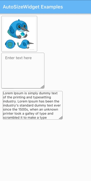
- To resize both the height and the width of the widget
initialWidth and initialHeight should be different from maxWidth and maxHeight respectively.
AutoSizeWidget(
  initialWidth: 120,
  initialHeight: 120,
  maxWidth: 320,
  maxHeight: 320,
  boxDecoration: BoxDecoration(
    border: Border.all(width: 1, color: Colors.grey),
    borderRadius: BorderRadius.circular(5)),
  child: Image.network(
    'https://docs.flutter.dev/assets/images/dash/early-dash-sketches2.jpg',
    fit: BoxFit.fill,
  ),
),
- To resize the height of the widget
initialWidth and maxWidth should be same to ensure that the width does not change on resize.
AutoSizeWidget(
  initialWidth: 250,
  initialHeight: 120,
  maxWidth: 250,
  maxHeight: 280,
  boxDecoration: BoxDecoration(
    border: Border.all(width: 1, color: Colors.grey),
    borderRadius: BorderRadius.circular(5),
  ),
  child: const SelectableText(
    "Lorem Ipsum is simply dummy text of the printing and typesetting industry. Lorem Ipsum has been the industry's standard dummy text ever since the 1500s, when an unknown printer took a galley of type and scrambled it to make a type specimen book. It has survived not only five centuries, but also the leap into electronic typesetting, remaining essentially unchanged. It was popularised in the 1960s with the release of Letraset sheets containing Lorem Ipsum passages, and more recently with desktop publishing software like Aldus PageMaker including versions of Lorem Ipsum."
  ),
),
- To resize the width of the widget
initialHeight and maxHeight should be same to ensure that the height does not change on resize.
AutoSizeWidget(
  initialWidth: 150,
  initialHeight: 200,
  maxWidth: 300,
  maxHeight: 200,
  boxDecoration: BoxDecoration(
    border: Border.all(width: 1, color: Colors.grey),
    borderRadius: BorderRadius.circular(5)),
  child: TextFormField(
    keyboardType: TextInputType.multiline,
    maxLines: 3 * 120,
    textAlign: TextAlign.start,
    decoration: const InputDecoration(
      focusedBorder: InputBorder.none,
      contentPadding:
        EdgeInsets.symmetric(vertical: 11, horizontal: 15),
      hintText: "Enter text here"
    ),
  ),
),