
Overview
The at_gauges package is for Flutter developers who want to build beautiful and customizable gauges.
This open source package is written in Dart, and it supports Flutter with the following widgets:
SimpleRadialGauge
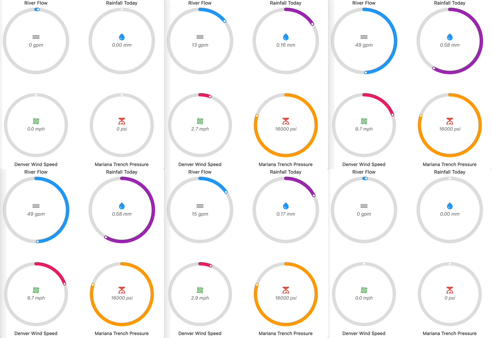
ScaleRadialGauge
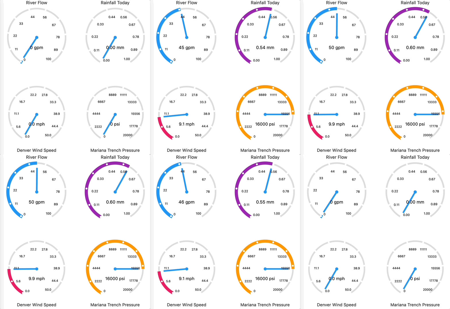
SimpleLinearGauge
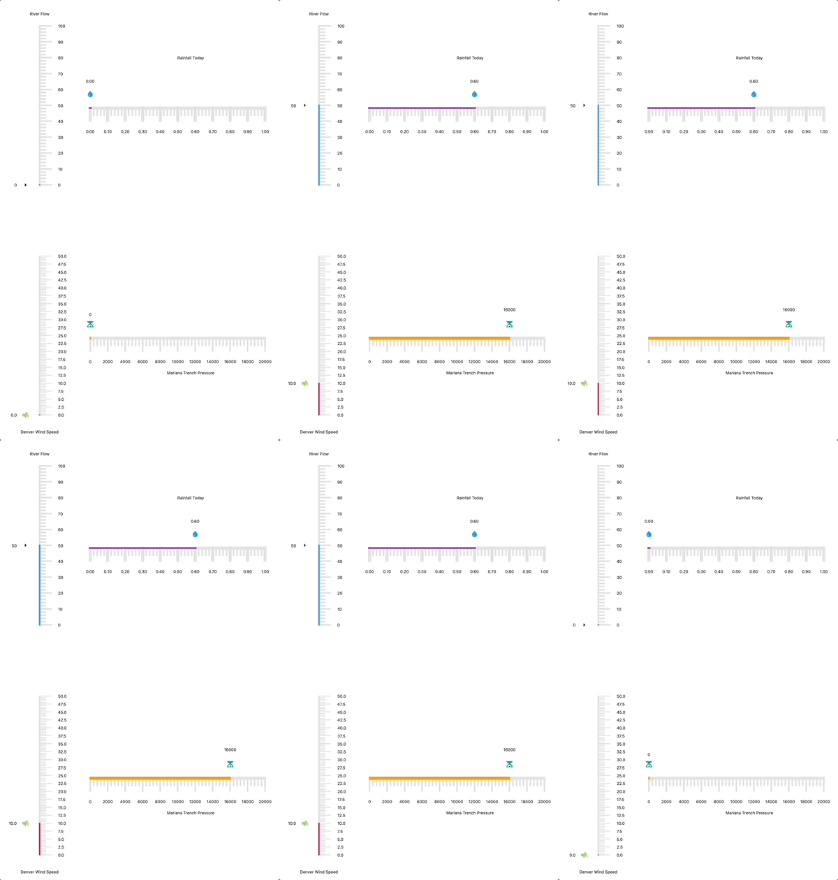
We welcome suggestions you may have to create more gauges or to add features to gauges already created.
Get started
There are two options to get started using this package.
1. Clone it from GitHub
Feel free to fork a copy of the source from the GitHub repo.
$ git clone https://github.com/atsign-foundation/at_gauges
2. Manually add the package to a project
Instructions on how to manually add this package to your project can be found on pub.dev here.
How it works
Setup
This package needs to be imported as shown below:
import 'package:at_gauges/at_gauges.dart';
Usage
This package provides three beautiful gauges.
Simple Radial Gauge Example
The code snippet below shows the simple gauge widget with the required actualValue, maxValue and the optional properties.
SimpleRadialGauge(
    actualValue: 50,
    maxValue: 100,
    // Optional Parameters
    minValue: 0,
    title: Text('Simple Radial Gauge'),
    titlePosition: TitlePosition.top,
    unit: 'L',
    icon: Icon(Icons.water),
    pointerColor: Colors.blue,
    decimalPlaces: 0,
    isAnimate: true,
    animationDuration: 2000,
    size: 400,
),
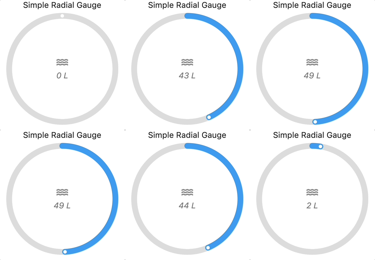
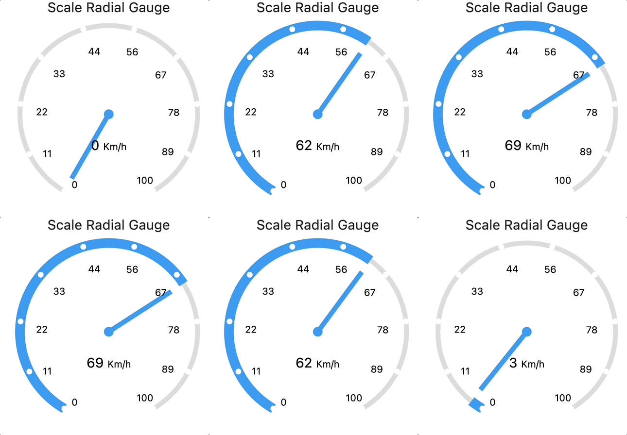
Scale Radial Gauge
The code snippet below shows the scale gauge widget with the required actualValue, maxValue and the optional properties.
ScaleRadialGauge(
    maxValue: 100,
    actualValue: 70,
    // Optional Parameters
    minValue: 0,
    size: 400,
    title: Text('Scale Radial Gauge'),
    titlePosition: TitlePosition.top,
    pointerColor: Colors.blue,
    needleColor: Colors.blue,
    decimalPlaces: 0,
    isAnimate: true,
    animationDuration: 2000,
    unit: TextSpan(text: 'Km/h', style: TextStyle(fontSize: 10)),
)
Simple Linear Gauge
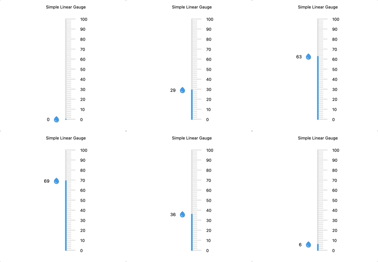
The code snippet below shows the simple gauge widget with the required actualValue, maxValue and the optional properties.
SimpleLinearGauge(
    maxValue: 100,
    actualValue: 76,
    //Optional Parameters
    minValue: 0,
    divisions: 10,
    title: const Text('Simple Linear Gauge'),
    titlePosition: TitlePosition.top,
    pointerColor: Colors.blue,
    pointerIcon: const Icon(Icons.water_drop, color: Colors.blue),
    decimalPlaces: 0,
    isAnimate: true,
    animationDuration: 2000,
    gaugeOrientation: GaugeOrientation.vertical,
    gaugeStrokeWidth: 5,
    rangeStrokeWidth: 5,
    majorTickStrokeWidth: 3,
    minorTickStrokeWidth: 3,
    actualValueTextStyle: const TextStyle(color: Colors.black, fontSize: 15),
    majorTickValueTextStyle: const TextStyle(color: Colors.black),
),
For more information, please see the example tab or API documentation listed on pub.dev.
Open source usage and contributions
This is open source code, so feel free to use it as is, suggest changes or enhancements or create your own version. See CONTRIBUTING.md for detailed guidance on how to setup tools, tests and make a pull request.
Maintainers
Libraries
- at_gauges
- Create beautiful looking gauges.

